
Peltier Tech Grouped Box and Whisker Chart


Peltier Technical Services - Excel Charts and Programming
Box and Whisker Charts (Box Plots) are commonly used in the display of statistical analyses, to illustrate the underlying distribution of data in a data set, by showing medians, quartiles, and outlying data points.
Peltier Tech Charts for Excel creates box plots based on the protocol in Excel Box and Whisker Diagrams (Box Plots), a tutorial on the Peltier Tech Blog. Excel 2016 introduced Microsoft’s own box and whisker plots, but they are not as flexible as those created by Peltier Tech Charts for Excel.
You can create a box plot by clicking on the Box Plot button in the Custom Charts section of the Peltier Tech ribbon…

…or by clicking on the Box Plot dropdown arrow, and clicking the first item in the Box Plot dropdown menu.

Box plots are available in both Standard and Advanced Editions of Peltier Tech Charts for Excel. Note that the Standard Edition does not have the Box Plot dropdown, as the Grouped Box Plot option is only available in the Advanced Edition.
The box plot dialog contains several options. Many of the options are saved for the next time you open the dialog.

Click here to download a workbook with Peltier Tech Charts for Excel Sample Data for waterfall charts and other charts in the program.
Box plot data can be arranged in columns…

… or in rows.

The program checks for labels in the first row (if data is aligned in columns) or in the first column (if it is aligned in rows). You can override this setting, for example, if the years in the first row should be treated as labels rather than data. If there are no category labels in the data, the program will use “Series 1”, “Series 2”, etc., as labels in the chart.
The program checks for non-numeric data in the first column (if data is aligned in columns) or in the first row (if it is aligned in rows). This data has record information in the first column.

Box Plot data need not be contiguous. You can select multiple-area ranges by holding Ctrl while selecting additional ranges. The data can be split vertically…

… or horizontally…

… or both.
The program will accept multiple area ranges as long as the total range is nicely divided into separate areas by complete rows or columns.
You can select vertical…

… or horizontal orientation for your box plot.

Peltier Tech Charts for Excel produces three styles of Box Plots.
There are simple box and whisker plots, where the boxes indicate the inner quartiles of the data distribution, and the whiskers indicate the outer quartiles.

There are four box plots, where all quartiles are represented with boxes.

And there are box and whisker plots with outliers, where boxes indicate the inner quartiles, whiskers represent the outer quartiles out to the furthest non-outlier points, and outliers are represented by markers.

Note that there may be two classes of outliers. Near outliers, represented by star markers, fall between 1.5 and 3.0 interquartile ranges outside the inner quartiles. Far outliers, represented by circles, fall more than 3.0 interquartile ranges outside the inner quartiles. The interquartile range is the distance from the first and third quartiles, or the combined height of the inner quartile boxes.

The program inserts a new worksheet, makes a linked copy of the data on this new sheet, inserts rows of calculations needed for the box plot, and finally inserts the chart itself. Here is how the inserted worksheet looks when we zoom out to 40%. The chart (box plot) and some worksheet controls are at the top of the sheet. The linked data is in the bottom left corner of the sheet. The statistical calculations lie between the linked data and the box plot. Finally, for box plots with outliers, there are three blocks of data to the right of the linked data which are used for plotting the outliers. You don’t need to worry about any of these details; the program manages it for you.

Here is the important part of the program’s output. The box plot is at the top. The top of the calculation range is a summary of the data, and the columns of calculations are aligned with the boxes in the chart (only for vertical box plots, of course). There are controls beside the chart that allow you to select an option for calculation of quartiles, as well as to show or hide averages and outliers (for outlier-containing charts).

The standard box plot with outliers shows outliers as well as averages for each category.

You can check and uncheck the boxes beside the chart to toggle display of outliers..

… and of averages.

You can select from six different methods to compute Quartiles (and Outliers).

These have been explained in an extended tutorial, Quartiles for Box Plots, on the Peltier Tech Blog.
Box and Whisker Charts (Box Plots) are commonly used in the display of statistical analyses. In 2016 Microsoft Excel added a box and whisker chart, but it is not very flexible, and some of the expected formatting options for charts are not available. But you can create your own fully-features Box and Whisker charts, using stacked bar or column charts and error bars. This tutorial shows how to make box plots, in vertical or horizontal orientations, in all modern versions of Excel.

In its simplest form, the box and whisker diagram has a box showing the range from first to third quartiles, and the median divides this large box, the “interquartile range”, into two boxes, for the second and third quartiles. The whiskers span the first quartile, from the second quartile box down to the minimum, and the fourth quartile, from the third quartile box up to the maximum.
These techniques for creating box plots are complicated, and they can get long and boring, and this resulting tedium can lead to errors. Peltier Tech Charts for Excel creates waterfall charts and many other charts not built into Excel, at the push of a button.

Sample Data and Calculations
To play along at home in Excel 2007 or 2010, download the workbook Excel_2007_Box_Plot_Workbook.xlsx.
Let’s use the following simple data set for our tutorial. The values were taken from a normally distributed population with a mean of 10 and standard deviation of 5. There are four sets of 20 values.
All of these values are positive. If your data set has mixed positive and negative values, this technique requires major modifications.

First, insert a bunch of blank rows, and set up a range for calculations. Only the horizontal version of the box plot uses the last calculated row, “Offset”. It will not hurt to include it in the vertical box plot’s calculations.

First, compute some simple statistics, such as the count, mean, and standard deviation. The formulas used in column B are shown in column G of the screen shot.

Now let’s compute the minimum and maximum, median, and first and third quartiles.

Finally, let’s determine which values we need to plot. Our chart has a box for the second quartile, which shows the difference between median and first quartile calculated above. It has a box for third quartile, which show the difference between the third quartile calculation and the median. The bottom of the lower box rests on the first calculated quartile. The down whisker is as long as the first quartile minus the minimum, and the up whisker is as long as the maximum minus the third quartile.

The offset values are calculated as follows: In my example, I have four categories, Alpha through Delta. I can divide my horizontal chart into four horizontal strips, numbered from 0 to 4, each containing one box-and-whisker unit. I need to position my average points in the middle of each 1-unit horizontal strip. These will ultimately go onto a secondary vertical axis which I will have conveniently scaled from 0 to 4. Hence the Y values I will need are 0.5, 1.5, 2.5, and 3.5.
Chart Construction
Select the header row of the calculated data, then hold Ctrl while selecting the three rows that include Bottom, 2Q Box, and 3Q Box. This multiple-area range is highlighted in orange below.

With this range selected, insert a stacked column chart or a stacked bar chart. Be sure to use the stacked version, and not the 100% stacked version, of the column or bar chart.


The labels in the bar chart go bottom-to-top. To reverse the labels, select the vertical axis, press Ctrl-1 (numeral one) to open the Format Axis dialog, then check the “Categories in Reverse Order” box, then under “Horizontal Axis Crosses”, select “At maximum category”.

To add the down whisker, select the Bottom series, then in the Chart Tools > Layout tab, click Error Bars, and select More Error Bar Options from the bottom of the menu. Choose the Minus direction, select Custom for Error Amount, and click on Specify Value. Leave the contents of the Positive Error Value box alone (“={1}”) in the mini dialog that appears, then clear the Negative Error Value box and select the Whisker- row from the table (B14:E14). Click OK and Close to get back to Excel. These “down” error bars (whiskers) extend from the bottom (left) edge of the 2Q Box downward (leftward) into the Bottom series.


To add the up whisker, select the 3Q Box series,then in the Chart Tools > Layout tab, click Error Bars, and select More Error Bar Options from the bottom of the menu. Choose the Plus direction, select Custom for Error Amount, and click on Specify Value. Leave the contents of the Negative Error Value box alone (“={1}”) in the mini dialog that appears, then clear the Positive Error Value box and select the Whisker+ row from the table (B15:E15). Click OK and Close to get back to Excel.
These “up” error bars (whiskers) extend upward (rightward) from the top (right) of the 3Q Box.

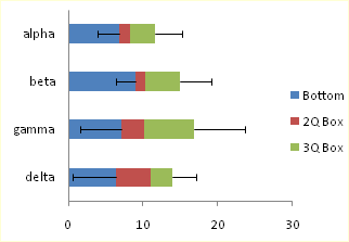
Now we can format the boxes. Select the Bottom series, and apply no fill and no border, so it is hidden. Then select each of the 2Q Box and 3Q Box series, and apply a dark border and a light fill.


To add the mean as a series of markers, select the Mean row in the calculated range (highlighted in blue). If you are making a horizontal box plot, hold Ctrl and also select the Offset row (highlighted in green), so both areas are selected. Copy the selected range.

Select the chart, and use Paste Special to add the data as a new series. If you are making a horizontal box and whisker diagram, check the “Category (X Labels) in First Row” box. The “Series Names in First Column” box should already be checked.
The new series is added as another column or bar stacked on top of the existing ones.


Select this new series, then on the Chart Tools > Design tab, click on Change Chart Type. If you are making a vertical box plot, choose a Line Chart style. If you are making a horizontal box plot, choose an XY Scatter style.


The points in the horizontal box plot are in reverse order. To change the order of points, select the secondary vertical axis (right edge of the chart), press Ctrl-1 (numeral one) to open the Format Axis dialog, then check the “Values in Reverse Order” box.

If you’re making a horizontal box plot in Excel 2003, this last process is a little more involved. Excel draws both secondary axes, but the vertical one is hidden behind the primary axis with the text labels (below left). Double click on the secondary horizontal axis (top of chart), and on the scale tab of the Format Axis dialog, check “Value (Y) Axis Crosses at Maximum Value” (below right).


Excel 2003, continued: Double click the secondary vertical axis (right of chart), and on the scale tab, check “Values in Reverse Order” and uncheck “Value (X) Axis Crosses at Maximum Value” (below left). Finally, select the secondary horizontal axis (top) and click Delete; Excel will now plot the XY series on the primary horizontal axis.


All Versions: Now format the mean series: remove the line, and use an appropriate marker of a contrasting color. If you’ve made a horizontal box plot, hide the secondary Y axis (right edge of the chart) by choosing no tick marks, no tick labels, and no line in the Format Axis dialog.

That was easy and didn’t take too long.
This tutorial shows how to create Box and Whisker Charts (Box Plots), including the specialized data layout needed, and the detailed combination of chart series and chart types required. This manual process takes time, is prone to error, and becomes tedious.
I have created Peltier Tech Charts for Excel to create Box Plots (and many other custom charts) automatically from raw data. This utility, a standard Excel add-in, lays out data in the required layout, then constructs a chart with the right combination of chart types.

The utility creates vertical Box Plots …

… horizontal Box Plots …

… and Grouped Box Plots …

Outliers can be shown or hidden, and a number of quartile definition options are available.
This is a commercial product, tested on thousands of machines in a wide variety of configurations, Windows and Mac, which saves time and aggravation.
Please visit the Peltier Tech Charts for Excel page for more information.
