Simple Gantt Charts
A year ago I wrote an article about Gantt Charts in Microsoft Excel. It was pretty comprehensive, showing how to make simple Gantt charts using worksheet conditional formatting and using regular Excel stacked bar charts, and it covered some advanced techniques for adding embellishments, such as a reference line for a given date, multiple bars showing percent complete of a task, and milestone markers at the end of the bars.
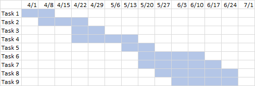
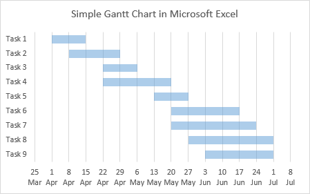
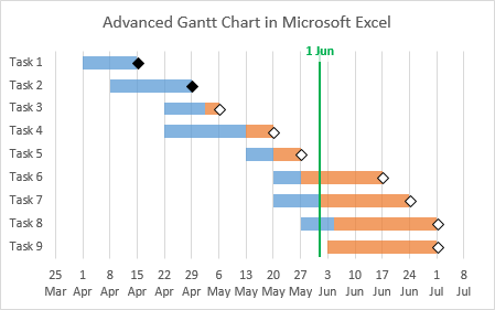
These Gantt charts all looked great, but a clever reader asked about a nicer axis scale across the bottom of the chart. In my example above, I had a tick label and vertical gridline every week, which is great for the time scale of my data. But what if the chart spans a longer time, for example, a year, and I want a label and gridline at the first of every month.
Gantt Chart with Wrong Monthly Date Scale
Below is a similar data set, but spanning a year rather than a few months.

Following the protocol in the earlier tutorial, we can build a Gantt chart like this one. Never mind the steps, because we’ll have to do it differently. Read on.
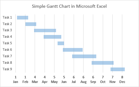
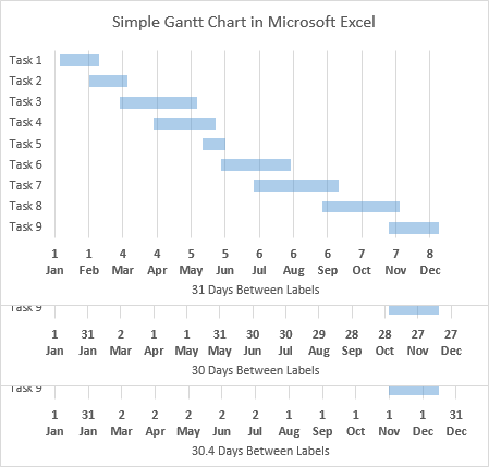
The chart spans the year nicely, but the axis scale is not what we’d like. When setting the bar chart’s axis scale, I can’t just say, put a label every month on the first. I have to pick a set number of days. Above I tried 31 days, which worked for January and February, but quickly went awry.
Below you can see the 31-day axis spacing, and a 30 day spacing, which is also wrong. If we recall that 365 days divided by 12 is 30.41666…, we might try 30.4 days, in the bottom scale, and it almost works.
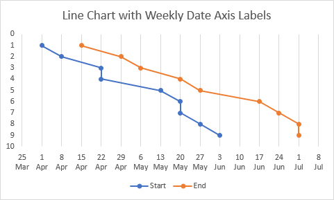
Excel Line charts can give us a nice axis scale. Let’s have a look.
Line Chart Date Axes
In the first example, we had a bar chart with a horizontal axis date scale that had a label every 7 days. The horizontal axis in a bar chart is a value axis.

We can use that same data to create a line chart, with the same 7-day axis spacing. The horizontal axis in a line chart is a category axis, in this case, a date-scale axis. The axis can have the same min and max as the bar chart’s value axis above, but there are more formatting options.
Below are the Format Axis task panes for the bar chart’s horizontal value axis (left) and the line chart’s horizontal date axis (right).
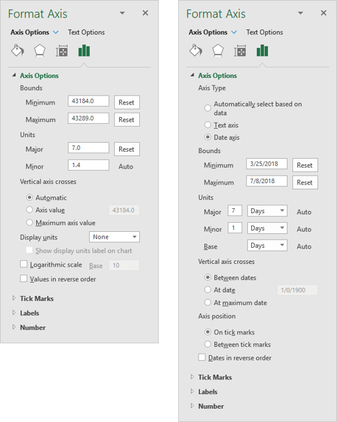
In the bar chart, the minimum and maximum are the numbers 43184 and 43289, which are actually the serial numbers (days since 1 January 1900) of the min and max dates in the line chart, 3/25/2018 and 7/8/2018. The
major unit (axis tick spacing) in the bar chart is 7, and in the line chart is 7 days. So these two axes are the same.
In the current example, we have a bar chart with a horizontal axis date scale that had a label every 31 days. Not exactly every month.

Again, we can use that same data to create a line chart, with monthly axis spacing. But here, the spacing is exactly monthly.
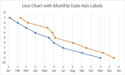
Now we can see the real difference in the axis scales. Here are the Format Axis task panes as before.
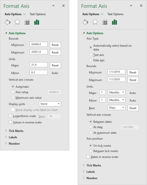
In the bar chart, the minimum and maximum are the numbers 43466 and 43831, which are the serial numbers of the min and max dates in the line chart, 1/1/2019 and 1/1/2020. The major unit (axis tick spacing) in the bar chart is 31, which is only appropriate for some months, while in the line chart it is 1 month. Excel uses this setting and adds the appropriate number of days, 31, 30, 29, or 28, so the tick labels are one month apart.
Gantt Chart with Nice Monthly Date Scale
Sometimes different chart types can share incompatible axis types, but here we are not so lucky. We need to create a chart with bar chart series to display the Gantt chart bars, and we need to combine this with a line chart to produce the date axis with the desired tick spacing. It’s a lot of steps, but not too complicated, and for the most part, the order you apply them is immaterial.
The Data
Let’s start with the data, below. On the left is the data needed to create the Gantt chart itself, and on the right is the data for the axis scale. The Gantt data has Task names, Start dates, Duration, and End dates; only the first three columns are needed. The Axis Scale data has the first and last dates in the first column, dummy values of zero in the second column, and serial numbers of the dates in the third column. The formula in the third column links to the first, but the cells are formatted not as a Date but as General.

Create and Format the Chart
Select the first three Gantt columns, and insert a bar chart.
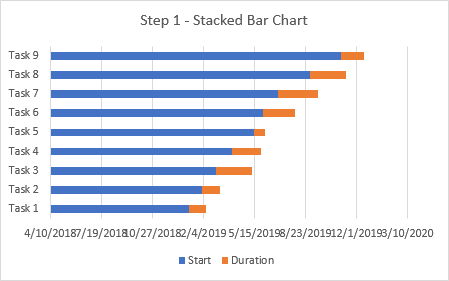
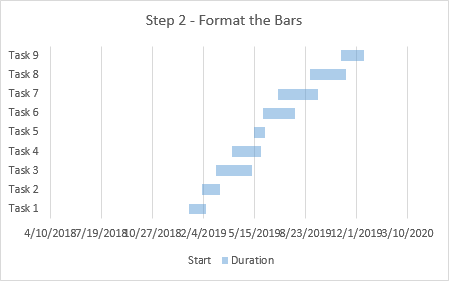
Let’s format the bars and get it over with. Start has no fill, so it’s hidden, and Duration is given the desired color. I have applied a 50% transparency to Duration, so the gridlines show through the bars.
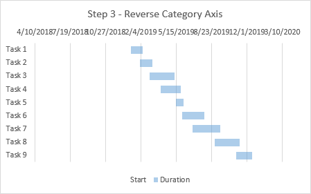
Format the vertical category axis (showing task names), choosing the Categories in reverse order. In the simple Gantt chart from the earlier tutorial, we also moved the time axis to the bottom of the chart, but we’ll keep them at the top for this chart.
Now add the data for the dummy axis. Copy the first two columns of the right hand data block shown above, with dates and dummy zero values. Select the chart, then go to the Home tab of the ribbon, click the Paste dropdown, and choose Paste Special from the bottom of the menu. Make sure these options are selected: Add Cells as New Series, By Column, Series Names in First Row, Categories in First Column.

The series doesn’t appear as much: it is a new set of stacked bars, but the values of zero means the bars have zero length and don’t appear. There is a new entry in the legend.

Right click on any series in the chart, and choose Change Series Chart Type. All three series are listed as Stacked Bar on the Primary Axis.
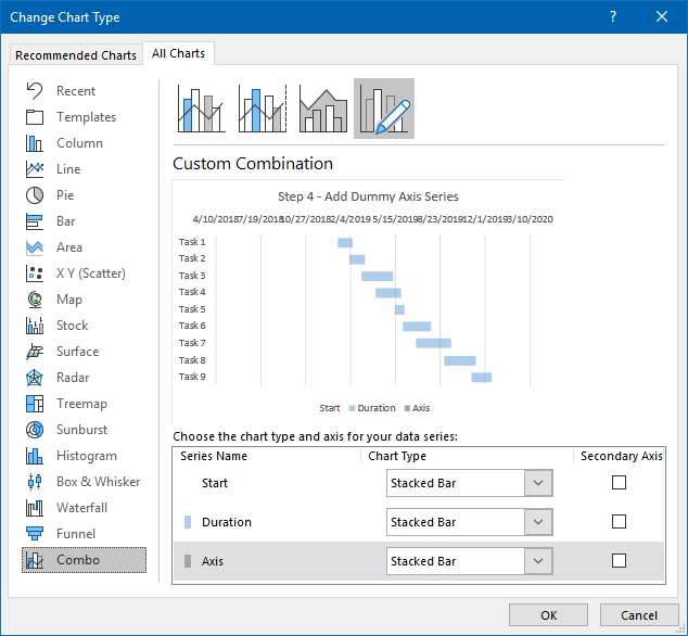
Click the Chart Type dropdown for the series named Axis, and select a Line type (I used the line with markers subtype so the series shows more clearly in the following steps).
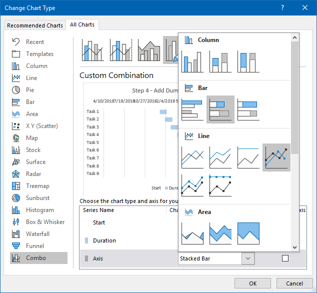
Excel automatically changes the Axis series from Primary to Secondary Axis.
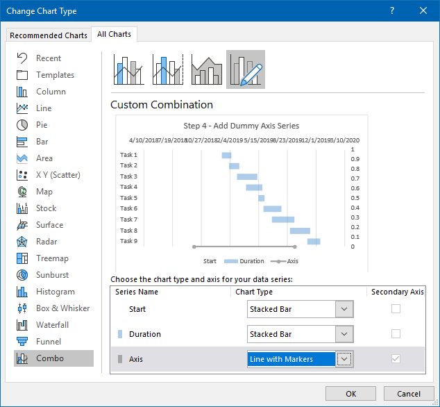
Here’s our combination chart.
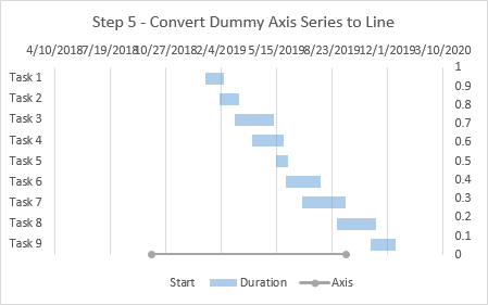
We don’t need the legend any more, so delete it.
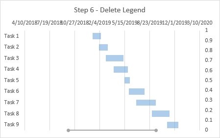
Format the Date Axes
Now add the secondary horizontal axis, the whole reason we added the dummy Axis series. Easiest way: select the chart, click on the “+” icon that appears next to the chart, click the right-pointing triangle next to Axes, and check the Secondary Horizontal box.
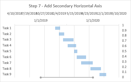
Now move the new axis to the bottom. Format the secondary vertical axis, on the right edge of the chart. Under Horizontal Axis Crosses, choose Automatic.
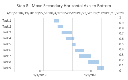
Now double-click on the bottom horizontal date axis to format it. Make sure the minimum and maximum are correct, change Base Units to Days, and change Major Units to 1 Month. Under Axis Position, choose On Tick Marks. Also, click under the paint can, and choose No Line for the axis.
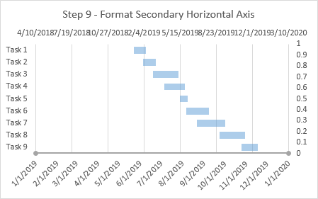
Change the Number Format of the axis labels. I like to use a two-line format, with the day above the month. You can get a line feed in the middle of a number format in the worksheet, by typing Ctrl+J in the Number Format box, and then use this data for the axis and check Linked to Source in the Format Axis task pane. Unfortunately there is no way to get the line feed in the Format Axis task pane, which is a severely annoying shortcoming.
I was so annoyed that I wrote a little VBA procedure to do this, and I’ve added it to the Peltier Tech Charts for Excel 4.0, pardon the shameless plug. I can right click on the axis, and select Axis Number Format from the context menu.

A little dialog pops up, showing the current number format for the axis.
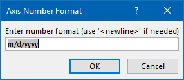
Then I enter the number format I want, inserting ‘<newline>’ where I want a line feed.
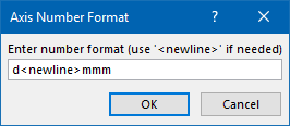
I click OK and I get the desired number format.
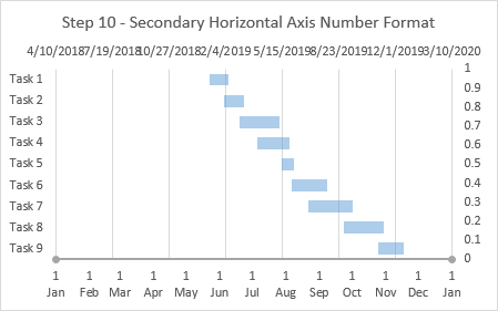
The axis may have been fine with just the short month name, that is, a number format of “mmm”, which you can apply using the Format Axis task pane.
Now set the axis scale limits on the primary axis, showing dates at the top of the chart. The axis had used 43200 and 43900, the serial numbers of 10-April-2018 and 10-March-2020, which were autoscaled by Excel. We need to use the serial numbers of 1-January-2019 and 1-January-2020, which are 43466 and 43831. If you use a major unit of 365, you will get tick labels at only the min and max of the axis, as shown below.
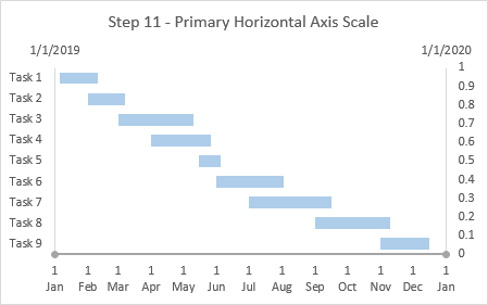
Finish with a Little Clean-Up
Turn off the primary major vertical gridlines and turn on the secondary major vertical gridlines. Easy: click the “+” icon next to the chart, click the right-pointing triangle next to Gridlines, and use the checkboxes.
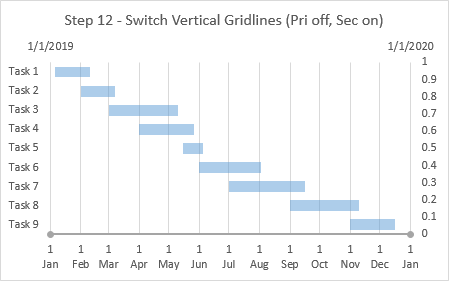
There are two axes we don’t want to show. Format the top horizontal axis so it uses no line (in this case it already had no line) and no tick labels. Format the right-hand vertical axis: set the maximum to 1, then apply None for Tick Label Position and No Line for Line Color.
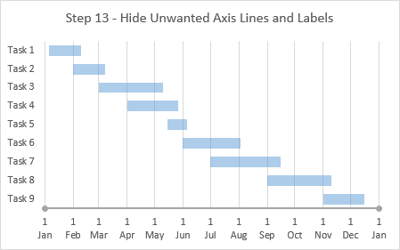
Finally, hide the dummy axis series. Double click on the series, and under the paint can, choose No Line and No Markers for its formatting.
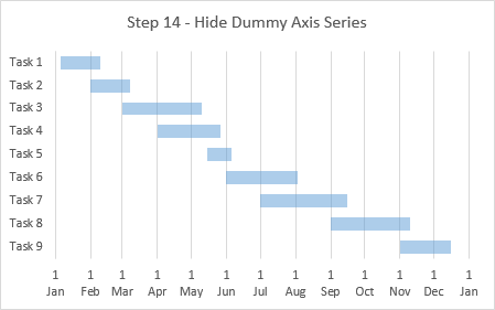
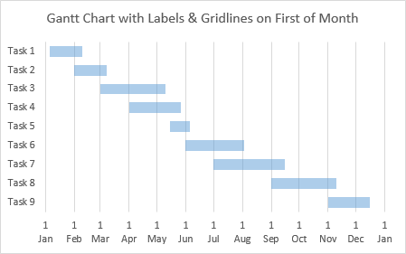
There’s our Gantt chart with gridlines and axis labels at the first of each month. You don’t need to squint too hard to see that the month between 1 February and 1 March is shorter than the months between 1 January and 1 February and between 1 March and 1 April.
Adding a Milestone
Elizabeth commented that she made a chart using this technique and it was just awesome. But her boss wanted her to add a milestone to the chart and she didn’t know how. I didn’t know at first. I tried an XY scatter series with one point for the milestone, but Excel wouldn’t let me change the series to XY Scatter. But I figured out another way. Before adding any milestone I adjusted my chart.
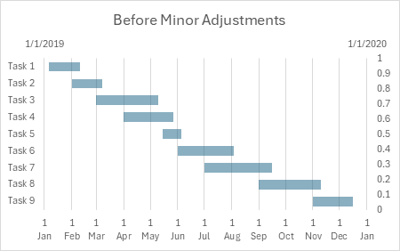
I want to indicate the milestone with a marker at the top of the chart, so Y=1 on the secondary vertical axis. I formatted the axis so its maximum is 1; otherwise Excel’s automatic axis scaling would change it to 1.1 or 1.2 and the point would be below the top of the chart. Then I set Label Position > None.
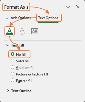
Then to allow space for the milestone label above the chart, I need to keep the top axis tick labels in place. So I selected the axis and selected Label Position > Next to Axis (see below). Then I formatted the axis to use No Fill for the label text. The labels are hidden but remain in place as a spacer for our milestone labels.
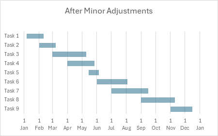
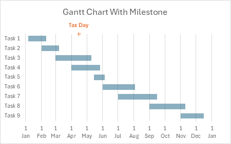
Here is how the chart looks after these adjustments.
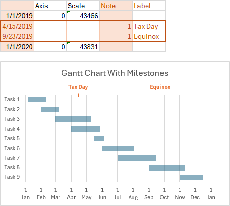
I added two columns to the Axis Scale data range, labeled Note and Label. For my milestone I inserted a row between the first and last dates in the first column. Text in the added columns and rows is dark orange and the added row has a dark orange border. The first column of the added row has the date for the milestone, the next two columns are blank, the fourth column has the Y value (one), and the fifth has the milestone label.

I selected the first column of dates, and held Ctrl while selecting the Note column, so that the entire orange-shaded range was selected. I copied then selected the chart and used Paste Special to add a new series by columns, with categories in the first column and series names in the first row.
This added a new line chart series. Since the previous line chart series used no markers and no lines, so did the new one. I formatted the new line series (“Note”) to use an orange plus-sign marker. Then I selected the new series, and clicked the Chart Elements skittle (the Plus icon next to the chart). I selected Data Labels > More Options; under Label Options I chose Label Position > Above, I unchecked Value and Leader Lines and checked Value From Cells, and in the dialog I selected the light purple “Label” column. This applied the data label above the milestone marker, and I applied orange to the text.
To add another milestone, simply insert another row with the data for the new milestone. The orange marker and data label appear automatically.
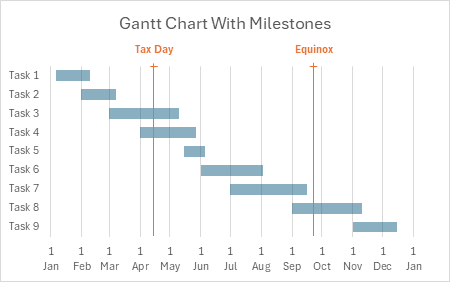
Do you want to indicate the milestones with vertical lines? Select the Milestone series, click the Chart Element (Plus) icon, and select Error Bars > More Options. Select Minus and No Cap, and a Fixed Value of one, then format the line color.
Articles Related to Gantt Charts on this Blog
- Gantt Charts in Microsoft Excel
- Gantt Chart with Nice Date Axis
- Error Bar Gantt Chart
- Repeated Gantt Chart to Track Players’ Ice Time
- Gantt Chart for Repeated Tasks
- Easier Gantt Chart for Repeated Tasks
- Gantt Chart with Repeated Tasks via Excel XY Chart
More Axis Scale Articles
- Calculate Nice Axis Scales with LET and LAMBDA
- Calculate Nice Axis Scales in Your Excel Worksheet
- Calculate Nice Axis Scales in Excel VBA
- Chart UDF to Control Axis Scale
- How Excel Calculates Automatic Chart Axis Limits
- Reciprocal Chart Axis Scale
- Custom Axis Labels and Gridlines in an Excel Chart
- Custom Axis, Y = 1, 2, 4, 8, 16
- Logarithmic Axis Scales
- Link Excel Chart Axis Scale to Values in Cells
- Consistent Axis Scales Across Multiple Charts
- Gantt Chart with Nice Date Axis
- Select Meaningful Axis Scales
- Bar Chart Value Axis Scale Must Include Zero


