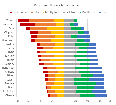
Often stacked bar charts are used to show the frequency of responses in surveys, where each stack represents the frequencies of replies to a given question (replies often sorted, such as Strongly Disagree, Disagree, Agree, Strongly Agree). A variation on stacked bar charts are Diverging Stacked Bar Charts, which position the replies horizontally so positive responses are stacked to the right of a vertical baseline and negative responses are stacked to the left of this baseline. Below is a diverging stacked bar chart that represents the relative truthfulness of politicians’ statements, with truthful and mostly truthful statements stacked to the right, and false statements to the left.
In case you’ve been stuck in a cave for the past 16 months or so, here in the US we’re in the middle of an interminable presidential election campaign. During a campaign, there are a lot of statements made by the candidates, some truthful, some less so.
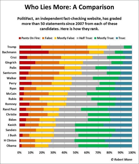
An organization known as PolitiFact has been fact-checking politicians’ claims, and various charts of their results have circulated the internet in recent weeks. Most are in the form of stacked bar charts, since those are easier to produce in Excel and in other graphing packages. The one below, for example, was found on Andy Kirk’s Visualizing Data web site, as part of his series The Little of Visualisation Design; he got it from Michael Sandberg’s Data Visualization Blog. Andy noted that had he drawn the chart, he would have “pivoted” the bars so that the positive bars (true statements) extended to the right and the negative bars (lies) to the left.
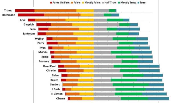
RJ Andrews claims he made the following variation in 3 minutes in PhotoShop. He didn’t actually create the chart, he simply split the above chart into horizontal strips and offset the strips laterally to align the baseline. It obviously was done in a quick and dirty fashion: the gridlines don’t line up, since they were laterally offset with the adjacent bars. But it shows how such a chart would look.
So how do we go about drawing such a chart?
Stacked Bar Chart
The data from the above charts is too complicated to show the process clearly, so I’ve dummied up the following data set.

Select the data and insert a 100% stacked bar chart.
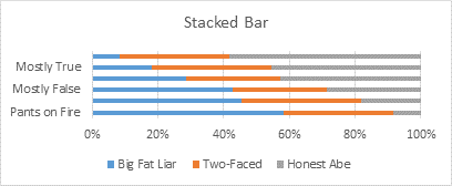
Since there were more columns in the data set than rows, Excel didn’t plot the data the way we wanted it. No matter, it’s easy enough to click the Switch Rows and Columns button on the ribbon.

Now let’s format the data. We’ll format the bar colors to match the charts I’ve scavenged from the internet, and apply a gap width of 75% to shrink the white space between stacks. (You only need to apply the gap width to one series, and the rest will use the same value.)
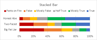
Finally, as usual, Excel laid out the stacks from bottom to top, although the data was listed from top to bottom. This is a common issue, and is actually consistent with charting in general, but it annoys many people. I’ve written about it in at least two posts on this blog, Excel Plotted My Bar Chart Upside-Down and Why Are My Excel Bar Chart Categories Backwards? The solution is an easy two-step process: Format the vertical axis, check the Categories in Reverse Order box, and select Horizontal Axis Crosses at Maximum Category.

Diverging Stacked Bar Chart – First Attempt
When you are exploring a new chart type in Excel, it often takes a few attempts to get it right. I’ll step through these attempts so you can see my thought process and perhaps learn more about Excel’s charting logic at the same time.
Since we want the lies plotted to the left of the baseline, we’ll make those numbers negative, and the vertical axis will become the baseline. Here is how the simple data set changes.

We select the data and insert a 100% stacked bar chart.

Oh yeah, then we switch rows and columns. You’ll get good at that before this tutorial is finished.
To move the labels (“Big Fat Liar”, etc.) to the left of the chart, right click on the labels and choose Format Axis from the pop-up menu. Under Axis Options, find Labels, and set the Label Position to Low.
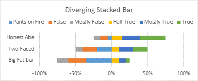
Apply the desired colors, and set gap width to 75%.
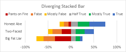
Finally reverse the order of categories and cross the horizontal axis at the maximum category.
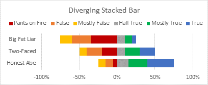
So what’s right with our chart, and what’s wrong? The false statements go to the left and the truths to the right, that’s good. But while the truths are plotted from the axis starting with the least true, the lies are plotted from the axis starting with the most false. We need to reverse the order of the negative data columns, so they are stacked in the order we want them.
Diverging Stacked Bar Chart – Second Attempt
Here is the rearranged data.

Select the data, insert a 100% stacked bar chart.

Switch rows and columns, blah, blah.
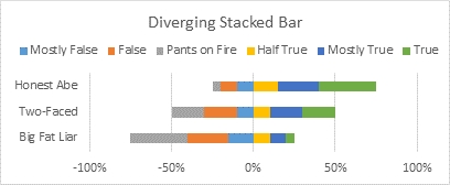
Apply fill colors and gap width.
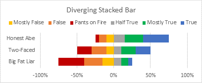
Reverse categories and cross the axis at the maximum.

So how are we doing? Well, the bars are all stacked in the appropriate order, that’s good. But the legend has the negative entries in the reverse order. How do we get the bars stacked in the right order, while also listing the legend entries in the right order, since they seem to be working against each other?
Diverging Stacked Bar Chart – Third Attempt
In hindsight, the way to get the appearance we want is easy. But when I first worked on this chart type a few years ago, it took me a couple days before I figured it out. What we need are a couple dummy series. The following adjusted data range will help clarify it.
Notice that there are duplicate column headings for False and Mostly False, but the cells contain no values. We will plot these columns with the others, so we will have duplicate series for False and Mostly False. The duplicate series will not appear, since they have no values. Then we will have duplicate legend entries, and we can delete the ones that are out of order.

Here’s another view of the data, showing which series will have visible legend entries and which legend entries will be deleted.

Select the data and insert yet another 100% stacked bar chart.

Switch rows and columns. This should be second nature by now.
I’ve widened the chart so the legend entries appear in a single row. Note the duplicate entries.
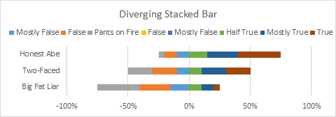
Apply the fill colors and gap width as before. Note that both False series have the same formats, as do both Mostly False series. Even if a series doesn’t appear in the chart, you can select it by selecting a visible series and using the arrow keys to cycle through the other series; once the hidden series is selected, you format it just like any other.
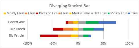
Delete the excess legend entries: click once to select the legend, then click again to select the legend entry then click Delete. If you delete the wrong one, simply delete the whole legend and reinstate it. When it appears with all legend entries, delete the ones you don’t want, only more carefully this time.
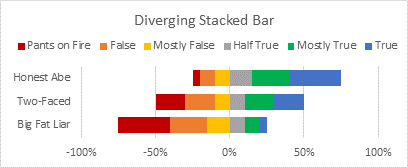
Finally, do the axis switcheroo: categories in reverse order, cross at maximum.
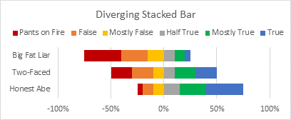
And that’s just what we wanted.
One final fix. You may not want to show any negative percentages along the horizontal axis. Select the axis, press Ctrl+1 to open the Format Axis dialog, and change the number format from 0% (which applies a percentage format with no decimal percentages and a minus sign for negative percentages) to 0%;0%;0% (which applies a percentage format with no decimal percentages and no minus signs for any numbers: the three items separated by semicolons are for positive, negative, and zero values).

Now that’s really just what we wanted.
Politician Data – Stacked Bar Chart
Here’s the data I manually digitized from the chart I got from Andy Kirk’s chart. This article is a tutorial on the making of a chart with this data, and I will not entertain any discussion on the data itself, its derivation, or its accuracy. There is plenty of that discussion in the various social media.
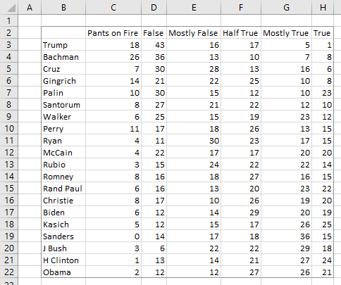
Select data, insert 100% stacked bar chart. Hey look, with more rows than columns, Excel plotted it the way we wanted, so no need to switch rows and columns.

Apply fill colors and gap width.
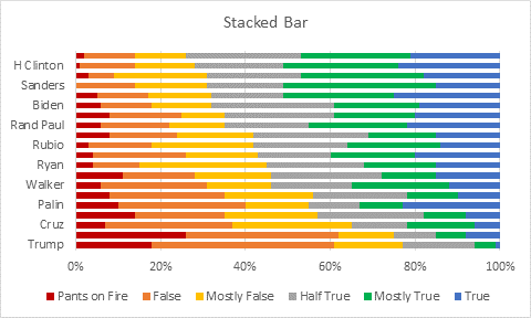
Format that vertical axis: Categories in reverse order, horizontal axis crosses at maximum category. While there, specify a label interval of 1; with so many labels, Excel automatically shows only every second label.

Finally, stretch the chart vertically, so it doesn’t look so crowded.

That’s a decent enough stacked bar chart.
Politician Data – Diverging Stacked Bar Chart
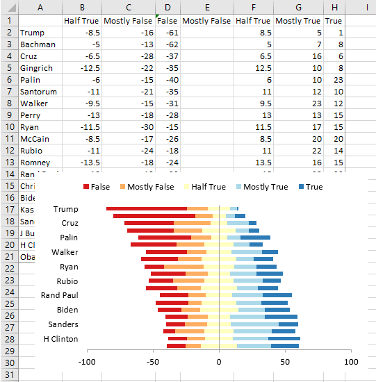
Here is the politician data adjusted to make a diverging chart. Note the negative values and columns with blank values and duplicate labels.
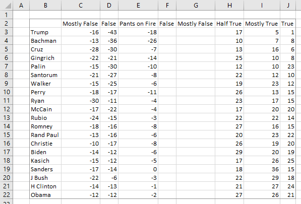
Select the data, insert a 100% stacked bar chart.

Apply fill colors and gap width.
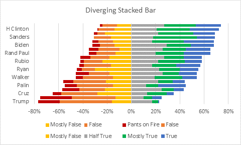
Delete the unneeded legend entries.
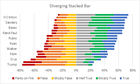
Reverse the categories on the vertical axis, move the horizontal axis to the maximum category, and show all labels.
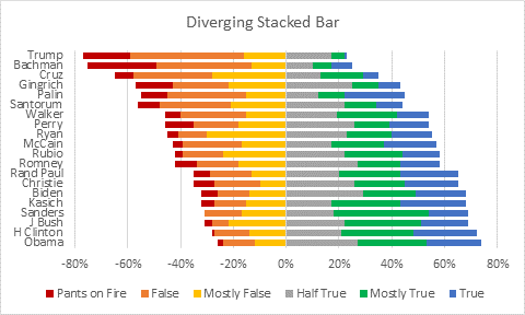
Finally, stretch the chart.

Finally, if you don’t want to display negative percentages, you can adjust the number format of the horizontal axis. Follow the protocol introduced above: select the axis, press Ctrl+1 to open the Format Axis dialog, and change the number format from 0% to 0%;0%;0%.
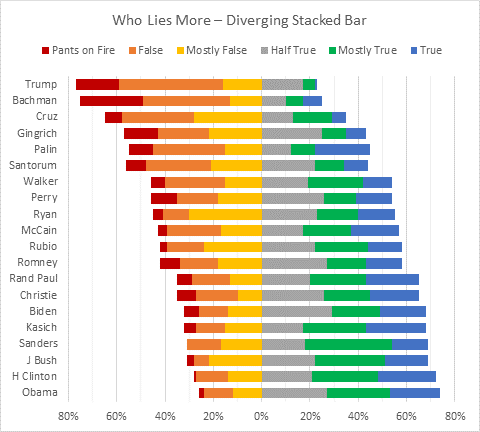
And there’s our Diverging Stacked Bar Chart in Excel.
Peltier Tech Charts for Excel 3.0 – Diverging Stacked Bar Chart
This technique for making diverging stacked bar charts is a bit tricky, especially with the repeated and deleted legend entries. I’ve built this chart type into the Advanced Edition of my Excel charting software, Peltier Tech Charts for Excel 3.0, so the extra series are added and the superfluous legend entries removed automatically.
Starting with the stacked bar chart data set, you can click on the Diverging Bars button on the Peltier Tech Advanced ribbon tab. A dialog pops up with a few typical settings.
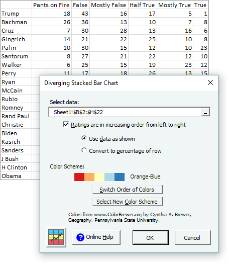
The color scheme options have been taken from Cynthia Brewer’s Color Brewer. You can select your color scheme, and set the order of the colors (i.e., left to right or right to left), and the program will use as many colors along the scale as you need.

A new worksheet is inserted, with negative values, duplicate series headers, and blank columns as needed, and a chart is generated.
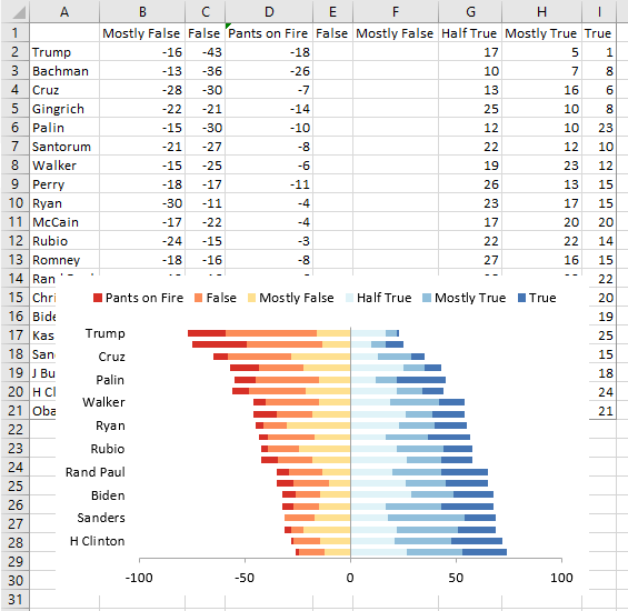
As with any Excel chart, it’s easy to stretch the chart and modify its formats.

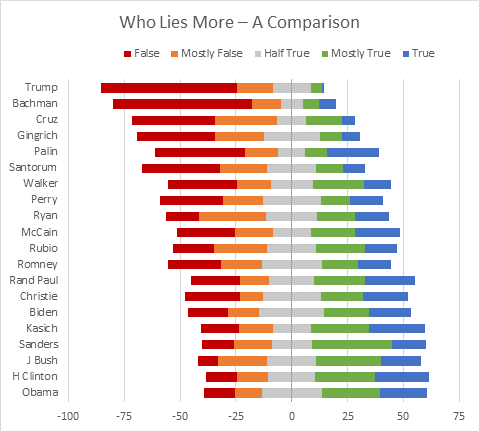
Many surveys have a neutral response. A diverging stacked bar chart would plot the neutral responses so that it spans the vertical baseline.
The data set below joins Pants on Fire with False into a new False category, and the Half True becomes a neutral category. The dialog works just the same.

To achieve a neutral bar spanning the vertical axis, the program splits Half True into a negative half and a positive half, both formatted the same using the central color for the selected color scheme.
Again, the chart is easily manipulated.
For more information about this Excel charting add-in, go to Peltier Tech Charts for Excel 3.0. Note that Diverging Stacked Bar Charts are included only in the Advanced Edition of the software.


