In In what order to display data series?, Jan Schultink of Slides That Stick suggested changing series order to make your point clearer. In Jan’s example, he had three series in a stacked column chart.

The upper two series in the stack are almost constant from year to year, while the bottom series is increasing steadily. This chart may not tell a story as clearly as it could.
Reordered Stacked Charts
To show that the orange and brown series are almost constant and the yellow series accounts for most of the variation in the total, you could rearrange the order of the stacked series.
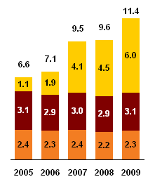
In many cases, this is all you need to do. This particular data set was uniquely suited for this arrangement of stacked series, and rearranging the series told a nice little story. As Jan said in a follow-up comment, and I’m paraphrasing, when you’re making a presentation for the boss, each chart is a custom experience, and you do what seems to make sense.
But what if there’s some kind of relationship between the three series? Suppose in the original chart they were stacked in A-B-C order. In our rearranged chart, the order is now B-C-A. This may be awkward, but we can reorder the series again into C-B-A order, which is less disruptive.
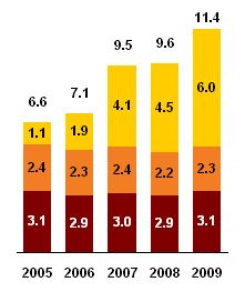
What if the original series showed first quarter data on the bottom, then second quarter data, then third quarter data? It hardly makes sense to plot second quarter on third and first on second.
And what if you didn’t have two essentially constant series? Rearranging the order of the stacked series may not help.
Line Chart
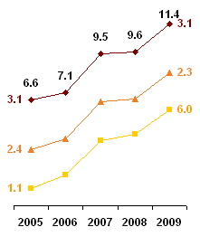
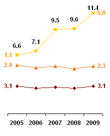
We can change the chart to a line chart, and add a total series. This shows as well as the reordered stacked charts that the yellow accounts for most of the total growth, and it does not give any meaning to the order of series, which a stacked chart may imply.

An added benefit is that we can compare all data points. It may not always be clear in the stacked charts whether the brown series has greater values than the orange series. In the line chart there’s no mystery: the marker placement makes it obvious, even without the data labels.
Stacked Line Charts
You could show the same data in a stacked line chart (unsorted and sorted).
 – – –
– – – 
It shows the data fine, and if your three series are first, second, and third quarter, the lines plotted in that order show 1Q YTD, 2Q YTD, and 3Q YTD.
But stacked line charts are difficult to interpret and may be deceiving. A frequent problem in the online help forums is:
My line chart doesn’t plot correctly. The first series has greater values than the second, but the second is plotted higher. It’s almost like the second series plots the sum of the first and second series.
That’s right, because the user clicked on the second line chart icon, not the first. And not just this user. I suspect that half the time the stacked line chart type is used, it is used unintentionally.


