A member of the online forum Quora asked, How can I have multiple scatter plots and one trendline for all of them combined in Excel? I interpreted this to mean, “I have multiple scatter series in my chart, how do I get a trendline for the combined data in the chart?”
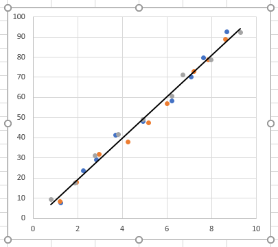
I made up some dummy data, and generated this XY chart. Note: this approach will not work in Line charts; in general you should not use Line charts if you need trendlines for your data.
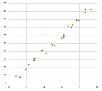
You can download a workbook with my dummy data and charts here: MultiScatterTrendlineData.xlsx.
Of course you can add a trendline to each of the series, and you get this cluttered mess. It has multiple trendlines, not a multiple-trendline.
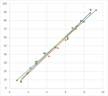
Note: In a recent version of Excel (I don’t recall if it was 2013 or 2007), trendlines changed from black to the color of the points, which was good for visibility, and they also became a dotted line, which was bad for visibility. I always change to a solid line.
Well, this is not what the person wanted to know. But it’s no big deal to get what they wanted.
First, let’s just check out the chart. The three series have these formulas:
=SERIES(Sheet1!$C$2,Sheet1!$B$3:$B$11,Sheet1!$C$3:$C$11,1)

=SERIES(Sheet1!$E$2,Sheet1!$D$3:$D$11,Sheet1!$E$3:$E$11,2)

=SERIES(Sheet1!$G$2,Sheet1!$F$3:$F$11,Sheet1!$G$3:$G$11,3)
I’ve color coded the formula arguments to show series names in red, series X values in purple, and series Y values in blue (the colors of the series highlights in the worksheet). The numbers at the end are the plot order of each series.
What we need to do is add a series to the chart that uses all of these X values and all of these Y values. There are at least two ways to get this series.
Select Data
Right click on the chart and click on Select Data from the pop up menu.

The Select Data Source dialog appears.
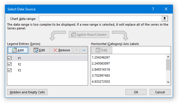
Click the Add button, and the Edit Series dialog appears.
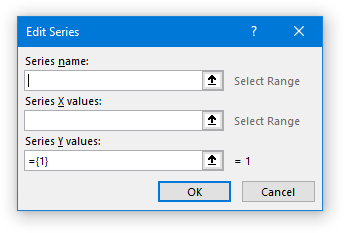
Click in the Series Name box, and add a descriptive label. “Combined” works.
Click in the Series X Values box, then with the mouse select the first range of X values. Type a comma, and select the second range of X values. Type another comma, and select the third range. Note: instead of typing a comma, you could hold the Ctrl key while selecting the second and third ranges, but I find that I make fewer errors if I type the comma and then don’t have to worry about how many buttons I’m holding with how many fingers.
Click in the Series Y Values box, delete the “={1}” that is there, then with the mouse select the first range of Y values. Type a comma, and select the second range of Y values. Type another comma, and select the third range.
The populated Edit Series dialog looks like this:
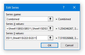
The Series X Values and Series Y Values boxes contain
=Sheet1!$B$3:$B$11,Sheet1!$D$3:$D$11,Sheet1!$F$3:$F$11
and
=Sheet1!$C$3:$C$11,Sheet1!$E$3:$E$11,Sheet1!$G$3:$G$11
Excel will put parentheses around these comma-separated addresses, and double quotes around the Series Name.
Click OK twice, and a new series will appear, whose markers obscure those of the existing three series.

The formula for the added series is:
=SERIES("Combined",(Sheet1!$B$3:$B$11,Sheet1!$D$3:$D$11,Sheet1!$F$3:$F$11),

(Sheet1!$C$3:$C$11,Sheet1!$E$3:$E$11,Sheet1!$G$3:$G$11),4)
We can see that it includes the X values and the Y values for the three original series.
Add Series Formula Directly
You don’t need to use the Select Data Source dialog to add data to a chart. If you select the chart area (just the outermost rectangle containing the chart), you can click in the Formula bar, and enter your formula. Note that you have to enter double quotes around the series name and parentheses around the multiple areas of the X and Y values. You can type the addresses of the individual names, which is inconvenient since you have to remember to include the sheet name and exclamation point; it’s easier to select the ranges with the mouse. You can hold Ctrl while selecting multiple areas, but I find it easier to type a comma between range addresses. Don’t forget to end the formula with a comma, the Plot Order 4, and the closing parenthesis.
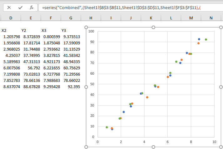
When you press Enter, the chart has a new series that hides the old series, just like above.

Add Trendline
Select this new series, click on the plus “skittle” next to the chart, and check Trendline.
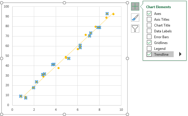
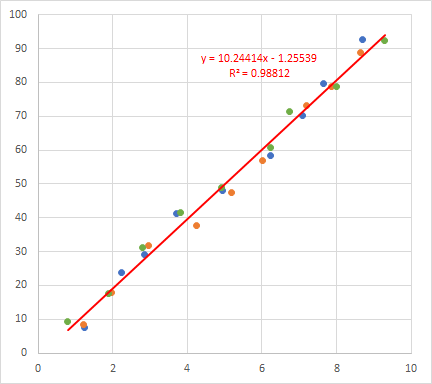
Now format the “Combined” series to hide it (no lines or markers), and format the trendline to enhance visibility and to display the trendline formula and R² value.
Update: Trendline Calculator for Multiple Series
For anyone who wants to apply this technique but finds it tedious to add a series with all the X and Y ranges, I’ve built a small utility that does the heavy lifting for you.
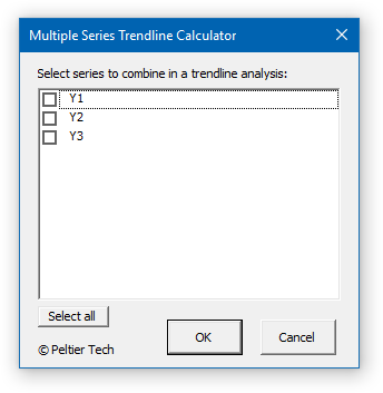
It’s a simple Excel add-in that lets you select a chart, choose which series in the chart to include (and exclude), and it builds a hidden series with a visible trendline combining all series that you’ve selected.
In the article I show some simple code that compiles the data into a new series. The add-in is free and unlocked, so you can look into its inner workings: the code, the dialog (UserForm), and the custom ribbon elements.
See Trendline Calculator for Multiple Series for information.
Trendline and Regression Articles on this Blog
- Trendlines and Chart Types in Excel
- Trendline Calculator for Multiple Series
- Trendline Fitting Errors
- Choosing a Trendline Type
- Plot Two Time Series and Trendlines with Different Dates
- Polynomial Fit vs. Statistical Process Control
- Moving Averages
- Stacked Column Chart with Stacked Trendlines
- Deming Regression
- Deming Regression Utility
- LOESS Smoothing in Excel
- LOESS Utility for Excel


Carlos Barboza says
Amazing slick trick John, thanks for sharing ! Quick question, can the SERIES function be enhanced ?
Jon Peltier says
Carlos –
Enhanced how? You are limited to what can be used in the formula: link references, arrays, constants, but no functions.
Peter Adams says
Very good
Stephen Haneline says
Help! I am obviously missing something.
A group volunteered for an experiment where they returned every x months for a total of 9 visits. As expected I had volunteers drop out over time;therefore some with 9 scores, some with 8, etc. So the data is in a table where there are 9 columns ( one per sequential visit) and then a row for each volunteer. I graphed them as a series in a scatter plot with smooth lines with the x being the visits and y the scores. To get a common trend line, I used the select data approach. For the X axis, I only entered the range for the the visits ONCE since they all the same for every volunteer.. I then entered the y data using the comma. Excel created a new series. I then added the trend line to this new line (series). Here is the rub. If I sort the rows so that those with the most data are at the top, vs. leaving them randomly sorted, I get 2 different lines.
Here are the first three rows sorted vs not
a b c d e f g h i a b c d e f g h i
-0.3 -0.6 -0.5 -0.5 -0.1 -0.7 -0.3 -0.8 -0.9 -0.7 -1.0 -0.9 -1.1
0.6 0.5 0.4 0.8 0.5 0.2 0.3 -0.3 -0.8 -1.6 -1.9 -1.7 -2.3
0.1 0.0 0.1 -0.2 -0.1 -1.0 -0.7 -0.9 -1.6 -1.4
since I can only post text here are the formula of the 2 lines
sorted: y = -0.1573x + 0.3776 downward slope intersecting the 0 y value line
not sorted: y = 0.0569x – 1.1165 upward slope all below the 0 y value line
Jon Peltier says
Stephen –
Here is your first set of data. Note that I am using row 2 as my X values, the numbers 1-9 rather than the letters a-i.
The left chart below plots data for the three volunteers, and I’ve added a trendline for each. All three have negative slope, and the three data sets are spread out vertically.
The right chart shows the addition of a combined data set, which I named “All” so the legend would fit in one row in these small charts. I added the data for this series using the Select Data Dialog, and selecting ranges with the Edit Series dialog open.
When doing regression, every Y value needs an X value, so I selected the X range three times. Well, not exactly, because of an unequal number of points. So for my X values, I selected A2:J2, then A2:J2 again, and finally A2:H2. For my Y values, I selected A3:J3, then A4:J4, and finally A5:H5. Notice that every black square outline marker for series “All” covers one of the round filled markers for the other three series. If I had selected my X and Y values incorrectly, there would not be a good match up of the data.
The trendline for the combined data looks reasonable, falling through the middle of all the points, with a negative slope. When I selected my combined data from row 5 down to row 3 (in a separate chart, not shown), the data and trendline are the same as in the chart shown here.
Cathy says
Hi There, I am new to the website and find it fantastic. I want to redo these charts myself so that I can master the Excel skills. So I am wondering if there is any place to download data associated with each post ?
Thanks very much for your help!
Stephen Haneline says
Thank You! So even if every row had a full set of values, I would still be forced to add ‘an x for every y’ even though the y values are constant for every row. I was hoping a common one would work.
I was trying to avoid going first into SAS or R to create spaghetti plots. (Some of my tables have over a 1,000 rows of data and I guess I am destined to use SAS or R eventually). I was hoping I could sample ~ 250 rows in excel and take a quick look in excel since it is my go-to app for much of my work.
Thanks for your blog! I’ve turned to it often for solutions.
Jon Peltier says
Cathy –
Sometimes I post the workbooks I’ve used while writing the article. But sometimes the workbooks are such a mess, I don’t think anybody besides me would be able to navigate them. Maybe I should try to build a cleaned-up workbook when I’m done.
Jon Peltier says
Cathy –
I’ve added a sample workbook for this tutorial: MultiScatterTrendlineData.xlsx.
Jon Peltier says
Stephen –
The series population seemed too tedious for you, so I’ve built a little utility to do it for you. See Trendline Calculator for Multiple Series for details.
Maira says
Hi. Thanks for this. Is it possible in one click to add multiple trendlines to multiple series (each series with its own trendline) and publish their equation and R2? Thanks
Jon Peltier says
Hi Maira –
If you want to add trendlines for each series, you have to add them individually (which is still pretty easy, click-click-click). The routine here lets you add one trendline equation that fits all the data.
Dimas says
Thank you so much. I can finished my final exam :)\
Love from Indonesia
Jean-Marc says
Hello,
I was wondering, how can I use this method but on a larger number of series (let’s say 150 series), all having the same X Values. Doing all 150 columns manually would take forever.
Thank you.
Jon Peltier says
Jean-Marc –
I would have expected this approach, accreting each additional series’ X and Y values to a combined series formula, to bog down when there are too many series.
But I tried the automated approach from my follow-up article Trendline Calculator for Multiple Series. And I was amazed that it worked. I added 250 series to a chart, ran the program, and successfully got a trendline for a combined series.
This is in Office 365, the latest build available. I know this would have choked in much earlier versions of Excel; I have no idea when Excel started allowing a series formula with more than about 250 characters of X and Y values.
The series formula produced cannot be shown in its entirety, due to limitations of the formula bar.
sana says
How to remove trendline equations
Jon Peltier says
To remove a trendline equation, select it (it behaves like a regular text label) and press the Delete key. Or select the trendline itself, press Ctrl+1 to open the Format Trendline task pane, and uncheck the Display Equation on Chart box.
To remove the trendline altogether, simply select it and pess Delete.
sana says
Hi Jon,
The equation is not disappearing, it comes back If I do selection from slicer.
Jon Peltier says
Does the equation disappear if you select the original slicer setting? If so, then it’s one of the “properties” that follows the data point. See my tutorial Properties Follow Chart Data Point for details.
ken says
found this very handy ✋, you just saved the world mr John ,kudus.