A reader named Felix posted a comment on the blog, asking how he could make a line chart which has two time series, in which each time series has data for different dates. What makes his question more challenging is that Felix is using Excel 2007. This was such a good question, it deserves its own post.
Felix provided the following data:

I’ll describe the various techniques available in Excel 2003 and earlier, with pros and cons, and I’ll compare them to the same techniques as followed in Excel 2007.
Time Series in Excel 2003
The two time series are plotted separately below. Time series A has weekly data, but with two values omitted. Time series B has more data points, at irregular intervals, over a shorter time span.
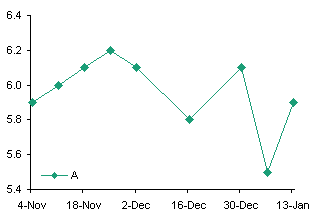
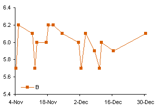
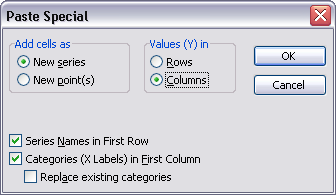
Create the Time Series A line chart above left, copy the Time Series B data, select the chart, and use Paste Special to add the data as a new series, using the options as shown.
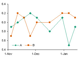
This illustrates a limitation with Line charts in Excel: the category labels or dates are defined by the first series. Any additional series are forced to use the same X values or labels, and if the added series has more points than the first series, those extra points are omitted.
The obvious alternative is to make an XY chart with the two data series. The X and Y values of separate series in an XY chart may be completely independent.

The data is plotted correctly, but the date axis isn’t as nice as the one we had in the line chart. A line chart lets you put a tick on the first of every month, but since the length of a month is not constant, this doesn’t work in an XY chart.
So how can we plot multiple time series on a chart with nice date labels?
The limitation that all series in a Line chart must use the same dates is not completely true. All series on the primary axis use the dates for the first primary axis series, while all series on the secondary axis use the dates for the first secondary axis series. Format series B in the two-series line chart so it resides on the secondary axis.

There are drawbacks to this approach. First, it ties up the secondary axis with data that otherwise fits the primary axis, so you are limited to how else you can embellish the chart. You can always hide the secondary date axis to clean up the chart, but you cannot remove it altogether. Second, the two date axes must be manually synchronized each time the data changes. Third, you are limited to two different sets of dates.
There is an alternative combination chart that gets around these limitations. Make the first series a Line chart series, so you have a nice date scale axis, then add any additional series and change them to XY type series. At first, Excel associates the XY series with the secondary axis, but you can override this setting and assign it to the primary axis, and it will use the nicely formatted date scale of the Line chart. You are not limited to two sets of dates, and you do not have the added responsibility of synchronizing the time axis scales.
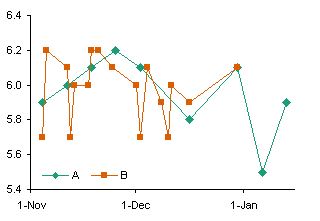
But there’s an easier way.
Unfortunately this never occurs to me until I’ve already made a Line-XY combination chart. You can combine the data in the following way, putting the Series B dates below the Series A dates, and the Series B values below and one column offset from the Series A values.
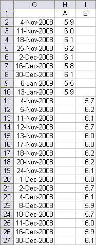
You don’t even need to sort the dates, because a line chart internally sorts the dates before plotting the points, so that it connects them in date order. In contrast, an XY chart connects the points in the order they appear in the worksheet.
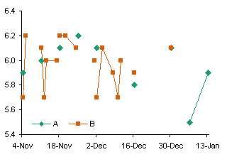
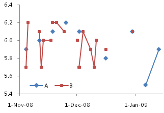
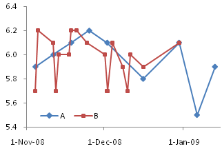
Select this larger data range and create your line chart. The points are plotted according to their own dates. The only problem is that, by default, Excel leaves a gap between points if there is a blank value cell between these points (below left). However, it’s easy enough to change this behavior. Go to Tools menu > Options > Chart, and in the top section, choose the option that makes Excel interpolate across the gaps (below right).

Now why didn’t I think of that before I made all those complicated charts?
Time Series in Excel 2007
Excel 2007 works much the same way as earlier versions, but there are a few notable exceptions.
In a line chart, all series use the same categories or dates as the first series, and any extra points are truncated. Just like in Excel 2003.

Two time series can be plotted together, with one on the secondary axis, and the times will be kept independent. This approach is subject to the same limitations as in Excel 2003.
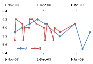
You can change the second series to an XY type series, and when plotted on the secondary axis it works just fine. (Note: you can remove the secondary Y axis and both series will use the primary Y axis.)
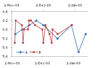
The limitation here is that you are tying up the secondary axis with the XY series, thus limiting your ability to use the secondary axis for other tricks. You are not limited to two series, because any number of XY series can be plotted independently on the secondary axis.
In Excel 2003 we could assign the XY series to the primary axis, and it would coexist with the line chart series and use the same axis. However, when we try this in Excel 2007, we notice two flaws. First, it’s unclear what scale the XY series is using for its X values, but it’s unrelated to the primary category axis. Second, there are only as many XY series points shown as there are Line series points in the first series. Whoa! How’d that get through QA?
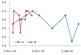
These glitches are not too important for this particular use of a Line-XY combination chart, but there are other uses which are completely broken by the changed behavior.
Fortunately the easiest method of all, the one which uses the combined data, works just fine in Excel 2007. The dual chart first appears with gaps, but you can change the behavior by opening the Select Data dialog, clicking on the Hidden and Empty Cells button in the bottom left corner, and selecting Connect Data Points with Line.
This is one more example of my favorite phrase: You can spend five minutes with your data, and save yourself five hours of frustration and aggravation.


