About the Revenue Chart
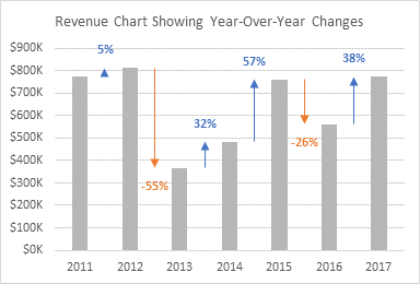
This tutorial shows how to enhance a simple column chart of revenues to show percentage changes or variances between columns.

I saw a similar chart on my colleague Jon Acampora’s web site, Column Chart That Displays Percentage Change or Variance.
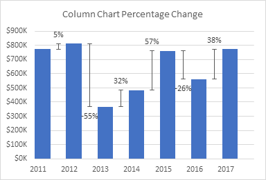
Jon uses another set of columns as a dummy series, and puts error bars and data labels on these hidden columns to show his variances. But using columns as his dummy series leads to some constraints. First, Jon’s visible columns have an apparent gap width of 100%; you could balance gap width and overlap to get a larger gap width, but it’s not possible to make it any smaller. Second, with only a single dummy series, there is a single set of data labels and error bars, so you cannot color code positive variances from negative ones. Third, Jon had to manipulate the year labels on the horizontal axis by padding them with space characters, in order to center these labels under the visible columns. But the chart above has been resized without tweaking the number of padding spaces, so the labels are offset.
In my version of this chart, I use two dummy series, both of type XY Scatter. This allows any gap width between the columns, it provides for different colors for positive and negative variances, and it requires no label manipulation for the year labels to align beneath the columns. I also formatted the error bars with arrowheads to help indicate the direction of the change.
Building the Chart
Revenue Data
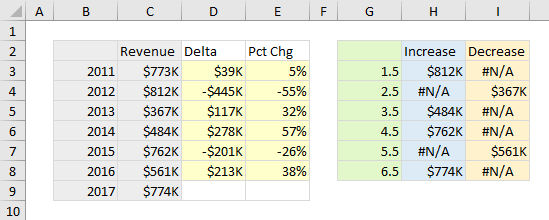
I’m using the data from Jon’s example. The column chart values are years and revenues, with Delta showing the difference from one year to the next, and Pct Chg showing how large Delta is as a percentage of that year’s revenue.
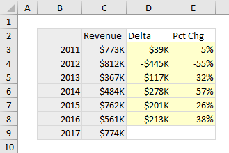
I selected the gray shaded cells and inserted a plain old column chart.
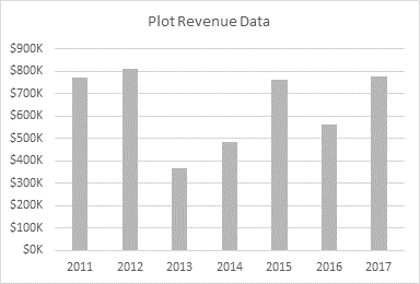
Note that I’ve changed the columns’ fill color from the default blue to gray. Later I’ll use blue for increases and orange for decreases. Blue and orange are a better combination than green and red, because about 8% of men and less than 1% of women have color vision deficiencies that make it difficult to distinguish green and red.
Data for the XY Dummy Series
The dummy XY series can be plotted on the primary axes with the columns. But we can’t use the year numbers as the X values. In a column chart) or a line or area chart), the X values of the data points (columns) are simply sequential numbers starting with 1. In our revenue chart, the seven columns have X values of 1 through 7.
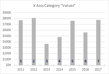
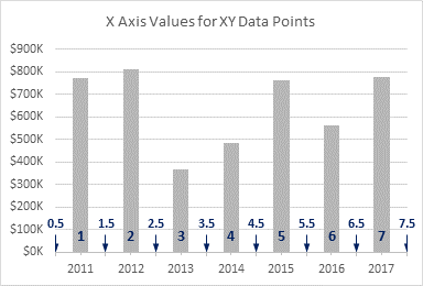
We can plot XY points anywhere along the axis, not just at the whole numbers where the columns are. The axis actually starts at 0.5 and extends to 7.5, and we will locate our dummy XY points halfway between each adjacent pair of columns.
I’ve set up a second data range for the XY series. The X values are in the green column, and I will plot Increase and Decrease XY series using the blue and orange columns. Increase shows the second value of each pair if the data increases, or it shows #N/A. Decrease shows the second value of each pair if the data decreases, or it shows #N/A. The Delta values will be used for custom error bars for both Increase and Decrease; Pct Chg will be used for custom data labels for both of these series.
Adding the Dummy XY Series
Copy the range of green, blue, and orange shaded cells. Select the chart. On the Home tab of the ribbon, click the Down arrow on the Paste icon, and choose Paste Special. Choose to add the data as New Series, in Columns, with Series Names in First Row and Categories in First Column.

Excel adds the data as new columns.

Note that I’ve applied my color scheme of gray for Revenue, blue for Increase, and orange for Decrease. The default color scheme uses the same colors in a different order.
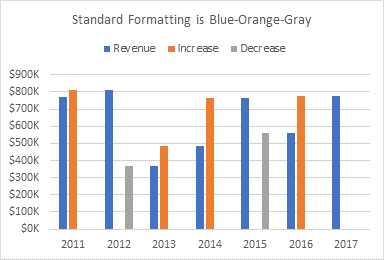
Right click any series in the chart to open the Change Chart Type dialog. Change both Increase and Decrease to XY Scatter, then uncheck the Secondary Axis box for each.

The markers are now positioned between their respective columns.

Add Error Bars
This chart uses custom error bars to show variances between revenues. Naturally I’ve written a tutorial on this topic, Custom Error Bars in Excel Charts.
Select the Increase series, and click the plus icon floating beside the chart to add error bars.
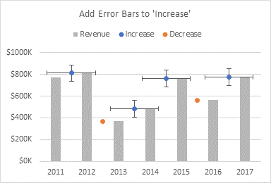
Fun fact: the three icons floating next to the chart are called Skittles.
Select the horizontal error bars and press Delete.

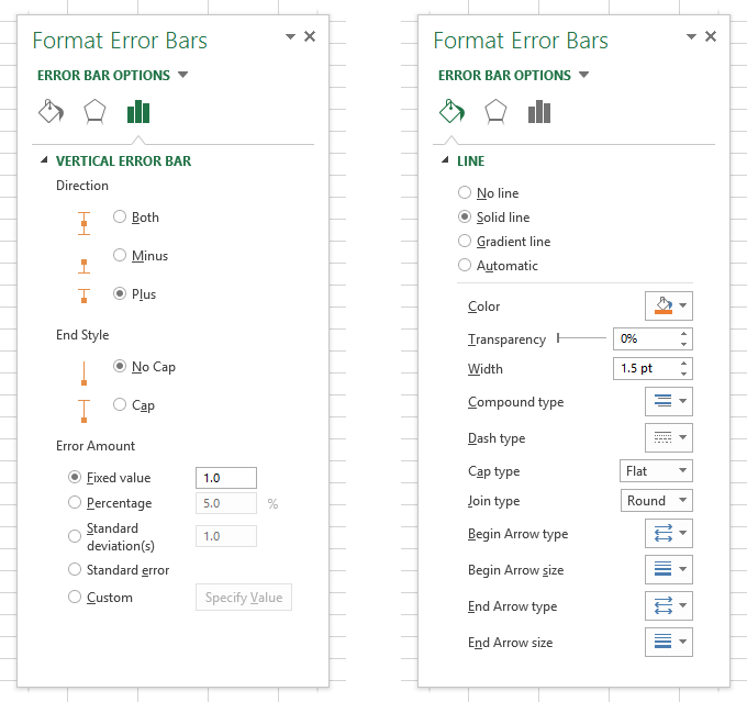
Select the vertical error bars, and press Ctrl+1 to open the Format Error Bars task pane. For Error Amount, choose the Custom option, and click Specify Value. The dialog allows you to select a value or range for positive and another value or range for negative.

This is one of the dumbest dialogs in Excel: it’s very small, and the value boxes aren’t even as wide as the narrow dialog, so it’s difficult to read the whole address when you populate one of the boxes.
We will only add negative error bars, reaching from the marker at the upper value down to the lower value. Delete the ={1} in the box, then select the range with the Delta values. If you don’t delete what’s in the box, Excel usually does not overwrite it, so you get ={1}+Sheet1!$D$3:$D$8 (but the value in brackets is hidden in the undersized box), and then you get an error message.
To get zero for the positive error value, you can’t just clear the box, you must enter a zero, and in some versions of Excel (as I recall) you have to put the zero in brackets. Like I said, it’s a dumb dialog.

You can’t see the whole address, but the Negative Error Value box contains =Sheet1!$D$3:$D$8.
Here’s the chart with the custom error bars.
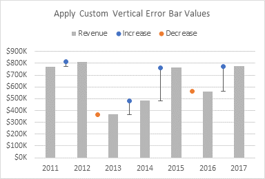
Format the Increase series so it uses no markers.
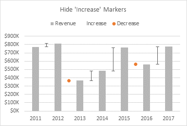
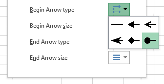
Now format the error bars. Specify No Caps, then change the line color, and add an arrowhead for the starting arrow type.
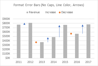
Lather, Rinse, Repeat
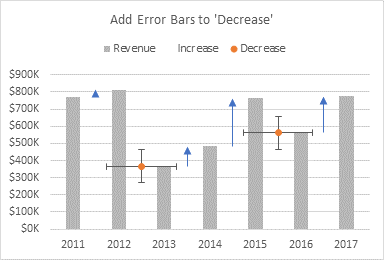
Repeat the error bar protocol for the Decrease series. Add error bars.
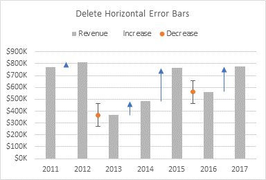
Delete the horizontal error bars.
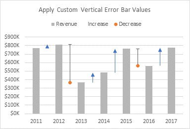
Apply custom error bar values, using the same range for negative error bars. Since the Delta values are themselves negative, the negative error bars will extend in a positive direction from the points.
Hide the markers.
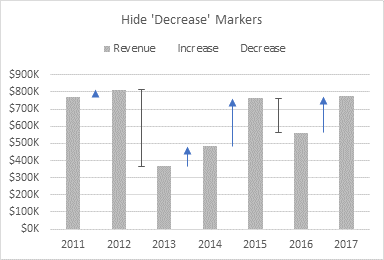
Format the error bars: No Caps, line color, and starting arrowhead.

Add Data Labels
Select the Increase series, hidden at the tips of the blue arrows. Click the plus skittle next to the chart, then click the arrow next to Data Labels, and select Above. Excel adds data labels showing the value of each point.
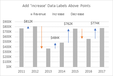
Format the data labels, and select the Value From Cells option, and click on Select Range. In the dialog, select the Pct Chg range in the worksheet.
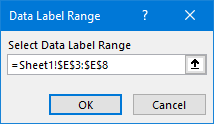
Then unselect the other options (Y Value, Leader Lines), and change the font color to match the arrows.
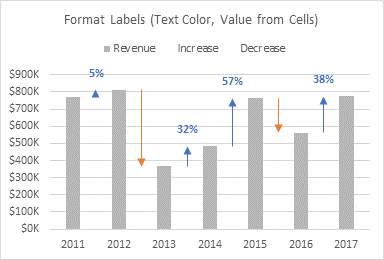
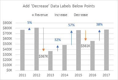
In the same way, add labels below the Decrease data points.
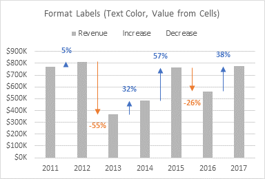
Apply label values from cells and change the label text color.
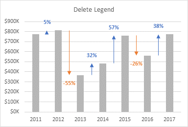
Finally, remove the legend.
The Finished Product
It was a lot of steps, but the final effect is worth the effort.
