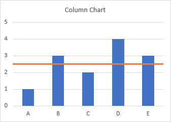
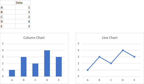
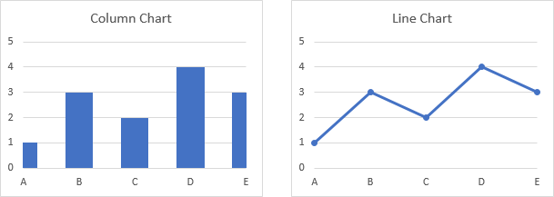
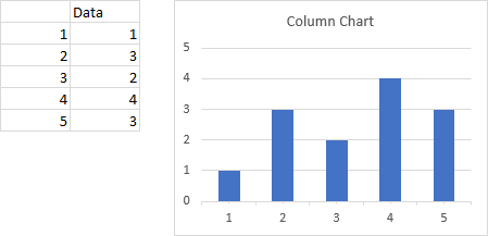
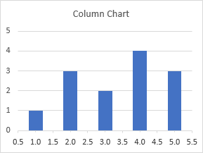
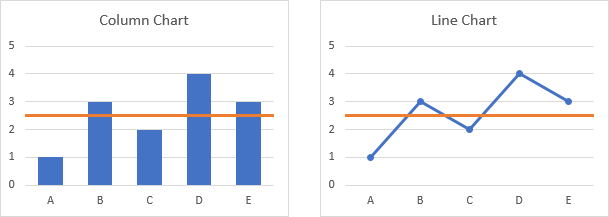
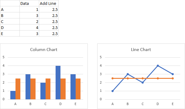
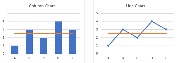
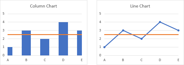
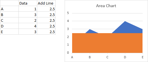
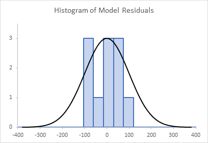
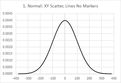
Often when I plot data in a column, line, or area chart, I want to plot additional points on that chart. For this I use an XY Scatter type series for the extra data points. These added points may be used for additional labels or other purposes.
There are a few tricks for positioning of XY data points. I use these tricks in many of my tutorials, and I describe them in the protocol. But it’s probably good to have a single dedicated page, like this, dedicated to precision positioning of these extra points.
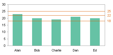
Long ago, when this blog was very young and I was not so old, I wrote Stacked vs. Clustered, which compared stacked and clustered column charts and described what each is well suited for. I included the following throwaway image; well, I considered it a throwaway, until a reader asked how I added the lines and markers.

Thanks for the nudge, dear reader. What follows is the protocol for adding those markers so precisely to the chart.
Clustered Column Chart
Here is my data and my starting column chart.


What I could do, of course, is add an XY Scatter series on the secondary axis, then adjust my X and Y values and the secondary axis limits until the points are positioned appropriately. But that is tedious to do in the first place, and if the original data changes, the tweaked X and Y values would probably need readjusting.
But Excel is nothing if not extremely flexible. I can plot my XY data points on the same primary axis as the column data, with my tweaked data points based on the column chart configuration. This means that all XY points will stay in the same position relative to the column chart data, with a minimum of adjustment.
Column Chart Axis Measurements
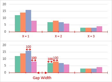
The two charts below illustrate how scatter chart X values can be calculated based on the column chart’s configuration.
First of all, each category of the column chart has a number, from 1 to the total number of categories. The chart below has categories numbered from 1 to 3. If I use these numbers for my scatter chart X values, the points would be centered on the categories (between the orange and blue columns).
I merely have to calculate how far to the left and right of each category I need my XY data points to be. I need to know my Gap Width and I need to know how many series there are.
The Gap Width is a number, stated as a percentage of the width of a column, that tells me how wide the gap is between the clusters of columns. A Gap Width of 100 means that the white space between clusters is 100% as wide as a column. In the schematic, I have indicated that the columns are 100 percent wide, so the distance between cluster centers is 100 times the number of series, plus the Gap Width. In this case, the Gap Width is 200%, so my categories are 600% from center to center.
The X axis of a line chart or an area chart work in exactly the same way. A bar chart is a different story; the approach is similar, but it is more complicated, and you do need to use secondary axes.
The Algebra
The amount my data points need to be offset is easy to calculate. For example, to center a point on the tallest bar in the chart, I start with the category position, then add half the bar’s width divided by the distance to the next category:
X = 1 + 50 / (4 * 100 + Gap Width)
which turns out to be 1.08333333
Since I want my points at the top of the columns, I use the same Y values for the XY points.
Below is my data for the XY points.
I put the name of the category in the first column, and the offset (in column width percentages) from the center of the category in the second. The formula in cell C9 is
=MATCH(A9,$B$1:$D$1,0)+B9/(4*100+$F$9)
The MATCH function looks up the category name and returns the number of the category (1 for North, etc.). Cell F9 contains the Gap Width.
I’ve inserted a blank row between categories, so there is a gap in the line between categories.

Adding the XY Series
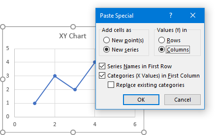
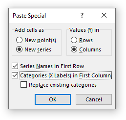
Copy the XY data in C9:D22. Select the chart, and use Paste Special from the Home tab of the ribbon. Click on New Series, Series in Columns, Series Names in First Row, and Categories in First Column.
Because it’s a column chart, Excel adds the data as another set of columns.

Right click on any series in the chart, and choose Change Series Chart Type. Scroll to the bottom of the list of series and select the added series (“Connect”). Use the Chart Type dropdown to select the XY Scatter with Markers and Straight Lines option (NOT a Line Chart option), and uncheck the Secondary Axis checkbox.
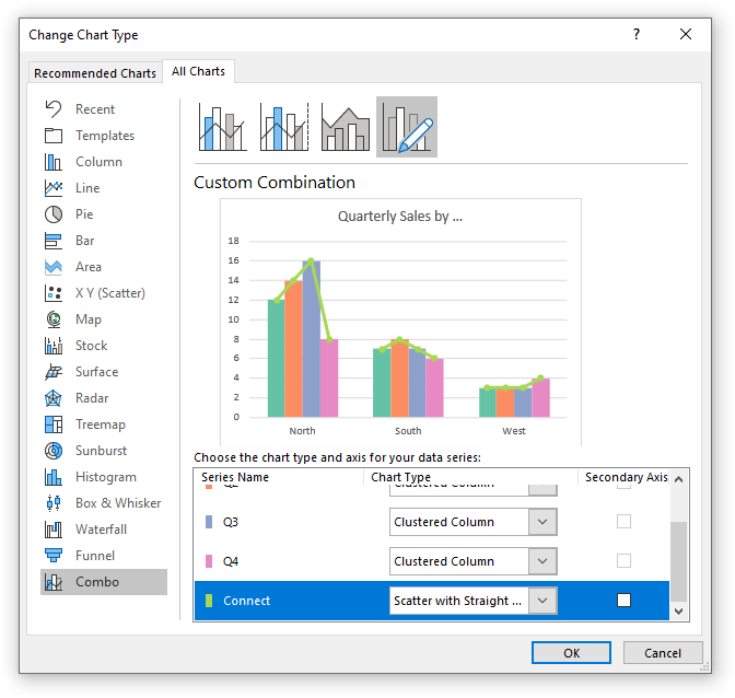
This results in the XY data points we want, except the lines and markers are in an ugly shade of green (well, for this particular color scheme).

But we know how to fix that.

Adjusting Gap Width
If I change the Gap Width in my chart, from 200% above to 75%, the XY data points are no longer lined up.
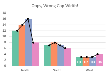
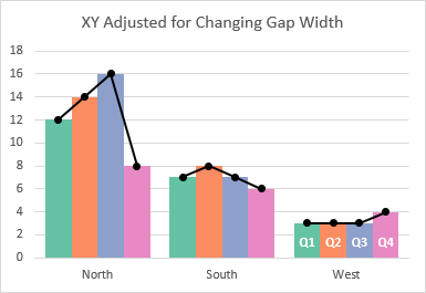
But all that is needed is to change the Gap Width in cell F9 of my calculation range; the X values recalculate and the chart looks great again.
More Combination Chart Articles on the Peltier Tech Blog
- Pareto Charts in Excel
- Clustered Column and Line Combination Chart
- Add a Horizontal Line to an Excel Chart
- Horizontal Line Behind Columns in an Excel Chart
- Bar-Line (XY) Combination Chart in Excel
- Salary Chart: Plot Markers on Floating Bars
- Fill Under or Between Series in an Excel XY Chart
- Fill Under a Plotted Line: The Standard Normal Curve
- Excel Chart With Colored Quadrant Background


