How do you chart a wide range of values? There are numerous solutions to this, each with pros and cons. I’m showing these in Excel charts, of course, but they apply no matter what charting package you may be using.
It’s easy enough to think of an example. The following two charts show monthly sales data. One month had very high sales, while the rest of the months had low sales. (I’ll be illustrating the concepts in this article using both line and column charts, because each has special considerations.
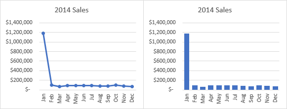
In both charts, the January sales value stands proud, while the other months are hiding in the weeds along the bottom of the chart.
Use a Logarithmic Scale
The first approach to chart a wide range of values was suggested in Logarithmic Scale In An Excel Chart, a tutorial on the MyExcelOnline Excel Blog. The My Excel Online web site is run by my colleague John Michaloudis, and it features lots of great tutorials, podcasts, free training, and paid courses. John’s point was well taken, but it was incomplete. It was a short and sweet review of the technique, but it left out the thought process that should accompany any charting effort.
It’s easy enough to apply a logarithmic scale to a numerical axis in an Excel chart. Select the axis, then press Ctrl+1 to open the Format Axis task pane (or dialog in Excel 2010 and earlier). In the same view that allows formatting of scale parameters like minimum and maximum, you should find a checkbox that says Logarithmic Scale. Check the box, and the scale is adjusted. You can also change the base of the log scale, but it’s usually best to keep it at 10.
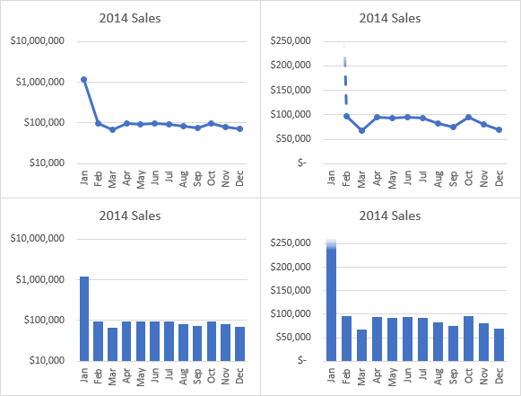
Here are my two charts with log scales. The data I’m using here is very similar to the data in the MyExcelOnline post cited above.
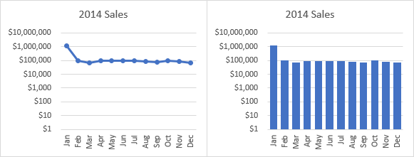
Your first thought might be satisfaction that the data are now all shown with a similar magnitude. That’s wrong, of course, because they aren’t of similar magnitude. But that’s secondary, because we are really only comparing extreme values with very little in between.
The other point about the charts above is the scale limits. Excel likes to use zero as one endpoint of an axis, and 1 corresponds to zero on a log scale. However, this choice of scale minimum means that the bottom two-thirds of the chart is blank, all of the data occurs in the top.
We can reduce the white space by entering a better value for axis minimum.
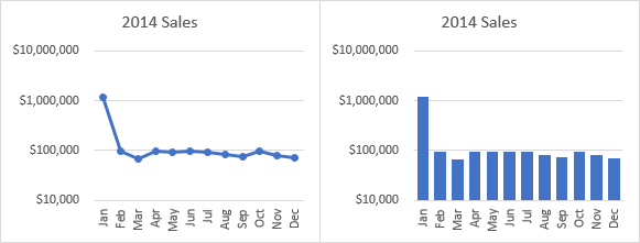
There is still a problem, especially with the bar chart. In a bar chart, our precognitive sense of the values is based on the lengths of the bars, and it’s hard to overcome that. When I look at the bar chart above, the short bars all look about half as tall as the long ones, so I get the mistaken impression that the smaller values are around half of the large value. (The first logarithmic column chart is even worse, since the shorter bars are 80% as tall as the long one.) The actual ratio of values is less than one-tenth.
The log scale also tends to wash out the variability in the shorter values. In the charts below, I show the previous log scale charts, and beside them a linear scale chart with the scale blown up so the mean of the linear scale and log scale are at about the same height. Of course the large value is way off scale, which I’ve tried to indicate by fading the top of the visible indication of the large value.
The variability in the small values is shown best using the linear scale.
I should mention a couple more points about logarithmic scales.
First, as should be clear above, there is no place for log scales in bar or column charts. Bar and column charts need to include zero in the axis scale, but you can’t include zero on a log scale, since log(0) is negative infinity.
Second, most audiences will not be able to properly appreciate a logarithmic scale. Sure, engineers, scientists, and quants may have a strong enough numerical sense to interpret them accurately. But general audiences, and even smart managers and executives, are likely to be misled by such numerical transformations. It’s best to stick to the linear scale that most people are comfortable with.
Show Part of the Data
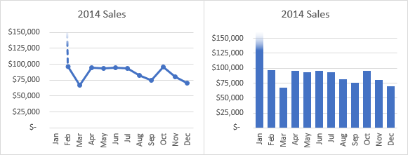
The charts used above aren’t bad, showing that linear scale charts preserve variation in the data better than logarithmic charts. Maybe we don’t need to actually show the extreme values on the axis scale, if we just indicate that they’re way off scale.
I can adjust the scale a bit more, to center the smaller values in the chart, keeping the scale minimum at zero, and fading the top of the largest value. The large value is so much bigger anyway, maybe we don’t need to actually show it to indicate that it is much larger than the others. This fading is a bit tricky, but it’s important to indicate that the data point isn’t just at the top of the chart, but instead extends far beyond.
Break the Axis Scale
A common approach to chart a wide range of values is to break the axis, plotting small numbers below the break and large numbers above the break. An advantage here is that it generally uses a linear scale. A disadvantage is that it distorts data, and doesn’t really give a sense for the differences in value on either side of the break.
Here are the two original charts, with a break in the vertical axis scale.
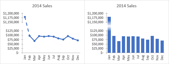
Bravo, you got in all the data points. But despite the visual cues that the axis has broken, there is still a strong tendency to mentally interpolate the values: those short bars still look half as tall as the large one, and the faded center and gap in the axis tell my conscious mind but not my precognitive mind that my first impression is wrong.
Sure, it’s easy enough to read the value off the axis scale, corresponding to the data point. But if you have to do that much work, what’s the point of a chart? You might as well just read the data from the cells in the worksheet.
Another drawback to breaking an axis is that it’s hard. You need to hide the real axis, construct two parts of a fake axis with a combination chart and data labels, and change at least some of the data you’re plotting. Nobody understands how to make these charts, and nobody understands the output anyway. So why bother.
The charts in the Show Part of the Data section are more effective.
Use Multiple Charts, or Make a Panel Chart
A lot of people are obsessed with getting all of their data into exactly one chart. Sometimes this is fine, but as we’ve seen above, sometimes charts with all of the data are not very easy to interpret without distorting the relationships within the data.
What’s wrong if we use two charts? We can show the whole range of data while highlighting the larger values (see the first chart of this article), then add the chart from the Show Part of the Data section which highlights the smaller values.

There are some redundant chart elements, so let’s hide the category labels in the top charts and the titles in the bottom charts.
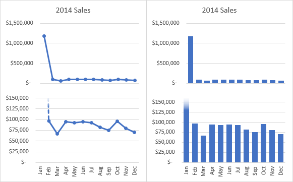
From here it’s not a big stretch to combine both charts. Plot the original data twice, once each on the primary and secondary axes, do some heavy axis formatting, and voila. Here are panel charts, where one panel shows the full extent of the data, and the other zooms in on the smaller data.
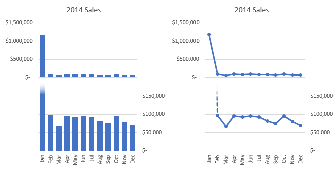
In my tutorial Broken Y Axis in an Excel Chart, I explain some of the shortcomings of a broken axis scale, and I give step-by-step instructions for creating exactly this kind of panel chart. Panel charts are a little more complicated to build and maintain, but using a single chart helps with alignment and other formatting.
Panel charts are among my favorite ways to show this kind of data. But we aren’t done yet with alternatives.
Pareto Charts
A Pareto chart is a combination chart that combines a column chart (sorted from largest value to smallest), like the one that led off this article, with a line chart showing the cumulative total.
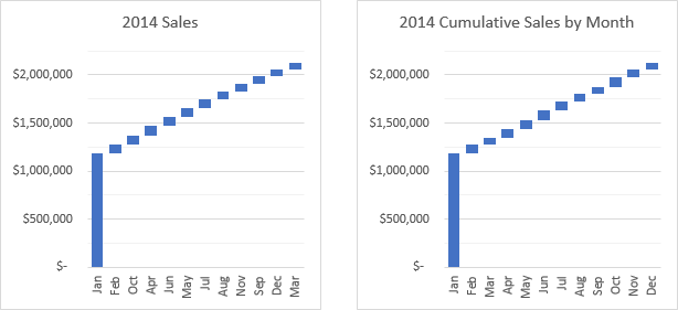
Here are two versions of a Pareto chart for this data. The Pareto one on the left is sorted by value. The one on the right is sorted by month, so the cumulative line doubles as the cumulative YTD sales.

Below is a combination of Pareto chart and waterfall chart, which I call a “Floating Pareto” chart. The bars show the incremental values and the increasing additive value. The one on the left is sorted by value, while the one on the right is sorted by month, again showing YTD sales.
First and only shameless plug of the entire article: the Advanced Edition of Peltier Tech Charts for Excel 3.0 includes Pareto and Floating Pareto charts. Check it out.
Think Further Out of the Box
You always have to keep in mind why you need to plot this data. If you want to say that our sales team kicked ass in January, then the sales director left for a competitor and took with him his account book and his entire staff, you can even get away with a pie chart.
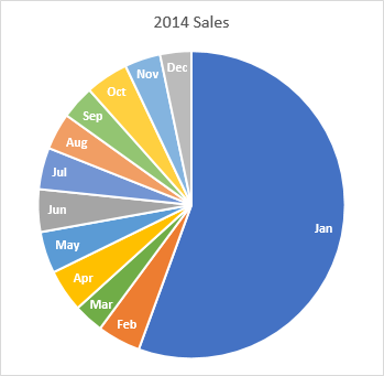
Sure, you’re thinking, “A PIE chart? Wut? Has he lost his mind? Pie charts suck.” They’re not good at showing numerical data, and blah blah, yada yada, etc etc etc.
Well, I’ve softened a bit in my stance on pie charts, in part because of some actual research into their effectiveness by Robert Kosara of EagarEyes and Tableau (go read An Illustrated Tour of the Pie Chart Study Results, and read the papers that post links to). Seriously, the chart above practically shouts, “What the hell changed between January 31 and February 1?” There really seems little point in examining the month to month variation from February on.
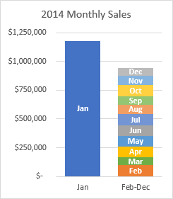
If you want something slightly more quantitative, you can make yourself a nice little stacked column chart. The chart below clearly says that January sales were enormous, more than the rest of the year combined.
Why do you want to chart a wide range of values?
As with any charting exercise, you need to ask some questions. What am I trying to learn from this chart? Who am I making this chart for? What message am I trying to give them? What’s on Netflix tonight?
If your purpose is a quick overview, then something like the Pie Chart or Stacked Column Chart might be all you need. If you’re trying to show something in more detail, the Pareto Chart, the Panel Chart, or a chart from the Show Part of the Data section may be more appropriate. If it’s detailed engineering data or scientific model predictions and your audience is highly literate in mathematics, then consider Logarithmic Scale charts.


