Note: this approach worked in classic versions of Excel (2003 and earlier) but inconsistencies between Line and XY Scatter charts introduced in Excel 2007 interfere with XY series trendlines on Line charts.
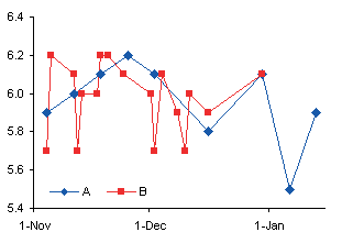
Elsewhere in this blog I’ve showed how to Plot Two Time Series With Different Dates:
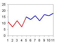
In Category Axis Tricks for Line and Area Charts – 1 I extended this technique to show how to format parts of a line chart in distinct colors:
A reader asked how to show two years of data on two separate lines and show a trendline for each.
Line Chart Approach
Let’s make up two year’s worth of data:

Here’s the data in a two-series timeline chart:
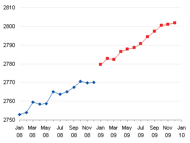
To add a trendline to a series, right click on it and select Add Trendline. Here’s the chart with a trendline for each series.

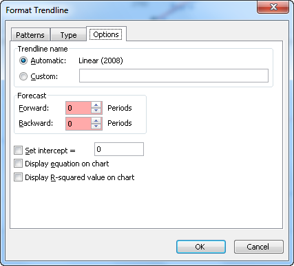
These trendlines are too long, each extending across the entire date range. The trendline dialog allows us to extend a trendline beyond the data in the forward or backward direction, but it doesn’t allow us to shorten a trendline (the forward and backward text boxes only accept positive values or zeros).
Well, we can always roll our own trendlines. Here is an updated data range:
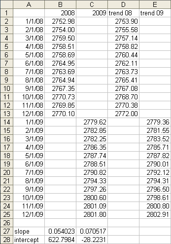
The slopes and intercepts are calculated as follows:
B27: =SLOPE(B2:B13,A2:A13)
B28: =INTERCEPT(B2:B13,A2:A13)
C27: =SLOPE(C14:C25,A14:A25)
C28: =INTERCEPT(C14:C25,A14:A25)
Column D has trendline data for 2008 with this formula in D2 and filled down to D13:
=$B$28+$B$27*A2
Column E has trendline data for 2009 with this formula in E14 and filled down to E25:
=$C$28+$C$27*A14
The data in these two columns is added to the chart, and a little formatting gives us two distinct timelines with distinct trendlines:
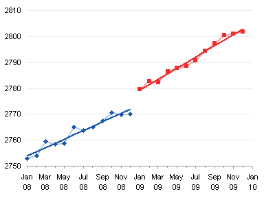
That’s not too bad, but is there any way to use only two series and the native chart trendline feature?
XY Chart Approach
Why not just make an XY chart? Looks the same as the line chart with the homemade trendlines.

But wait, on closer inspection, the date axis looks wrong. The line chart has a date label for every second month, but the XY chart’s axis shows August and October 2008 instead of September and November 2008.
Line charts allow us to adjust the scale to put a label at the first of each month, regardless of the number of days in the previous month. In the line chart, we can set our min and max as 1-Jan-2008 and 1-Jan-2010, and the major and minor tick spacing as 2 months and 1 month (and don’t forget the base unit should be days).
In the XY chart, we can set the same min and max, 1-Jan-2008 and 1-Jan-2010, but we have to use the inconvenient values of 60.917 and 30.4585 days as our major and minor tick spacing (731 days divided by 12 major and 24 minor divisions). This causes some ticks to occur before the start of a month (31-Aug-2008 and 31-Oct-2008 in the chart below), and some after the first of the month (02-Mar-2009, 02-May-2009, and 02-Jul-2009).
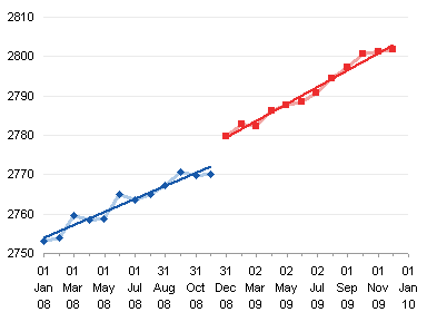
The line chart is needed if we want “nice” date scale axis labeling.
XY-Line Combination Approach
Let’s start with a line chart using only the 2008 data, to give us our preferred date axis format.
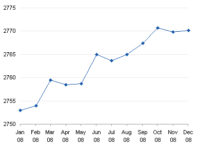
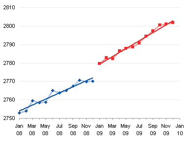
Copy the 2009 data (select A14:A25, hold CTRL and select C14:C25, A1, and C1, then press CTRL+C), select the chart, and use Paste Special to add the data as a new series. Excel adds a line chart series, using the same X values (dates) as the first series, even though we copied and pasted the X values as well as the Y values.

We can convert the new series to an XY type (right click the series, choose Chart Type, and pick the style we want).

If Excel moves the XY series to the secondary axis as in the chart above, move it back to the primary axis.

Now we can add a trendline to each series, and it extends only as far as the series itself.
Summary
As usual, Excel provides multiple ways to accomplish our goal. We could not do this directly, but we have our choice of at least two viable workarounds: Line chart with manually calculated trendlines, and Line-XY combination chart with built-in trendlines. What’s more tedious, calculating your own trendlines, or creating a combination chart?
Trendline and Regression Articles on this Blog
- Trendlines and Chart Types in Excel
- Add One Trendline for Multiple Series
- Trendline Calculator for Multiple Series
- Trendline Fitting Errors
- Choosing a Trendline Type
- Polynomial Fit vs. Statistical Process Control
- Moving Averages
- Stacked Column Chart with Stacked Trendlines
- Deming Regression
- Deming Regression Utility
- LOESS Smoothing in Excel
- LOESS Utility for Excel


DaleW says
Jon, that combo chart is a useful and nonobvious work-around here, thanks.
Don’t suppose you can explain why Microsoft included their friendly logic for handling a date axis for Line Charts (which otherwise EVENLY space points along the X axis regardless of their X values, as if they were categorical values) instead of for XY scatter charts (which plot points by their numeric X values)?
Jon Peltier says
Dale – Does anyone really understand Microsoft logic?
Teknik servis says
Theese are really helpful, thank you very much.
have a nice day