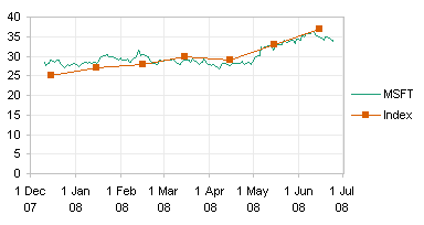
In Plot your data around the clock, Chandoo proposed a complicated bubble chart to show website traffic vs. time of day.

I thought it was daring of Chandoo to try such a unique treatment of the data, but I found the bubbles difficult to interpret, and it was distracting that I had to look from chart to chart to try to see the whole picture. My complete review of Chandoo’s chart is in Rock Around The Clock.
Jorge Camoes has chimed in with a radar chart solution in Charting around the clock.

Jorge’s chart prevented the side to side motion needed to see the entire picture, but it does not show where the lines join to make a 24-hour record of the data.
Note: This chart is a novelty, and is not as good at representing the data clearly as a line chart would be. It’s really only effective at showing the difference between pairs of points 12 hours apart, the AM and PM values. This chart type cannot effectively show trends or compare values an hour or more apart. For effective data presentation, stick to line charts.
I created my own 12-hour circular graphic, which addresses my conceptual problems with the charts shown thus far. It’s actually a combination radar-XY chart, using the radar to reproduce Jorge’s nice Roman-numeral clock face, and the XY series uses Chandoo’s trig algorithms to locate the actual data.
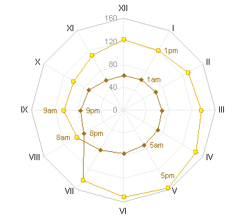
I presented this chart in Rock Around The Clock, but I did not show how I made it. This post has instructions.
Radar-XY Combination Chart Data
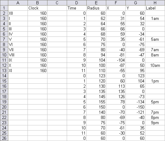
The chart has two blocks of data. The first block in columns A and B consists of data that drives the labeling of the chart numbers. I’ve used Jorge’s Roman numerals for the time labels in column A (the category labels of the radar chart), and the values of 160 in column B correspond to the maximum value in the chart.
The data in Columns D through H are used in the XY series. The time in column D is the time in hours, with 0-11 AM followed by 0-11 PM. The radius (column E) is the set of values to be plotted radially from the center of the chart. We accomplish this in an XY chart by converting the angle and radius to X-Y coordinates. The angle goes from 0 to 360 degrees (0 to 2 PI) from 0 to 12 hours. Columns F and G contain trig functions to handle this conversion. Cell F2 has this formula:
=E2*SIN(D2/6*PI())
Cell G2 has this formula:
=E2*COS(D2/6*PI())
These formuas are filled down to row 26. Note that the first point is repeated at the end of the table: while the radar chart automatically connects the first and last points, an XY chart does not assume that the points trace a circuit.
Column H contains labels which will be applied to selected points.
Creating the Radar-XY Combination Chart
Start by selecting A1:B13, and create a radar chart. The data traces the circumference of the chart. I’ve changed the axis spacing from 20 to 40, because there were too many gridlines.
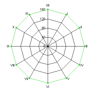
This appearance of the radial spokes and circumferential is reminiscent of a spider’s web, so radar charts are also known as spider charts.
Change the gridline and axis (spoke) line color to very light gray. Change the data series and the axis labels to a medium gray, so these features will not overwhelm your plotted data.
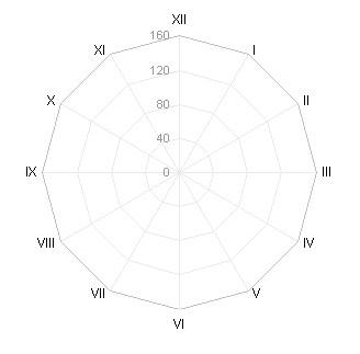
Select and copy F1:G26, select the chart, and use Paste Special to add the data as a new series. Excel adds it as another radar series. Since it has 24 points, the series changes the chart so that it has 24 spokes, and the first series covers only half of the chart.
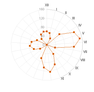
Right click the new series, choose Chart Type, and select an XY chart type. Excel plots the XY series on the secondary axes, and adds secondary X and Y axes to the chart.
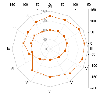
Change the secondary X and Y axes so that both have a minimum of -160, a maximum of 160, a major unit of 40, and the matching axis crosses at zero. The axes are coincident with the axis of the radar chart.
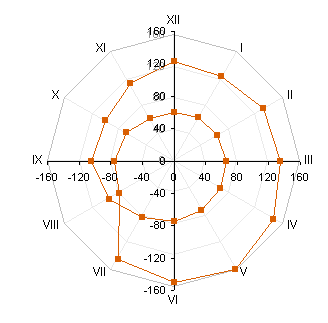
Finally, format the secondary X and Y axis to be invisible: no line, no ticks, and no tick labels.
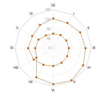
If you just want to show the 24 hour cycle, you can stop here. To help clarify the chart, I added some labels to selected points, showing the corresponding time, using Rob Bovey’s Chart Labeler.
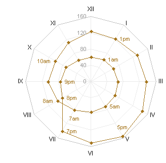
You may want to show the daytime data points with different formatting. You can individually format the particular points, but I prefer to add a new series, so I can edit formatting in one step instead of one step per point. Copy F10:G21, select the chart, and use Paste Special as before to add the data as a new series.
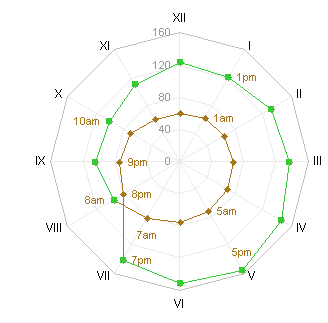
Apply the desired formatting to the daytime series
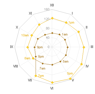
Download RadarXYAroundTheClock.zip to see a workbook that shows these steps.


