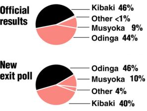
In More graphical propaganda, Andrew Gelman of the Statistical Modeling, Causal Inference, and Social Science blog shows some pie charts of recent Kenyan election results which he got from John Sides’ blog post, Election Fraud in Kenya in The Monkey Cage blog. The charts are awful; as Andrew notes, the colors change and the wedges are reordered. I’ve regraphed the data on a bar chart, which I think is much better.
Original Chart
Better Chart


