What’s a Dot Plot?
A dot plot is a simple chart that plots its data points as dots (markers), where the categories are plotted on the vertical axis and values on the horizontal axis.
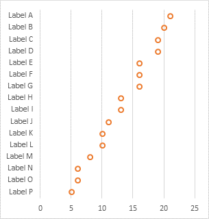
It’s a nice plot, but it isn’t built into Excel’s default chart offerings. It’s not too hard to make your own Dot Plots, and the Peltier Tech Charts for Excel features several variations of Dot Plots among its custom chart types.
The Problem
A popular chart type in Excel is a line chart. Below is a line chart showing some simple data. It’s a pretty clean chart, especially without connecting lines between data points. But the labels are hard to read without hurting your neck.

It would be nice to be able to rotate this chart, to make the labels more readable. The only reason not to rotate the chart would be if the categories (Label A, Label B, etc.) were dates, because people are used to time being plotted horizontally. But we can’t simply make a “line chart” in Excel that had the categories on the vertical axis and values on the horizontal axis. The closest we can get is a bar chart.
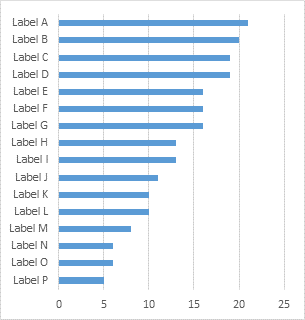
But the bar chart doesn’t look as clean, because of all that color. And if there are multiple sets of bars, it can be hard to distinguish the different series of data.

Let’s Build a Dot Plot in Excel
It’s possible and not too difficult to construct dot plots in Excel. But it takes a little work. We’ll use an XY scatter chart for the dots, and a bar chart for the vertical axis labels.
The Data
Here is some simple data for our dot plot. The “Labels” column provides the categories for the bar chart, which will adorn the vertical axis. The “Values” column provides the horizontal values for both bar and XY chart. And the “Height” column provides the vertical coordinates for the XY points. The height values are calculated using a simple algebraic formula:
=(ROWS($A$2:$A$17)-ROW()+ROW($A$2)-0.5)/ROWS($A$2:$A$17)

Start the Chart
Select the first and second columns of data and insert a bar chart. I’ve already configured it to be slightly taller than it is wide.

The labels are going in the wrong order, so double click on the vertical axis to open the Format Axis dialog. In Excel 2007 you have so right click on the axis and choose Format Axis… from the pop-up menu (which works in any version). Or in any version you can select the axis, then press Ctrl+1 (numeral one).

Fun tip: Select any Excel object (a cell, a shape, a chart element) and press Ctrl+1 (numeral one) to open the corresponding Format dialog. I think this is my #1 time saving shortcut in Excel, and it ticks me off that other programs don’t use it too. I’m going to harp on you repeatedly until you’ve learned to do it automatically. You’re welcome.
While you’re formatting the vertical axis in the Format Axis dialog, choose Horizontal Axis Crosses At Maximum Category, so the horizontal axis labels return the the bottom of the chart.

Add the XY Data
Select and copy the second and third columns of data, select the chart, and use Paste Special to add the data as a new series, with series in columns, series name in first row, and categories in first column.
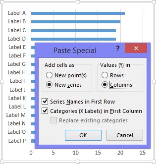
Excel adds the data as another bar chart series.
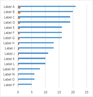
Right click on the new series, choose Change Series Chart Type from the pop-up menu, and select the XY Scatter type. Excel adds a new vertical axis on the right of the chart, since it can’t plot numeric values on the category axis on the right. Fortunately Excel can use the existing horizontal axis for both the bar and XY data.
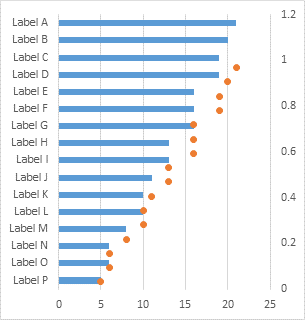
Align the dots with the bars by formatting* the secondary vertical axis (right side of the chart) so that its minimum and maximum are 0 and 1.
*You used that Select plus Ctrl+1 trick, right? Right?
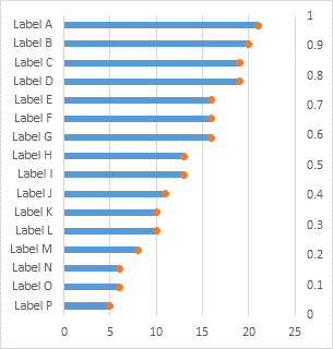
Format the vertical axis (Ctrl+1!!) so it has no line color and no axis labels, which hides the axis.
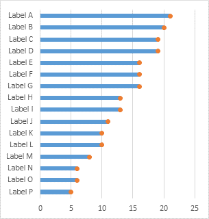
Format the bar chart series (don’t make me say it!) so that it has no border and no fill color, which hides the bars and leaves the dots standing alone. I’ve formatted the dots so they have no fill color and a thicker marker line, because I think these look better than boring old filled circles.

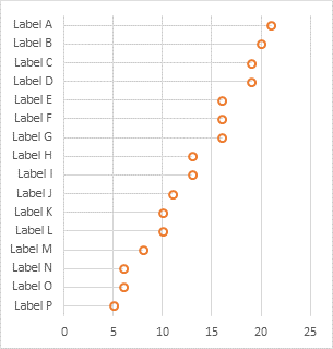
And that’s our Dot Plot.
Adding more data to the dot plot doesn’t clutter it up the way it does with bar charts.

Drop Lines May Increase Readability
In this example, the labels are pretty close together, and some of the dots are pretty far away, so it might be tricky for people to tell exactly which dot goes with which label. Often dot plots have lines connecting the dots to the labels to clarify this. We’ll use horizontal error bars for these connecting lines.
Select the dots and add error bars. In Excel 2007 and 2010 find the Error Bars control on the Chart Tools > Layout tab. In Excel 2013 it’s on the menu that pops up when you click the plus sign icon. Choose any of the options, because we need to modify the settings.

For XY points, Excel adds vertical and horizontal error bars. Select the vertical error bars and press Delete.

Format the horizontal error bars, select the Minus direction and the No Cap style option, and for error amount, select the Percentage option and enter 100.
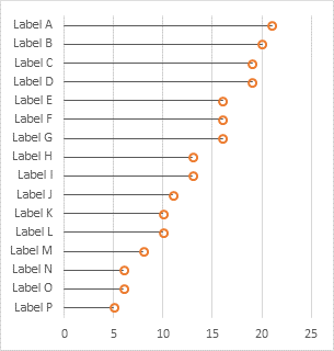
Finally format the error bars, giving them a light line color so they don’t overwhelm the dots.
Dot Plots in Peltier Tech Charts for Excel
This tutorial shows how to create Dot plots, including the specialized data layout needed, and the detailed combination of chart series and chart types required. This manual process takes time, is prone to error, and becomes tedious.
I have created Peltier Tech Charts for Excel to create Dot Plots (and many other custom charts) automatically from raw data. This utility, a standard Excel add-in, lays out data in the required layout, then constructs a chart with the right combination of chart types. This is a commercial product, tested on thousands of machines in a wide variety of configurations, Windows and Mac, which saves time and aggravation.
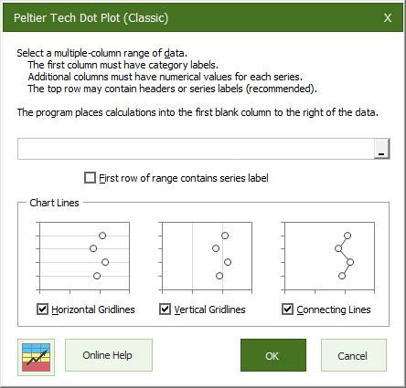
A simple dialog presents you with a few options for your chart.
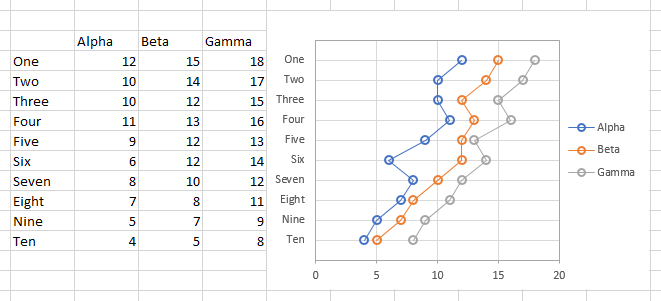
The output appears in an instant. The necessary calculations are hidden behind the chart, which is scaled and sized so the chart axis categories line up with the rows of the table.
I’ve also added some additional types of dot plots, including lollipop charts and dumbbell plots. The dialog is simple to use:
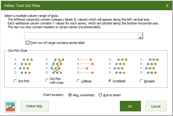
The output of this dialog is produced on an inserted worksheet:
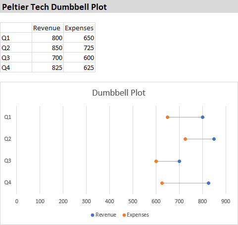
Please visit the Peltier Tech Charts for Excel page for more information.


derek says
A cheap nasty way to get a dot plot is to make a line chart, copy the cells it’s embedded in, and Paste Link Picture
Now rotate the picture 90 degrees, re-arrange the chart title and the axis labels, et voila. (I don’t think I can do anything about the legend)
Sadly you can’t do this to the chart object, it has to be the worksheet cells you paste link.
roberto mensa says
Hi Jon, great point.
I have always used a different approach.
I do it using an xy series plotted on the secondary axis with a very large value as axis maximum … so:
1 – Add a serie xy.
2 – Set x values on the range of labels and y values equal to the other series (can be a simple progression from 1 to n) 3 – Set the serie on the secondary axis and the maximum value of the axis to a very big value 1000000 …
4 – I add labels to this xy series and set it to show the x values (which is the label text)
here http://goo.gl/JxilIR a sample file i used
Eric says
So are you taking the same “Statistics and Data Visualization” class that I am right now? I haven’t seen you in class… Or are you just going through Cleveland’s Visualizing Data? I actually was thinking about how to do dot plots in Excel as my instructor is pushing R at us…
Next topic: jittering data. Just a suggestion.
Jon Peltier says
Roberto –
That approach works fine too. I generally find the bar chart easier for people to understand; if the idea of data labels is new to them, they can get confused.
Using a bar chart was more complicated in Excel versions before 2007, because the bars and scatter points couldn’t share the horizontal axis. When that was changed in Excel 2007, the bar/scatter approach became definitely easier.
However, the ease of using a range of cells for a set of data labels, introduced (finally!!) in Excel 2013, means the scatter-only approach may soon be the easiest. Even using Rob Bovey’s elegant Cart Labeler add-in was not as easy.
Jon Peltier says
Derek –
Yeah, that works too, in a quick and dirty way. But I don’t like the quality of the rotated picture. Also, in the old days, having more than about 6 or 8 of these linked pictures could cause Excel to bog down or even crash.
rossa says
I really enjoyed your previous post on this but it was way over my head. I think I found a way to do one differently.
What are the disadvantages of the following method?
Using your “Height” column change all the numbers to 5, rename the column “l’.
Create a Stacked bar chart, change the color of the charts to No Fill.
Find the Series l and add data labels, go to format data labels and remove the value and instead add the Series name. Make sure the label is centered.
Then change the font type to Wingdings and you get a circle. You can change the value in Series l for 5 to something very small like 0.5 so the dots are centered a bit more.
Jon Peltier says
Rossa –
That’s pretty good, never thought of it. I have a follow-up showing a way to make dot plots using text (in cells, not in charts). This would be an interesting addition to that article, if you don’t mind.
You can even use a value of 0 for the “l” series, so the labels are as well positioned as it’s possible to position labels. You can play with font color and size, too, as if the dot characters are markers.
rossa says
Jon,
Sure no problem, I got the idea after seeing one of your other posts on in-cell charts (where you used the REPT function with a number of spaces followed by a special character).
The CHAR function used with Webdings, Wingdings1, Wingdings2 & Wingdings3 gives a large number of special characters to play with.
Jon Peltier says
Yeah, I was going to reprise the in-cell charts. Got a few tricks up my sleeves, though.
Bob says
Hi,
One of the ways I create dot plots is to use a horizontal bar chart to get the categories. And XY for the actual dots.
This gives me the flexibility of creating alternate shading by setting alternate rows to be zero or full scale. This helps to guide the eye.
In most cases the bar fill is light grey, but if specific attention is to be drawn to a set of data, the underlying bar formatting can be changed with a few clicks.
Many ways to achieve clarity with dot plots.
Cheers,
tamoghna says
I love your new ‘light weight’ writing style in this blog :)
online excel training says
This is a neat idea and thank you for the formula tip. Thanks for sharing.
Agata says
I’d love to start using the dot plot in my daily work, but unfortunately I cannot reproduce it in Excel 2010 (does it have something to do with the version?). I am stuck at the point when you switch the orange bars (“height”) do the XY scatter type chart. After the conversion the dots are not placed more or less at the ends of the blue bars – like in your example, but they go in the oposite direction – from “North West” to South East” of the chart ;-). Is there a way reverse them and obtain the same result as you did? Thank you in advance for the hints!
Jon Peltier says
Agata –
Are you using the data in this example, or your own? Make sure all of the data is numerical. If any is actually text, Excel will chart it as 1, 2, 3. Also make sure the dot series is using column B (not A) as its X values.
Agata says
“Also make sure the dot series is using column B (not A) as its X values.”
Thanks Jon, that was my case, I have already corrected it and the chart looks now as it suppose to look :-)
BTW – I have found a simplier and IMHO better way to show the points accurately on the horizontal grid lines (column “height”) – I have simply replaced your formula: “=(ROWS($A$2:$A$17)-ROW()+ROW($A$2)-0.5)/ROWS($A$2:$A$17)” with COUNTA(rows with data) in the first cell of the “height” column. The formula in all other cells “= value of previous cell – 1” (I obtain 16,15,14 etc.). To make the trick work and place dots exactly on the grid lines, the X and Y chart values have to cover an area bigger by 1 row. Then I set manually the max. value of secondary vertical axis by (here:) 16 (= CountA…) and it’s done. Enjoy :-)!
Jon Peltier says
Glad it’s working.
I use my formula as a way to scale the axis from 0 to 1, so if I adjust the size of the range, I may need to adjust formulas, but not the chart.
Ben G Braun says
I used to do this in Excel 2013 all the time, but I just got upgraded and can’t figure it out in 2016. I can’t paste special my values in; I can get the scatter plot to appear correctly using the “combo chart” feature.
Help!
Jon Peltier says
Ben –
That’s funny. THings like this have hardly changed between Excel 2013 and 2106.
Philip Nye says
Jon,
Great explainer, as per usual. One small point: for the first instruction under ‘Add the XY Data’, the image shows the ‘Categories (X Labels) in First Column’ option unticked – trying to add the second set of data with this unticked results in to two new series being added rather than one. The text of your post says that this option needs to be selected, but it took me a third time of reading it to realise what I’d done wrong. So just mention in case there are others like me (yep) who lean too heavily on the images and don’t pay close enough attention to the text!
Jon Peltier says
Philip –
Fixed it. I’m sorry for the confusion, I’m usually super obsessive about things like that.