There are many reasons to add data to an Excel chart. Your data may not be ideally arranged to plot it all in one selection. You may decide after the fact to include more information. You may have received another month’s data to plot. You may be adding dummy data to generate some of the effects described in this blog, such as custom labels or a special axis.
Excel offers many ways to add data to a chart, and almost as many ways to adjust the data which is already in the chart. I describe them in this blog whenever the need arises, but I thought it would be good to list them all in one place.
Drag and Drop
One of the easiest ways to add data to a chart is to select the range of data, click on the edge, then drag it over and drop it onto the chart.
We see from the highlights in the worksheet that the active chart is populated with the upper block of data (alpha and beta). We want to add the lower block (gamma) to the chart.
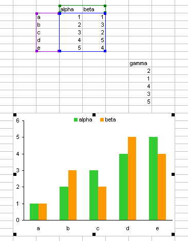
The first step is to select the data. When you mouse over the edge of the selection, the cursor shows a four-way arrow, indicating that the selection can be dragged elsewhere.
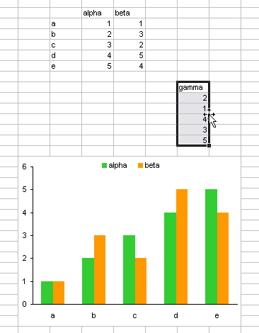
When the range is dragged over the chart, the chart outline is highlighted, and a plus sign appears next to the cursor, indicating that the selection can be added to the chart.
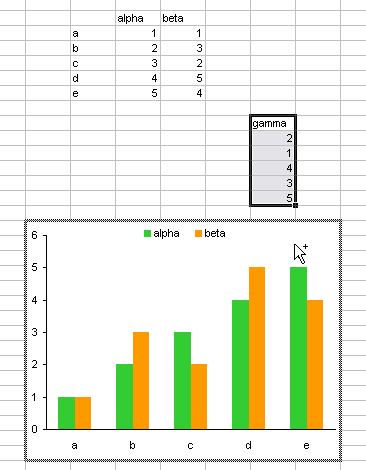
When the mouse is released to drop the data, the Paste Special dialog pops up, so you can make sure Excel is going to add the data the way you want it to.

Here is the chart with the data added. When the series is selected, we see that the selected range is highlighted to show the series name and Y values. Notice the existing category labels (X values) from the upper range are also highlighted.

This is a handy technique, even if it is limited to data on the same worksheet that the chart is embedded in. For some reason, though, it has been removed from Excel 2007. There are still many ways to accomplish this task.
Copy Paste Special
Instead of dragging the range and depositing it onto the chart, you can get the same result if you copy the selected range, then select the chart, and use Paste Special. The Paste Special box appears, allowing you to adjust the settings, if necessary. Data copied from another worksheet, even another workbook, can be pasted into a chart.
I never got into the habit of dragging and dropping data onto my charts, so I very frequently use Copy and Paste Special.
Copy Paste
You can also copy the selected range, then select the chart and use Paste. This bypasses the Paste Special dialog, instead applying the default settings without disturbing the user.
Neat Trick with Axis Labels
I learned a new trick this week in Excel Chart Tip – Insert Chart Series in an Excel Chart, by Ajay of the DataBison blog. You can use either the Copy Paste or the Drag and Drop technique to replace the category labels in a chart.
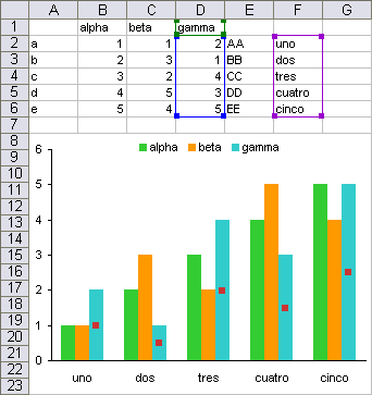
The chart’s source data has to be lined up, as in the chart shown below: the category (X) labels and Y values are all parallel and begin in the same row. It’s not necessary that the Y values be in consecutive order, nor that the category (X) labels be located to the left of the Y values. The Y value and category (X) label ranges can span different numbers of columns as long as they start in the same row.
An alternate set of labels can be used to replace the existing category labels. The new labels must be located in the same alignment as the category (X) labels and Y value, and the new labels have to be text labels, not numerical values.

Drag and drop the new label range onto the chart, or copy and paste the labels onto the chart. The new labels replace the existing category labels in the chart.
Drag Highlights in Worksheet
As described in Chart Source Data Highlighting and shown above, the source data range of a chart is highlighted in the worksheet. You can click on the corner of this highlighted range (the cursor turns into a multiple arrowhead)
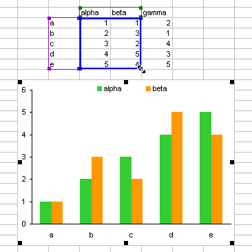
and drag it to enclose a different range

and the new chart source data will be plotted in the chart.

Obviously this technique is limited to data on the worksheet the chart is embedded in.
Add Series Formula
When you add a series to the chart, you add a series formula. Conversely, if you add a series formula, you also add a series. You can just start from scratch and type the whole formula, but it’s easier start with a copy of an existing formula. I think I used series formulas to edit chart data for a couple years before I realized that there was a source data dialog I could use.
Select an existing series in the chart, and note the series formula in the formula bar. Copy the formula.

Press Esc to exit editing mode in the formula bar. Select the chart area or plot area, click in the formula bar, and paste. Then edit the formula like you would any other formula. Here, references to column C are changed to D, and the plot order is changed from 2 to 3.

If an existing series is selected when you paste the formula in the formula bar, you will be replacing an existing formula, so the selected series will change based on the edited formula.
If the plot order is not changed, the new series will be inserted into the slot defined by the plot order index, and series with that index or higher will be moved higher in the list.
Press Enter to accept the formula, and the chart displays the added data.

You can copy the series formula from anywhere. It can be in the same chart or another chart, or you could save some frequently used formulas in a text file.
The formula can reference data in any worksheet or workbook. Tt can also refer to named ranges, and even data that’s not in a range: the series name can be a string embedded in quotes, while the X or Y values can be entered as an array. For more details, see my article on The Chart Series Formula.
Source Data – Data Range Dialog (2003)
You can add data to the chart using the Source Data dialog, Data Range tab, to stretch the range plotted in the chart. This works best if the data is in a contiguous range. You can’t add an arbitrary series in this manner, because any selection made in this dialog overwrites the existing source data.

Source Data – Series Dialog (2003)
You can use the Series tab of the Source Data dialog to add any arbitrary series to the chart. The series name, X values, and Y values can be defined independently, even taken from different worksheets.
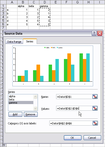
Select Data Source Dialog (2007)
In Excel 2007, the Data Range and Series tabs of the Source data dialog have been combined into the single view on the Select Data Source dialog. The dialog has lost the preview of the chart, and the individual series data has to be selected on small child dialogs that pop up when the user clicks on various buttons (Add or Edit).
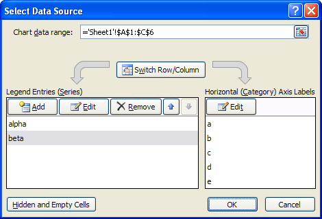
Despite the different appearance, this dialog works much the same as its classic equivalents.


Andrew says
I am unable to drag and drop to insert a new series. Is it because I am using 2007? I am also unable to work out the “Neat Trick”.
Jon Peltier says
Andrew –
Right at the end of the Drag and Drop section, I mention that this capability has been removed from Excel 2007. Perhaps in the next version they’ll be able to reinstate it.
anne says
thank you for your guide in building chart using excel,
sorry, this is out of topic…
actually im looking for how to add tertiary axis using excel. i found your good suggestion using panel chart from https://peltiertech.com/Excel/ChartsHowTo/PanelUnevenScales.html
i tried to follow your instructions and applied to my data, unfortunately i cant get as the example. I checked again which step was wrong, finally i found that one of your equation for A-plot was not similar with what had been returned in the cells E2:G7.
Can you explain to me what is the correct one?
thank u very much
Jon Peltier says
Anne –
Given the same layout as in the worksheet described in the Panel with Uneven Scales article, the formula in cell E2 should be
=((B2-E$9)/(E$10-E$9)*E$12+SUM($D$12:D$12))/SUM($E$12:$G$12)
as stated in the article. This cell should then be copied and pasted into the entire region E2:G7.
I don’t know what you mean about my equation for A-plot.
anne says
thank you very much,
actually the “equation for A-plot” is the formula for A-plot, i’m sorry for that.
yesterday i tried to follow the formula, but i could not get the graph in separate panel. i noticed that in the formula it has dollar sign ($) either like this:$E$, or E$ ;what’s the different between these two?
Jon Peltier says
The dollar signs are very important, because they differentiate between absolute and relative referencing. A dollar sign before the column letter makes the column reference absolute, a dollar sign before the row number makes the row reference absolute, and without the dollar sign, each is relative.
If I have a reference to A1 in a cell, and I copy it to the cell down one row and right one column, the following changes to the formula occur:
original: =A1
copied: = B2
original: = $A$1
copied: =$A$1
original: =$A1
copied: =$A2
original: =A$1
copied: =B$1
Praveen says
Hi. My name is Praveen and I heard about your site while searching for answers to create a break in the y-axis of excel charts. I am still not sure how to go about doing this in regards to my data – since I need to make around 60 charts and adding marker data to each chart will be extremely time consuming, but I have another question. I was wondering how to switch the x and y axis of a chart. I have a .jpg picture of what my chart looks like and how I want the x and y axis switched at this address:
http://www.bananacity.org/media/excelhelp.jpg
your help would be greatly appreciated. Thanks.
Jon Peltier says
Praveen – Use the Dot Plot technique.
kashi says
Dear Sir,
My Name is Kashi, I am trying to make a panel chart and just could not follow the formula, =((B2-E$9)/(E$10-E$9)*E$12+SUM($D$12:D$12))/SUM($E$12:$G$12). I have been trying this for a week now, Can you please help, I am doing this chart for the below sales data’s.
Products A B C D E Total
Apr-10 62.75 48.46 17.6 60.64 5.58 195.03
Apr-11 108.35 77.27 23.71 118.8 4.1 332.23
May-10 105.54 106.14 24.26 90.44 3.53 329.91
May-11 139.91 105.39 32.41 214.01 16.91 508.63
Jun-10 123.21 74.64 32.38 136.13 7.89 374.25
Jun-11 141.26 102.13 60.83 180.51 41.4 526.13
1st qtr-2010 291.5 229.24 74.24 287.21 17 899.19
1st qtr 2011 389.52 284.79 116.95 513.32 62.14 1366.99
Laurie says
I have to create a bar chart with current test scores for a course I am taking. Next week, I need to add scores to the chart but the prof wants the second scores added to the top of the original bars in a different color so he can see improvement. How do I add that second color (data) to the top of the original bars?
Jon Peltier says
Laurie –
Don’t try adding the data to the top of the old data. First, you’d have to add only the difference. Second, you’d have to do something else if a score declines.
Just add the new scores as a new series. Keep the clustered column chart type. The new scores will appear adjacent to the old scores.
Russ Urquhart says
Looking at this article, is there a way to call the built in dialog Select Data Source Dialog (2007) from within a vba, as mentioned, and use that built in for the user to enter their series, and then get those ranges to then feed a subroutine that will draw the chart.
There should be a way to call the built in and get at the values input, right?
thanks for any help!
Russ
Jon Peltier says
Russ –
You could probably activate the source data dialog using VBA, but you would lose any control over the information in it. But you could use a RefEdit control on a userform, or an inputbox control, to get a selected range from a user. I’ve written a few articles about these techniques.
Russ Urquhart says
The only reason that i would like to use the Select Data Source dialog is that the user may enter/edit any number of ranges/series for the x and y axis. This dialog seems to offer a way to handle a number of things, and is already part of excel.
We are trying to augment the charting part of excel, and add vba code to constrain certain aspects of charts that can be generated. (As the user can, in theory, enter a number of x & y series, i thought using that dialog might be handy.)
Another quick question, what does a chart template actually control? I ask because I originally thought it was like a stylesheet in word, but it seems to be pretty easy to override. What settings does it constrain? It this a good mechanism to use to make users charts fit a standardized size?
Thanks,
Russ
Jon Peltier says
Russ –
For the entry of multiple X and Y ranges, you could customize a user form so it has two ref edits, one for X and one for Y. Have an Add button to add the X and Y pair just entered, plot the series, clear the ref edits, and be ready accept another pair of X and Y ranges.
I hate the new source data dialog, and I’ve been meaning to redesign a custom one, but I haven’t had time.
I haven’t worked enough with chart templates to know what they control. The old custom chart types in Excel 2003 and earlier were very flaky, so I got into the habit of writing a VBA procedure for any custom chart I needed. Some of these procedures have turned into my commercial charting utilities.
Russ Urquhart says
Jon,
You have me concerned now that we may have to set all the chart parameters, even after using a chart template.
Would doing something like:
Set MyChart = ActiveChart
after a template was applied save the current chart properties in MyChart? In theory, i should be able to then query the values stored in MyChart and make sure the ActiveChart has the same values, right?
Jon Peltier says
Russ –
“Set MyChart = ActiveChart” sets a reference to the active chart in the variable MyChart. Since MyChart references that chart, its properties are those of the chart it references. In principle you can get all of the relevant properties my querying MyChart, but in practice it’s hard to remember them all, so you need to do some testing to make sure you get the ones you need.
Russ says
Jon,
Well the templates that i am getting seem to be giving me inconsistent results when i try and apply them to data.
If i know the desired plot area width & height, font size for the axis titles and labels, and know the desired space between the axis title and corresponding axis label, i should be able to set all of these through vba code right? Do i need to do any special calculations?
Thanks for your help,
Russ
Russ says
OK, Last question for a while.
How can i position the xaxistitle centered horizontally wrt the plot area above it? i have used the xlCenter attribute, but it seems to center to the chartarea, or it doesn’t work at all, in Excel 2007. Especially when i move the chart to a chartpage, things seem to scale interestingly there too!
Thanks for all your help!
Russ
Jon says
Hi Jon
I have a bit of a tricky problem with charting in 2007 which I cannot get past.
I am adding some weekly corrolation data to an existing chart by inserting a copied row at the top of a worksheet. I have 52 weeks of data A1 to A52 and a chart displays the results to keep an eye on how it tracks across the course of the last year. Old data can either drop off the bottom when the latest data is added or remain part of the chart, it doesnt matter..
My issue is when I insert a new row, the whole chart range drops down a row so the new range is A2 to A53 and the new data doesnt show. I have used ctrl+F3 and created a name but the same thing happens. It works fine if the row is inserted amongst the data ie the whole range expands out to 53 total rows if i insert to row 3, but I cant find a way to include the top row of data automatically as its pasted in.
At the moment I have to re-select the data series and change the range every time i do this and I am desperate for a better way…
Do you have an ideas for this… Thanks
Jon Peltier says
How do you define your range? If the numbers start in row 2 (as they should, since best practice has headers in row 1), you can base the OFFSET on the header row:
=OFFSET(A1,1,0,52,1)
this defined range will always start in A2.
If for some reason you can’t use a header row (but you should), try
=INDIRECT(“A2:A53”)
but charts sometimes have problems with names defined using INDIRECT.
If the range where you insert the data is a Table, and the data is inserted in the top data row, any formulas referencing complete table columns will include the inserted data. See https://peltiertech.com/easy-dynamic-charts-lists-tables/.
Jon says
Thanks Jon
I love the look of both of those options, yes I have headers in row 1.. however when i select a chart, then select the data source and try either of the indirect or offset functions in the ‘chart data range’ i get a “that function is not valid” message box? I get the same result if I use the edit button and enter the formula in the y-axis box.. (excel 2010 btw)
Cheers
Jon
Jon Peltier says
The Chart Data Range only accepts link formulas with cell addresses, no calculations.
The X and Y Values and Series Name only accept link formulas, with cell addresses or names (aka named ranges, defined ranges, etc.), no calculations. For these quantities you could define the named range using the indirect or offset function, then use the name (qualified with the worksheet or workbook name) in the range box.