Last week, in You Have 1 New Notification On Klout!, I used social media metrics site Klout to illustrate how choice of axis scales can exaggerate or wash out the variation in a data set. Today I’ll pick on another social media metrics site, Topsy, to show how to pick meaningful axis tick spacing parameters. [Note from the future: according to the Social Media Management Software Graveyard, both Topsy and Klout have been shut down.]
A meaningful axis spacing allows a human viewer to make sense of the numbers in your chart.
Original Topsy Charts
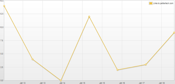
Here is a chart of Twitter mentions of my blog over a one week period. Sorry the chart’s too wide, that’s as small as Topsy would make it and still have text large enough to read. You could right click on it and choose your browser’s equivalent of “Open Image In New Tab” to see it in all its glory.

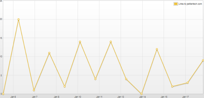
Here’s the Topsy graph for two weeks.

Notice anything wrong with these charts? No, they do have the right number of points. But the vertical gridlines and the horizontal axis labels are not aligned with the points. In the 7-day chart (top), there are 8 labels between the axis min and max values. To accommodate this mismatch, some adjacent pairs of tick marks fall within the same day, so a couple of labels are repeated. In the 14-day chart (above), there are 9 labels between the axis min and max value; some days have no tick marks, so dates are left out, but not in a regular pattern.
This kind of unorthodox labeling causes the humans to have to think too much about the chart. Sometimes the choice of incredible charting options like this leads to lack of credibility of the whole chart.
Human-Friendly Axis Spacing
In a 7-day graph, what would be an intuitive axis tick spacing? Let’s try one day, since one week is too wide and one hour too narrow. In general, numbers that are 1, 2, or 5 times a power of ten make good values for axis tick spacing. 1, 20, 500, 0.01, and 0.5 are reasonable choices. If the scale is days, and a spacing of 1 or 2 days result in crowded labels, 7 days is a reasonable choice.
Here I’ve reconstructed Topsy’s 7-day chart with a 1-day axis tick spacing. It’s very natural, the ticks and gridlines are spaced the same as the data points, one day apart. Nobody has to use any excess gray matter to understand the time scale.

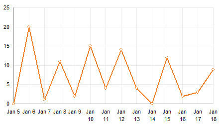
Here is the 14-day Topsy data plotted with a 1-day axis spacing. It is as easy to read as me 7-day chart with 1-day spacing, which is to say, much easier than the Topsy Turvy spacing in the original chart.

This is really more axis labels than are needed, and some of them are forced to wrap so they don’t overlap. We can fix this by using a 2-day axis spacing. Also easy to read. I’ve helped the viewer by placing small minor tick marks at 1-day intervals.

Intermediate gridlines work as well as intermediate tick marks.

Topsy’s Axis Scale Parameters
So what was Topsy thinking? Well, I can’t answer that, but I can estimate the axis tick positioning that they used.
Here is Topsy’s 7-day data. I’ve secretly replaced the regular time scale axis with an XY series that has spacing independent of the actual plotted points. Vertical error bars on the invisible points serve as my gridlines. The X values are based on formulas I can tweak in the worksheet, and I align the custom gridlines to closely resemble the original Topsy alignment. Jan 13 and Jan 15 both appear twice as in the original chart.

To get the spacing right, the first gridline appears at 3:44 pm on January 12, which rounds up to the Jan 13 shown in the label. Each subsequent gridline is 16 hours and 40 minutes after the previous one. I think we can all agree that 16:40:00 is not as intuitive as 24:00:00.
I’ve reproduced the 14-day chart as well. The first gridline appears at 3:20 pm on January 5, which rounds up to Jan 6. Subsequent labels are 33 hours and 20 minutes apart. Again, not so intuitive.

I can’t really say where these strange tick spacing values came from, but I have a suspicion. 16:40 is 1000 minutes, and 33:20 is 2000 minutes. If the time dimension were plotted in minutes, the two charts have ranges of 8640 minutes (7 days) and 18720 minutes (14 days), so in fact 1000 and 2000 are human-friendly numbers. Of course, the data is spaced 1440 minutes apart, so the nice minute-based axis spacing is really irrelevant.
I suspect the charting mechanism has a nice algorithm to calculate the spacing based on the minimum and maximum data values, but it doesn’t consider the actual data spacing, nor does it investigate alternative units. And the algorithm was automated before a human had a chance to look at it and say “Huh??”
More Axis Scale Articles
- Calculate Nice Axis Scales with LET and LAMBDA
- Calculate Nice Axis Scales in Your Excel Worksheet
- Calculate Nice Axis Scales in Excel VBA
- Chart UDF to Control Axis Scale
- How Excel Calculates Automatic Chart Axis Limits
- Reciprocal Chart Axis Scale
- Custom Axis Labels and Gridlines in an Excel Chart
- Custom Axis, Y = 1, 2, 4, 8, 16
- Logarithmic Axis Scales
- Link Excel Chart Axis Scale to Values in Cells
- Consistent Axis Scales Across Multiple Charts
- Gantt Chart with Nice Date Axis
- Select Meaningful Axis Scales
- Bar Chart Value Axis Scale Must Include Zero


james says
Jon
I have a standard line chart with horizontal x-axis at pre-defined intervals of say 100 .. so the x-axis may run from say 0 – 1,000 with 10 intervals of 0,100,200 … 1,000.
Is there a way of adding a vertical line at a specific value inbetween the intervals … at say a value of 257 on the x-axis?
Many thanks
James
Jon Peltier says
James –
Is it a line chart or an XY chart with markers connected by lines? An XY chart is almost always preferred over a line chart.
For one vertical line you can easily add an XY series that has two points: X,Ymin and X,Ymax. Format so it uses a line and no markers.
For multiple lines it’s probably easier to add a series of points at 0, X, 2*X, 3*X, etc. Format the series so it has no lines or markers, and ass a vertical positive error bar as long as you need.
james says
Jon
Thanks for reply … it’s a line chart … but I can probably re-format as an XY Chart … and have a go at adding vertical line as you suggest.
Many thanks
James