tldr; Stick to XY Scatter charts if you need trendlines for your data. Line charts may misrepresent the relationships in your data.
Trendlines and Chart Types
A user had problems with my Trendline Calculator for Multiple Series and sent me his workbook. It turns out, he was using the program on a Line chart, and I recalled that Line charts can have problems when calculating trendlines.
Here is some simple data, plotted in a Line chart. A trendline has been calculated, and the formula and R² are shown in the chart. Wow, that’s a very nice straight line fit, with all points exactly on the line.

But wait! Look at the X axis: the labels go from 1 to 2, then to 5 and 6, then to 9 and 10, and the spacing between labels is equal! That happens because unless Excel recognizes the X values as dates, it treats them as non-numeric text labels, and spaces them evenly as categories across the chart. Excel also uses the category number, not the inherent numerical value of the category label, when calculating the trendline formula. So Excel uses 1 through 6 as X values, which match the Y values perfectly, resulting in a perfect fit to the formula y = x.
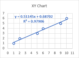
The solution, of course, is to use an XY Scatter chart instead. X and Y values are all treated as numeric, and these numbers are used as is when calculating the trendline formula. The horizontal spacing of the points matches the X values, and we see that while the fit is rather close, the points are not all exactly aligned with the trendline.

Another solution would be to format the X axis as a Date axis. This forces Excel to treat the numbers numerically, even though they are not dates. Now the horizontal spacing of the points matches their true values, and the trendline matches the one calculated for the YX chart above.

But using an XY Scatter chart type is better than using a line chart in most cases, even with a Date axis (unless you are working with dates). The X axis does not begin at zero, for one thing. Other chart formatting is designed for line charts (you can change the formatting, but why bother?).
Why Do People Use Line Charts Instead of XY Scatter Charts?
When inserting a chart, a user encounters a set of icons similar to those below. The Line chart icon shows data points connected by lines, while the XY Scatter icon shows points without connecting lines. Through inexperience or haste, I think a lot of people insert Line charts because they want lines connecting their points.

But this is not the difference between Line and XY charts. In both cases, you can format your data with or without markers, with or without connecting lines. The difference is in how the two chart types treat X values. As we saw above, Line charts will treat numerical X values as non-numeric labels, potentially spoiling your whole day.
More About Trendlines and Regression
- Add One Trendline for Multiple Series
- Trendline Calculator for Multiple Series
- Trendline Fitting Errors
- Choosing a Trendline Type
- Plot Two Time Series And Trendlines With Different Dates
- Polynomial Fit vs. Statistical Process Control
- Moving Averages
- Stacked Column Chart with Stacked Trendlines
- Deming Regression
- Deming Regression Utility
- LOESS Smoothing in Excel
- LOESS Utility for Excel


Leave a Reply