Tornado charts are often used to compare distributions, in the form of back-to-back histograms. Tornado charts are particularly popular for comparing closely related populations, such as male and female age distributions. In this context they are known as “population pyramids”. Tornado charts are attractive, but I don’t think they are as effective as they at first seem to be. To illustrate this point, I went to the US Census Bureau and found the following age data for males and females:
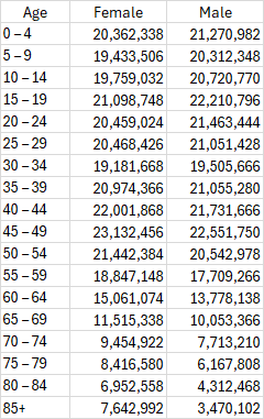
We can make the two histograms from this data, one for the female population and the other for the male population.
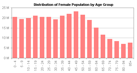
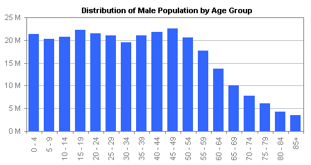
The histograms present the data in separate charts, which makes them tricky to compare, while the vertical age group labels on the horizontal axis are difficult to read. A tornado chart combines the data by rotating these two charts so their categories are arranged vertically, and placing them back to back.
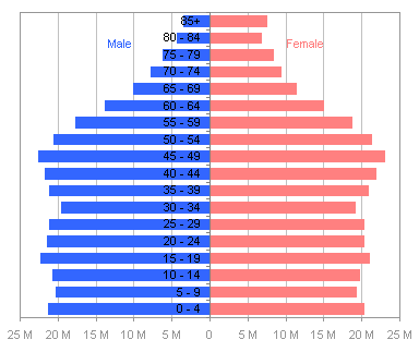
Although the category labels are now horizontally oriented, they are still difficult to read because they are partially obscured by the bars they overlay. This is often fixed by putting the labels on the side of the chart, which unfortunately puts them close to only one of the populations.
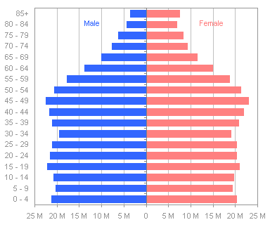
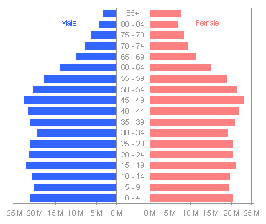
This is also sometimes addressed by splitting the chart halves and inserting the labels between the two populations. This is probably the best of the tornado chart options, because the labels are located at the baselines of each distribution.
While a tornado chart seems like a good approach for comparing similar distributions, I am always somewhat distracted by the optical illusion in which an image seems to switch between a goblet and two profiles in silhouette.

Source: AVIV – optical illusions – brain teasers – riddles
Another problem is that the two populations are more difficult to compare than we think when we view the chart. In the last tornado above, we can clearly see the greater female population in the oldest age groups, and we can see the baby boomer peak in the 45-49 age group. We cannot easily detect the differences between any age groups younger than about 60-64, because the bars move away from each other.
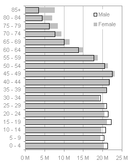
This problem can be solved by putting the bars on the same side of the category axis, in a clustered bar chart. We can easily see the differences between male and female populations in all age groups. In groups up to 30-34, the males have greater numbers; at 35-39 the numbers are very close to the same, and from 40-44 upwards, females have larger numbers, and the differences increase with age. An advantage is that the chart shows the populations with the same resolution as above in less space, because the data only extends in one direction from the category axis.
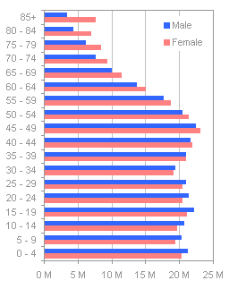
The problem with the clustered bar chart is that the alternating bar colors disrupt the smooth display of the distributions, and in some cases the distributions may be made to appear offset, because of the placement of the bars side-by-side rather than one atop the other. Jorge Camoes has written about population pyramids in How-to screencasts: Population pyramids in Excel and Animation and demographic information visualization. Jorge also thinks these charts are not as effective as they might be, and he suggests the use of overlapping bars, with one displayed as an outline rather than a filled bar. This approach gives a better impression of smooth distributions than the clustered bar chart above, but the different formatting gives different emphasis to the filled bar and outlined bar. The two charts below show the same data, but the initial impressions each gives are different.
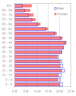

A different choice of colors may improve the uniformity of the two series, but not completely. A black line and a light gray fill give the series more equal weight than the blues and reds above.

I’ve written about Dot Plots in Microsoft Excel on my web site, where I’ve also linked to other sources: Good Graphs for Better Business, by William S. Cleveland and N.I. Fisher, Dot Plots: A Useful Alternative to Bar Charts, by Naomi B. Robbins, Ph.D., and Compare Metrics by Category Using Excel Dot Plot Charts, by Charley Kyd. Jorge Camoes also finds them a suitable replacement for population pyramids in Population pyramids in Excel. This is a good data set to display in a dot plot. The lines clearly show the distributions for both populations, as well as the relative populations in each age range.


Jorge Camoes says
Jon, the problem population pyramids (as a subset of tornado charts) is that they became an icon of a the demographic science. So, you can make them more efficient, but I am not sure if the people in the field are prepared to accept them. (Please note also that they usually put the first age group at the bottom.) There was an interesting discussion around this topic in Stephen Few’s forums some months ago. I also wrote about it.
I do prefer the last design, but if you overlap the bars in a clustered bar chart I think that’s acceptable (in this case, the fill option in one of the series must be set to “none”).
Jon Peltier says
Jorge –
I looked up tornado on your site, but it was the term “population pyramid” which found the posts you mention, Population pyramids in Excel and Animation and demographic information visualization. I’ve referenced that term and your posts. I’ve also flipped the charts over (Excel makes it relatively easy to reverse an axis), added an overlapped bar chart like you’ve suggested, and replaced most of the legends with labels.
The problem I saw with your bar chart that had one population filled and the other outlined, is that the outlined series had a different emphasis than the filled one. When the outline is used as a target, and the filled as an actual value, this difference is fine, but when you are comparing more equal data, such as these populations, I think it detracts from an objective conclusion. However, one step at a time.
Is changing this demographic visualization the same uphill battle we face with pie charts and gratuitous 3D effects?
Jorge Camoes says
Jon, we can be gentlemen and fill women outline men… Seriously, I agree with you, filled/outlined bar charts are better suited for target/actual charts. But I believe this is the best option if you are using column/bar charts. But probably we should avoid them and use a line chart or a dot plot.
Demographers look at population pyramids to see the overall shape. If you “fold” it you get a higher data density and you can easily spot meaningful differences between sexes for each age group. But you already have a standard that gives you some insights. Pie charts and 3D effects just mean that people can’t manage data. That’s more challenging to fix…
Jon Peltier says
Obviously part of the effectiveness of a chart type is the users’ familiarity with it. This would explain why a demographer would prefer the pyramid to a dot plot, and his familiarity would give him insights quickly which would take me longer. Whether another type is more effective may be less important. The overlapping outline/fill chart is a pretty good compromise.
But familiarity also makes people use pies and 3D charts, and their familiarity blinds them to the ineffectiveness of their chosen chart styles.
Doug Glancy says
Jon,
I like the clustered bar chart best, but I’d maybe go back to square one and make the bars vertical. I don’t find the age labels hard to read, and then it would be a “side-to-side” comparison of each age group.
Jon Peltier says
Doug – If you like the horizontal age axis with the vertical bars, you could easily fix the category labels. Since we’re measuring 5-year blocks, it makes sense to put the years that separate the bins on tick marks between the histogram bars. Mike Middleton’s Better Histograms includes instructions and an add-in to do this, but I just manually added a dummy XY series to add the labels “0” through “85”.
Or if you like the overlapping bars, something like this:
Or even a horizontal version of the dot plot, which is our old favorite, the line chart:
Doug Glancy says
Jon, I like the first one. I find it captures the chronology well, because it reads left to right, it’s easy to compare each pair, and the new labels are very clean. The dot plot doesn’t quite jibe for me, because when I see one I expect it to be over years, e.g., from year 1980 to 2005. Thanks.
Jon Peltier says
Doug – Hat’s off to Jorge, I think I prefer the middle one. You’re right about the line chart: it isn’t really a time-line, but it causes the reader to think it shows a continuous span of years.
Kevin Johnson says
Can someone tell me what the right and left side of a tornado chart means. I am having problems understanding it. For instance, my text book says that the cell that has the most impact on the EMV should be placed at the top of the chart. However, my problem involves setting several input cell to + and – 20% of there base case. Nevertheless, two of my imput cells have an amount of -40,000 but yet both are shown at different locations on the chart. Could someone explain. Thanks.
Jon Peltier says
Hi Kevin – There’s not necessarily any significance between the left andd right sides of the tornado plot. You have two opposite items being compared so you draw one in each direction. Often tornado charts are used to compare effectss of separate categories, rather than of an ordered set of categries (like the ages in my example). In the case of independent categories it’s customary to rank them from the widest spread at the top to the narrowest at the bottom. But you don’t sort each side, you sort the categories by the total of both measurements in each. I’ve also used charts which weren’t charts showing two populations, but more like floating bars going from a minimum to a maximum for each category. We sorted those from widest to narrowest and called them tornados too.
Kevin Johnson says
Thanks Jon.
Sarah says
I’m a couple of months late on this, but I like the idea of folding a population pyramid onto itself to more easily compare male to female. I have a slightly more complex case (which, by the way, I created using your tornado chart tutorial):
[image no longer available]
I guess one option would be to turn all of the series into lines, but since we have age ranges and not single-year ages, I think I prefer bars. But it’s difficult to compare male to female education levels except in the most pronounced cases, such as Afghanistan:
[image no longer available]
Jon Peltier says
Sarah – Those are interesting graphics. Breaking down the bars into prportions (i.e., by education level) complicates the issue if you want an overlaid comparison. Sometimes I find it better to use several charts. For example, I might do a master dot/line plot of total population M/F. then a version of this for each education level, then maybe a line/dot plot for each gender showing all education levels, unstacked. Then I’d pick the few charts that supported the story I was telling, and place them all in an appendix.
Paula says
I might be dense, but I cant find the tutorial that Sarah would have used to create the the tornado graphs with the x-axis down the middle. Can you point me to the link or are these in books. thanx
Paula says
In addition, I have seen a tornado chart tutorial by you, but I cant get mine to look like sarah’s with the split axis with 2 zeros. thanx.
Jon Peltier says
Here are a couple links:
Tornado Charts
Tornado Charts and Dot Plots
Keep in mind that tornado charts are not as good as you might think for comparing two sets of data. The fact that the bars extend in opposite directions makes comparisons difficult.
Copa says
thanks for the info
Greetings from the south
Juan C. Mendez says
John
Good post. Other kind of chart that is also named tornado is commonly used in financial and business settings to show how a given result (usually NPV) is affected by changes in the key assumptions, variables or uncertainties.
I show how to create these charts on my blog [link no longer available]
Best wishes,
Juan C.
Dave Fenton says
I like the tornados but they are all with respect to zero. Say you have values of ranges (5-70, 60-90, 30-80 etc.) and you want to tornado them all on top of one another where their centerlines don’t necessary match up. This is useful in Sensitivity Analysis.
Thank you,
Dave
Jon Peltier says
Dave –
In this case you want a floating bar chart, with a transparent bar with a value equal to the lower limit of the spread, and a filled bar with a value equal to the width of the spread (upper limit minus lower limit).
Jon Barrett says
Hi,
I love your site, some fantastic stuff.
Could you pleae let me know how you create the chart with one bar overlapping the other, and one outlined?
It is the ones that you say ‘A different choice of colors may improve the uniformity of the two series, but not completely. A black line and a light gray fill give the series more equal weight than the blues and reds above.’ just before the charts.
I would like to use it for a chart comparing actual v’s target.
Thanks very much, Jon
Jon Peltier says
Jon –
Make a clustered column chart with two series. The filled (and not outlined) series is the first, the outlined and unfilled) one is the second. Format them as appropriate. Format one of the series so the overlap is 100%.
Pato says
Hi Jon,
First I want to thank you, your blog rocks.
The tornado chart with the labels on the middle link that you gave to Paula (the split axis one) seems to be broken. I want to do something similar but with positive values on the right side of the axis, and with negative values on the other side…is there a way to accomplish this?
Thanks in advance
Jon Peltier says
Pato –
In the example, I had either multiplied one set of values by -1 to make them extend to the left, or I had plotted them on a secondary axis with values in the opposite order, again so they’d extend to the left.
If this isn’t the problem, well, I’m actually reluctant to help because I don’t think this kind of tornado is particularly good at showing what people think it shows.
Prateek kothari says
Hey Jon. I find it very useful. But while using the tornado charts i am facing a big problem. I made a template which consists of tornado charts and with this emplate, I made my presentations. But the data range is variable. So i have to go in each presentation to delete the extra series.
for ex: I made a template which consists of 12 series but when i use this template for data having 8 series, i have to go in each presentation and has to delete the 4 extra empty series. Please help me to automate the selection of the series.
Jon Peltier says
Prateek –
Combine the layout for tornado charts with these dynamic chart techniques: Dynamic Chart Review and Easy Dynamic Charts Using Lists or Tables.
Prateek kothari says
Thanks a lot. We tested it and its working fine.. Thanks a lot again as it saves a lot of manual work as we generate nerarly 300 presentations in a week conssisting of 100 slides involving 10 to 12 slides which incorporate manual changes.
Prateek kothari says
Hey Jon, one more thing. Is there any way to bring an shape or more precisely an arrow from ecxcel to the powerpoint without being defining it as an object. Sice the tool that we use to construct the slides incorporate only cell objects.
Jon Peltier says
Prateek –
If the tool populates a PowerPoint table using the Excel data, it won’t handle the arrow, since the arrow is a shape floating over the worksheet.
Of course, you could copy the range of data, with the arrow floating above it, and paste it as a picture in the slide.
Prateek kothari says
Hey Jon, the way i am incorporating the signs is different from the way you are thinking. As I am using conditional formatting – Icons – arrows. So still they are considered as objects sliding on worksheet or are they a part of cell??
Jon Peltier says
Prateek –
Those icon sets are not objects floating in the drawing layer above the worksheet. They are also not part of the cell contents. They are part of the formatting of the cell, like font color, bold, italic, etc.
If the tool you use to move the data into PowerPoint is only moving the cell contents, then the icon sets are not recognized.
Prateek kothari says
Jon-
After doing a little bit, I have found an interesting way to fix it as i am using the character function to incorporate the signs.
For ex : =char(175)give me an upward arrow.
Thanks for the reply . Your blog is awesome
Prateek
Prateek kothari says
Hey Jon, Thanks a lot for your guidance. Your blog is awesome. I mean after reading your blog, it gives ne nore and more to automate the things.
One more thing in addition to automation:
When we keep the axis of any chart AUTO it starts from Zero. Actually in my data lots of points are around in a small range so i have to go and set the axis accordingly. Is there any way to get away from this painful work??
Jon Peltier says
Prateek –
Use Calculate Nice Axis Scales in Your Excel Worksheet or Calculate Nice Axis Scales in Excel VBA to compute good axis limits, then use Link Excel Chart Axis Scale to Values in Cells to keep your axes updated.
Prateek kothari says
Hi Jon,
I have a doubt in Vba interface between excel and powerpoint.
I just want to know is there any way to copy the complete table ffrom excel with its formatting and paste it into powerpoint
The present way is taking one by one cell which takes a lot of time as we are generating 300 decks with 150 slides in a deck over a period of month.
SO it would be of great help ,
Thanks a lot in advance..
Asusual i am waiting for ur reply ASAP
Jon Peltier says
Prateek –
That’s pretty far off-topic, and I don’t have time to test out a method.
Follow instructions in Getting Answers For Your Excel Questions to ensure a prompt response