|

|
|
Fun With Dummy Series.
Introduction
Microsoft Excel offers many chart types and many chart effects, but sooner or later you'll want to do something that Excel doesn't offer. Many effects can be accomplished through the use of extra series and clever formatting. For example, you might want a customized axis style, or a line or shape drawn in a particular position, or text labels that are tied into axis values.
Several of these tricks with dummy series are adaptations of Tushar Mehta's Flexible Log Scale Axis technique, from his web site, http://www.tushar-mehta.com. While custom labeling of dummy series points can be done manually, most of these tricks rely on Rob Bovey's XY Chart Labeler, a free add-in available for download at http://www.appspro.com, or John Walkenbach's JWalk Chart Tools, another free addin from http://j-walk.com/ss/excel.
Dummy Series Tricks
Simulating Axis Types that Excel Doesn't Include
Placing Lines, Shapes, and Labels Exactly Where You Want Them
Simulating Axis Types that Excel Doesn't Include
|
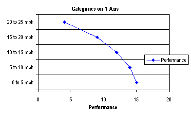
How do you arrange your chart so the categories are displayed along the Y axis? The method involves adding a dummy series along the Y axis, applying data labels to its points for category labels, and making the original Y axis disappear.
You may also want to check out the page on Dot Plots.
Top of Page |
|
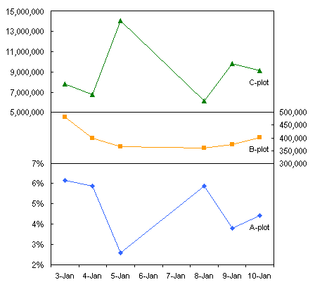
I once had a page on this site that showed how to generate additional axes in a chart. With the technique you could go beyond primary and secondary axes, to tertiary and quaternary axes, and even more.
Given that charts with just primary and secondary axes can be confusing, a tertiary axis is just overkill. Multi-axis charts can be cluttered and confusing, even when using a custom color scheme to help identify each series with its corresponding axis.
I propose using Panel Charts as a substitute for charts with confusing multiple axes. Here are some tutorials and examples of panel charts:
Top of Page
|
|
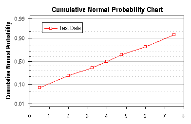
Microsoft Excel does not offer a built in capability to chart probability data, but the technique described here allows you to simulate a probability scale along a chart axis.
Top of Page
|
|
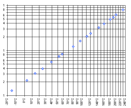
An Arrhenius equation gives the following relationship between some measure of reaction rate or chemical solubility and temperature:
K = A exp (-Q/RT)
where K is the rate or solubility, A is a constant, Q is an activation energy, R is the gas constant, and T is the absolute temperature. The equation above can be restated to:
log (K) = A' - Q/RT
A chart can be constructed with log(K) on the Y axis and reciprocal temperature (1/T) on the X axis; the slope of this line indicates the activation energy (actually -Q/R) and the intercept is the new constant A'. This page describes the construction of one variation of this type of chart.
Top of Page
|
Placing Lines, Shapes, and Labels Exactly Where You Want Them
|
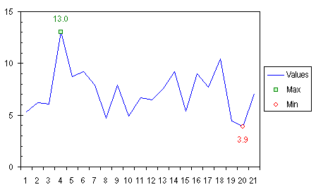
Ever want to apply special formatting to just a certain point? This example shows you how to highlight the minimum and maximum values of a series by using a different marker for each, and data labels. We'll accomplish this with two extra series in the chart, one for minimum and one for maximum.
Top of Page
|
|
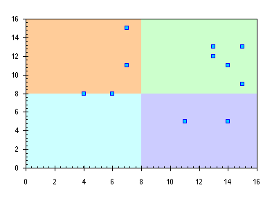
I was recently asked, "I have an XY scatter chart that gets divided into 4 quadrants and each quadrant needs a different color. Any ideas?" I love a good challenge, so I came up with the procedure in this page.
Top of Page
|
|
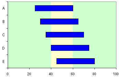
This page shows how to put a vertical band on a chart, highlighting a certain region. The technique can be used, for example, to highlight a certain time period in the background of a gantt chart.
Top of Page
|
|
Some kinds of data look very nice and are easily understood in the form of a "floating" column or bar, in which the column floats in the chart, spanning a region from a minimum value to a maximum value.
Top of Page
|
|
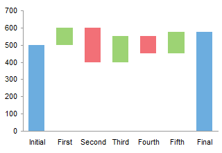
Waterfall charts are a special type of Floating Column Charts. A typical waterfall chart shows how an initial value is increased and decreased by a series of intermediate values, leading to a final value. An invisible column keeps the increases and decreases linked to the heights of the previous columns.
This page shows how to arrange your data and create a waterfall chart in Excel.
Top of Page
|
|
In Microsoft Excel's bubble charts, bubble sizes are fixed according to the largest bubble in the chart. This is a problem when comparing multiple charts that have dissimilar bubble size data. This article shows an easy way to link the bubble size scales of charts with different bubble size data.
Top of Page
|
|
|