Floating bars can be used to plot many types of data sets. (“Bars” in this usage means “bars”, as Excel calls horizontally oriented bars, as well as “columns”, as Excel calls vertically oriented bars.) In a waterfall chart, floating bars (usually vertical) show how contributing factors affect a cumulative total. In a Gantt chart, horizontal floating bars along a horizontal date scale help program managers plan task start and end dates and durations, and track progress towards completion of these tasks. Floating bars can be useful to show running highs and lows in a data set, such as daily high and low temperatures, stock prices, diastolic and systolic blood pressure readings, etc.
There are numerous ways to create floating bars in an Excel chart. There are so many ways that I should write more than one post, but I’m going to cram them all into this one. I’ve divided the techniques into the following:
- Stacked Column and Bar Charts
- Line Chart Tricks
- Error Bars
- XY Chart Line Segments
Stacked Column and Bar Charts
Stacked column and bar charts are probably the most obvious way to create floating bar charts. This approach is pretty flexible, and allows individual floating bars to be formatted differently, but will require some calculations to get the bars to appear as desired.
Stacked Column Charts (Vertical Bars)
This tutorial will show simple floating columns, stacked floating columns, floating columns that span the horizontal axis, and overlapping floating columns, all using stacked column charts.
Floating Columns
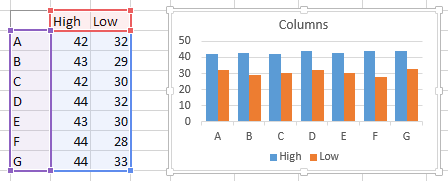
In the data set below, there are several high and low values for the categories in a column chart. The clustered column chart shows the values we want to highlight: we want a floating column to connect each low value to its corresponding high value.
We achieve this by inserting a column in the worksheet which has a simple formula to calculate the difference between high and low (“Delta” in the table below). Adjusting the data range and changing from clustered to stacked columns shows all we need. The floating column is resting on top of the Low value column.
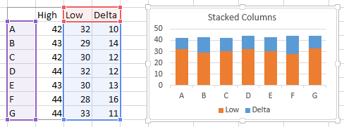
A little formatting gives us all we need. The Low series is formatted to be invisible: no border and no fill. The vertical axis has been rescaled to zoom in on the data and remove some of the white space below the floating bars.
You can change the relative width of the columns and gaps between by selecting them and changing the Gap Width property; a Gap Width of 100 means that the gap will be 100% as wide as a bar. I like to use gap widths of 50% to 100%, and I used 75% in most of the charts here.

With this technique, each column can be selected (it may take two single clicks) and formatted independently of the rest, for purposes of highlighting one or more specific values.
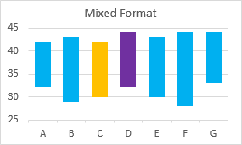
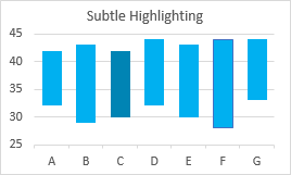
The gold and purple colors above may show extreme highlighting, and were selected to clearly show the different colors. In general, subtle highlighting, like the slightly darker shade of point C or the outlined column of point F are usually sufficient.
Stacked Floating Columns
The stacked column chart allows multiple items to be stacked, since each floating column rests on the lower columns. This table and chart show low, medium, and high values.
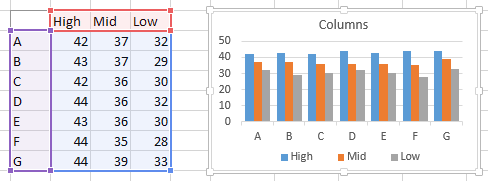
Insert two columns for the two sets of calculations of floating column heights, and plot these with the minimum value.
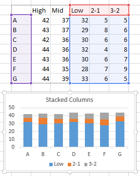
As before, format the lowest column to be invisible, and adjust the axis scale, if desired.
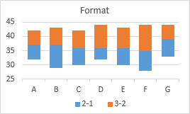
As before, individual columns can be formatted independently of the others.
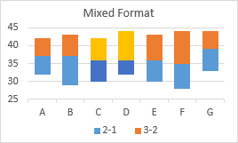
Floating Columns Crossing the Horizontal Axis
If you want to show floating columns that span negative and positive values, you will encounter problems, as shown by this sample data. It all looks fine when we examine the unstacked columns that show the minimum and maximum values.
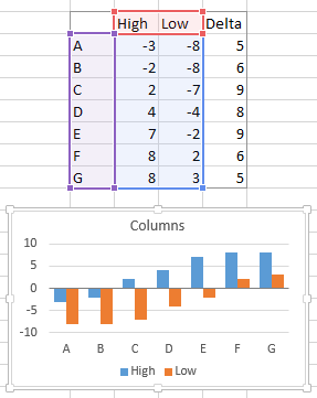
However, when we plot the minimum values and stack the differences on top, we see that the stacking doesn’t work the way we would have liked. Excel plots columns with negative values below the X axis and columns with positive values above the X axis. Even though the Delta begins below the X axis, the Delta column has a positive value, and is plotted starting at zero or at the top of the minimum, if that value is positive.
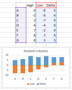
Our simple formulas are not adequate, and we need a different approach. We’ll add three columns to the data sheet: one for the blank columns on which the floating columns will rest, one for whatever part of the floating column is positive (above the X axis), and one for whatever part of the floating column is negative. Using pseudo-references, the formulas we need are:
Blank:  =IF(High<0,High,IF(Low>0,Low,0))
  Pos:  =IF(High>0,High-MAX(Low,0),0)
  Neg:  =IF(Low<0,Low-MIN(High,0),0)
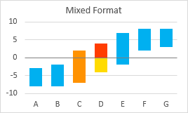
When we plot these values, we get the floating columns spanning the ranges we expect. Note that the floating columns may consist of two pieces, one (orange) below and one (blue) above the X axis, if necessary separated from the axis by the blank series (shown gray in the chart below).
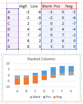
As always, format the blank series to be blank (no border and no fill), and format the floaters as desired.
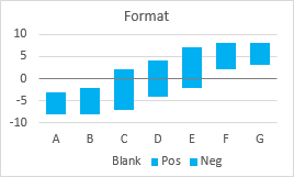
As before, individual floating columns can be formatted independently; the positive and negative portions can be formatted the same or differently.
Overlapping Floating Columns
You may want to show two sets of floating columns. For example, you may want to compare high and low temperatures for a set of dates with the average historical high and low temperatures for those dates. The way to handle this is to have one set of data on the primary axis, and the other set on the secondary axis.
The table and chart below show two sets of high and low values. The blue will eventually be shown on the primary axis and the orange on the secondary.
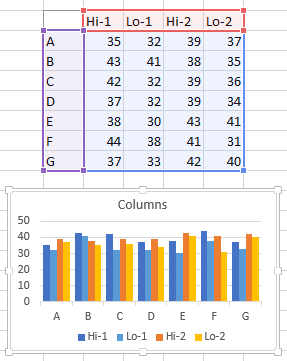
Insert two columns in the sheet, to capture the differences between high and low in the two sets of data. Here are the low and delta of each set in a stacked column chart.
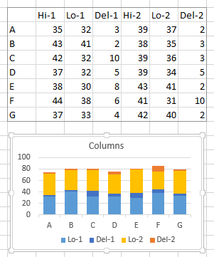
Here is the same stacked column chart, with the orange series moved to the secondary axis. Each axis has its own Gap Width setting. Here I’ve used 50 for the primary axis (blue columns in back), and 150% for the secondary axis (orange columns in front).
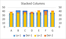
More formatting: Hide the low columns (no border or fill) and adjust the Y axis. Also, delete the secondary vertical axis and if present the secondary horizontal axis. The chart will keep the series for each axis separate (so they have separate gap widths and so they don’t go stacking on each other), but will plot them on the primary axis scales.

Individual columns can always be formatted separately.
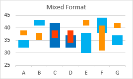
Stacked Bar Charts (Horizontal Bars)
The techniques described above for Vertical Column Charts work the same for Horizontal Bar Charts. This tutorial will show simple floating bars, stacked floating bars, floating barsthat span the vertical axis, and overlapping floating bars, all using stacked bar charts.
Floating Bars
In the data set below, there are several high and low values for the categories in a bar chart. The clustered bar chart shows the values we want to highlight: we want a floating bar to connect each low value to its corresponding high value.
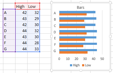
To get the vertical axis labels in your chart to be in the same top-to-bottom order as in the worksheet, follow the approach described in Why Are My Excel Bar Chart Categories Backwards? and in Excel Plotted My Bar Chart Upside-Down.
Note also that in an Excel Bar Chart the vertical axis is the X axis (for the independent variable), and the horizontal axis is the Y axis (for the dependent variable). This confuses a lot of people, so I usually stick to “horizontal” and “vertical” instead of “X” and “Y”.
We achieve this by inserting a column in the worksheet which has a simple formula to calculate the difference between high and low (“Delta” in the table below). Adjusting the data range and changing from clustered to stacked bars shows all we need. The floating bar is resting to the right of the Low value bar.
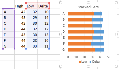
A little formatting gives us all we need. The Low series is formatted to be invisible: no border and no fill. The horizontal axis has been rescaled to zoom in on the data and remove some of the white space to the left of the floating bars.
You can change the relative width of the bars and gaps between by selecting them and changing the Gap Width property; a Gap Width of 100 means that the gap will be 100% as wide as a bar. I like to use gap widths of 50% to 100%, and I used 75% in most of the charts here.
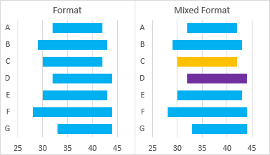
With this technique, each bar can be selected (it may take two single clicks) and formatted independently of the rest, for purposes of highlighting one or more specific values.
Stacked Floating Bars
The stacked bar chart allows multiple items to be stacked, since each floating bar rests on the lower bars. This table and chart show low, medium, and high values.
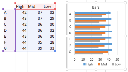
Insert two columns for the two sets of calculations of floating bar lengths, and plot these with the minimum value.
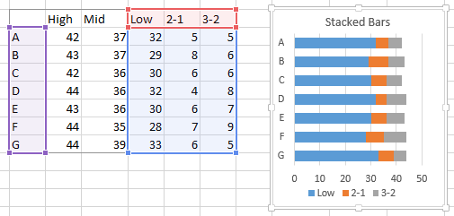
As before, format the lowest bar to be invisible, and adjust the axis scale, if desired.
As before, individual bars can be formatted independently of the others.

Floating Bars Crossing the Vertical Axis
If you want to show floating bars that span negative and positive values, you will encounter problems, as shown by this sample data. It all looks fine when we examine the unstacked bars that show the minimum and maximum values.
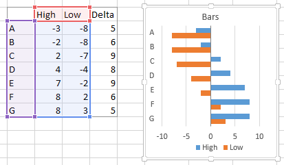
However, when we plot the minimum values and stack the differences on top, we see that the stacking doesn’t work the way we would have liked. Excel plots bars with negative values to the left of the X axis and bars with positive values to the right of the X axis. Even though the Delta begins to the left of the X axis, the Delta bar has a positive value, and is plotted starting at zero or at the right end of the minimum, if that value is positive.
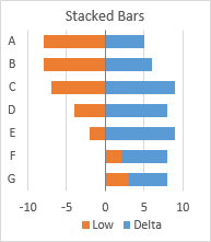
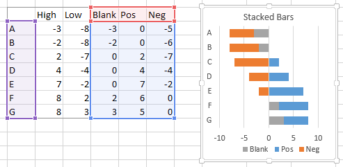
Our simple formulas are not adequate, and we need a different approach. We’ll add three columns to the data sheet: one for the blank bars on which the floating bars will rest, one for whatever part of the floating bar is positive (above the X axis), and one for whatever part of the floating bar is negative. Using pseudo-references, the formulas we need are:
Blank:  =IF(High<0,High,IF(Low>0,Low,0))
  Pos:  =IF(High>0,High-MAX(Low,0),0)
  Neg:  =IF(Low<0,Low-MIN(High,0),0)
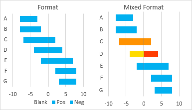
When we plot these values, we get the floating bars spanning the ranges we expect. Note that the floating bars may consist of two pieces, one (orange) to the left of and one (blue) to the right of the X axis, if necessary separated from the axis by the blank series (shown gray in the chart below).
As always, format the blank series to be blank (no border and no fill), and format the floaters as desired.
As before, individual floating bars can be formatted independently; the positive and negative portions can be formatted the same or differently.
Overlapping Floating Bars
You may want to show two sets of floating bars. For example, you may want to compare high and low temperatures for a set of dates with the average historical high and low temperatures for those dates. The way to handle this is to have one set of data on the primary axis, and the other set on the secondary axis.
The table and chart below show two sets of high and low values. The blue will eventually be shown on the primary axis and the orange on the secondary.

Insert two columns in the sheet, to capture the differences between high and low in the two sets of data. Here are the low and delta of each set in a stacked bar chart.
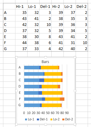
Here is the same stacked bar chart, with the orange series moved to the secondary axis. Each axis has its own Gap Width setting. Here I’ve used 50 for the primary axis (blue bars in back), and 150% for the secondary axis (orange bars in front).
If you used the Upside-Down-Bar-Chart trick to plot the primary vertical axis labels in the same order that they appear in the worksheet, you’ll have to display the secondary vertical axis and apply the same trick to it.
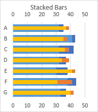
More formatting: Hide the low bars (no border or fill) and adjust the Y axis. Also, delete the secondary horizontal axis and if present the secondary vertical axis. The chart will keep the series for each axis separate (so they have separate gap widths and so they don’t go stacking on each other), but will plot their values using the primary axis scales.
Individual bars can always be formatted separately.

Line Chart Tricks
Excel’s line charts have a few built-in features that can be used to generate floating columns. These include Up-Down Bars and High-Low Lines, which can be combined to create Open-High-Low-Close (OHLC) Stock Charts, and also Drop Lines. Being tied into line charts, these features can only be used to generate vertical floating bars.
Up-Down Bars
Up-Down Bars connect the values of a chart’s first line chart series and last line chart series with floating bars. There are actually two sets of bars: Up Bars, which connect a lower first value to a higher last value (the value goes Up), and Down Bars, which connect a higher first value to a lower last value (the value goes Down).
Floating Columns
For simple floating bars, you need to plot two data series in a line chart.

In Excel 2013, click the Plus icon next to the chart, and check the Up-Down Bars box; alternatively, on the Chart Tools > Design ribbon tab, click the Add Chart Element dropdown, and select Up-Down Bars. In Excel 2007 or 2010, on the Chart Tools > Layout ribbon tab, use the Up/Down Bars dropdown.
The chart below specifically has Down Bars, since all of the values in the last series are lower than all those of the first series.
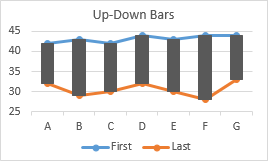
Unlike the Stacked Column Chart technique, we need to carry out no calculations to determine how tall the floating bars have to be, and we don’t need a hidden set of bars on which to balance the floating bars.
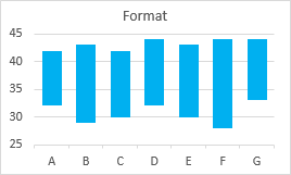
Now apply a little formatting. Format the lines to have no markers and no lines, and give the up-down bars a suitable fill color.
You can change the relative width of the up-down bars and gaps between by selecting them and changing the Gap Width property of one of the line chart series; a Gap Width of 100 means that the gap will be 100% as wide as a bar. I like to use gap widths of 50% to 100%, and I used 75% in most of the charts here.
Mixed Formats: Up vs. Down
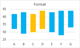
You can’t format individual up-down bars with their own colors, but since there are Up Bars and Down Bars, you can at least format some with one color and the rest with another color.
In the data below I’ve switched the First and Last values for points C and D. The line series cross, so the Last series is greater than the First for these points.
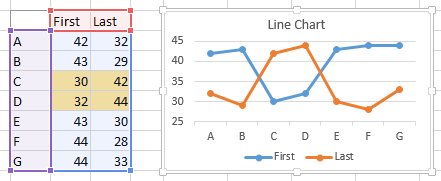
When Up-Down Bars are added, the black Down Bars for most of the points are replaced by Up Bars for points C and D.
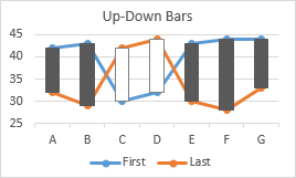
In this way we can assign different formats to highlight selected points.
Up-Down Bars: First to Last
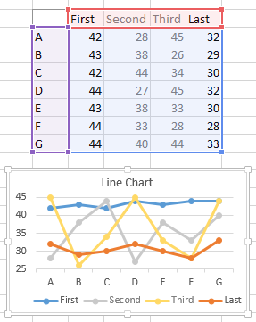
As mentioned before, Up-Down Bars connect the first line chart series to the last, ignoring values in between. In this data set, the earlier First and Last series have had intermediate series Second and Third inserted between them.
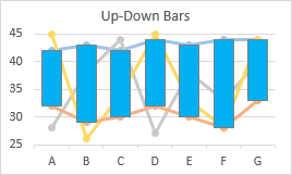
When Up-Down Bars are inserted, they connect First and Last, ignoring any values of Second and Third that may extend beyond First and Last.
Floating Columns Crossing the Horizontal Axis
When dealing with the Stacked Column Chart technique, if you recall, we couldn’t simply use a floating column to span values below and above the horizontal axis. Let’s try this with Up-Down Bars.
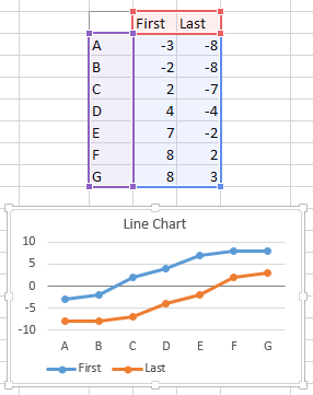
The lines show where we want the bars to appear, and when we add the Up-Down Bars…
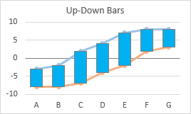
… they go where we want. Again, no calculations required.
Overlapping Floating Columns
We can use Up-Down Bars to generate overlapping sets of floating bars, using primary and secondary axis groups. Here are two pairs of values plotted in a line chart. The Blue series are plotted on the primary axis, and the Orange series on the secondary. The secondary vertical axis has been deleted so that all values are plotted along the primary axis.

One of the primary series is selected, and Up-Down Bars are added.
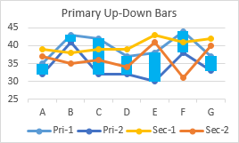
One of the secondary series is selected, and again Up-Down Bars are selected.
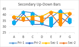
The Up-Down Bars are formatted with different colors, and the line chart series are formatted to use different gap widths as well as no lines and no markers.

As before, individual bars can be formatted as Up Bars among a field of Down Bars. In the table below, first and last values have been switched for points C and D for both primary and secondary series. The line chart series cross…
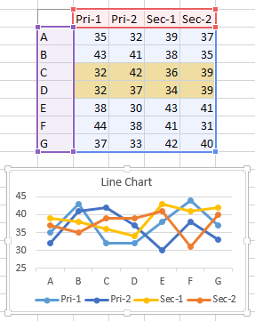
… and the bars have been formatted differently to highlight points C and D.

High-Low Lines
High Low Lines connect the highest and lowest values of a chart’s line chart series using vertical lines. The order of series makes no difference to these lines.
Floating Columns
For simple floating bars, you need to plot two data series in a line chart.
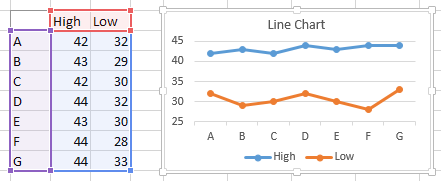
In Excel 2013, on the Chart Tools > Design ribbon tab, click the Add Chart Element dropdown, click Lines, and select High-Low Lines. In Excel 2007 or 2010, on the Chart Tools > Layout ribbon tab, use the Lines dropdown, and select High-Low Lines.
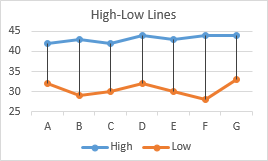
Format the plotted line series with no lines and no markers to hide them, and you’re left with boring black vertical lines.
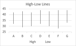
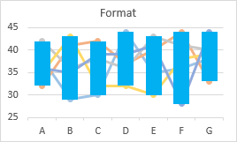
In classic versions of Excel (2003 and earlier) you had limited ability to format such lines, but Excel 2007 introduced the ability to make the lines pretty much as wide as desired. The high-low lines in the chart below are 13.5 points thick, and look a lot like the floating columns produced by the other techniques above.

These lines can be assigned colors and thicknesses, but are not actually rectangular shapes, so they don’t have both border and fill colors.
High-Low Lines: Highest to Lowest
High-Low Lines work by connecting the lowest and highest values at each category. It doesn’t matter where in the sequence the high or low value occurs. In the data below, the highest (blue) and lowest (red) values are highlighted: they are distributed among the columns of data.
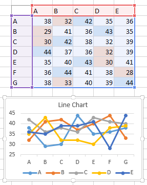
When High-Low Lines are added, they connect high and low, regardless of which series includes the extremes.
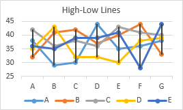
Note that no values are located above or below the formatted High-Low Lines.
Floating Columns Crossing the Horizontal Axis
The Stacked Column Chart technique required tricky formulas to allow a floating column to span values below and above the horizontal axis, while the Up-Down Bar approach did not. Let’s try this with High-Low Lines.
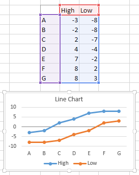
The lines show where we want the bars to appear, and when we add the High-Low Lines…
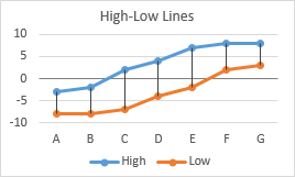
… and format them…
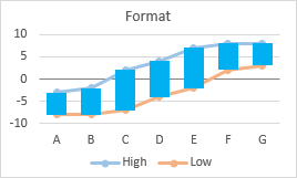
… they go where we want. As with Up-Down Bars, it works easily, no calculations required.
Overlapping Floating Columns
We can use High-Low Lines to generate overlapping sets of floating bars, using primary and secondary axis groups. Here are two pairs of values plotted in a line chart. The Blue series are plotted on the primary axis, and the Orange series on the secondary. The secondary vertical axis has been deleted so that all values are plotted along the primary axis.
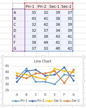
A primary axis series is selected, and High-Low Lines are added.
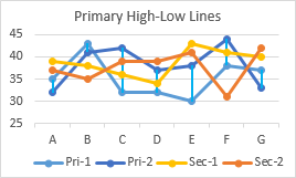
A secondary axis series is selected, and again High-Low Lines are selected.
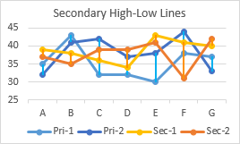
The High-Low Lines are formatted with different colors and line widths (13.5 and 8 pts), and the line chart series are formatted to use no lines and no markers.
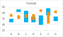
Stock Charts
Up-Down Bars and High-Low Lines were probably introduced into Excel to enable Open-High-Low-Close type Candlestick stock charts. Open and Close are the First and Last series from the Up-Down Bars examples above, and High and Low are, well, High and Low from the High-Low Lines examples. When applied together with the data columns in the appropriate order, simple line charts can be formatted into OHLC charts.
Line Chart Plus
Here is a table with two weeks of stock data and the corresponding line chart.

Add High-Low Lines…

… add Up-Down Bars…
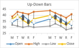
… and do a little formatting to create a candlestick chart. Use no markers or lines for the plotted series, and use your favorite colors and gap width for the Up-Down Bars. I always forget whether black or white bars signify up or down, and green and red make a bad combination for color vision deficient viewers, so I usually use blue for up and red or orange for down.
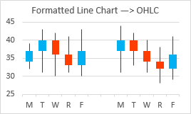
In “Classic” versions of Excel (97 through 2003), the line chart with High-Low Lines and Up-Down Bars was smart enough to recognize itself as a stock chart type, but since Excel 2007, such a chart only considers itself a line chart.
In Excel 2007 and later you cannot combine a stock chart with any other chart type, so you can’t add another series to show how, say, some market index varies in comparison. But you can make your stock chart using a line chart like I did here, then add whatever index lines you want.
Built-In OHLC
Using the same data set, you can directly insert an OHLC stock chart.
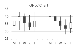
A little formatting, and it’s identical the the line chart stock chart above.
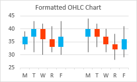
The only difference is that the “official” stock chart can’t be combined with any other data.
Drop Lines
Drop Lines are lines that drop from data points to the horizontal (category) axis in line charts and area charts. Each line or area series in a chart can have Drop Lines, and every point in a series with Drop Lines has a Drop Line. Drop Lines cannot produce floating bars, since they by definition start at the axis, but they are related to these other techniques, and it’s useful to know about them, even if you use them only infrequently.
Column Chart
Here is the simple data and line chart we’ll use for our Drop Lines example.

In Excel 2013, on the Chart Tools > Design ribbon tab, click the Add Chart Element dropdown, click Lines, and select Drop Lines. In Excel 2007 or 2010, on the Chart Tools > Layout ribbon tab, use the Lines dropdown, and select Drop Lines. The lines are thin vertical black lines.

Like any lines in Excel 2007 and later, we have great flexibility in how we want to format Drop Lines. Here I’ve hidden the line series (no markers and no lines) and I’ve given the Drop Lines a width of 13.5 points and a blue/cyan line color, to produce what appears to be a standard column chart.

Error Bars
Line Charts with Error Bars
Line charts can have vertical Error Bars, oriented upwards or downwards of the data points, or both. This technique will work with column and area charts as well, but it’s easier to illustrate with line charts.
Floating Bars
We can use Error Bars with custom lengths as floating bars. Here we have high and low values, shown together in a line chart. There is another worksheet column with formulas that compute the differences (Delta).
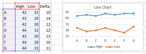
We only need one of the line chart series for our Error Bars. We can plot the High values, and use Minus Error Bars for our floating bars (left), or we can plot the Low values, and use Plus Error Bars for our floating bars (right).
To assign custom values for error bars, first add Error Bars (in Excel 2013, use the Plus icon floating beside the chart; in Excel 2007 or 2010, use the Error Bars control on the Chart Tools > Layout tab). Then under Error Bar Values in the formatting dialog or task pane, select Custom and click Select Values. In the dialog, click in the Plus or Minus box, and select the range of cells with the Error Bar values. If you are only using one of the boxes, you have to explicitly type a zero in the other box, or Excel will not recognize your selection. Stupid Excel.

Hide the line chart series (format with no lines or markers), and format the Error Bar lines to use No End Caps, and appropriate width (here I’ve used 13.5 points) and line color.

Stacked Floating Bars
Here are High, Mid, and Low values along with the computed differences between adjacent points (Upper and Lower). We want stacked floating bars showing the distance between Low and Mid and between Mid and High.

“Aha!” you say, “I’m way ahead of you this time.” Plot the Mid series with Plus and Minus Error Bars (below left), then format the Error Bars as above (below right). But wait, the Plus and Minus Error Bars cannot be independently formatted?

Too bad, but it’s not a big deal. We just need two series, one for each independently formatted set of Error Bars. Here, I’ll plot the High and Low series.
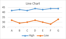
I’ll add Minus Error Bars to the High series, then Plus error bars to the Low series.

Then I’ll hide both series and format the Error Bars.
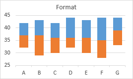
Floating Columns Crossing the Horizontal Axis
When using Stacked Column Charts to generate floating bars, if you recall, we couldn’t simply use a floating column to span values below and above the horizontal axis. But Up-Down Bars and High-Low Lines didn’t care if they crossed the axis. Let’s try this with Error Bars, using the same High and Low values as before.
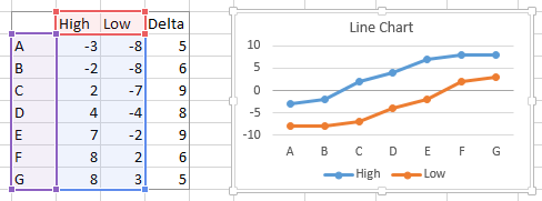
So we try the High series with Minus Error Bars, and the Low series with Plus Error Bars. Both allow the Error Bars to cross the category axis.

Format away.

Error Bars as Drop Lines
Error Bars can also be used to create Drop Lines. Here’s a simple line chart using the Drop Lines data from above.
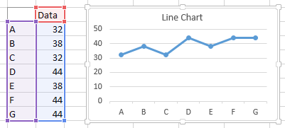
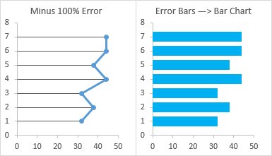
Instead of adding Drop Lines, we can add Error Bars, choose the Minus direction, and a Percentage Value of 100.
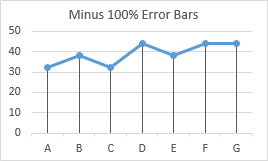
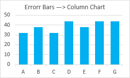
No lines and markers for the data series, no end caps but thick lines and a nice line color for the Error Bars.
XY Scatter Charts with Error Bars
As with the line charts in the preceding section, XY scatter charts can support vertical Error Bars. They can also support horizontal Error Bars. Every trick that works with line chart vertical Error Bars will also work with XY scatter chart vertical and horizontal Error Bars.
Vertical Floating Bars
Okay, we already know it’s going to work, but let’s run through the exercise for completeness. Here is the same High and Low data as before, with numeric rather than alphabetic X values.
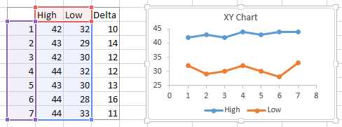
Plot the High series with Minus Error Bars or the Low series with Plus Error Bars…

… a little formatting, and it’s the same as with the line chart Error Bars.

Horizontal Floating Bars
Plot the same data, but exchange X and Y in the chart.
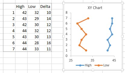
Plot the High series with Minus horizontal Error Bars or the Low series with Plus horizontal Error Bars.
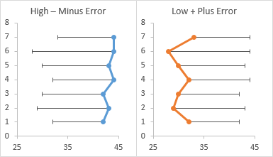
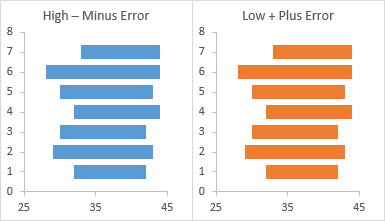
The same as before, but horizontal.
Vertical Drop Lines
We can use vertical error bars on an XY scatter chart to create drop lines. Same data as before, but in a scatter plot.
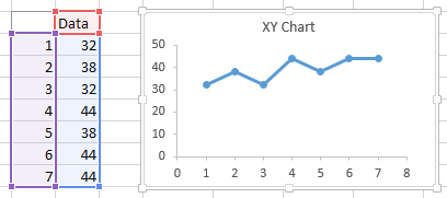
Add Minus Error Bars, using the Percentage Value option, and 100%.
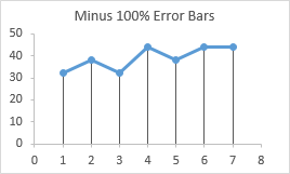
Hide the plotted series and format the Error Bars.
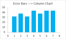
This is the answer to two common Excel-related forum questions:
- How do I get Drop Lines on my scatter plot?
- How can I get a column chart on a value X axis?
Horizontal Drop Lines
Taking the previous data, but switching X and Y…
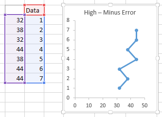
Add horizontal Minus Error Bars, using the Percentage Value option, and 100%, then hide the plotted series and format the Error Bars.
XY Chart Line Segments
A very powerful technique for creating floating bars is using XY chart series line segments. You can make vertical and horizontal floating bars, but you are not constrained to these simple orientations. You can position endpoints of your bars pretty much anywhere in you chart, so the possibilities are limitless. In addition, line segments can be independently formatted, even within the same series of points.
I will use simple examples to illustrate the technique, then set you free.
Floating Columns and Bars
Here are plots showing the same High and Low values for vertical and horizontal floating bars.
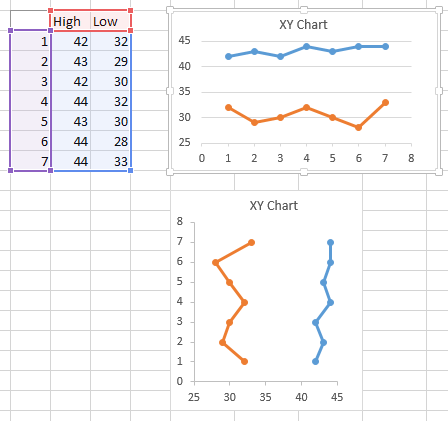
XY chart segments connect points in the same series, not in different series as in several of the techniques covered so far. So we need to arrange the data to plot points in one series, not two.
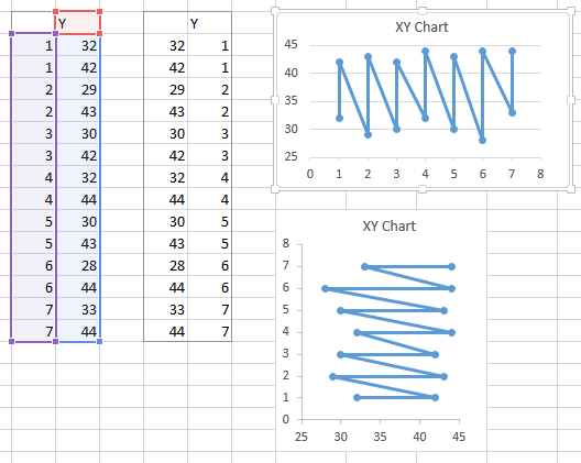
We could use that data, but then we’d have to format the in-between (slanted) segments to use no line color. Pretty tedious after the second or third line segment. But if we insert a blank row between each pair of values, Excel will not plot a line segment across the gap, so formatting will be easy.
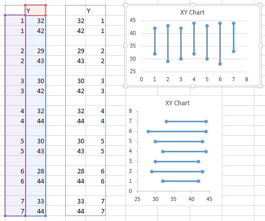
As with the previous techniques using thick formatted lines, we’ll start with out XY scatter chart, and thicken up the lines. The vertical lines are 13.5 points, the horizontal lines, 10.5 points. But we’ve hidden the markers; why are there circles at the endpoints?
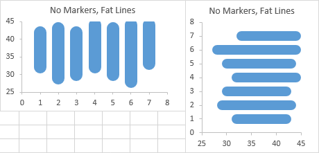
It turns out that Excel’s richly formattable lines have three different “Cap Type” styles. I’ve illustrated them here with small red markers to illustrate their appearance. The Round Cap style has a circular end shape extending beyond the endpoint of the line segment, where the marker is at the center of the circle. The Square Cap style has a square end end shape extending beyond the endpoint of the line segment, with the markers at the center of the square. And the Flat Cap stops exactly at the end of the segment, with the line squared off right at the marker.

We didn’t have to worry about this with the Error Bars, Drop Lines, and High-Low Lines, because their default “Cap Type” is Flat Cap.
The default “Cap Type” for chart series line segments is Round Cap, which makes for nice-looking polygonal plotted lines. But for floating bars, we most likely will want to use the Flat Cap style.
Here are floating bars using vertical and horizontal XY segments and the Flat Cap style.
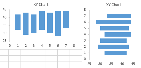
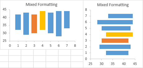
We can select individual line segments (click once to select the entire series, and again to select the particular line segment), and format them independently of the others.
Stacked Floating Columns and Bars
Here is our stacked floating bar data, plotted as separate XY Scatter series for vertical and horizontal floating bars.

Here is the same data rearranged to facilitate XY series line segments for vertical and horizontal floating bars, including the blank rows between pairs of points.
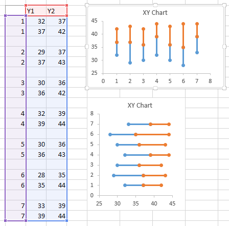
Hide the markers and fatten up the lines, and we’ve got stacked floating bars.
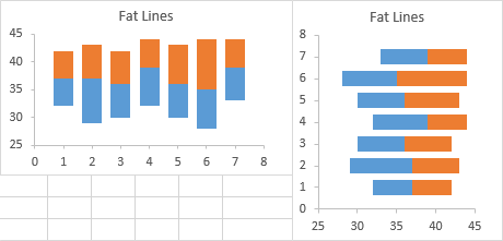
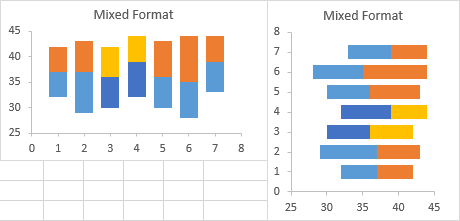
As before, individual bars (line segments) can be formatted independently of the rest.
Fake Axis Tricks
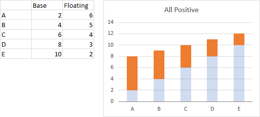
It’s possible to draw your stacked column chart with all values positive (by adding an offset to the Y values of the hidden “Low” (or “Blank”) series, then taking steps to make the axis labels reflect the values minus this offset.
Here is a stacked column chart with all values positive, so no need for the columns to cross the axis. The orange bars are the floating bars, and the semitransparent light blue bars will be made invisible later to provide the illusion of floating.
Here the values go from negative to positive, so some columns will have to span the axis.
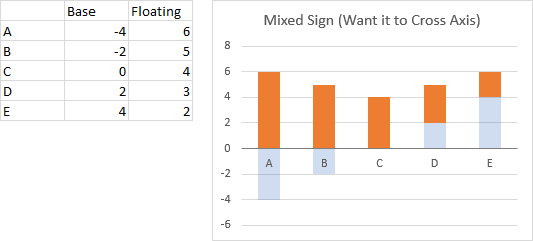
There are a couple ways to proceed. In both cases we add an offset to the bottom series Y values (in this case, we’ll add 6), and plot the stacked columns.
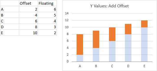
Dummy Series for Fake Axis Labels
We need to add a new series to the chart, an XY Scatter series, with hidden points along the vertical axis, and data labels attached to these points. The date is shown below: X values for the XY Scatter series are 0.5, Y values are at the places we want out labels (in the offset coordinate scheme), and Labels are the actual values we want our labels to display.
Start by adding the dummy series: Copy the X and Y values, select the chart, and use Paste Special from the Home tab > Paste Dropdown, and select New Series, by Columns, Categories in First Column, Series Names in First Row. Excel adds the series as another set of stacked columns.
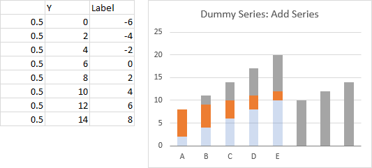
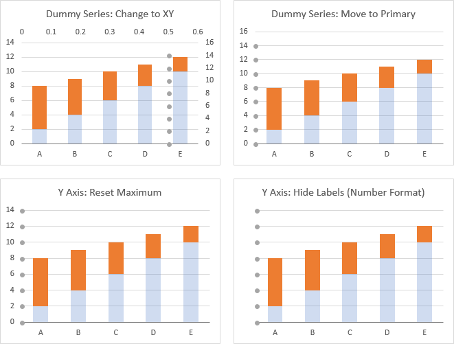
In a few steps we’ll have that cleaned up. First, change the dummy series to an XY Scatter type (right click on the series, choose Change Series Chart Type from the pop-up menu; top left chart below).
Format the new series so it appears on the Primary axis (top right chart below).
The Y axis has changed so the maximum is above the largest X value of this added series, so format the axis to show a maximum of 14 (bottom left chart below).
Hide the Y axis labels: format them and for Number Format, choose something like ” ” (five spaces surrounded by double quotes). This hides the labels but leaves room for the data labels on the XY series without having to drag the plot area around (bottom right chart below).
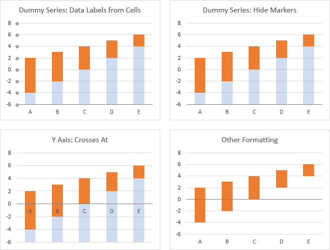
Add data labels to the left of the XY series, and use the Value from Cells option to label the points with the label column of the data (top left chart below).
Hide the XY series by using no markers (top right chart below).
Format the Y axis so the X axis crosses at the point where 0 should appear, which is 6 (the same as the offset added to the Y values (bottom left below).
Finally, clean it all up: for the horizontal axis labels, choose Label Position Low, and change the bottom series fill to no fill, so the orange bars appear to float (bottom right).
That’s not too hard, but it is a bit trickier than using Up-Down Bars, and someone who stumbles upon your chart might not readily understand how the data was plotted.
Dummy Series for Secondary Axis Labels
In this approach we’ll add a line chart series to the secondary axis. The series should use data that spans the values we want the visible axis to display. -4 to 6 will give us the Y range we want, and I’ve generated the data below accordingly.
Begin by adding the new data to the chart: Copy the X and Y values, select the chart, and use Paste Special from the Home tab > Paste Dropdown, and select New Series, by Columns, Categories in First Column, Series Names in First Row. As above, Excel adds the series as another set of stacked columns.
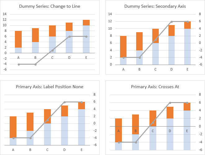
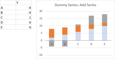 Change the new series to a Line Chart type (top left chart below).
Move the line chart series to the secondary axis (top right chart below).
Hide the primary vertical axis labels by choosing Label Position None (bottom left chart below).
Format the primary Y axis so the X axis crosses at the point where 0 should appear, which is 6 (the same as the offset added to the Y values (bottom right below).
Move the secondary axis labels across the chart by formatting the axis and choosing Label Position Low (top left chart below).
Hide the dummy series by formatting it to have no lines and no markers (top right chart below).
Finally, clean the chart up: for the horizontal axis labels, choose Label Position Low, and change the bottom series fill to no fill, so the orange bars appear to float (bottom chart below).
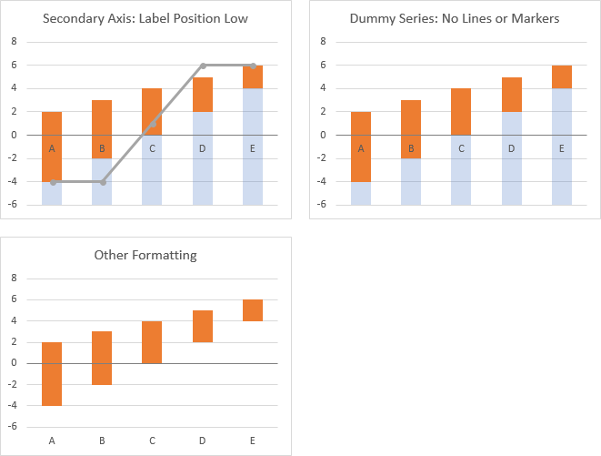
This is still not as easy as Up-Down Bars, but it is probably a bit better than the previous approach which uses fake axis labels.
Summary
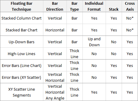
Here is a summary of the Floating Bar techniques discussed in this article.
Most techniques provide vertical bars, a couple horizontal bars, and XY Scatter Line Segments alone produce bars at any orientation.
A few techniques provide actual rectangular bars, which have a border and fill, while many approximate the appearance of a rectangle with thick line segments.
Some techniques allow individual bars in a set to be formatted independently, and some allow easy creation of stacked bars through the use of multiple series.
Stacked column and bar charts do not permit floating bars to cross the category axis, at least not without using tricky formulas to split bars into positive and negative components. The other techniques allow floating bars above, below, or across the axis.


bernat says
good post! didn’t know about flat caps :D
Abhilash VK says
Awesome! I have learnt different methods in excel charts.
Mitja says
This is a monster post :D
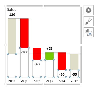
We have come to similar results and are using stacked columns and bars for our waterfalls. You can also fix the problem of crossing the horizontal axis by pushing even the negative values to the positive side with “blanks” series that takes the minimum into consideration. This complicates the labels, axis labels and the calculations for all the involved series. Not sure I explained it well but here is an example (the blank series is selected):
Jon Peltier says
Mitja –
There are lots of tricks. In your chart, aren’t the floating columns plotted on a different axis group than is represented by the horizontal axis? I used to do it that way, but it was too complicated to juggle primary and secondary axes in that manner.
Mitja says
The horizontal axis in this case is a custom axis, not an Excel one. Yeah it complicates the chart quite a bit. It has some benefits tough. One of them is the ability to have only one series for the bars that go from positive to negative (and vica versa). I guess in you case they are split in the positive and negative part. But some other benefits are not so apparent until you start doing things like scaling multiple charts and applying different formatting to the labels.
Jon Peltier says
“The horizontal axis in this case is a custom axis, not an Excel one.”
What does this mean?
Mitja says
We are not using the built in Excel horizontal axis. Instead we are drawing our own.
Cyba says
Thanks for the the variations about floating bars.
Still I have something I can´t create. The graph should show a range of temperatures with a mark for the optimal temperatures within each bar. Using horizontal stacked bar charts is not the problem, but I don´t get the optimal temperature at the right place. Though overlapping bars with error bars would be a solution, but that doesn´t work.
Do you have suggestion?
Jon Peltier says
Do you have sample data and an image showing what “I don´t get the optimal temperature at the right place” exactly means?
Cyba says
Hello Jon,
Here are the data and an image.
The red dots are the “optimal temperature” which I drawed now by hand. Place these temeperatures is difficult, because of the decimal places. Would be nice to do it with Excel.
Thanks!
Jon Peltier says
Cyba –
Here’s the modified data. I inserted column C to calculate the difference between High and Low (“Span”), and I added column F for the Y values of the Optimal points. These start at 0.5 and increase by 1.0.
Select the blue shaded data and insert a stacked bar chart (top left chart). Format the Low series to have no fill and the Span series to have a light gray fill; format either to have a gap width of 0.75; click on the legend, then click on the Low entry, and press Delete (top right chart).
Copy the orange shaded cells, select the chart, and use Paste Special to add the data as a new series, series names in top row, category labels (X values) in first column; it becomes another bar stacked on the gray bar (middle left chart).
Change the series name to Optimal (change the first link in the SERIES formula from F1 to E1); right click on the series, select Change Series Chart Type, and select the XY Scatter type. Note that the secondary vertical axis automatically runs from 0 to 10, so our height data of 0.5 to 9.5 works out perfectly (middle right chart).
Finally hide the secondary axis by setting its labels to None.
You can download the workbook: FloatBarAndMarkers-Cyba.xlsx.
Cyba says
Thanks a lot!
Works perfectly, even with a higher number of data! :) I just needed to adjust the secondary axis to the right number of data to place “optimal” at the right place on the bar charts.
Andre says
Awesome post. Learnt alot !
Tom says
Hi there,
I am trying to do a floating bar chart for angles between -180 to +180 with values spanning not just the vertical axis with positive and negative, but over each end. E.g. +160 to -160. If this makes sense? Do you know if these is possible with excel?
Jon Peltier says
Hi Tom –
You can use stacked columns or bars if you want vertical or horizontal floating bars:
But by using XY data you can get vertical or horizontal floating bars, or by carefully defining your X and Y values for the endpoints, you can get bars with any arbitrary orientation:
Cawas Cooper says
Dear Jon,
Please provide a MS Excel 2010 template that I can use for showing the items listed below in stacked bar chart:
Y axis list of project names.
X axis planned/actual/forecast start and end dates for each project with horizontal bar. OK to have bar in bar or line in bar.
Thanks,
Cawas
Jon Peltier says
Cawas –
Custom templates are something you usually have to get a contractor to construct for you.
sumanta sharma says
How to make a “Chart overlays” incorporating use of range charts and the chart’s secondary axis? here is the sample graph.
Jon Peltier says
Sumanta –
The sample didn’t come across, could you post it in an online image or file repository? (e.g. imgur)
Glenn says
I am trying to create a floating bar chart but the range of the bars needs to be in months. I am charting a list of 9 chemicals we buy through contracts. The bar is showing the start and end of the contract. I can do this with numbers, but not with months.
Jon Peltier says
Glenn –
Horizontal bars? Numerical months, or labels like Jan, Feb, Mar, etc., or actual dates plotted by month?
Simon Carville says
Hi Jon, thanks very much for this guide, I’ve found it very helpful.
I’m creating floating columns, however one issue I’ve discovered is that one of my criteria only has 1 value, which means Delta is zero, and the graph doesn’t draw it, resulting in an invisible column. Is there a way to format this particular column so it leaves a line in place?
David Harding says
Thank you very much. You told me how to do exactly what I need to do.
Willie says
Incredible graphing and learned a lot. I am trying to replicate this graph and I would show the green/yellow/red and actual.
floating horizontal bar with 3 ranges
green 0-70
yellow 71-100
Red 101-200
actual – 65 (red dot)
x axis – 0, 70,100 only
Thanks!
ioncila says
Hi Jon
Following your explanation above to a post (Monday, July 13, 2015 at 7:39 am), I would like your help for this issue:
If I hide a few lines, how do I maintain the position of the shown milestones in the right place?
(I don´t know how to post an image here)
Thanks
Jon Peltier says
Ioncila –
How are you hiding the lines?
ioncila says
Hi Jon
I’m hiding the lines by grouping.
Thanks
Jon Peltier says
Ioncila –
I presume you mean grouping using the outline feature of the worksheet.
By default, Excel charts do not plot data in hidden (i.e., grouped) ranges. Unfortunately the process of grouping may not preserve the placement of milestones, because the values don’t account for hidden rows or columns. You may need to try using some of the subtotal functions, which let you sum values for visible cells only.
ioncila says
Hi again Jon
I think I have found a way to solve part of the issue:
1 – Considering Col F to Height values (1,3,5,…,49). There are 25 items
2 – Create an auxiliar col (G) to order 1 to 25
3 – Create another auxiliar col (H) with = SUBTOTAL (102;G…) for each cell in G range. This will give value 1 to each visible cell and zero to hidden cells
4 – Back to col F, introduce in last cell (say, F25) value 1. in F24 =IF(H24=1,F25+2;1) and so on. Now if I close any group, F visible cell will return 1,3,5,…
What is my problem now:
How to automatically adjust Secondary Vertical Axys to the new range.
I.E. Original range goes from 1 to 49 (1,3,5,…). If I hide for example 6 rows by grouping, it goes from 1 to 37, but axys limits don’t update to the new range.
Can you help?
Thanks
Jon Peltier says
Ioncila –
Change your visible values so that instead of showing a whole number they show a fraction. If the values i go from 1 to N, use a formula like (i-0.5)/n.
Now change the axis minimum to 0 and maximum to 1.
ioncila says
Hi Jon
Thank you for your replies.
I realize something new:
With the help of this macro, I am “almost” able to update automatically all Axys and so update milestones placement.
———
Option Explicit
Private Sub Worksheet_Change(ByVal Target As Range)
If Intersect(Target, Range(“A1:M50”)) Is Nothing Then Exit Sub
Application.EnableEvents = False
Call ChangeAxisScales
Application.EnableEvents = True
End Sub
Sub ChangeAxisScales()
Dim objCht As ChartObject
For Each objCht In ActiveSheet.ChartObjects
With objCht.Chart
‘ Value (Y) Axis
With .Axes(xlValue, xlPrimary)
.MaximumScale = ActiveSheet.Range(“A1”)
.MinimumScale = ActiveSheet.Range(“B1”)
.MajorUnit = ActiveSheet.Range(“C1”)
End With
With .Axes(xlValue, xlSecondary)
.MaximumScale = ActiveSheet.Range(“D1”)
.MinimumScale = 0
End With
End With
Next objCht
End Sub
—————-
The thing is that, everytime I group/ungroup, I still need to refresh a cell in Range(“A1:M50”) to macro update axys and milestones placement.
I´ve been searching for some VBA code to run this macro when I group or ungroup, but no success until now.
Can it be done?
Thanks
Ioncila
Jon Peltier says
Ioncila –
When you group or ungroup, you’re not really changing the worksheet. Any changes that you see are formulas which have recalculated, but any actual cell contents are unchanged.
Try the Worksheet_Calculate procedure instead of Workcheet_Change.
JJohn says
Hi Jon, this is incredibly helpful. I’ve read through and worked to get floating bars (my goal) with the sample dataset you provided. The problem I’m having is changing the orientation of a line graph from horizontal to vertical. You do that often in the examples beginning around the middle of the webpage (“Horizontal Floating Bars”) and your instructions refer to that as “taking the previous data but switching X and Y.” I feel silly but I am having a tough time making that work. I’m using Office 2010. I’ve tried simplifying the data and copy/pasting the columns so that the Y data column precedes the X data. I also have tried right-clicking on the chart and choosing Select Data and then Edit. A YouTube video on this showed three options to edit, the label, the X and the Y. My Excel menu only gives me the Series Name and Series Values. I had a co-worker who knows Excel well take a look at it and he and I did all the stuff we thought would work. Is there something I might have overlooked? Can you explain that step you took of ‘switching X and Y’ in more detail? Thanks –
JJohn says
Hi, I’m updating my comment from Jan 25, 2017 to say that I figured out what I was doing that was screwing me up. I was trying to change the X & Y on the wrong type of chart. I found the correct info in part by re-reading your original blog, so thank you again!
Jon Peltier says
JJohn –
Sorry, I thought I’d replied to your comment, but apparently I never clicked the button. From your description I know you weren’t working with an XY chart (the dialog “only gives me the Series Name and Series Values”). I just never published my reply.
Frank Nitsch says
Excellent article! Thank you very much for the comprehensive overview. :-)
Jess says
Jon,
Can’t thank you enough. Realizing this is probably easy for you – the tricks above were just what i needed to get the charts i wanted. Your response to the comment above about how to add the circle identifying a specific point within the floating bars was the cherry on top!
Sandra says
Very useful tips, thank you, Jon!
AM says
Hi Jon / JJohn,
I am facing the same problem as you JJohn – I am unable to switch the X and Y axes to create a horizontal floating bar chart. What am I missing? (My current chart is a simple line chart, wherein the lines go from left-to-right, and not top-to-bottom).
Jon Peltier says
AM –
You cannot switch X and Y in a line chart. You can only switch X and Y in an XY Scatter chart.
Dek says
Hello,
Many thanks for these chart ideas. However, I do not understand something: in your “Stacked Floating Columns and Bars” section, you have an example with “Hi” “Mid” and “Low”. I tried to recreate the example but I find it impossible to get the horizontal floating bars !! All excel automatically gives me are the vertical bars. I then find it impossible to rotate so as to get horizontal bars, with “1, 2, 3, …, 7” on the vertical left axis and the “25, …, 45” on the horizontal bottom axis. Can you please help ? Many thanks
Dek says
Just to clarify: the only chart type that gives the same graph as yours is the “Scatter with straight lines” chart. I am not sure why you say to use the “stacked” line charts as they to not work for me as the numbers, instead of stopping at 45, go up to 90 in the vertical axis and the numbers are doubled in the horizontal axis (1,1 ; 2,2; etc.). When I use the scatter chart I do not have these problems and get the same exact result as you, BUT only vertical ! I am using excel 2013. Many thanks
Jon Peltier says
Dek –
I should clarify: Those charts use XY Scatter series, not Stacked Line. The top chart is easy to create; the bottom one requires you to separately specify three series using the first column (1, 2, 3, etc.) for Y values and the other three (Low, Mid, and Hi) for X values.
Tina says
Is there a way to make a floating bar graph where, rather than categories, the vertical axis uses values as well? Thanks!
Jon Peltier says
Tina –
Under “XY Scatter Charts with Error Bars” in this article, see “Horizontal Floating Bars”.
Alternatively, under “XY Chart Line Segments”, see “Floating Columns and Bars”.
Tina says
Thank you so much for your help! Another quick question – in these instructions, you simply say “exchange x and y in the chart”. I’m sure I’m simply missing something, but Excel will not allow me to use multiple columns for the x variable. How should I go about this? Thanks again!
Jon Peltier says
Tina –
You have to edit each series separately. You can do this by editing the series formula, or in the Edit Series Data dialog.
IF says
Ok, here’s a challenge:) I have a spreadsheet to track lab results over time. The data itself is pretty basic: a list of appx 100 lab test variables (Glucose, Sodium, Cholesterol, etc) with a Goal/Target reference range for each one, which runs down the left side, and a list of dates across the top (also have a completely transposed version). Each time tests are done, the results are entered in the date column. There’s also a total of 100 date columns set up to accept and calculate new test results.
*If there was a non-macro way to automatically add new columns/rows (and fill/update), rather than have a pre-set number of cells, that would be amazing… but that’s a different topic.
The fun part: For any areas of concern, I start a new sheet and insert a line chart so I can see trends. It’s a rolling line chart that automatically plots the 5 most recent test results for the specific variable(s) selected.
The dilemma: For any real value, I also need to see the Goal/Target range on the chart. I know there’s a method using stacked columns to create a floating horizontal band, but every version of that method (that I’ve found) requires three additional values (high, low, and the difference between them) to match each instance of entered data. In my case that means 3 cells for every individual variable, for each date they were tested (appx 300 additional cells per testing date).
The question: The reference ranges for each variable really don’t change over time… I only need to plug in the High & Low value once for each one. Is there a way to use those two values to create the range/floating band… somehow get the chart to interpret two values as a series rather than having to add three additional values for every single data point?
I feel like I’m missing something simple… It’s basically just a high/low range on a chart, right?
The interim solution is to create a separate sheet just for all the new calculations, which has turned out to be more of an elaborate project than expected:/
Thanks for the help!!
Jon Peltier says
IF –
Excel doesn’t mind the extra columns for adding the data for the floating band, and it doesn’t bother me. But I know it can seem like these effects take up much more worksheet real estate than the original data. Below I’ll show my usual way to add the bands that uses all the data, and an alternative way that uses much less data.
Here’s the way I add a floating band, which adds two stacked column series, Min and Span (Span equals Max minus Min). The stacked column series each contain as many points as my original line chart data.
In the charts below:
1. Plot the original data in a line chart.
2. Add the Min and Span data to the chart using columns with as many points as in the original data (Excel adds them as additional line chart series).
3. Convert the Min and Span series to stacked column types.
4. Format: Make Min transparent (use no fill color), make Span partially transparent so gridlines show through, make the Gap Width of either of these series 0%, so adjacent bars touch each other, forming a continuous band across the chart.
Here’s the alternate approach.
1. Plot the original data in a line chart.
2. Add the Min and Span data to the chart using one cell for Min and one cell for Max (Excel adds them as additional line chart series with one point each).
3. Convert the Min and Span series to stacked column types, on the secondary axis (Excel adds a secondary vertical axis).
4A. Fix the axes: Add the secondary horizontal axis, and delete the secondary vertical axis (shown in the 4th chart below).
4B. Format the secondary horizontal axis to hide it: change Axis Label position to None, change the Line Color to No Line (happened between the 4th and 5th charts below).
5. Format: Make Min transparent (use no fill color), make Span partially transparent so gridlines show through, make the Gap Width of either of these series 0%, so the bars stretch from the left edge to the right edge of the chart, forming a continuous band across the chart.
IF says
GENIUS. What I had been doing was basically the same as your first method, which worked, but required so much useless data… and made it a little more complicated to make future revisions. Your alternate approach was EXACTly what I was looking for:)
Where do I donate??
Jon Peltier says
IF –
I used to have a donate button on this blog many years ago, but it’s been gone for a long time.
If you really feel strongly, perhaps you’d like to check out my Excel charting add-in, Peltier Tech Charts for Excel. It’s more than the usual donation amount, but it’s the gift that keeps giving. I use it every day, numerous times.
IF says
Oh my… I just looked through the list of features for the Tech Charts. If I had any idea what even 10% of those things were, I’d buy two copies!! Way out of my league haha. For now all I can offer is my guilt for years harvesting free information from your blog:/
Jon Peltier says
No problem.
Todorov says
Hi Jon,
I have got this PDF with values within range, range extends further (black lines). All bars are lined up equal.
I wonder if you have an idea how this might have been created.
I would like to be able to plot those bars vertically by listing several of those bars, each representing different time (date) when the values were measured. Overall this would give a great visual tool to determine the trend of development over time.
Snapshot below:
C:\Users\TodorovK\Desktop\Value in Ref Range.jpg
Todorov says
Sorry, Snapshot did not come through.
How do I edit my previous post to add the required snapshot.
Jon Peltier says
Todorov –
You can post the screenshot on a file sharing site (Imgur.com works well for me) and comment with the link. I’ll fetch the image and post it with your comment.
Todorov says
Thanks Jon,
I will rephrase my comments from above, just so I make it a bit more clear.
I have received a .pdf file, which is an export from an Excel worksheet. What you see is what should be on the Excel worksheet.
The meaning of the text is not important, so please ignore the theme, scientific, medical or else.
I like the design of presenting the data ( description or variable, if outside of range flagged with “L” for low or “H” for too high, bars designating the range and outside of range as well as actual value).
The lab producing this PDF export from Excel are no use contacting to obtain the source Excel template.
I would like to build Excel spreadsheet, having the same concept, except bars are vertical. Each adjacent bar (to the right) would be the new value for same variable but for another (follow up) date. This way as time goes by I can just add the new reading/ value and create an overview of previously measured values/ data.
Are you able to point how this might have been created in Excel?
Snapshot link of concept below:
https://imgur.com/a/xj4QI
Thanks Jon
Peter Sandiford says
Hi Jon,
I’ve been trying to see if you have ever created floating horizontal bars with data labels over the point where the two horizontal bars meet in the middle. It would be useful for presenting results with 95% confidence limits where the midpoint between each of the bars is labeled above it. I tried using stacked horizontal bars but I can only get the data labels in the middle of one bar or another. I’ve tried error bars but they don’t looks as good.
You help is most appreciated. You are the world expert on this stuff.
Peter
Jon Peltier says
Peter –
For these labels, I would add an XY series to the chart that places a point right at the junction of the two floating bars, and apply the data label to that point.