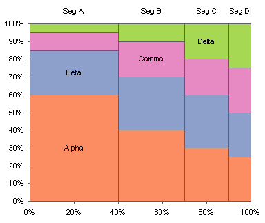
Last week I posted a tutorial showing how to make Marimekko Charts in Excel. Marimekko charts, at first glance, are a neat, compact way to show how a handful of segments are divided into subsegments. The segments may be industries or markets, while the subsegments may be companies or divisions doing business in each of these segments.
Of course, nothing is ever as good as it seems, is it? The comparisons that can be readily made in a mekko are the widths of each segment, and the heights of each subsegment within a segment. These comparisons are not as easy as it seems, however, because the objects being measured do not share a baseline: each item serves as a platform for the next item in the set.
Comparisons which are difficult are between subsegment items in different segments, for example, Beta in Segment A vs, Beta in Segment B, or Gamma in Segment B vs. Beta in Segment C. The comparative values are encoded in the area of the objects, but the baselines are different in one or both directions and the aspect ratios of the rectangles are different.
Comparisons which are impossible are between the sum of subsegments, for example, the total of all Beta subsegments vs. the sum of all Gamma subsegments. In this case it’s an easy comparison, but in general it is not trivial.
Stephen Few of Perceptual Edge pointed out the deficiencies of a Marimekko Chart in A Design Problem. I encourage my readers to visit Steve’s thoughtful analysis and his straightforward solution. I suspect we’ve known what the solution is all along.
The underlying problem with the Marimekko chart is the assumption that since all the data is in a single graph, it is the best way to show the data. Sometimes, however, it’s better to use multiple charts to show multiple sets of data.
Steve has solved the problems of the mekko by creating four column charts. Two charts simply show the totals of the segments divided in either dimension, for example, totals by company and by market segment. Two additional charts subdivide the columns in the first two charts into their constituent parts, showing market segments within companies and companies within market segments.

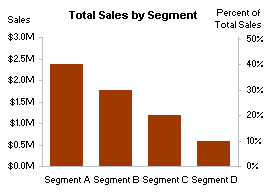

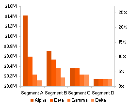
Steve’s approach is elegant, except perhaps for the excess of repeating axes and the discrete nature of the four separate charts. I made an attempt at cleaning this up, carefully overlaying the subsegmented bars onto the segmented bars.
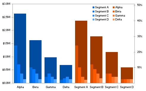
This approach clears up the duplicate axis labeling, but I’m not sure it’s any easier to digest.
My final attempt simply condensed Steve’s four charts into a two-by-two panel chart.
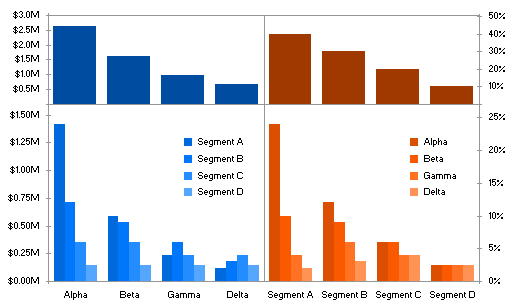
This is arguably cleaner, and just as clear, as Steve’s four charts. It also uses a neat trick to show a split legend which I will describe in an upcoming post.
Update 6 March 2009
I have written a few tutorials on how to create these Marimekko alternatives:


Hadley says
There is one feature that is easier to see in the mosaic plot – whether or not the two categories are independent.
Jon Peltier says
Hadley –
Do you have an example?
Liu 's chart blog says
It is complex ,advanced ,and skillful, thanks .
but I think it has no business character,does anyone really create this chart in real business situation ?
Colin Banfield says
The most telling statement in Stephen’s article is: “…and displayed them in a way that relies on our perceptual strengths, instead of our perceptual weaknesses.”
If we all understood and appreciated the meaning behind those words, there would be higher quality visualization products out there. Obviously, the originators of Mekkos had no clue about perceptual strengths and weaknesses when they designed a chart that, perceptually, ranks lower than a pie chart.
I’ve used the overlay approach in the past, but now favor separating the charts. Overlaying isn’t all that bad – the main problem being that the color behind the clusters can make the cluster members harder to read…
Jon Peltier says
Liu –
Marimekkos are used widely, particularly in marketing and strategic planning. What prevents their being used more widely is that they are hard to make.
Jon Peltier says
Colin –
“[T]he originators of Mekkos had no clue about perceptual strengths and weaknesses . . .”
The same could be said about the originators of many of the “professional” charting packages currently available, as I discussed in my posts about the Stacked Pyramid Chart and Funnel Chart.
I agree that the charts are better when the data is shown in separate panels, rather than having thin subsegment columns overlaying thick segment columns.
Hadley says
@Jon – It’s hard to find something accessible to non-statisticians. Have a look at , (or maybe and let me know if it makes sense to you.
I’d also be interested to know why you call them marimekko plots. A google search seems to reveal far more relevant hits for mosaic plots rather than marimekko plots. And it also avoids the difficulty of using a trademarked term in a plot name.
Colin Banfield says
“Marimekkos are used widely, particularly in marketing and strategic planning.”
I’d love to meet someone who uses this chart to understand how and why they find them more effective than the alternatives you’ve shown.
“What prevents their being used more widely is that they are hard to make.”
Perhaps we should be thankful. LOL! But if someone insists, it’s good to know that can come here to see how it’s done….Perhaps this difficulty will be “fixed” in Excel 14.
Jon Peltier says
Hadley –
I’ve seen these statistical mosaic plots, and I have to admit that after the first two levels of subdivision, I find them pretty hard to follow. They become more like tree diagrams, but somehow I find tree diagrams easier to swallow.
I call them Marimekko charts because that’s how they were presented to me the first couple of times I encountered them. Probably some unimaginative statistician thought the name Marimekko was too colorful, and started calling them mosaic plots. Or perhaps the Marimekkos grew out of marketing, where the similarity to the fabric was obvious, while the mosaics grew out of more rigorous (i.e., black and white) disciplines.
Speaking of trademarked chart names, I understand that ‘trellis chart’ is a trademarked phrase. The term ‘panel chart’ was invented to sidestep the trademark.
Jon Peltier says
Colin –
“. . . why they find them more effective . . .”
I’ve had this discussion with a marketing guy. He wanted mekkos, nothing less. He didn’t care that bar charts were easy to make and easy to read. He didn’t care that mekkos were hard to make and easy to break, or that they were easily misinterpreted. He Had-To-Have Marimekkos.
So I made him a template with a big old Marimekko chart, using a technique much more tedious and fragile than the one I posted last week. He loved it.
Rod McInnis says
I see Marimekko used quite frequently to demonstrate categorized market share now that I work for a consumer focused company. I spent years working for manufacturers & tech companies and I never saw one at any of them. Stephen Few’s shoe industry example if fairly typical.
So where did they name Marimekko come from anyway? I have always wondered but could not find the origin quickly online.
Hadley says
@Jon – agreed, static mosaic charts are generally hard to follow. That’s why most research focusses on their interactive use in combination with simpler bar charts etc. Unfortunately, it’s hard to learn how to use them to their best advantage without apprenticing yourself to an expert and looking over their shoulder while they work. We really need to do better at creating more screencasts and videos to show how to use these powerful but intimidating tools.
I wonder how long they have been used in marketing. The canonical reference in statistics is
J. A. Hartigan and B. Kleiner. Mosaics for contingency tables. In Computer Science and Statistics: Proceedings of the 13th Symposium on the Interface, pages 268–273, Fairfax Station, VA, 1981. Interface Foundation of North America, Inc. I suspect this is probably earlier than marimekko plots, because it’s certainly before the ready availability of colour graphics.
I don’t point this out in order to claim primacy for statistics, but unless related disciplines talk to each other then people up reinventing the wheel and making unnecessary mistakes.
Jon Peltier says
Rod –
From Wikipedia:
Marimekko is a Finnish company based in Helsinki that has made important contributions to fashion, especially in the 1960s and 1970s. They are particularly noted for brightly-colored printed fabrics and simple styles. . . . Marimekko was founded in 1951 by Armi and Viljo Ratia, when Armi asked some artist friends to apply their graphic designs to textiles.
Rod McInnis says
Thanks Jon. I learn something new ever day.
These really are just rectangular pie charts. Enough said.
Steve Kearley says
I wonder if these types of charts would be useful for depicting variations in a claims lag or percentage-of-completion table. Those tables, to me, present a challenge not only in spotting trends, but depicting them for management to see. Any ideas?
Jon Peltier says
Steve –
Could you post a link to an example of such a table?
Steve Kearley says
Hopefully, this link will work. This is a replication of a typical lag table I deal with. There are 3 years worth of data, (I cut it down from 6 years) arranged by Month of Service against the Month of Payment. Tables like these are often used for calculating IBNR, incurred-but-not-reported expenses.
The sheet is in 3 sections at this point. The first section shows dollars. Then I do a calculation to get a percentage of completion. Finally, I have a calculation to derive a 6 month average. This allows me to see if the specific month of payment, say the first month, is going up or down.
Thought about using one of these dynamic type charges where I could scroll through showing how the percentages change over a 12-months at a time. I have used an area chargt that shows trends over time–again it will be more useful if I could roll the selected 12 months by moving a spinner. The more manual part that throws me initially is having the data that needs to be the source arranged diagonally. Not to mention whether this is the best choice of chart. Of course, this is one worksheet of several types of lags that have to be analyzed, but, back to my main question: what chart or charts might help depict trends better. The second part of the analysis I am doing is trying to show the impact of say a change in percentages from Jan-Jun and what that will do to cash flows. That’s really the main point–but again, manual.
Sorry for the long post (I’ve been at this for a while now!)
http://spreadsheets.google.com/ccc?key=pqZR0t7LxFYKoVsTUTf7tUA
Jon Peltier says
Steve –
I’m not sure offhand how I’d show your data. The grid already takes up two dimensions, and I don’t know how to add the values to the grid. One could break it into a lot of individual line charts, or maybe a stacked area chart, where each series is the collections for expenses incurred in a given month, plotted against the month the expenses were paid.
Steve Kearley says
I do appreciate you taking the time to look. I was thinking about the multiple line charts or perhaps, multiple lines representing a six month trend, for instance. The lines would themselves stacked over one another might show the trends of the averages.
Thanks again for the time.