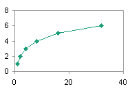
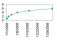
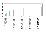
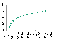
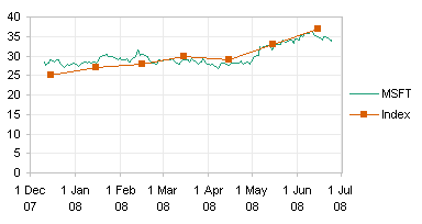
There has been a lot of discussion here lately about XY and Line charts:
- Line Charts vs. XY Charts
- Line-XY Combination Charts
- Category Axis Tricks for Line and Area Charts – 1
- Category Axis Tricks for Line and Area Charts – 2
- Order of Points in XY and Line Charts
Many of these posts have described differences between XY and Line charts. One difference that’s been mentioned but not examined is that an XY axis recognizes the complete numerical value of its X data, while a line chart only recognizes whole number (integer) categories. Even if you use a Date-Scale X axis in a line chart, the dates are treated as categories, and you can only plot a point on a date, not on a time between midnight and midnight.
To investigate the behavior further, let’s look at fractional data, that is, dates with times. This data set contains a few points per day (midnight, noon, 6pm; not uniformly spaced) over several days.

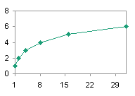
The XY chart plots the X values perfectly proportionally to the values of time between the points.

The line chart with a category axis spaces the points uniformly in the horizontal direction, despite the not-quite-uniform spacing of the X data, because the category-type axis treats the dates and times merely as text labels, without any intrinsic numerical value.

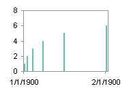
The line chart with a date-scale axis is an interesting case, because all points for a given date are plotted at midnight at the beginning of that date. This is because the X axis is a category axis after all, and the integer values of the date-time X values, that is, the dates, are used as the numbers of the categories.

If the data is plotted twice in a combination chart, first as a line chart series to provide the line chart date-scale axis, second as an XY chart series, we see both behaviors at once.

In Line-XY Combination Charts I described how to make a Line-XY Chart that used a line chart’s “nice” date-scale axis. The same technique is used in the previous chart. Although the category axis is defined by the line chart series, the XY series is not constrained by the whole-number-only restriction.
Excel 2007 Note: This behavior is broken in Excel 2007. A Line-XY Combination chart using a date scale axis imposes the whole-number-only restriction on the XY series. You can still make the combo chart work, but the XY series must remain on the secondary axis, which means (a) you must manually make sure that the primary and secondary axes agree, and (b) the secondary axis is no longer available for other effects you may have wanted to apply.
If you want to make a combination chart that uses an XY series in conjunction with a chart type that uses a Category-type X axis (Line, Column, Area), knowing that the category labels have effective X values of 1, 2, 3, etc., makes it easy to position the XY data points. Suppose I have a column chart with quarterly data, and I want a target line. The quarterly data is shown in columns A and B below, and the data for an XY series that shows the target is shown in columns D and E. The X value of 0.5 is where the left edge of the chart is located (the axis crosses between categories zero and 1), and the X value of 4.5 is 4 categories further right of the first point.

Start with a column chart.

Copy the XY series data, select the chart, use Paste Special to add the data as a new series.

Right click on the new series, and change the series chart type to an XY type (not a line). Usually Excel will provide secondary axes for the new series, depending on the chart types of existing series in the chart.

Format the series so it is plotted on the primary axes. Note the endpoints coincide exactly with the edges of the chart.

Format the XY series so it has a line only, no markers (this could have been done by choosing the XY chart subbype that uses lines and no markers). Adjust the legend or remove it altogether. Add a data label to one or both points of the XY series using the Y Value option if desired.


