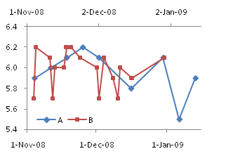
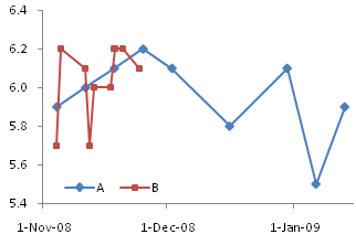
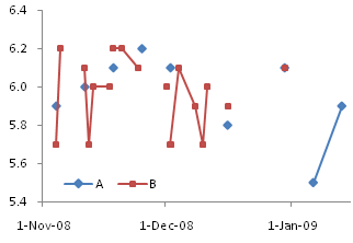
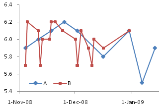
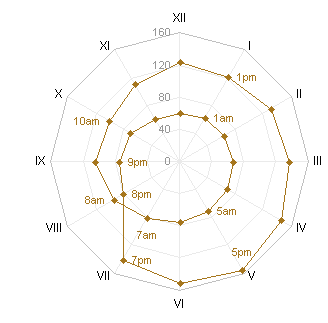
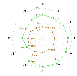
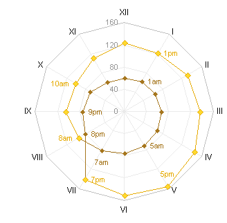
In Excel, the difference between Line charts and XY charts has nothing to do with formatting the data with or without lines, and everything to do with different behavior of the X axes in the charts. I’ve written about these differences numerous times, in X Axis: Category or Value?, Line Charts vs. XY Charts, Line-XY Combination Charts, and in innumerable forum and newsgroup posts.
Comparison of Line Charts and XY Charts
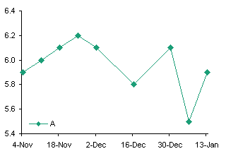
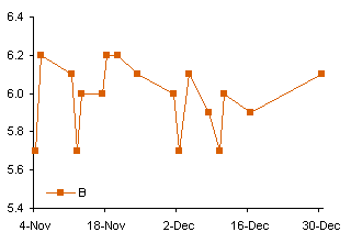
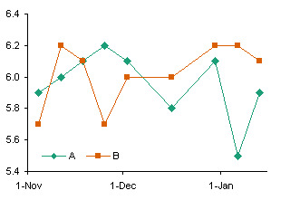
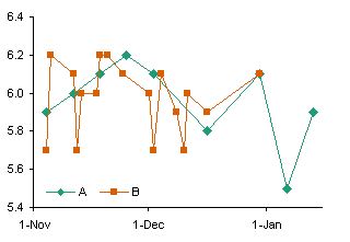
Essentially, the difference is that Line charts plot X values as nonnumerical categorical values, like {A, B, C}; XY charts treat X values as continuously varying numerical values. Here is a brief comparison of the two chart types:
| Line Charts | XY Charts | |
| Nice date scaling (e.g., first of each month) | No special date scaling | |
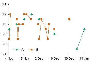
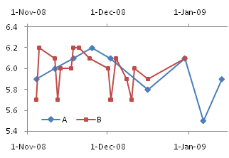
| Integer values only: Data plotted directly on category or on integer day numbers (midnight at start of each date) | Continuous values: Data plotted anywhere along axis (e.g., any fractional time of day, not just midnight) | |
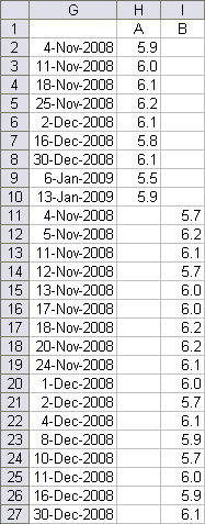
| All series use same X values (same dates or categories) | Each series uses independent X values | |
| Identical series formatting: lines or no lines, markers or no markers |
Identical series formatting: lines or no lines, markers or no markers |
|
| Only vertical (Y) error bars can be applied | Vertical (Y) and horizontal (X) error bars may be applied | |
A Typical Line Chart
A user is simply trying to create an XY scatter plot in Excel where the X axis values as shown in the example below can be maintained as-is on the final graph’s X axis points:

This data is perfectly suited for a line chart.
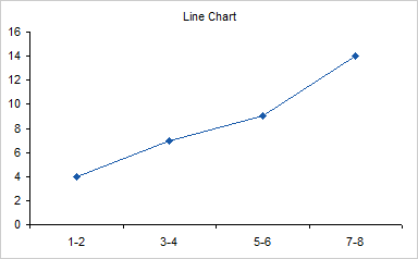
When you try to use the data in an XY chart, Excel ignores the non-numerical X values, and substitutes counting numbers, 1 for the first category, 2 for the second, etc.

For some reason, the user is insisting that a scatter plot is used, and all they want is the X axis to end up exactly as the line graph is formatted. I suspect this is due to a lack of understanding of the axis differences above, but I’ll never know, because this user is someone else’s client.
Making an XY Chart Mimic a Line Chart
An XY chart can be used to display this data, but it is a poor second choice. The tricks that are needed to make an XY chart display the nonnumeric labels like a line chart make the fake labels static, and they must be rebuilt if the amount of data expands, or if rows are inserted or deleted.
But I understand users, so here is the second option, which is what he thinks he wants, not what he needs.
We need to adjust the data. Since the Line chart X values are unsuited for an XY chart, we must insert a column of valid X values. To accommodate the Line chart style axis labels, we will use a dummy XY series along the X axis, which serves as placeholders for data labels which will look like the Line chart labels. The dummy series uses the column of zeros.

Select the yellow shaded range, and make an XY chart.
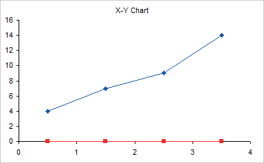
Hide the standard X axis labels but maintain the margin beneath the axis by using custom number format of ” ” (space character). If you simply format the axis with no labels, the plot area will be too close to the bottom of the chart, without leaving room for the dummy labels.
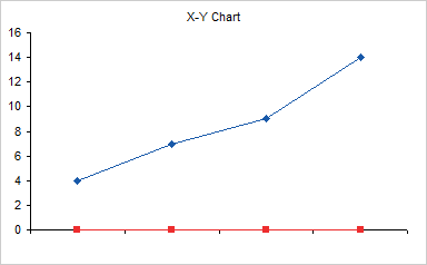
Use Rob Bovey’s Chart Labeler (a free utility that is indispensable for creating and manipulating custom labels) to label the dummy series. Apply the labels in the first column of the data (not shaded yellow in my example) to the “Label” series.
Each label remains linked to its cell. If the chart stays at 4 points using the same range, the labels will update as these cells are changed. Stretching the range or inserting/deleting rows will force you to rebuild the axis.
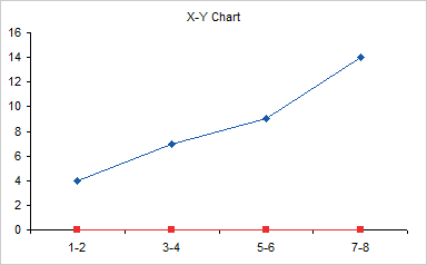
Finally hide the “Label” series by formatting it without markers or lines.
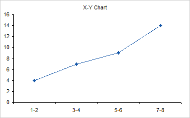
That’s a long way to go to mimic a completely dynamic Line chart with an XY chart which may need subsequent maintenance if the data changes. The wrong wrench, as we say, to hammer in the wrong screw.
Peltier Tech Update
Last week I had the pleasure of attending the Juice Analytics Viva Visualization tour at the Juice Boston Tea Party. They served breakfast, then presented their take on data visualization. Basically, they remind us to send a message, keep the visualization simple, put it in context, and follow good design fundamentals. We’ve heard the message many times before, but it’s worth retelling, especially by these experts who build solutions for big clients. Among the takeaways are:
- Don’t let novelty obscure the data.
- Don’t let visuals obscure the data.
- Choose the right chart type.
There is a lot of great content on the Juice web site and blog, including a guide for choosing the right chart.
The Learning As You Go blog has a nice article about plotting highly skewed data, at Graphing Highly Skewed Data. The article covers use of secondary axes (a bad idea), breaks in the axis (also a bad idea), logarithmic axis scales (okay if users understand log scales), and multiple charts. This article is a response to a discussion started by Chandoo in How do you make charts when you have lots of small values but few extremely large values?


