Several years ago I helped someone who was having trouble with a fitted trendline in an Excel chart. I saved the example, because I knew I’d have a blog someday, and I’d need a topic. I will use this example to describe a number of errors people encounter when fitting data. The errors are listed in the order they are likely to be realized, not in the order of severity.
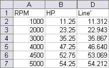
The person had a motor, and had measured horsepower (HP) at particular rotational speeds, in RPM (revolutions per minute). The data is charted and tabulated below:
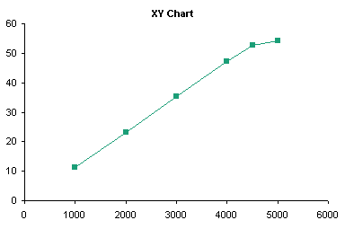
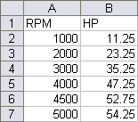
Note: Some versions of Excel have problems performing statistics on some data sets. For the most part, Excel is adequate for this purpose, particularly if the data aren’t “extreme” (a statistical term) and if the data is not overfitted.
Applying a Trendline
Adding a trendline is straightforward. The easiest way is to right click on a series, and choose Add Trendline from the context menu.
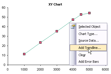
This pops up a dialog from which you can select a type of trendline to fit to the series, as well as choose options for the trendline. This dialog also appears when you right-click on an existing trendline and choose Format from the context menu, with an additional tab for patterns (to format the line). The specifics of this dialog are a topic for a different discussion.

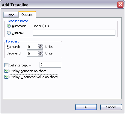
The added trendline is dumped onto the chart, obliterating details in its vicinity.
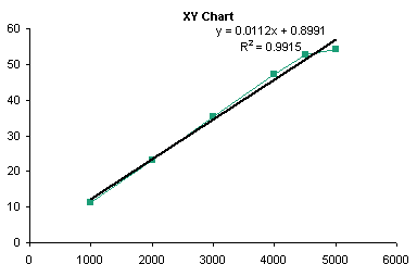
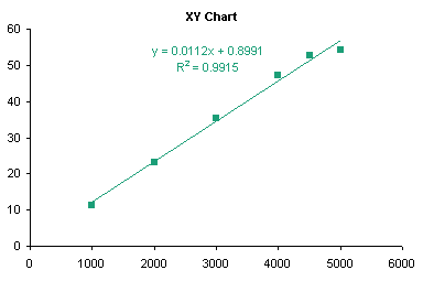
You can right click the trendline, choose Format, and make it much more presentable. Below I’ve formatted the trendline and trendline formula to match the line series, and changed the line series to display markers only.
Trendlines are really valid only for charts with a numerical category axis, such as an XY chart, or a line chart with a date-scale axis.
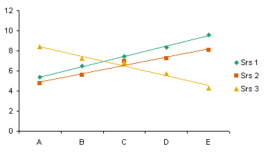
You can add trendlines to a line chart; Excel makes no value judgments here. Note that the categories are not numerical, and a trend between discrete categories may be meaningless (e.g., Cat, Dog, Ferret, Goldfish). I discuss use of trendlines on the wrong chart types in the next section.
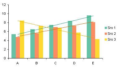
You can also add trendlines to a clustered column chart. Note that the trendlines don’t necessarily match up with their corresponding columns, but with the center of the cluster (centered over the category labels). This adds to the confusion of non-numeric categories.
You can even add trendlines to a horizontal bar chart, but their usefulness is even less than that of trendlines in a line or column chart.

You cannot add trendlines to a stacked series: the command is disabled.
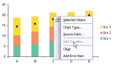
For qualitative purposes of illustration, I’ll show how to add trendlines to this type of chart. You must promise never to use them for evil purposes. Note that each trendline captures the variability of not only its respective series, but all other series stacked beneath it.
In the sheet, calculate the sums of the first series, then the first and second, then the first, second, and third series, etc., and add them to the chart as line chart series, formatted below as markers without lines.

Apply trendlines to the unstacked line series, format the trendlines, format the line series to display no markers, and remove all the unneeded entries from the legend.

You cannot add trendlines to a 3D chart: the command is disabled. This is Yet Another Reason not to use 3D charts, when will you ever learn?

Error 1: Wrong Chart Type
The first problem that many people encounter when fitting a trendline is caused by using the wrong chart type. The person who asked about fitting this data didn’t make this mistake, but this is a fine place to illustrate it.
In Line Charts vs. XY Charts I described differences between XY and Line charts. For our purposes here, suffice to say that XY charts treat both X and Y data as continuously variable numerical data, while line charts treat the X values as non-numerical text labels, and if necessary, treats them using the counting numbers 1, 2, 3, etc.
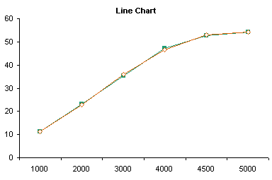
The first mistake people make while fitting trendlines to charts is when they start with a line chart. Notice the X values: The axis doesn’t start at zero, and although the differences between adjacent numbers are not all the same (some differ by 1000, others by 500), the spacing between labels is constant.
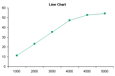
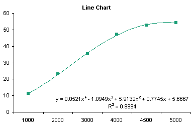
In this chart I have applied a fourth order trendline to the data, removed the lines between the points, and formatted the curved trendline to match the series. The fit doesn’t look too bad, but as I pointed out, the X values are not appropriate for the fit.
When the coefficients and actual X values are plugged into the trendline formula, we get the following actual HP values and fitted values (“Line”).
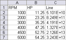
The calculated values are way too high: 5.1E+10 is 51 billion. The RPM values (1000 through 5000) were plugged into the formula, but it was calculated by Excel using the counting numbers 1 through 5. The fitted data matches the actual pretty well.
I discussed trendlines on other improper chart types (clustered and stacked column and bar charts) in the preceding section.
Error 2: Wrong Precision
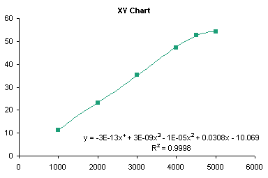
The following shows the trendline for the same data in an XY chart. It fits the points pretty well, with a little curvature even over the lower few points, which seem like they should fit a straight line.
When we plug the RPM data and the fitting coefficients into the trendline equation, we get the following horrendous match.


This illustrates the second mistake people make. They accept the trendline formula from the chart without thinking about the coefficients. Notice the second through fourth order coefficients above (-1E-5, 3E-9, and -3E-13): these are shown with only one significant digit. That’s a miscalculation waiting to happen. Select the trendline formula, and apply a scientific number format with lots of digits, and you’ll plainly see the source of the error.

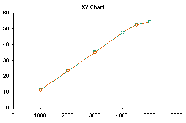
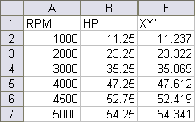
Here are the actual and fitted data points: much better.
Error 3: Manually Transcribing Coefficients
If you want to use the trendline coefficients in the worksheet, there’s a better approach than manually transcribing data from the trendline formula to cells. Excel has a function called LINEST which performs linear regression calculations. Select a range 5 rows tall and N+1 columns wide, where N is the order of the regression, type this formula in the top left cell, and array-enter it by holding Ctrl+Shift while pressing Enter:
=LINEST(B2:B7,A2:A7^{1,2,3,4},,TRUE)
If you’ve entered the formula correctly, Excel signifies that it is an array formula by enclosing it in curly braces (typing them yourself will only produce an error):
{=LINEST(B2:B7,A2:A7^{1,2,3,4},,TRUE)}
B2:B7 is the range of Y values, A2:A7 is the range of X values, A2:A7^{1,2,3,4} signifies that the X values are to be raised to the first through fourth powers for the regression. For more details on the formula and the results (below), refer to the help files.
The first row of the resulting range contains the coefficients, from fourth power to constant. The first cell in the third row contains the fitted R². These are identical to the coefficients in the XY chart’s trendline formula.

Error 4: Overfitting
I noted earlier how the first several points look like a straight line fit. Below I’ve computed the straight line fits for the first 5 points (blue dottedline) and the first 4 points (dashed red line). These lines fit all but the last point nearly perfectly.
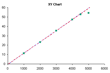
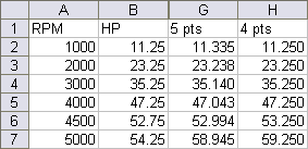
This illustrates another error people make when fitting trendlines: overfitting. A 4th order polynomial fit has no physical significance in any model I’ve ever heard of. It makes a “nice” curve, but is valid for interpolation only, for purposes of looking up intermediate values along smooth curves. First and even second order fitting may have some reasonable theoretical basis, but if the data curves systematically, you should consider applying logarithmic, exponential, or trigonometric transformations to your data prior to calculating a trendline.
Error 5: Ignoring the Physics of the Problem
This leads to my third point. One should not blindly apply statistics without first using one’s own trained eyeball. Yes, your eye may see patterns that are not there, but your eye can be better than statistical techniques at analyzing results. The high correlation of the 4th order fit (0.9998) might lead one to believe that the HP is truly proportional to RPM to the 4th power. A quick glance led me to look at the first part of the data, up to 4000 or 4500 RPM, which looked linear. It felt good in my gut that horsepower increases linearly with RPM. Then as RPM exceeds some threshold value, something breaks down. I don’t know what it may be, but I know where I would look. I would take multiple measurements in the 4500-5500 rpm range, to see whether I get a smooth curve, perhaps approaching some maximum HP asymptotically. Perhaps there is some slipping in the linkage, or some thermal effect from friction, or some deformation in the mechanism. The point is, don’t let a seemingly nice statistical fit prevent you from noticing what your eye is seeing, and always consider some real physical mechanism underlying the data.
Summary
To avoid errors in the use of trendlines, one should follow this approach:
- Consider the system under analysis. Does it lend itself to a curve fit? Do you know anything about the system that suggests a particular physical relationship?
- Consider the type of fit and the purpose for the fit. Is the fit used to make the chart “look nice”? A poly fit is probably fine. Are you using the relationship to interpolate between known values? A poly fit is probably fine, unless you know the relationship is logarithmic, exponential, or power law. Will you try to interpolate beyond the existing data? Not generally wise, especially using a polynomial fit.
- Use LINEST to get coefficients into the worksheet. This is easier and generally more reliable (subject to certain caveats) than manually transcribing coefficients from the trendline formula label in the chart.
- Use an appropriate chart type. This almost always means use an XY chart. You can get away with using a line chart (particularly with a date-scale axis), so long as you understand what the categories mean.
- Apply a suitable number format to the trendline formula. Generally a scientific format with lots of digits (14 or 15 digits) will provide sufficient resolution.
Related Trendline and Regression Articles
- Trendlines and Chart Types in Excel
- Add One Trendline for Multiple Series
- Trendline Calculator for Multiple Series
- Choosing a Trendline Type
- Plot Two Time Series and Trendlines with Different Dates
- Polynomial Fit vs. Statistical Process Control
- Moving Averages
- Stacked Column Chart with Stacked Trendlines
- Deming Regression
- Deming Regression Utility
- LOESS Smoothing in Excel
- LOESS Utility for Excel

