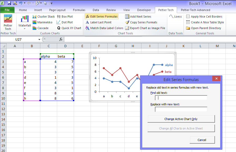
Ever have a situation where you have spent time getting your chart or charts to look nice, then try to use different data ranges in these charts? You’ve discovered that there’s no easy way to approach this change. At least there’s no easy way built into Excel, but there is a utility that can make the task easier.
Scenario 1
You’ve made a gorgeous chart of the data in Sheet1. You copied the chart from Sheet1 to Sheet2 so you could plot Sheet2’s data in the same splendor. And you hit a snag: the chart on Sheet2 refers back to Sheet1’s data. There are two ways to correct this:
- Create a copy of Sheet1 including the chart, so the chart on the copied sheet refers to the data on the copied sheet. Then copy Sheet2’s data and paste it over the copied sheet’s data.
- Edit the series formulas of the copied chart in Sheet2, changing all instances of one sheet name to the other. This becomes tedious if there are multiple series in the copied chart, or if you’ve copied multiple charts.
Scenario 2
You’ve charted data in rows 1 to 100 of your worksheet. Then you’ve updated the data so it reaches down to row 150. Your wonderful chart only shows data down to row 100. There are three ways to correct this:
- Before updating the data, convert the data range to a List (Excel 2003) or a Table (Excel 2007). Then update the data. The list/table will expand to include all of the data, and all formulas that refer to all rows in the list/table will update accordingly. This includes the chart’s SERIES formula.
- Create dynamic named ranges for the X and Y data ranges in the chart, and apply them to the chart series. This is described in Dynamic Charts in this blog and in a number of Dynamic and Interactive Chart examples described in this web site. However, this is an involved procedure that you never have time for.
- Edit the series formulas of the chart, changing all instances of one row number to another. This becomes tedious if there are multiple series or multiple charts to correct.
Scenario 3
Your charts show the data for product Alpha beautifully, but you want to show the data for product Beta instead. The data is listed in another column. You can:
- Select the series, then drag the highlighted rectangles on the worksheet to reflect the new data range. This becomes a laborious process for multiple charts and series.
- Edit the series formulas of the chart, changing all instances of one column to another. This becomes tedious if there are multiple series or multiple charts to correct.
The Solution
These suggested means for editing your charts all leave out one approach. In Change Series Formulas I showed how to programmatically change the series formulas in your charts. I’ve just recently updated the utility to account for glitches in Excel in Change Series Formula – Improved Routines.
The Change Series Formula Utility
These new algorithms have been incorporated into the Change Series Formula function of the Peltier Tech Charts for Excel 3.0, both Standard and Advanced Editions.


