|

|
|
Dynamic and Interactive Charts.
Introduction
Dynamic Charts
Alse see Dynamic Charts on the PTS Blog.
Worksheet Controls for Chart Interactivity
VBA Chart Interactions
Note for Excel 2007 users:
- Techniques using named ranges will fail if the names of the ranges begin with the word "Chart".
Use names like ChtValues instead of ChartValues.
|
How do you create a chart from a data range that will frequently change in size? Perhaps you collect weekly data, and would like the chart to automatically expand as each week's data is entered.
This page shows how to construct such a dynamic chart.
Contributed by Debra Dalgleish, Excel MVP
Top of Page
|
|

How do you create a chart from a data range that may change in size? There are many cases in which you would like the chart to automatically expand as new data is entered. Here is yet another example showing how to construct dynamic charts.
Top of Page |
|

You want to create a chart that shows the last twelve months of data. But how do you create a chart from the latest data in a range that grows, without having to manually update the source data range every month? Here is an example showing how to construct a dynamic chart to update automatically.
Top of Page |
|

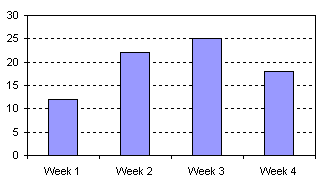
Often it is desirable to plot multiple series so that their values are normalized to an initial value of, say, 100. This is particularly useful when comparing performance of stock prices on a relative basis. This article shows how to use dynamic ranges and dynamic charts to display normalized values.
Top of Page
|
|
Would you like to let someone decide what series to plot on your chart? Here are examples showing how to use a Combo Box (Dropdown Box) or Checkboxes to let the user decide what series to display.
Top of Page
|
|

A parallel coordinates chart, or profile plot, is a useful way to compare several sets of observations (here, one set per quarterback) of a combination of different factors (offensive categories). The entire population, or at least a broad set of data, is generally shown in a subdued color (the gray lines in the chart) while one or more individuals are highlighted for inspection (the blue and red lines).
Top of Page
|
|
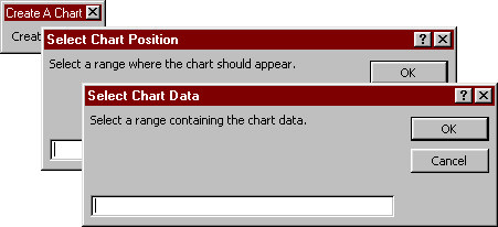
Choose on-the-fly where you want your chart to be drawn, and where to find the data you want to plot.
Top of Page
|
|
|


