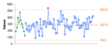
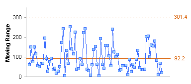
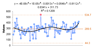
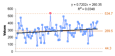
I’ve been working on a Statistical Process Control project for a client, building a workbook to automate construction of control charts. Years ago I wrote a tutorial called Introducing Control Charts (Run Charts). Many processes, in manufacturing, in business, or in nature, show fluctuations in their outputs. We can use Statistical Process Control (SPC) techniques to monitor these processes and ensure the fluctuations stay within expected limits.
I was looking for data to proof out the tool I was building, and I thought I could use my weight as a decent data set. My wife bought a new digital scale in 2006, and I’ve been weighing myself almost every day since then. And being an Excel jock, I put my measurements into a spreadsheet.
In the chart below, you can see how I fluctuated around 200 lb for over a decade. Then 20 months ago my wife and I joined Weight Watchers, and over the course of 6 or 8 months I lost 40 lb.
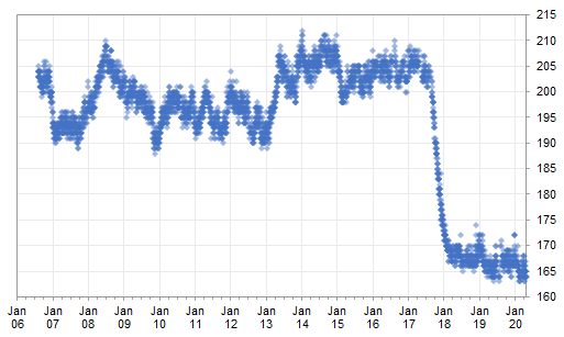
I thought looking at the past few months would be a good way to illustrate the use of SPC to track a process. This exercise will construct a series of control charts of this data.
Learning about Statistical Process Control
I first learned about Statistical Process Control as a practitioner and as a trainer, while employed as a scientist/engineer for a large manufacturing corporation. One of the resources we had was a deceptively small book called Understanding Variation: The Key to Managing Chaos by Donald J. Wheeler.
Understanding Variation: The Key to Managing Chaos
by Donald J. Wheeler
There are many other information sources about SPC and control charts. The National Institute of Standards and Technology (NIST) has an online Engineering Statistics Handbook, which has a chapter on Univariate and Multivariate Control Charts. Wikipedia has brief articles with many references covering SPC and Control Charts. And Google shows about 1.2 billion results for SPC and 0.5 billion results for Control Charts.
Getting Started
Prepare the Data
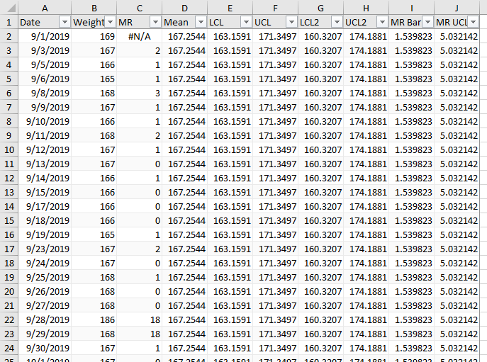
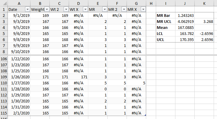
The first step is to identify the data and get it into a form where it can be analyzed. I decided to track from 1-Sept-2019 to 1-Feb-2020. Below is the top of my data worksheet, with a few calculations. The data is in three columns of an Excel Table named Table_1. The first two columns are date and weight, manually entered. The third column is Moving Range (MR), which we will use as a measure of variability in the data. The formula in cell C2 and filled down the Table column is
=IFERROR(ABS([@Weight]-OFFSET([@Weight],-1,0)),NA())
Essentially it determines the absolute value of my change in weight from one day to the next. Any error in the calculation (such as trying to subtract the column header) returns NA(), or the #N/A error.

I’ve calculated some values in a range beside the table, and I’ll explain them as I go along. The little table below the calculations show the formulas I’ve used. I’ve also named these cells as indicated, to make it easier to use the cells in formulas.
Chart the Data
The next step is to plot the data. I’ve made two charts, one of my weight, the other of the calculated moving range. We look first for any obvious issues in the data, such as the spike late in September. If you look at the data above, apparently I gained 18 lb one day, and lost it the next. A more likely explanation is that I transposed digits in 168 and instead entered 186 in the worksheet. I’ll deal with this data issue soon, but for now I’ll continue with the SPC construction.
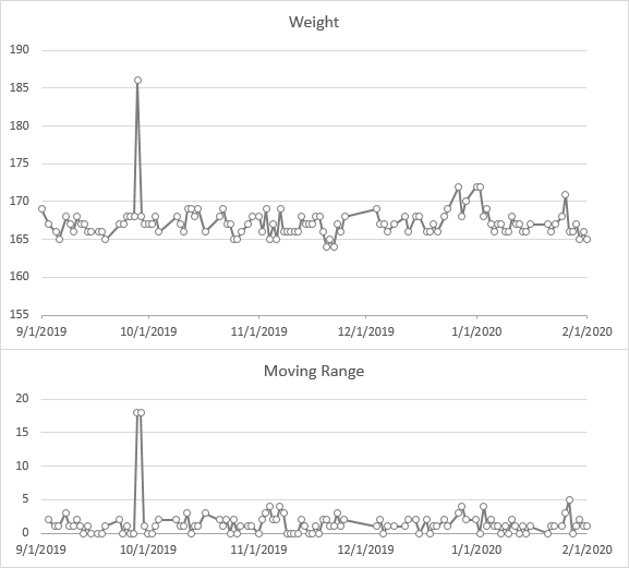
I added the calculated items as columns in my Table to make it easier to chart them. Having named the cells, I could use simple formulas in the Table: =Mean in cell D2, =LCL in cell E2, etc.
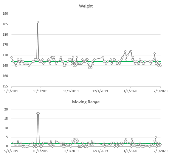
Among my calculations are averages of the weight data (Mean) and of the moving range data (MR Bar). Let’s add these as green horizontal lines to the weight and MR charts for reference.
Compute Limits
So far, so good. Now let’s add a measure of “allowable” or “acceptable” variation. If the process is following statistical rules and its variability follows a normal distribution, we would use multiples of sigma, the standard deviation, to identify limits. According to the definition of a normal distribution, 68.3% of values fall within ±1 standard deviation of the mean, 95.5% fall within ±2 sigma, and 99.7% fall within ±3 sigma of the mean. By convention, 3 sigma is commonly used to identify acceptable variations.
We could measure the sample’s standard deviation (SD) directly, multiply it by 3, and use this to determine our limits. But using moving range is more robust, since outliers and non-normal distributions have a greater effect on sigma than on moving range.
The average moving range, or MR Bar, is used to calculate control limits. Less commonly, the median of the moving range is used to compute these limits.
First we determine MR UCL, which is the Upper Control Limit on the moving range, by multiplying the average moving range by 3.268. This is plotted to the moving range chart as a horizontal orange line (bottom chart below). We would expect 99.7% of our MR values to fall below this limit.
In the same way, we calculate the UCL and LCL (Upper and Lower Control Limits) of our individual data. We multiply MR Bar by 2.67, and add it to or subtract it from the mean to get our limits. These are plotted on our chart of individual values as horizontal orange lines (top chart below). Again, we expect 99.7% of our individuals to fall between these two lines.

These charts of measurements along with means and limits are called Control Charts. The chart of individual values is called an I Chart (no, not “eye chart”), and the moving range chart is the MR Chart. Together they are referred to as an IMR (sometimes ImR) Chart.
Our ±3 SD limits are shown in the dashed red lines below (they are calculated as LCL 2 and UCL 2). They fall pretty far outside the MR-based control limits. All points fall well within the SD-based limits, except for the one obvious outlier.

In fact, because the outlier causes two excessive moving range values, the MR-based limits are also too wide, and would lead us to accept points that would otherwise be out of control.
Clean Up Special Cause Variations
Special and Common Cause Variation
The spike in my weight in September is a “special cause” variation, because it is a one-off problem. Since it is obviously not a valid measurement, we can attribute it to a recording error, and ignore it. We want to remove this value from our moving range calculations, since it resulted in limits which were too wide.
The other variation we see in the timeline is “common cause” variation. It comes from variations in inputs, like exercise, meals, and other factors, which are themselves subject to normal variation.
Clean Up the Data
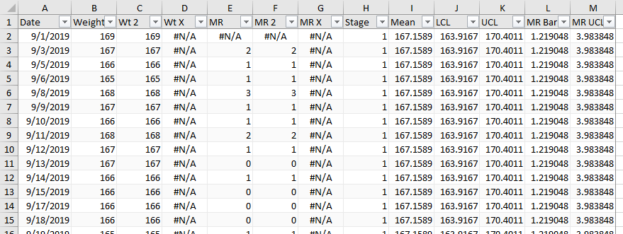
In my adjusted table below (Table_2), I’ve added two columns. Wt 2 simply repeats the data in Weight, using the Table formula =[@Weight]. I can replace any special cause deviation with =NA() or #N/A in this column. MR 2 uses the same formula as MR, based on the Wt 2 column:
=IFERROR(ABS([@[Wt 2]]-OFFSET([@[Wt 2]],-1,0)),NA())
Where there was one bad weight and two bad moving ranges, we now have #N/A values in the table, which we can ignore in the chart and in our other calculations.
Plot the New Data
When we plot our individual and moving range values, the chart scales now show much narrower ranges, and there are no longer any obvious outliers: there is one high individual value and corresponding moving range in January, a few low weights in November, and a few high weights in December.
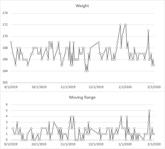
Let’s add our means and control limits, and see what we have. The MR chart shows the outlying value in late January, and four more moving range values that are just at the limit. In the individuals chart, the low values are within the limits (“in control”) while the high values we eyeballed before are above the UCL (“out of control”).
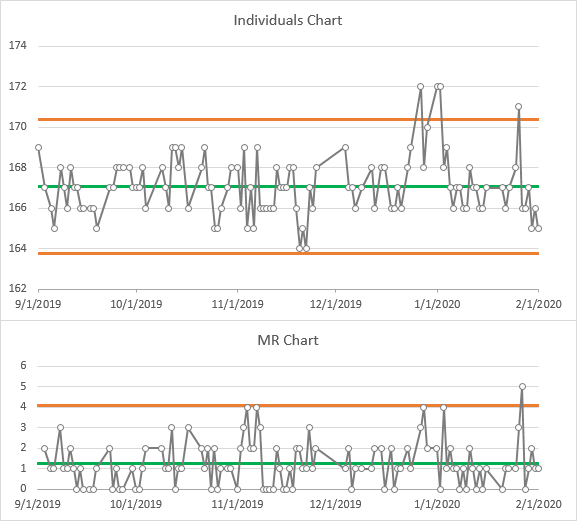
When values are out of control, we have to examine the process, to ensure that nothing is wrong with our process, and that nothing has changed. I can actually explain some of the variations. On Thanksgiving, I ran a “Turkey Trot” with my daughter, so for a couple weeks I was running more than my usual 3 miles a day: thus the few low values in November. And of course, the few values of 172 coincide with the Christmas and New Year’s holidays.
Standard Deviation vs Moving Range
Below I’ve plotted the SD-based limits along with the MR-based limits. The limits are much closer to each other and closer to the mean than when the outlier was included in the calculations.

Here I’ve plotted these control limits as calculated with and without the outlier. The outlier had a substantial effect on the limits, especially on the SD limits.

When the variation fits a normal distribution, the two sets of limits are close together, with the MR-based limits wider sometimes and the SD-based limits wider other times. The larger the data set, the closer they will be.
For the rest of this analysis, I’ll ignore sigma and stick to MR-based calculations.
Highlighting Outliers
Enhanced Data
We can enhance our IMR Chart by highlighting points which are out of control. I’ve added two columns to my table to support this. Wt X has this formula
=IF(OR([@[Wt 2]]<=LCL,[@[Wt 2]]>=UCL),[@[Wt 2]],NA())
which shows the value from Wt 2 if it falls outside the control limits, and #N/A otherwise. MR X has this formula
=IF([@[MR 2]]>=MR_UCL,[@[MR 2]],NA())
which again shows the value from MR 2 if it falls above the control limit, otherwise #N/A.
Highlighting the Chart
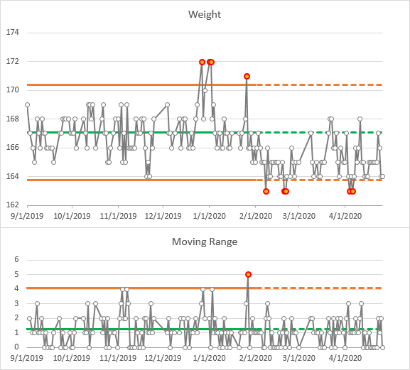
I’ve added these columns to my IMR Chart as red/orange markers.

Additional Control Chart Rules
There are other features of control charts that indicate a process which is out of control. These are conditions which are not expected to be found in about 99.7% of cases. Here are a handful of common out-of-control rules; the first one is the one I highlighted above.
- One point beyond 3-sigma control limits
- 2 of 3 points outside 2-sigma on same side of mean
- 4 of 5 points outside 1-sigma on same side of mean
- 8 consecutive points outside 1-sigma on both sides of mean
- 15 consecutive points inside 1-sigma on both sides of mean
- 9 consecutive points on same side of mean
- 6 consecutive points moving in same direction
- 14 consecutive points alternating up and down
Advanced SPC software highlights any of these situations, in addition to the 3-sigma violations.
Extending the Data
To show how to manage a growing data set, I added ten more weeks of my weight tracking.
Frozen Control Limits
Typically, when a process is determined to be steady, the limits are calculated and frozen, then these are extended forward. This is illustrated below: the frozen limits were calculated from September through February, indicated with solid lines, and extended into April, shown with dashed lines.
Where I had a few values above the UCL in December and January, I now had several below the LCL and only a few above the mean in February and beyond.
This is evidence of a process shift. Several of the additional rules mentioned at the end of the last section would have been triggered. Checking my exercise records gives us an explanation. For much of the period from September through January, I was running 3 miles a day, four or five days a week. The weather in February was rather mild, so I increased my mileage to about 3.5 miles a day, six days a week.
Moving (Variable) Limits
The control charts below show control limits calculated over the entire range. The process change is still noticeable, but it’s not as clear as with the frozen and extended limits above.
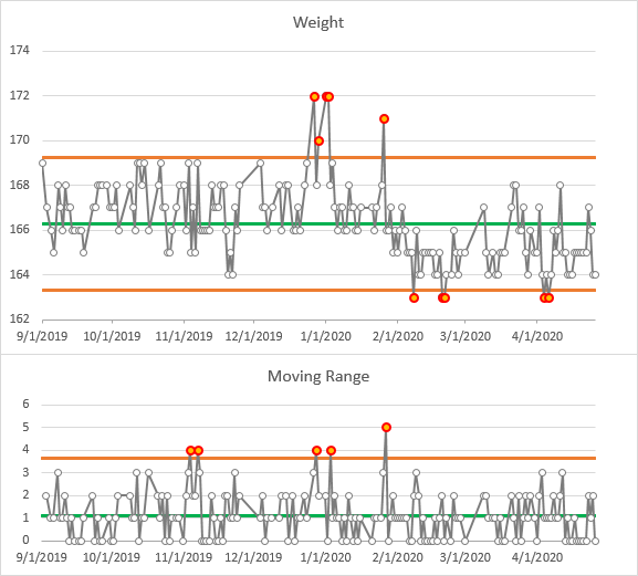
Another problem with continually recalculating limits is that the limits move over time. Points which were in control at one time may be pushed out of control by later measurements. A December point at 170 which was in control when the limits were frozen is now out of control under the newly computed limits.
Staged Analysis
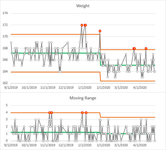
We can overcome this concern by staging our analysis, that is, computing different limits for different subsets of our data. In my latest Table below, I’ve added a column named Stage, which contains 1 for the first stage and 2 for the second; these can be entered manually or with a formula, which for example increments the stage number on a given date. The control limits are computed separately for different stages.
The IMR Chart below shows a staged analysis. Stage 1 looks familiar; the UCL for both MR and Individuals are slightly lower because the large MR late in January coincided with the process change. The violations in stage 1 are the same as before; the few outliers in stage 2 would have been well within the stage 1 limits, but are actually above the stage 2 UCL.
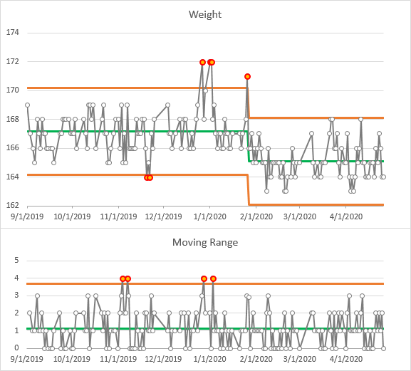
It’s common practice not to compute a separate average moving range for all stages, especially if the stages have small numbers of points, but instead use an overall MR Bar. The chart below uses this combined measure of variation. Stage 1’s control limits are now a bit tighter, so the low weights measured during the Turkey Trot training in November are now outliers. Conversely, Stage 2’s control limits are slightly wider, so there are no outliers in Stage 2.
Further Reading about Statistical Process Control
- ISO 9001 – Introduction to SPC
- Control Charts on Wikipedia
- Interpreting Control Charts
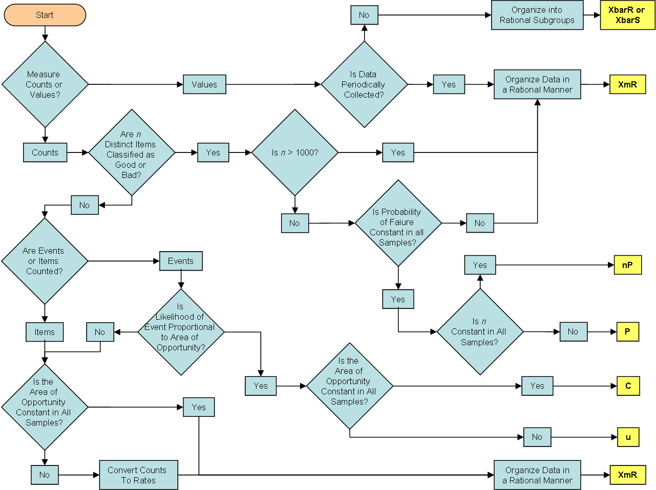
- Selecting the Right Control Chart

