About Pivot Charts
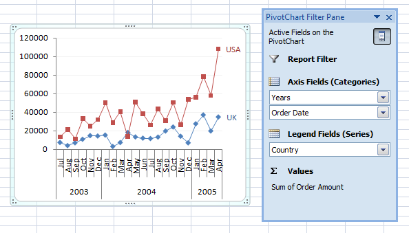
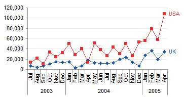
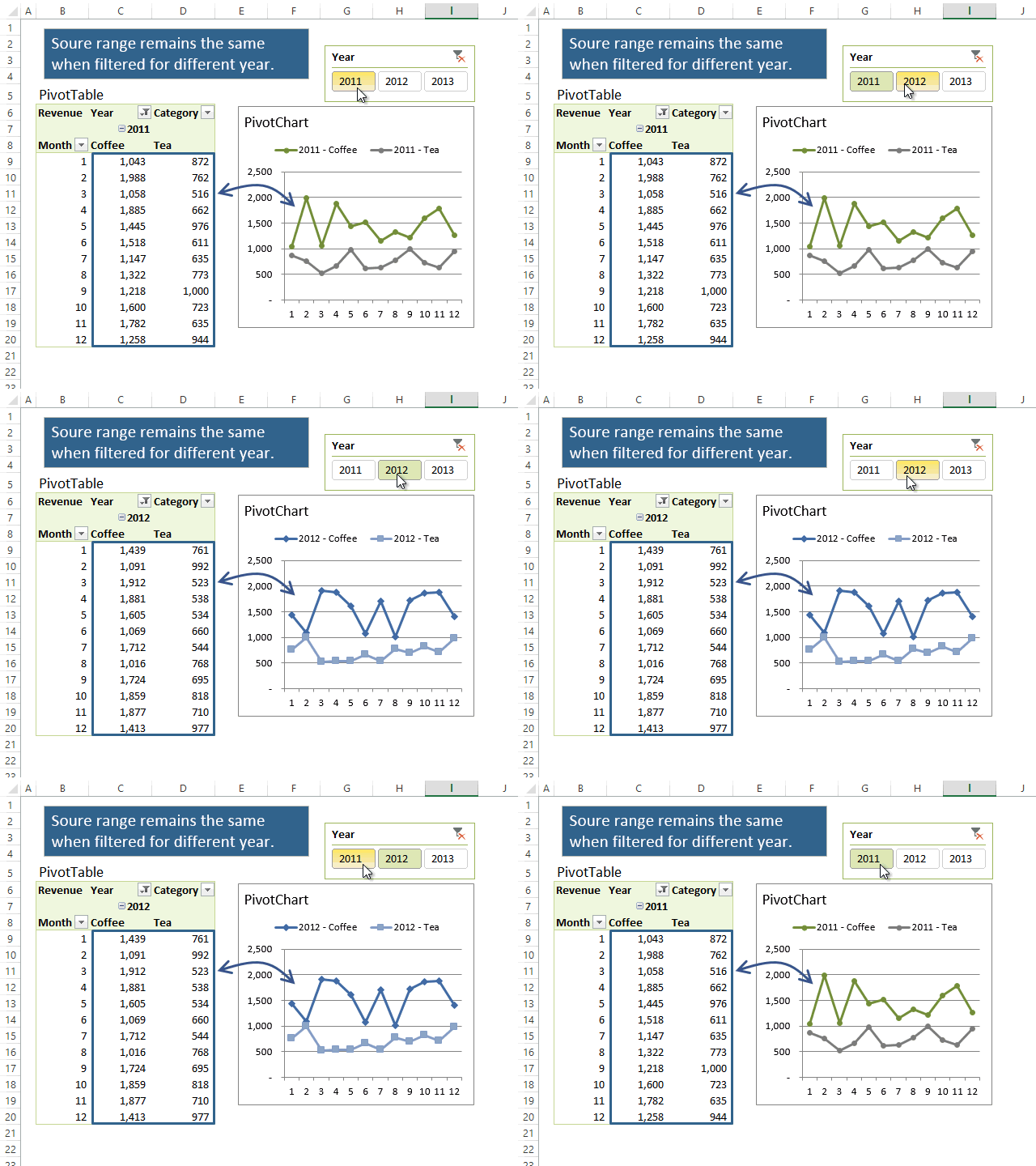
If you select a pivot table and insert a chart, Excel inserts a pivot chart. A pivot chart is a special Excel chart, with some strengths and some limitations. I used to avoid pivot charts because of these limitations, which included not being able to hide the field buttons and not being able to resize the plot area or move axis and chart titles. But Microsoft has kept improving them, and now the few remaining limitations seem pretty reasonable given the power and constraints of pivot tables themselves.
- A pivot chart is linked to its parent pivot table. Changes to the pivot table are reflected in the pivot chart, and vice versa. If the pivot table changes size, the pivot chart changes the number of its plotted series, and changes the lengths of these series, to accommodate the updated pivot table size.
- The pivot chart has optional field buttons that allow the same filtering capabilities directly in the chart that are available to the pivot table.
- All data in the pivot table is plotted in the pivot chart, except for subtotals and grand totals. No data from outside the pivot table is allowed in the pivot chart.
- Pivot charts are plotted with category labels and series values in columns only. Pivot charts cannot be plotted by row.
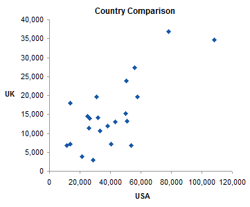
- Not all chart types are available in pivot charts. Line, column, area, bar, and pie charts are available, for example, but XY scatter charts and bubble charts are not.
Often, pivot charts are exactly what is needed. Sometimes, however, a regular chart must be used. For example, you might want a scatter plot of the pivot table’s data. Or you might want to add data from another source.
My colleague Debra Dalgleish has a brief Pivot Chart Tutorial on her Contextures.com web site, as well as a FAQ page on Pivot Tables and Pivot Charts. Debra also wrote Using Pivot Tables in Microsoft Excel on this blog.
This article will answer the following common questions about pivot charts in Excel.
- How do I disconnect a pivot chart from its pivot table?
- How do I copy a pivot chart and link it to another pivot table?
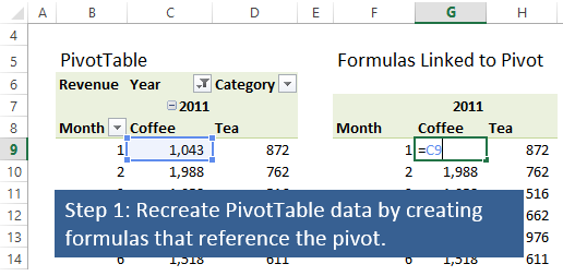
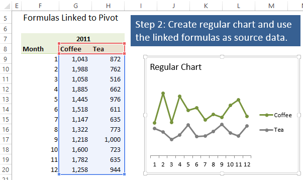
- How do I convert a pivot chart into a regular chart and preserve its links to the pivot table?
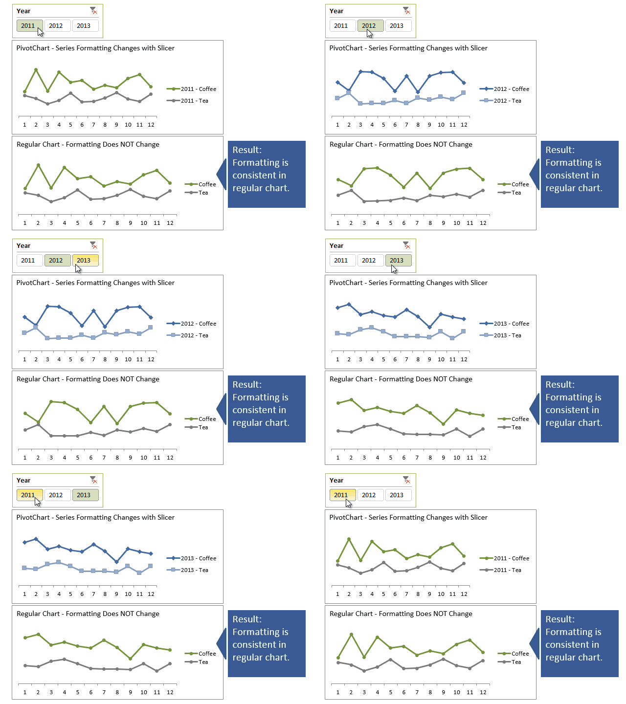
The last question could be answered by Making Regular Charts from Pivot Tables. But the question is often asked by someone who has spent significant time formatting his pivot chart, and doesn’t want to lose this formatting or be forced to recreate it.
We’ll start by reviewing regular charts and how their data is handled. Then we’ll examine differences between regular charts and pivot charts. Finally we’ll investigate answers to the questions above.
Regular Charts
The screenshot below shows a table with some simple data located in B2:D14. The data is rearranged in F3:I7 (a pivot table could have done this). Below that is a regular Excel chart which plots the data from this second range.
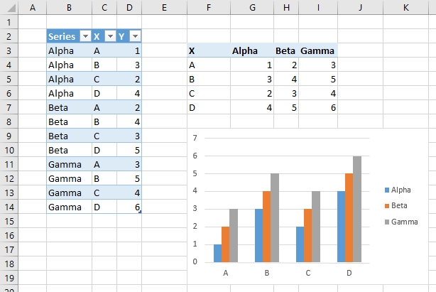
Chart Source Data Highlighting
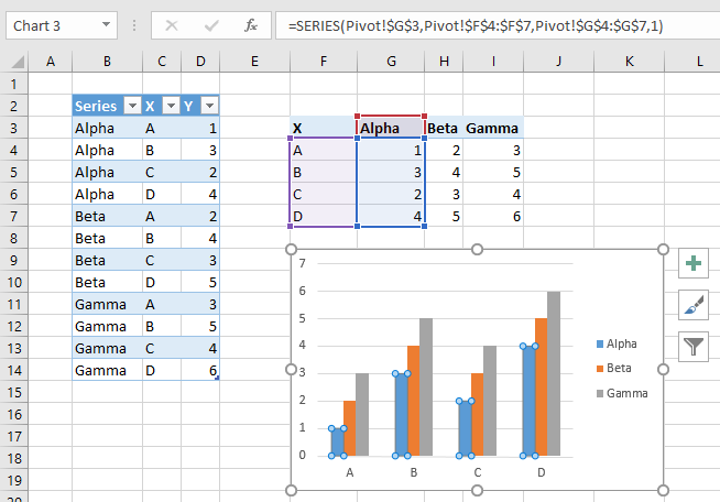
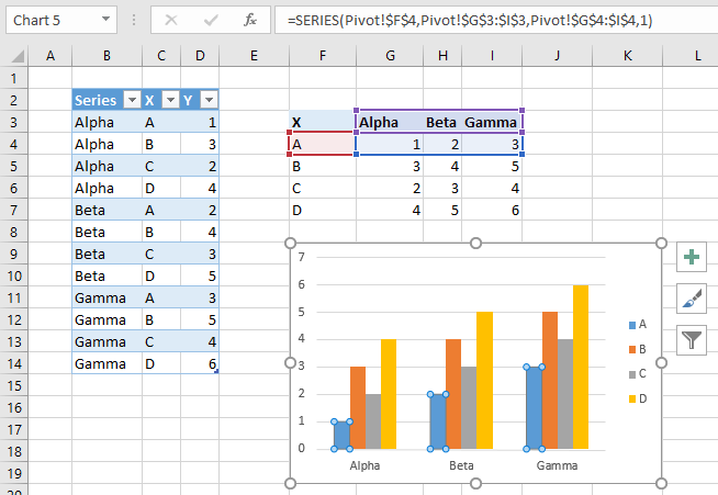
When you select a chart that has a well-behaved* source data range, the chart’s data range is highlighted in the worksheet. The highlighting for our simple chart in Excel 2013 and 2016 is shown below: the X values (category labels) are purple, the Y values are blue, and the series names are red. You can click and drag the highlighted borders to move the chart data, and you can click and drag on the highlighted corners to resize the chart data.
*Well-behaved means that the Y values of the series are in adjacent rows or columns, in order. Y values and X values (if present) must be aligned: in the chart below, the X values and all sets of Y values all begin on the same row and all end on the same other row, and the series names are aligned with the Y values.

When you select a plotted series, the data for that series is highlighted in the worksheet. The highlighting for the first series of our simple chart in Excel 2013 and 2016 is shown below: the X values (category labels) are purple, the Y values are blue, and the series names are red. You can click and drag the highlighted borders to move the chart data, and you can click and drag on the highlighted corners to resize the chart data. Note that our series is plotted by columns.
Chart Series Data Highlighting
When a series is selected, you can also see the corresponding SERIES formula in the formula bar. This series formula has the following components:
- Series Name: Pivot!$G$3
- Category Labels (X Values): Pivot!$F$4:$F$7
- Y Values: Pivot!$G$4:$G$7
- Plot Order: 1
You can edit this formula in place to adjust the chart data.
Another way to adjust a chart’s data is the Select Data Source dialog. To open this dialog, click the Chart Tools > Design tab > Select Data button, or tight-click on the chart and click Select Data from the pop-up menu.
Select Source Data Dialog
Here is the Select Source Data dialog for our regular chart. The box at the top shows the entire source data, which was highlighted when we selected the entire chart. You can edit this as text, or select another source data range in a worksheet. Caveat: if your selection in the Chart data range box intersects a pivot table, your chart will be converted into a pivot chart based on that pivot table.
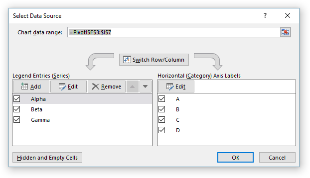
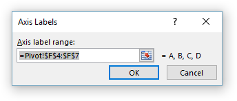
Click the Edit button under Axis Labels in the bottom right part of the dialog, and the Axis Labels dialog appears, showing the range containing the axis labels. You can edit this as text, or select another axis label range.
Select a series in the bottom right part of the dialog and click the corresponding Edit button, and the Edit Series dialog appears, showing the range containing the Y values. You can edit this as text, or select another range of values.

If you click the Switch Row/Column button, the same data is used as the source data, but its orientation is switched. The category axis labels become the series names, and the series names become the axis labels. Note that our chart now has four series with three points each (and three axis labels), and the red and purple highlighted regions have changed places.

When we select the first series, we see that it is now aligned in rows.
If your chart’s source data intersects a pivot table, clicking Switch Row/Column will convert your chart into a pivot chart based on that pivot table.
Disconnecting From Worksheet Data
Here’s a little-known debugging trick for Excel formulas. You can use the F9 function key or the Ctrl+= shortcut (hold the Ctrl key while you press the = key) to evaluate part or all of a formula in the formula bar. Fortunately this works for a SERIES formula.
If you click in the formula bar and click F9 or Ctrl+=, every section of the formula is evaluated (and the links are disconnected), as shown in this before-and-after screenshot.

Click Esc to restore the original formula, or Enter to keep the evaluated formula.
If you select just part of a formula and then click F9 or Ctrl+=, just the selected part of the formula is evaluated. In this screenshot, the Y value range of G4:G7 is converted to the array {1;3;2;4}.

To unlink a regular chart from its worksheet data, select each series, click in the formula bar, and press the F9 key.
Copying the Chart
You can copy a chart and paste it anywhere in the same workbook, even onto a different worksheet, and nothing happens to the chart. It shows the same data that it was linked to (on the original sheet), and the series formulas still link back to the original data. This is familiar, expected behavior, although when you want to link the chart to the data on its new parent worksheet, it’s not so welcome. But see Make a Copied Chart Link to New Data if that’s what you need to do.
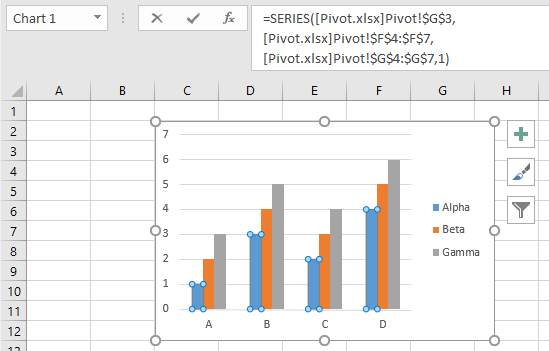
When you copy a regular chart to a new workbook, it still points back to the original data, which in the SERIES formula is referenced to the original workbook as well as the original worksheet, as “[Pivot.xlsx]Pivot”. So the regular chart behaves exactly as expected.
Pivot Charts
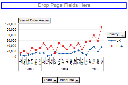
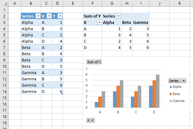
The screenshot below shows a table with the same simple data located in B2:D14. A pivot table in F2:I7 has rearranged the data. Below the pivot table is an Excel pivot chart which plots the data from the pivot table. Note the field buttons in the pivot chart, corresponding to the controls in the pivot table.
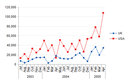
We can hide the field buttons (Pivot Chart Tools > Analyze ribbon tab > Field Buttons) and the chart will look just like our regular chart. But it still has the capabilities and limitations of a pivot chart.
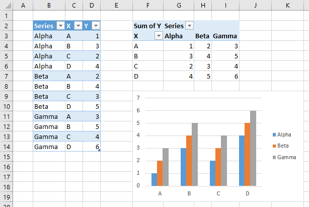
Chart Source Data Highlighting
When the pivot chart is selected, no chart data highlights appear in the worksheet.
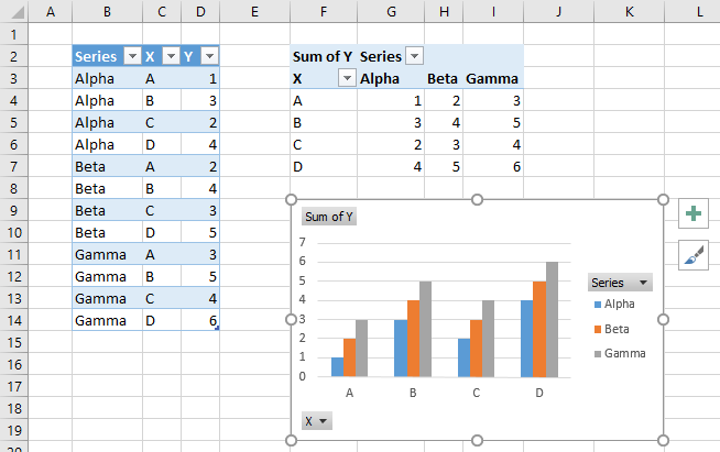
Chart Series Data Highlighting
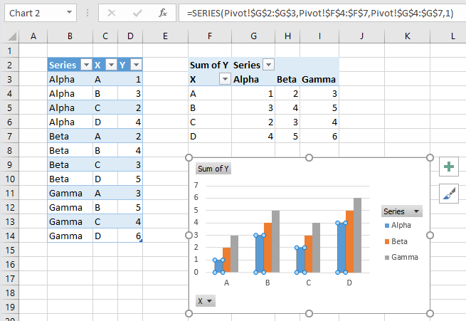
When a series is selected in the pivot chart, no series data highlights appear in the worksheet. The SERIES formula appears in the formula bar, but you cannot edit the series data by editing the series formula. You can only change the series plot order by changing the last parameter in the series formula.
Select Source Data Dialog
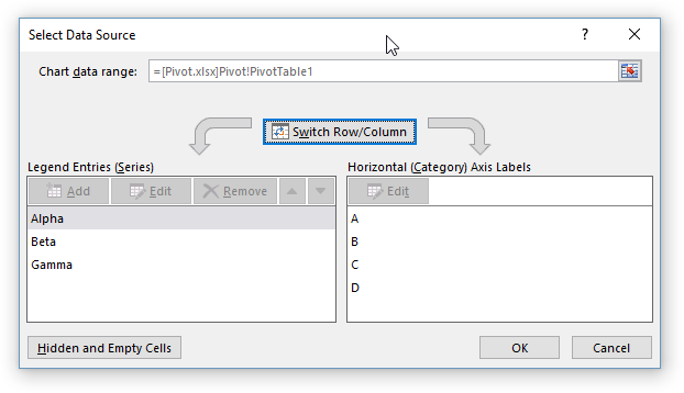
Here is the Select Source Data dialog for our pivot chart. The box at the top shows that the source data is our pivot table; this cannot be changed. The axis labels cannot be edited, nor can the series values be edited.
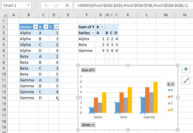
If you click the Switch Row/Column button, the chart changes its appearance to match how our regular chart changed: three series of four categories becomes four series of three categories. But the chart’s data orientation didn’t change, because pivot charts can only plot columns of data. Instead, Excel switched the fields in the rows area of the pivot table with those in the columns area. The X and Series field buttons in the chart have changed places as well.
The series formula shows that the first series of our pivot chart is still plotted by column, with the category labels in column F and Y values in column G.
Disconnecting From Worksheet Data
Excel does not let you evaluate part or all of a pivot chart’s SERIES formula using the F9 or Ctrl+= trick, so you can’t use it to disconnect the pivot chart from its pivot table.
Copying the Chart
You can copy a pivot chart and paste it anywhere in the same workbook, even onto a different worksheet, and nothing happens to the chart. It shows the same data that it was linked to (in the original pivot tables), and the series formulas still link back to this pivot table.
Answering Those Questions
How do I disconnect a pivot chart from its pivot table?
Interesting things happen when you copy a pivot chart to a different workbook. The first thing you may notice is that the field buttons have disappeared, because the pivot chart has been converted to a regular chart. The second thing you’ll notice, if you check out the SERIES formula, is that the links to worksheet ranges have been changed into literal arrays of strings and numbers, as if we used our F9 (Ctrl+=) trick to evaluate the formula.
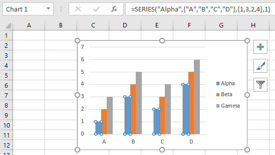
There’s the answer to our first question, how to unlink a pivot chart from its pivot table. Simply copy the pivot chart to a different workbook. Once the links are broken, you can copy it anywhere, even into the original workbook, and it will remain disconnected from the pivot table.
How do I copy a pivot chart and link it to another pivot table?
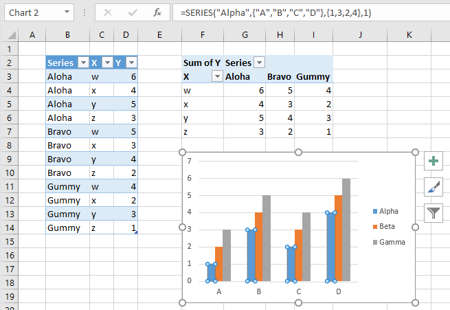
In the screenshot below, I’ve copied my unlinked chart and pasted it into the original workbook, in a different worksheet with a different Table of data and a different Pivot Table. As noted above, it’s still disconnected.
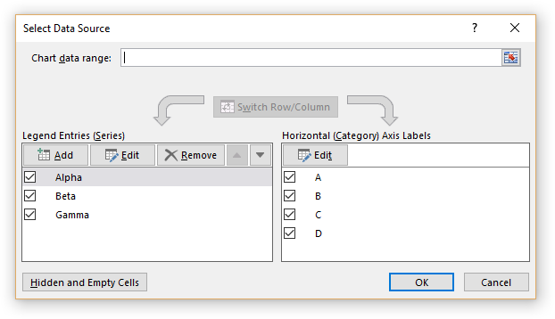
Here is the Select Source Data dialog for our unlinked chart. The Chart Data Range box at the top is empty, because the chart’s data is hard-coded into the chart’s SERIES formulas. You can click in the box and select a data range from the worksheet.
If you select a cell or range that overlaps with a pivot table and click OK, the chart will become a pivot chart and use the data from the selected pivot table. In the screenshot below the chart now has field buttons, so we know it has been converted into a pivot chart. The SERIES formula shows links to the data in the pivot table.
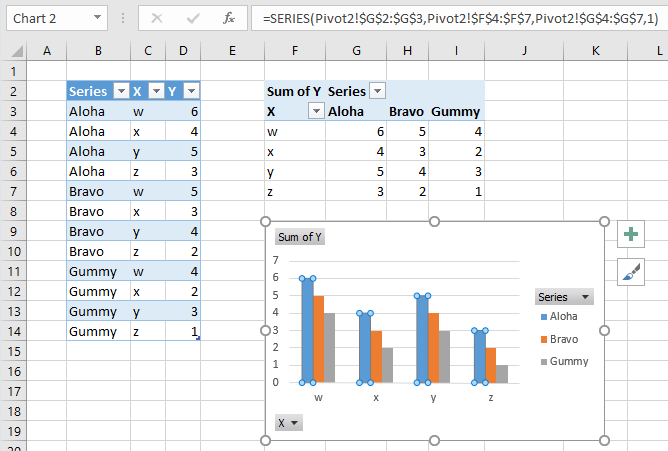
There’s the answer to our second question, how to copy a pivot chart but link it to a new pivot table. Copy the pivot chart to a different workbook to disconnect it from the first pivot table, then copy the chart to the sheet with the second pivot table, then use the Select Data dialog and select the new pivot table in the Chart Data Range box.
How do I convert a pivot chart into a regular chart and preserve its links to the pivot table?
If we avoid the Chart Data Range box, we can still use the Select Data Source dialog to reconstruct links to the pivot table data. This is essentially the technique in Making Regular Charts from Pivot Tables, but we’re using the pivot chart which may have had custom formats applied.

Under Horizontal (Category) Axis Labels, click Edit, and the Axis Labels mini-dialog will appear, showing the literal array of labels.
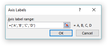
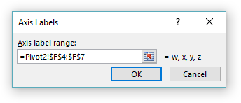
You can clear the box and select the axis label range from the worksheet using your mouse. Then click OK.
Now under Legend Entries (Series), select the first series from list, and click Edit. The Edit Series mini-dialog appears with the series name as a string, and the series values as a literal array of numbers.
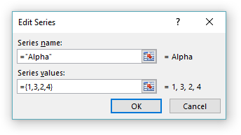
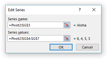
You can clear each box and select the cell containing the series name and the column of cells containing the series values. Click OK, then repeat for the rest of the series in the chart.
The Select Data Source dialog now looks like this, with the Chart Data Range box displaying the range containing all of the pivot table data. Don’t click in this box, and don’t click Switch Row/Column, or your chart will become a pivot chart.
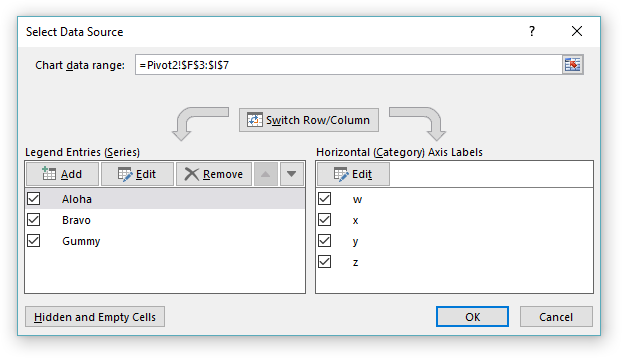
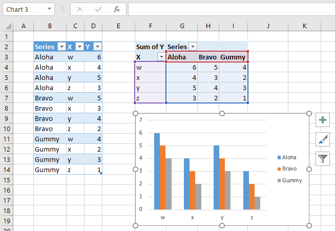
Click OK, and notice how the chart now plots the pivot table data. The data is highlighted in the worksheet, and the chart has no field buttons, because it remains a regular chart.
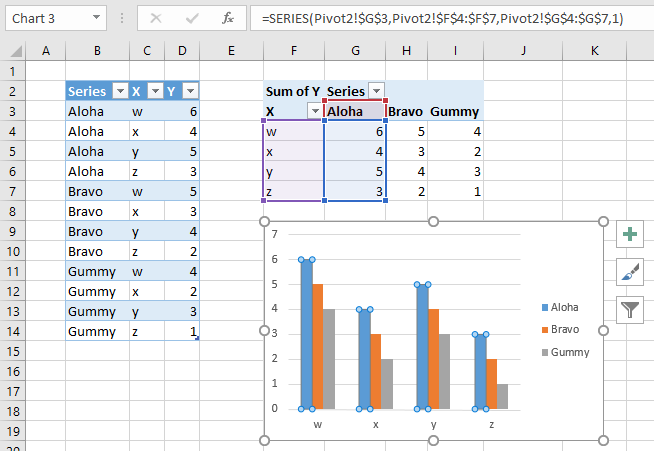
Selecting a single series shows the data is plotted by column, but again, the series highlights verify that the chart is not a pivot chart.
And this is the answer to our last question, how to convert our pivot chart to a regular chart but maintain links to the pivot table’s data. Actually, I’ve linked it here to a new pivot table, but I could link it to the original pivot table in the same way. Strictly speaking, this approach didn’t actually maintain the links, as we had to reconstruct them. There is no way to maintain the links while converting the pivot chart into a regular chart.




 Jon Acampora writes the blog at