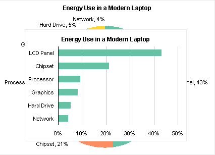
In the Engineering Windows 7 blog on MSDN, in Windows 7 Energy Efficiency, The Windows team posted a chart showing how energy is consumed in a modern laptop.
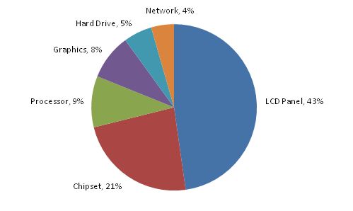
No surprise that almost half is spent lighting the display.
But wait, that looks a lot closer to 50% than 43%. Let me see what I get using their numbers.
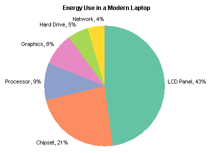
Looks the same. Let’s do a quick check of the numbers. 43% + 21% + . . . look at that, 90%! Often the numbers are off by 1% or thereabouts, due to rounding effects in the labels (but see Pie Chart Rounding in Excel for a discussion of rounding errors in Excel pie charts). But in this case they’ve obviously left something out.

All the well-intentioned guidelines for charting say to use a pie chart to show how parts make up the whole. And yet, here we have only some of the parts making up 90% of the whole. The basic premise of a pie chart is violated by omitting this 10% of the total energy usage.
Pie charts are supposedly the best way to show proportions of this sort, although they are not really so good even at that. People mistake familiarity with effective information display.
The same data is shown as effectively in a bar chart, either with the original values:

or with the missing 10% accounted for:
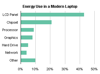
These charts are not distorted by exclusion of some of the data; no basic assumptions of bar charts have been violated.
In addition, at 320×221 pixels, the original bar chart uses only 54% of the space as my original pie chart (426×306 pixels).