Another baseball-related post today, and again I’m highlighting Justin Bopp’s Beyond the Box Score blog. And no, Justin, I’m not picking on you, I just have an alternative way to show the same information. In Introducing DiamondView Composite Player Evaluation, Justin describes a technique for graphing a player’s capabilities in four skill categories, on a scale of 0% (worst score in that category) to 100% (best score in that category). The DiamondView Composite Evaluation chart for Tampa Bay slugger Carlos Pena looks like this:
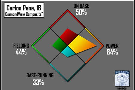
It’s a striking graphic – The colors capture your attention, and you can decipher quickly what the chart is showing. A weakness is that the use of bold fill colors precludes direct comparisons of players on the same graph. You could use side-by-side diamonds, but that’s not as clear a comparison as overlaying the data.
What if we used an unfilled diamond for each player? Carlos looks no less impressive in this less colorful chart:
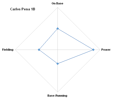
This type of chart is called a radar chart, because it has its origin in the center and the data sweeps around the periphery, like a radar screen. It is also called a spider chart, because with more spokes and with circumferential gridlines between the min and max, it looks like a spider’s web.
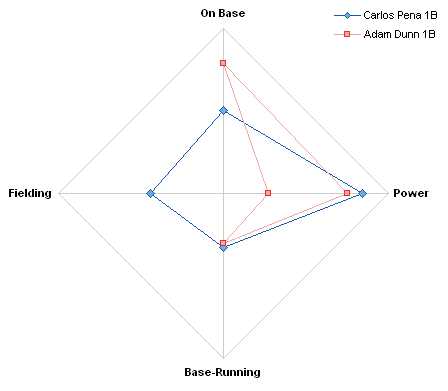
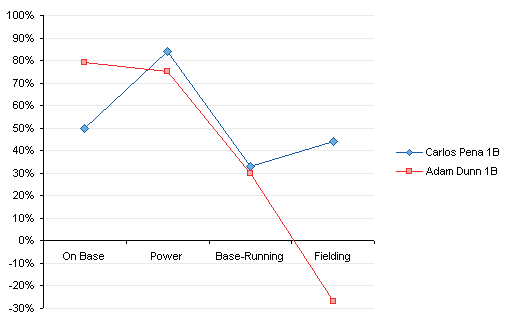
It is easy in this case to make comparisons between a couple players. Adam Dunn does not have two Power ratings, of course. His fielding is so bad, the corresponding rating is negative. Apparently something about his ratings means he’s worse than the worst fielder at 0%. Not unusual, I remember teammates like that in Babe Ruth ball.
Suppose we have a whole set of players to compare:
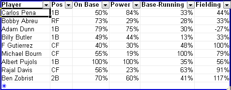
Conceivably you could compare many players in this diamond chart.
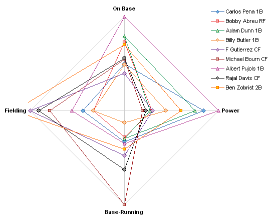
There are a couple of problems with this kind of chart, as discussed in Radar Charts are Ineffective. The resolution is worse at the lower numbers, and any zeros make interpretation more difficult. The negative value for Dunn’s fielding is difficult to pick out, and we see a similar calculation glitch with Ben Zobrist’s fielding score, which is greater than 100%. Maybe he could give Adam Dunn some lessons?
Where have we seen this style of chart before? Perhaps when we discussed Spider Chart Alternatives. Among the alternatives we’ve evaluated is the Parallel Coordinates chart, developed by Alfred Inselberg and described in Interactive Parallel Coordinates Chart and in Sample Parallel Coordinate Chart. Stephen Few discusses parallel coordinates charts in Multivariate Analysis Using Parallel Coordinates (html) and Multivariate Analysis Using Parallel Coordinates (pdf).
Justin has already done the hard work for us: the ratings are compiled and scaled to 0%-100% (with a couple computational irregularities). All we have to do is unwind the chart, that is, convert it to a line chart. Here are Carlos Pena’s ratings again.
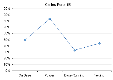
Because the coordinates are parallel, we can compare the scores in different categories more easily than in the radar plot. We can readily compare a couple players, and any off-scale values can be represented by enlarging the scale.
We can add more players, and the resulting chart is arguably less cluttered than the spider chart equivalent.

That’s still not easy to read, if you want to compare two players. In Interactive Parallel Coordinates Chart we embellished the chart above in order to let the user select any two quarterbacks from a list. We’ll apply the same techniques here: Color all series light gray for background, Add two more colorful series, Incorporate a couple of dropdown controls, and link the pieces together.
In the following chart, we can compare Pena and Dunn to each other, but also see how they fall within the larger population.
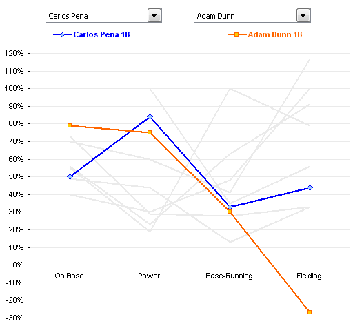
To change our comparison, we need only select a different player, Albert Pujols for example, from a dropdown list.
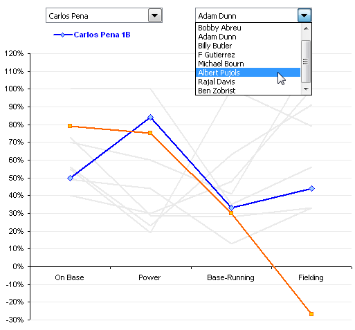
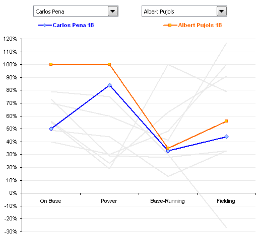
And the chart shows our new comparison.
I’ve posted the zipped Excel 2003 workbook on my web site at Composite_Player_Evaluation.zip.


