When people think of an Excel combination chart, they usually think of a chart with lines and columns, or something similar that they found on the list of “Built-In Custom” chart types (I just love that oxymoron). However, line and XY series are types that combine to make decent charts. The line chart’s Date Scale category (X) axis provides the only proper date formatting in all of Excel, while the XY chart type provides a great deal of flexibility missing from line charts.
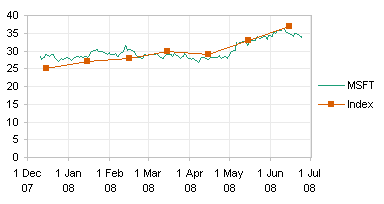
The chart below shows six months of daily stock data, using a line chart, and six months of an imaginary monthly market index. Note two features of this chart.
First, the date axis ticks are displayed at the first of every month (the vertical gridlines are usually unnecessary, but I’ve added them here to help illustrate the axis scaling). This can only be done using a line chart; in an XY chart, you have to pick a single value for the tick spacing, so you cannot accommodate the unequal days in a month.
Second, the markers for the market index are not plotted on the same dates as the stock price data. This could be done in a line chart, if you didn’t mind a lot of blank cells, but using an XY chart type for this series makes it simple without having to precondition the data.
As far as the appearance of the series is concerned, you can use XY or line types interchangeably. Either chart type accommodates lines or no lines, markers or no markers. You don’t have to use a “Line” chart just because you want your markers to be connected by a line. The difference between Line and XY charts is in how the X values (dates) are presented on the chart.
[Read more…] about Line-XY Combination Charts


