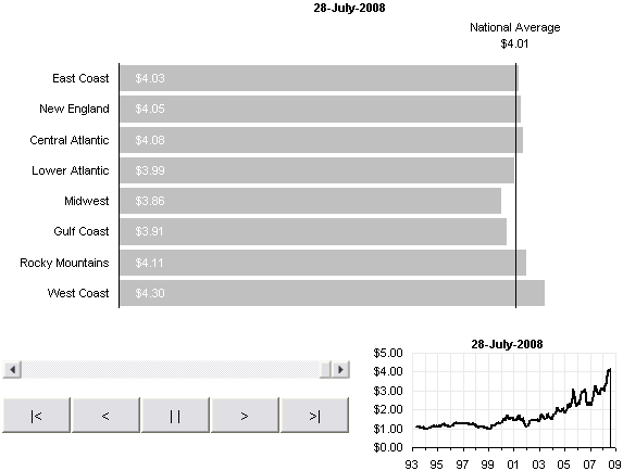
In Watch the Rise of Gasoline Retail Prices, 1993 – 2008, Nathan shows an animated bar chart that traces the price of gasoline over the past 15 years. Nathan’s animated chart looks like this:
I downloaded his data workbook and went to work duplicating his chart in Excel.
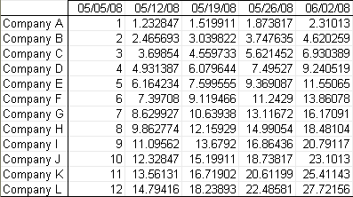
The top part of the worksheet ‘data’ looks like this with a little adjustment. I’ve inserted a bunch of rows at the top. B1:J1 contain short labels to replace the paragraphs in the original data set. Cell A1 is names RowIndex. A2:J2 contain the ith value in each column of prices, where i is the value in RowIndex. For example, the formula in cell A2 is
=INDEX(A$9:A$808,RowIndex)
Rows 4 and 5 contain the min and max values from each column, just so I could understand the scope of the data.

The worksheet named ‘chart’ looks like this. The bar data is as follows:
Series Name: data!$A$2
Series X Values: data!$B$1:$I$1
Series Y Values: data!$B$2:$I$2
I applied data labels showing each bar’s value. For the national average, I added an XY series with one point, using cell $J$2 for its horizontal coordinate. An error bar provides the line across the bars. The scroll bar allows the user to view prices on a particular date; the scrollbar is linked to the cell named RowIndex, so it changes the data in row 2 of the data sheet. The buttons (left to right: Go To Beginning, Reverse, Pause, Forward, Go To End) allow the user to view an animation of the changing gas prices.

This snapshot of the code behind the ‘chart’ worksheet is shown here (right-click on the sheet tab, and choose View Code).

To try out the animated chart, download this zip file. It is unlocked and unprotected, so you can see the code and watch how it works.
Update
I added an inset showing progress along the time axis of the time series in Gas Prices – Animated Bar Chart for Excel 2.
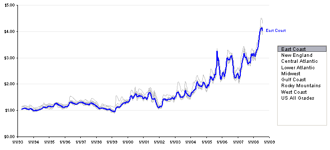
I showed the data in an intereactive time-series in Gas Prices – Interactive Time Series.

