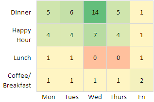
A reader of my post Excel 3D Charts: Charts with No Value asked how to arrange his data to display a variable on a grid, thinking I’d acquiesce to his desire for a 3D chart. My initial thought was “No way”, but I first asked what he was plotting. He was doing an agricultural experimental design with a 2×5 grid of plots planted with various plants, and wanted to see whether there was a positional variation to the results which would not have been seen in a standard ANOVA analysis. His output values typically ranged from 1000 to 5000 pounds per acre.
I thought this could be visualized in 2D without the usual 3D issues, using a heat map. Now I’ll construct such a heat map using Excel’s Conditional Formatting Feature.
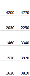
I set up a 2 column by 5 row grid, and inserted random numbers between 1000 and 5000.

To represent a 2×5 grid of square plots, I adjusted the rows and columns to be the same size, in this case 50 pixels. This was an assumption on my part, but whatever the dimensions of the actual plots, you can fudge the row and column dimensions to represent these dimensions.
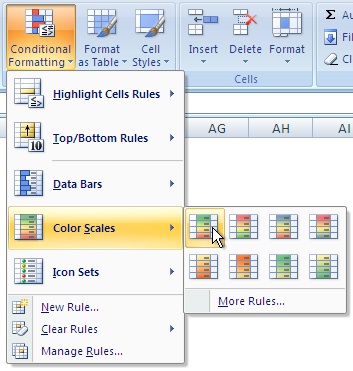
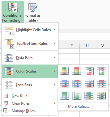
I selected this range, and clicked on Conditional Formatting on the Home tab of the Excel 2013 ribbon, and hovered over Color Scales. As far as I recall, this part of the color scales mechanism worked the same in Excel 2007 and 2010.
There are a dozen built-in color scales, and if this isn’t enough you can pick More Rules.
Below are the five built-in options I’d be most likely to use for such a heat map, highlighted in the popup menu and displayed in theworksheet. These are a red-yellow-green 3-color diverging scale, a red-white-green 3-color diverging scale, a red-white-blue 3-color diverging scale, a white-green 2-color sequential scale, and a yellow-green 2-color sequential scale.

I decided to use the red-white-green diverging scale, because I thought it would be the most color-vision-friendly of the three diverging scales.
To change to a better scale, I selected the range and selected Manage Rules at the bottom of the Conditional Formatting dropdown menu, and the Formatting Rules Manager dialog appeared.

If I’d selected a larger range with multiple sets of rules, like the range shown above with five color scales applied, this dialog would show all of the rules.
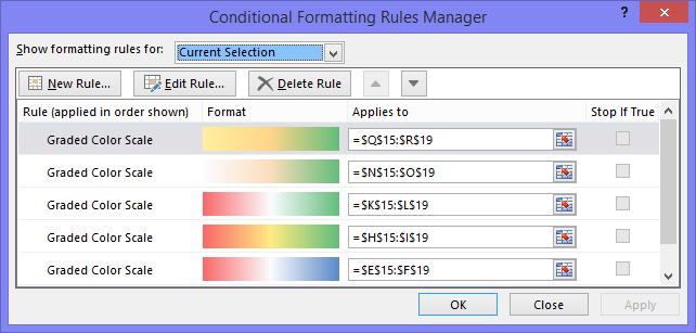
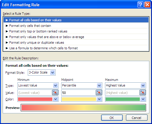
I selected the color scale I wanted to change, and clicked Edit Rule, to pop up the Edit Formatting Rule dialog. You can see that the options for this type of rule include 2- and 3-color scales, which are useful for heat maps, as well as data bars and icon sets, which are not.
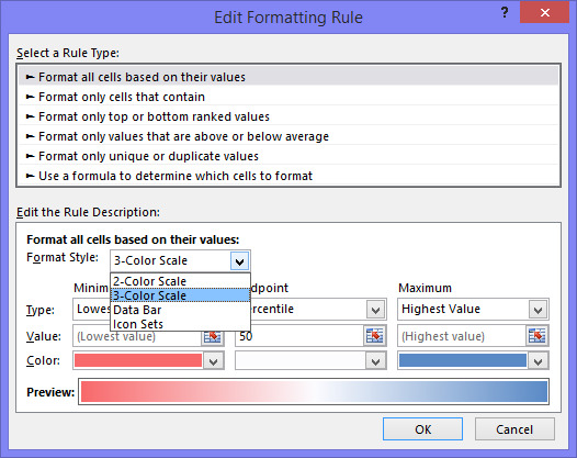
You can select three colors for minimum, midpoint, and maximum, and you can choose to define these points in several ways. Here I’ve kept the default lowest value, 50th percentile (median), and highest value, but all could be defined by percentiles, values, or formulas.
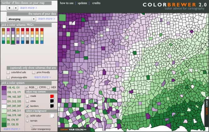
To select my colors, I went to my favorite source for color schemes at ColorBrewer2.org, by Cynthia A. Brewer at Pennsylvania State University. I decided on a color-vision safe, 9-color, purple-to-green diverging scale, and this is what ColorBrewer showed me. Click on the image to visit this selection at ColorBrewer2.org.
 Click on the image to visit this selection at ColorBrewer2.org.
ColorBrewer also lets you export the colors in various ways, including as an array of RGB values:
{118, 42, 131; 153, 112, 171; 194, 165, 207; 231, 212, 232; 247, 247, 247; 217, 240, 211; 166, 219, 160; 90, 174, 97; 27, 120, 55}
I used the second (purple) and eighth (green) elements of this color scheme for the min and max colors, and kept the white central value (the ColorBrewer midpoint is about 5% gray).
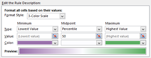
Below is the purple-white-green 3-color diverging scale (left), a purple-green 2-color sequential variation (center), and a white-green 2-color sequential variation (right). Note that these intermediate colors are not ColorBrewer’s, but are calculated by Excel.
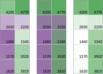
The three-color purple-to-white-to-green scale seems to show the variation better than the two-color purple-to-green scheme, because the latter doesn’t show much variation within the greens or within the purples. The two-color white-to-green might be the best overall choice, especially if the heat map has to be photocopied.


