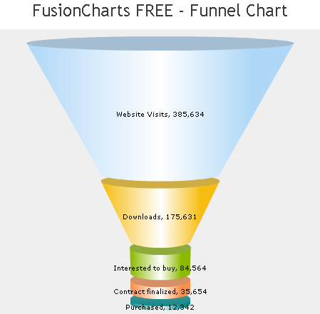
Sales Funnel Graphs
Sales funnel graphs are used to represent the development of sales leads into actual sales, or conversely the attrition of sales leads before they become actual sales. In the example below, A might represent web site visitors, B visitors who accessed the specific sales page for a product, C visitors who clicked the link to receive additional information, and D customers who finally purchased the product.
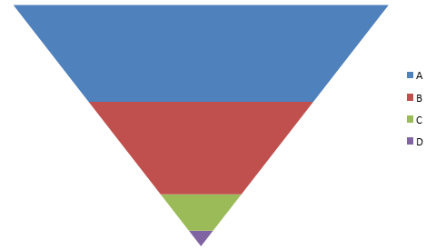
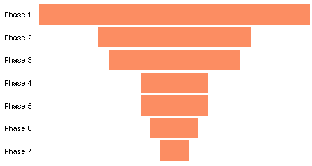
Sometimes these funnels are drawn tapering to a point, as above, and sometimes they taper to a small but nonzero width, as below.

I don’t like this kind of funnel chart. Sit back and I’ll tell you why.
Funnel – Bad Metaphor
Sales funnels are so named because of a superficial resemblance to the kind of funnel found in many kitchens or inverted on top of the Tin Man.
This is where the metaphor breaks down, for me at least. In my kitchen, everything that goes into the top of the funnel comes out the bottom. That’s the purpose of the funnel: to make it easier to pour liquids and small particulates into a small-mouthed container without spilling. A sales funnel shows how much is left at a certain point, that is, how much has not spilled out. They really should be called sales “sieves”.
Funnel – Bad Graphic
Even worse than the bad metaphor is the bad graphical behavior of a funnel chart. Funnels badly distort their data. Let’s examine this distortion with the idealized funnel below. Each colored layer of the funnel has the same value, that is, I’ve constrained it to work like the funnels in my kitchen: what goes in at the top comes out at the bottom. These funnels are usually drawn to make the height of each section proportional to its value, and the stack of areas starts at a small width at the bottom (zero width in this one) and widens to a maximum height at the top. What our eyes see is a much larger colored region at the top, but our eyes are fooled by the hugely distorted areas.
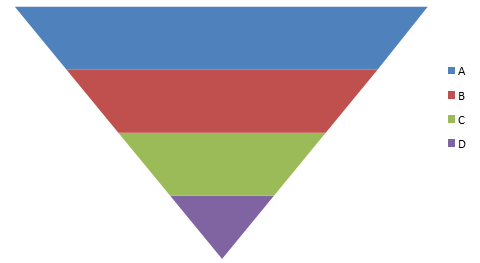
In this graph, I have divided each colored area into triangles as large as the single bottom purple triangle. Although each colored band represents the same value, each band uses a much larger amount of area (number of small triangles) to represent this value. By the time we get to the top band of the chart, we have used 7 times the area of the bottom band, for the same encoded value. This is a poor means of encoding data.

Funnel Chart: From Bad to Worse
The specific graphic that kicked off my current rant was brought to my attention by Adam Vero of blog.meteorit.co.uk in a comment under my recent post, Excel 3D Charts: Charts with No Value. He read about a Simple Chart Modification in Microsoft Dynamics CRM 2011 in a Microsoft blog, in which a “Chart Wizard” (said I sarcastically) was showing how to improve on the length-squared distortion in a regular 2D funnel by pimping it into a length-cubed distortion in a fancy faux-3D funnel.
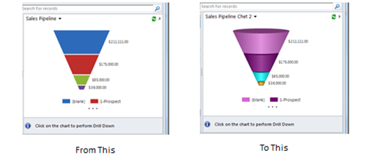
This is bad on so many levels.
A Better Representation of Sales Flow
When I talk about improving a chart, I don’t mean increasing the pseudo-dimensionality of the chart, or increasing the use of gratuitous graphical effects, or blinding the readers with pizzazz. I talk about improving the transfer of information. Thanks again to Adam Vero for starting this discussion.
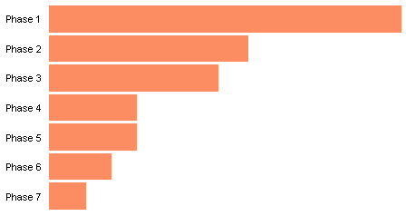
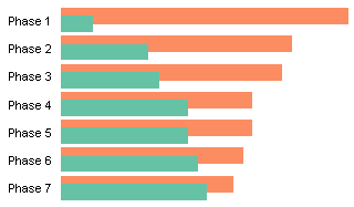
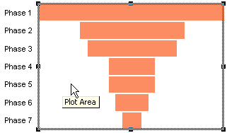
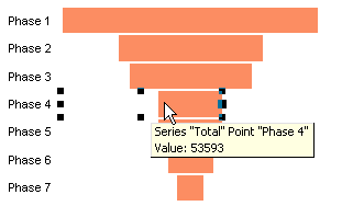
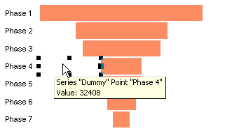
We can correct for the massive area distortion in a funnel graph by cropping the sides of the funnel. Now the remaining stacked column chart has columns that have heights and areas which are proportional to their values.

Here is the simplified stacked column chart. A lot easier to interpret than the funnel.

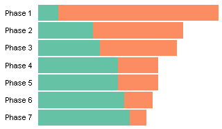
We want to represent retention in each step of the sales process. Bar sizes can be compared more easily if the bars are arranged side-by-side with their bottom ends aligned. The side-by-side arrangement also gives a somewhat intuitive sense of how the sales steps proceed, since we westerners interpret the passage of time from left to right. This clustered (side-by-side) column chart better represents the sales progression than does the previous stacked chart.

We don’t need the different colors in a clustered chart, and we can place our labels right below the bars.
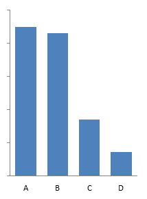
If our data is tied to events that have occurred on or by specific dates, we can convert the bar chart into a timeline. For example, we mailed out invitations to sales prospects on January 15, a large fraction of these emailed us for information by March 15, a smaller fraction attended our June 30 sales webinar, and by November 22, we had made sales to an even smaller group.


