Earlier this week, Tony Rose wrote about Highlighting Data in a Chart. He used an example called The Mixed Commodities Bag from Business Week, a magazine whose graphics always lead to discussion, for better or worse. I’ve reproduced the chart below using my graphics engine of choice, though I didn’t spend a lot of time to make the category labels just right. The caption comes from the Business Week page.
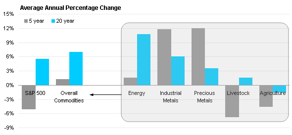
Although returns vary for individual goods, overall commodities have gained an average 1% a year over the past five years and an average 7% a year since 1988—even after the latest plunge.
The chart isn’t totally bad, either. It makes a good attempt to show the components of the overall commodities data. I wasn’t happy with the rounded rectangle, I felt it obscured the data as much as included it. I also thought the right to left alignment of the chart was backwards, at least for Western audiences.
I proposed moving the individual commodities to the left part of the graph, and the overall commodities and market index to the right. I proposed lighter fill colors for the individual commodities, and labeling that better separated the individual commodities from the combined commodities. Here is my version of the chart:
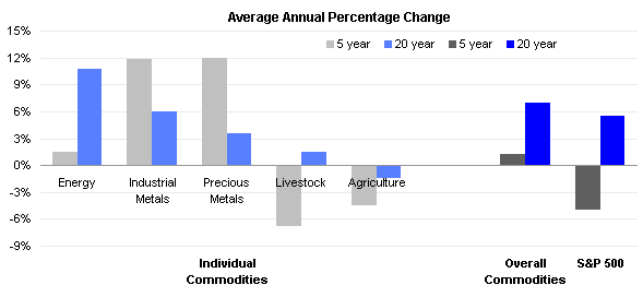
But some boss, or editor, or client will want an arrow. So I dropped in an arrow that was as unobtrusive as I could make it.

I think it’s an improvement, do you agree?


 Mike Alexander of