While writing last week’s introductory article about Excel 2013 charting, My First Excel 2013 Chart, I discovered a very cool bit of intelligence built into the function that inserts XY charts.
In prior versions of Excel, if you selected a rectangular range with N columns and inserted an XY chart with data in columns, the chart would use the first column for the X values, and the other columns for Y values for N-1 series. If your series didn’t all use the same X values, you had to define each series separately.
While playing with the Insert Chart dialogs, I discovered that Excel 2013 will offer several additional options if the data is arranged a certain way.
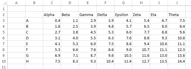
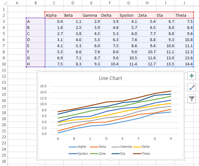
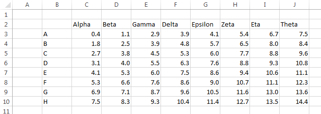
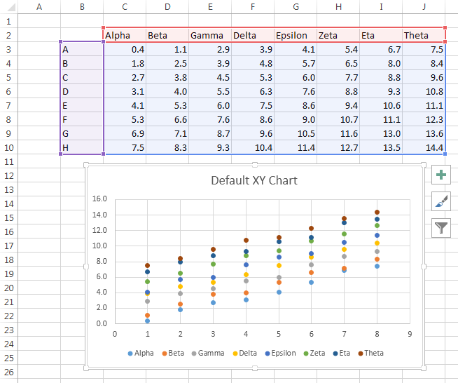
I’ll illustrate this coolness with the following data. There is an 8×8 grid of numerical data, with text labels (Greek letter names) in the row above the grid, and text labels (Latin letters) in the column to the left of the grid. Thedata is better suited for a line or bar chart because of the non-numerical categories in the first row and column.
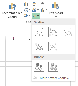
On the Insert tab, click on the XY Chart icon and you’ll see this dropdown.
Click on “More Scatter Charts” at the bottom, and you’ll see this dialog.
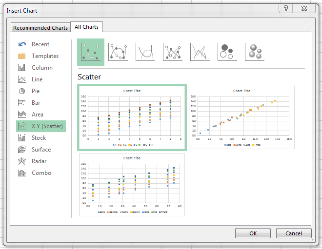
There are thumbnails for three options, which will be discussed shortly.
If you mouse over any of the options, you’ll see a preview of how that chart would look. Double clicking on the thumbnail or preview inserts the chart into the worksheet.
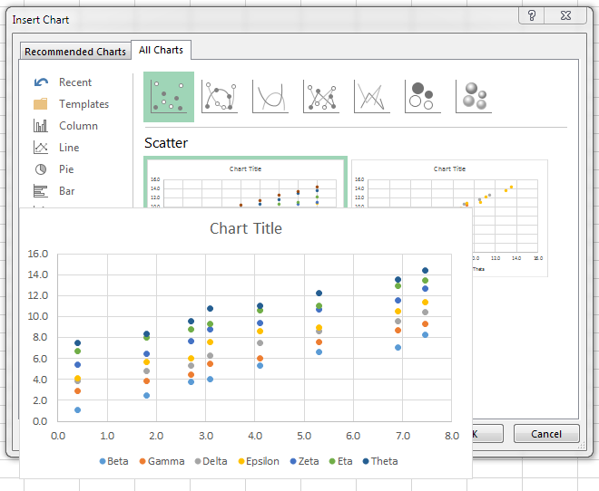
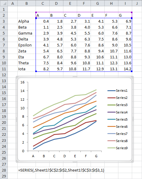
The first XY chart option is what you would get in prior versions of Excel. The first column is used for the X values, and the other N-1 columns are the Y values. In this case, the first column contains text labels, which an XY chart cannot accommodate, so it uses the counting numbers 1, 2, 3, etc. instead.
The second option available in this case shows one of the intelligent behaviors. Excel realizes that the first column doesn’t contain numerical values, so it ignores that column, and makes a chart with the number in the rest of the data range. The first numerical column is used for X, and the rest for Y.
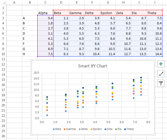
I tested this with one, two, and three leading columns of non-numerical data, and Excel ignored them all. Presumably it will ignore any arbitrary number of leading columns of text.
That’s pretty smart. But the next trick, as we say here in Baaston, is “wicked smaat”.
Many times I’ve been asked how to select a range with alternating X and Y values and create an XY chart with one series for each pair of columns. In Quick Chart VBA Examples I presented code that parses such a range and spits out the desired chart. In that tutorial I showed how to process several different arrangements of X and Y, including alternating X and Y columns.
If your usable numerical data is contained in an even number of columns (either standalone, or with some data ignored as above), Excel will give you the option to treat the data as alternating columns of X and Y data. The result is this Wicked Smaat XY Chaat:
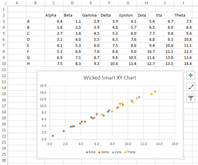
When the chart is selected, there is no highlighted data range, because the chart’s data is “too complicated” to display. This is because the series don’t share their X values.
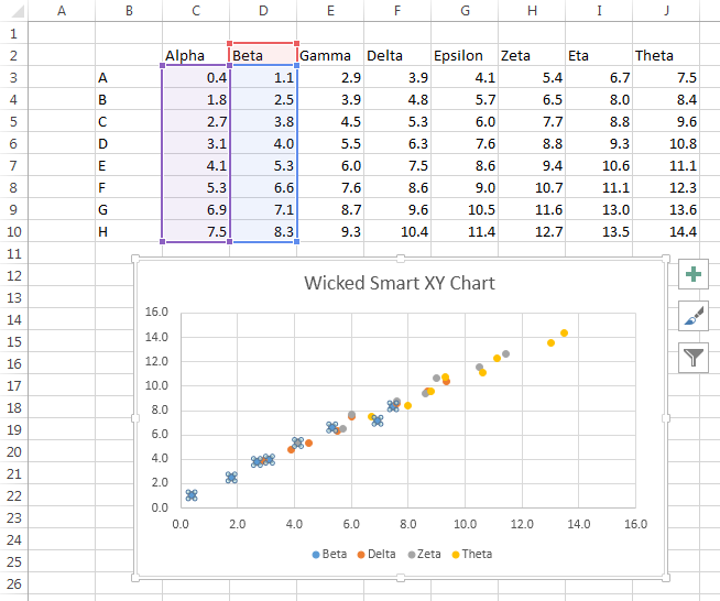
If you select the first series, however, you can see that it uses the first column of the range for X and the second for Y.
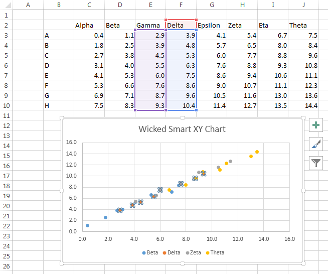
And if you select the second series, you can see that it uses the third column of the range for X and the fourth for Y. And so on, for the rest of the series i the chart.
I discovered this intelligent behavior by accident, using some arbitrary data from a totally different example. But knowing about this intelligence, I can design a data range to take advantage of it.
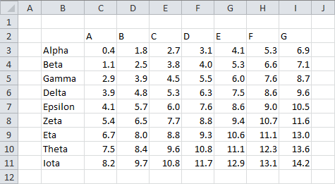
Here is an even number of columns of numerical data, alternating X and Y values.

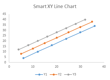
Here’s my wicked smart XY chart created using this data. The default formatting has markers but no lines.

You can use the Change Chart Type feature to change from a markers-only to a lines-and-markers format.
A lot of people are going to be very happy with this new functionality.


