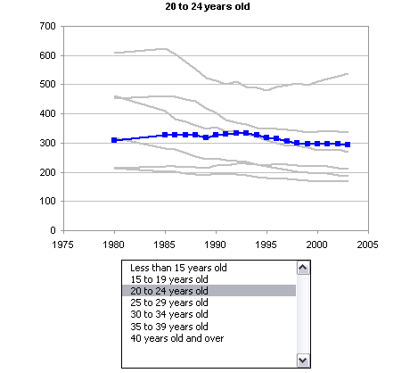
In the Microsoft charting newsgroup, SKP asked how to make a chart that he could easily change from one series to another. This post will detail the steps to make an interactive chart that allows the user to select from among a number of series using a listbox, and the selected series is displayed in a chart.

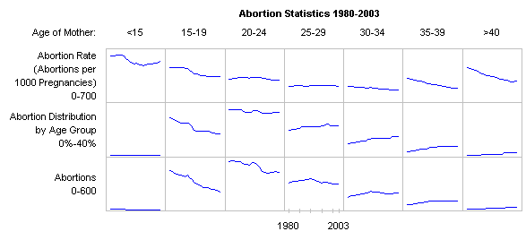
A similar technique is described in Interactive Parallel Coordinates Chart on my web site, and I used this technique in a workbook that supports my blog post Re: Abortion Ratios 1980-2003.
Update (22 July 2008)
My colleague Dermot Balson read this post and wondered why I was doing it the hard way. Well, he’s right. I’ve built a set of dynamic names that change based on the listbox selection, which is certainly a valid approach. However, for something as “simple” as plotting a column or row of data, it’s overkill. In Easier Interactive Multiple Line Chart I describe an easier approach.
Data by Columns
SKP had data for multiple companies in columns, with each row representing the respective values on a given date. I made up some sine functions for the company data; a portion of the data is shown below.

For many situations a popular visualization approach is to plot one series in a contrasting color, and the rest of the data set is plotted in the background. I plotted this data on a single chart, and formatted all series to use a light gray line. This chart comprises the background.

We need to define some dynamic names to make this work. This process is covered in some detail in Dynamic Charts. First, the column headers, the range of cells containing the Company names, is named “Companies”. The first column, the range of cells containing the dates, is named “Dates”.
The listbox we will add requires a columnar (vertical) list, and the company names are in a horizontal list. I selected a range one column wide and 12 rows high (there are 12 companies in the table), typed this formula
=TRANSPOSE(Companies)
and held down CTRL+SHIFT while pressing ENTER to make it an array formula. When an array formula is correctly entered, Excel wraps it in curly braces:
{=TRANSPOSE(Companies)}
I named this range “CompanyList”, then selected another nearby cell (cell O2 in the shot below) and named it “SelectedItem”.

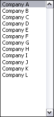
I added a listbox from the forms menu to the worksheet, and formatted it to use CompanyList as the input range and SelectedItem as the cell link. This means the list in CompanyList is displayed in the listbox, and the index of the selected item is displayed in Selecteditem.

The listbox looks like this:
A couple more names must be defined. Open the Defined Name dialog, add the name “SelectedSeries”, enter the following Refers To formula, and click Add.
=OFFSET(Dates,0,SelectedItem)
Add the name “SelectedName”, enter the following Refers To formula, and click Done.
=OFFSET(Dates,-1,SelectedItem,1,1)
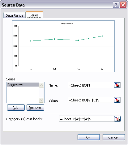
Now the selected series can be added to the chart. Select the chart, go to the Chart menu, choose Source data, and click on the Series tab. Click Add, then enter the appropriate names for the series name, values, and category labels, prefixed with the sheet name. Click OK.

To create a chart without the background series (like the one shown at the top of this post), select an empty cell, run the chart wizard, and in Step 2, click on the Series tab, add the first series, and enter the range names as above.
Here is the chart, showing all series in the background gray and the selected Company A highlighted in blue.

Clicking another item in the list changes the highlighted series, to Company L below.

By Row
For this example I made up data for multiple companies in rows, with each column representing the respective values on a given date; a portion of the data is shown below.
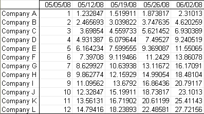
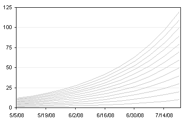
I plotted this data on a single chart, and formatted all series to use a light gray line. This chart comprises the background.
We need to define some dynamic names to make this work, as described in Dynamic Charts. First, the row headers, the range of cells containing the Company names, is named “TheCompanies”. The first row, the range of cells containing the dates, is named “TheDates”. I selected another nearby cell and named it “TheSelection”. (The names are different than in the first example, because both examples are in the same workbook, and I wanted to avoid naming conflicts.)
I added a listbox from the forms menu to the worksheet, and formatted it to use TheCompanies as the input range and TheSelection as the cell link. This means the list in TheCompanies is displayed in the listbox, and the index of the selected item is displayed in TheSelection.
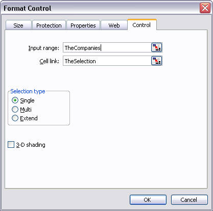
The listbox looks like this:

A couple more names must be defined. Open the Defined Name dialog, add the name “TheSeries”, enter the following Refers To formula, and click Add.
=OFFSET(TheDates,TheSelection,0)
Add the name “TheName”, enter the following Refers To formula, and click Done.
=OFFSET(TheDates,TheSelection,-1,1,1)
Now the selected series can be added to the chart. Select the chart, go to the Chart menu, choose Source data, and click on the Series tab. Click Add, then enter the appropriate names for the series name, values, and category labels, prefixed with the sheet name. Click OK.

To create a chart without the background series (like the one shown at the top of this post), select an empty cell, run the chart wizard, and in Step 2, click on the Series tab, add the first series, and enter the range names as above.
Here is the chart, showing all series in the background gray and the selected Company A highlighted in orange.
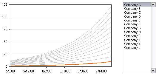
Clicking another item in the list changes the highlighted series, to Company L below.

Sample Workbook
Download a workbook that contains these two examples: InteractiveLines.zip


