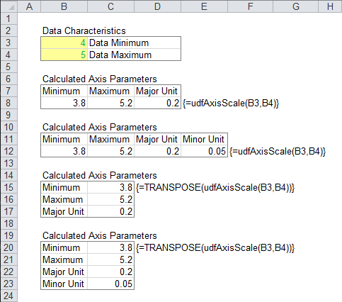
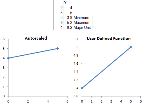
I recently described how How Excel Calculates Automatic Chart Axis Limits. The problem with these automatic limits is that they often leave a little too much white space around the outside of the plotted data, especially between the lowest data point and zero. So in Calculate Nice Axis Scales in Excel VBA I presented code that takes high and low series values and computes “nice” axis scaling parameters. This code could be called from other VBA procedures, or as a user defined function from the worksheet.
What if you want to get your axis scale parameters in the worksheet, but for some reason want to avoid using VBA? In this tutorial I show how to use boring old worksheet formulas to do just that.
Calculate Axis Scales in the Worksheet
The following table shows how to set up worksheet calculations of your axis limits. The minimum and maximum of your data are entered into the blue cells B4:B5 (labeled Min and Max), either as constants or as calculated values. Below these values are some calculations.
B6 and B7 (Min’ and Max’) are adjustments to min and max, adding 1% of the difference between the data max and min to the max, and subtracting this amount from the min. If the values are zero or closer to zero than 1% of the difference, then zero is used. This prevents any values except for zero from being located on the edge of the plot area of the chart. (The formulas shown in column C are used in the adjacent cells in column B.)
B8 and B9 determine what the axis tick spacing (called “major unit” by Excel) should be. If this major unit were written in exponential notation, Factor is “like” the pre-exponential coefficient and Power is “like” the power of ten.
The axis tick spacing (Xmajor) is computed in B3, where Factor is used in the lookup table in A11:B15, and multiplied by a function of Power to determine a nicer tick spacing. The tick spacings you calculate may not be exactly right, do to different chart and font sizes or other factors. You can experiment with the values in the lookup table to try to improve them.
Xmin in B1 is calculated as the largest multiple of Xmajor which is less than Min’, and Xmax in B2 is the smallest multiple of Xmajor which is greater than Max’.

Use the values in the red cells to adjust the chart axis manually.
Calculate Axis Scales Allowing User to Override Values
There are cases where you may want to allow the user to lock in one or more of the axis scale parameters. For example, if your data is for the value axis of a bar chart, you could override the calculated minimum to ensure that the axis scale starts at zero, regardless of the data minimum.
This greatly complicates everything, notably the formulas appearing in column C. The data min and max are in B7:B7 in the modified table below, while the user may enter preferred values into any of the cells B4:B6. Valid entries will be used in B1:B3, invalid entries or blanks will result in values being calculated.
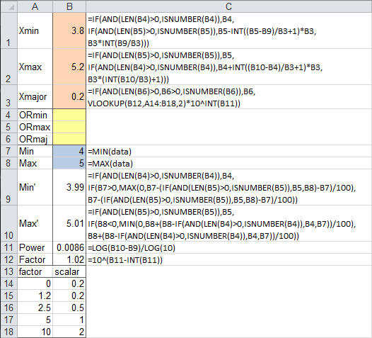
The Min’ and Max’ modifications to the data Min and Max use the override min and max values if they are valid, otherwise use the same algorithm as in the previous case.
Power and Factor are calculated the same way as before.
The logic of the new calculations are as follows:
Xmajor: if there is a valid override entry for tick spacing, use it, otherwise, calculate it as before from Factor and Power.
Xmin: if there is a valid override entry for axis minimum, use it; otherwise, if there is a valid override entry for axis maximum, start counting down from the override maximum in increments of Xmajor, and use the largest value which is less than Min’; otherwise calculate as before.
Xmax: if there is a valid override entry for axis maximum, use it; otherwise, if there is a valid override entry for axis minimum, start counting up from the override minimum in increments of Xmajor, and use the smallest value which is greater than Max’; otherwise calculate as before.
This example with user overrides may be overkill. But I occasionally find it very useful. This post is my way of saving it to the cloud, so I can find it later in a search engine.
More Axis Scale Articles
- Calculate Nice Axis Scales with LET and LAMBDA
- Calculate Nice Axis Scales in Your Excel Worksheet
- Calculate Nice Axis Scales in Excel VBA
- Chart UDF to Control Axis Scale
- How Excel Calculates Automatic Chart Axis Limits
- Reciprocal Chart Axis Scale
- Custom Axis Labels and Gridlines in an Excel Chart
- Custom Axis, Y = 1, 2, 4, 8, 16
- Logarithmic Axis Scales
- Link Excel Chart Axis Scale to Values in Cells
- Consistent Axis Scales Across Multiple Charts
- Gantt Chart with Nice Date Axis
- Select Meaningful Axis Scales
- Bar Chart Value Axis Scale Must Include Zero


