Dynamic Arrays, Names, and Charts
My previous post, Dynamic Arrays, Names, and Charts, described the process of building dynamic charts that used Names defined from the spill range of a Dynamic Array.
If a Dynamic Array’s spill range is used as a chart’s source data, changes in the size of the spill range are reflected in the chart. If the data is plotted by column, new rows in the spill range result in added points in the chart, and new columns in the spill range result in added series in the chart.
But there are numerous reasons for wanting to create dynamic charts the old-fashioned way, using defined Names for the X and Y values of each chart series. Dynamic Arrays, Names, and Charts describes the process, but this article looks at a further complication: category axes with multi-tiered axis labels.
Multi-Tiered Axis Labels
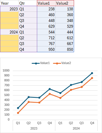
When you create a chart that uses multiple columns for its category axis labels (multiple rows if that series are plotted by row), the axis uses both columns for axis labels. The following dataset and chart show this behavior.
The first two columns contain axis labels, year and quarter, and the axis has two levels of labels, quarter and year. The yellow shaded cells in the data range are “blank”; they are not strictly blank, the cells can be empty or they can contain the empty text string or null string “”, which looks blank. Excel doesn’t always treat “” as a blank; for example, in a chart’s values source data, a null string is plotted as zero, because that’s how Excel plots text in the values range. But when “” or a blank cell occurs as shown, it helps Excel lay out the axis labels. The items next to the non-blank year and the following items next to a blank year are grouped together (Q1 through Q4); the years are centered under the group of quarters, and a line extends from the axis between adjacent groups (years), helping users to read the chart axis.
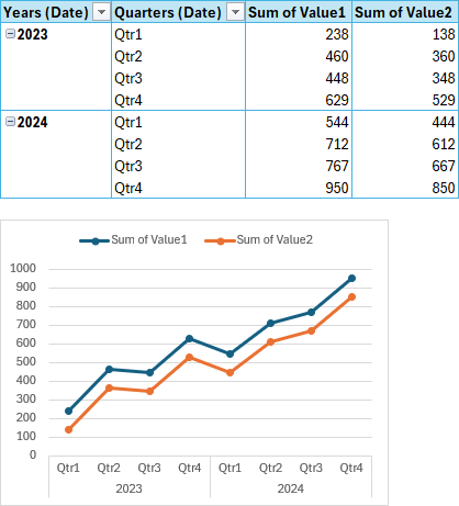
If you’ve ever inserted a chart from a pivot table with multiple fields in the Rows area, you would have seen this kind of axis layout. The pivot chart below looks like the regular chart above.
Static Range
Here’s my initial data area, with just one column for category labels, regular dates. The chart has only dates on the category axis in a single level of labels. I achieved the month/day<linefeed>year labels with a custom number format (applied with VBA because the number format UI isn’t smart enough in the Format Axis task pane).
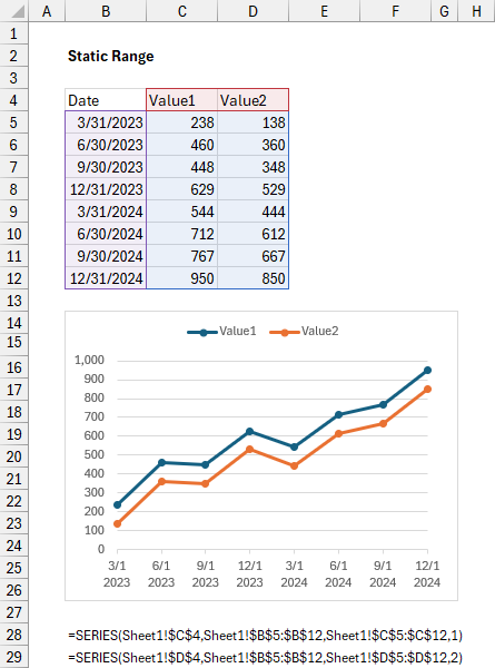
I will write a LAMBDA formula to convert the static data range above into a data range that includes multiple category labels.
Building the Dynamic Array Lambda Formula
Here is the Lambda formula followed by a description of its parts.
=LAMBDA(
  input,
  LET(
    header,TAKE(input,1),
    data,DROP(input,1),
    dates,TAKE(data,,1),
    values,DROP(data,,1),
    quarters,"Q"&MONTH(dates)/3,
    years,IF(quarters="Q1",YEAR(dates),""),
    output,
    VSTACK(
      HSTACK(
        {"Year","Qtr"},DROP(header,,1)
      ),
      HSTACK(years,quarters,values)
    ),
    output
  )
)(B4:D12)
The Lambda first defines ‘input’, taken from B4:D12, and it looks like this:
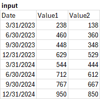
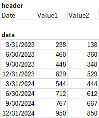
The Lambda splits ‘input’ as follows: ‘header’ TAKEs the first row of ‘input’ while ‘data’ DROPs the first row:
The data range is further divided: ‘dates’ TAKEs the first column of ‘data’ while ‘values’ drops the first column:
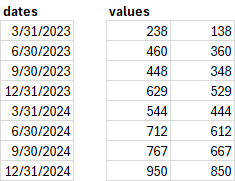
The Lambda needs one column of dates and at least one column of values. The output includes as many columns of values as the input range.
The function converts ‘dates’ into ‘Quarters’ and ‘Years’:
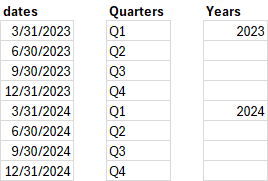
The formula uses VSTACK and HSTACK to assemble a new header row and a data range that includes Years and Quarters as multiple category labels.
Dynamic Array Chart
The Dynamic Array formula is shown below, along with a chart that uses the spill range as its data range. The multiple category labels appear automatically. SERIES formulas are shown below the chart.
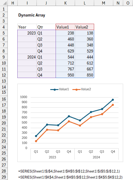
The chart is dynamic and updates as the Dynamic Array changes, adding points as the spill range adds rows and series as it adds columns. But there may be reasons to define Names to make the chart dynamic. One reason is that the chart’s data range can be distorted if a row is inserted or deleted above the spill range or if a column is inserted or deleted to the left of the spill range. Another reason is that when a Lambda results in an error, the chart may lose its dynamic link to the spill range, and correcting the formula will not restore the link.
Defining the Names
Below shows the practice formulas I wrote while defining the Names I will use in the chart. The lambda formula above is in cell I4, so its spill range is referenced by $I$4#. The X values and the Y values and names of the two series are shown below.
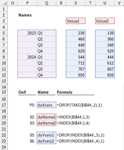
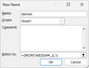
To create a Name, go to the Formulas tab and click on Define Name. The following dialog appears. Type the Name of the new name, enter the formula in the Refers To box, and add a comment if desired. For chart source data, I like to scope the Name to the worksheet containing the data, Sheet1 in this case. It isn’t shown below, but I have also referenced the spill range to the worksheet using Sheet1!$I$4#.
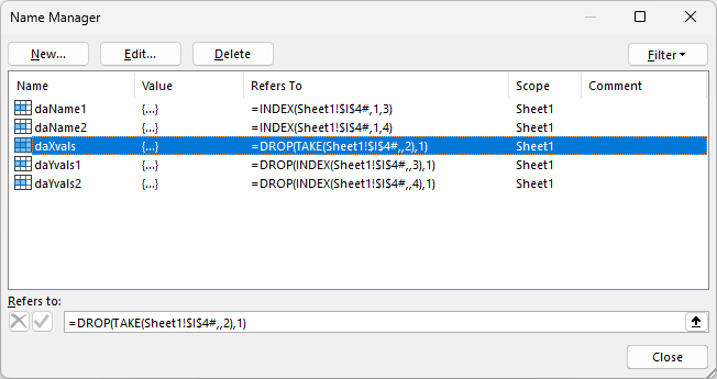
You can view all of the Names in the workbook by opening the Name Manager on the Formulas tab (or press Ctrl+F3). You can see each Name with its Refers-To formula and Scope. When you click in the Refers To box, the indicated range is highlighted in the worksheet; you can edit the formula in place. Clicking New or Edit opens the Define Name dialog shown above, to add a new Name or change the name, formula, and comment for an existing Name (you cannot edit the scope).
Now it’s time to incorporate the Names into the chart.
Dynamic Chart
Select your data and create the chart. I made a chart uses I4:L12 as its source data; here are its two SERIES formulas:
=SERIES(Sheet1!$J$4,Sheet1!$H$5:$I$12,Sheet1!$J$5:$J$12,1)
=SERIES(Sheet1!$K$4,Sheet1!$H$5:$I$12,Sheet1!$K$5:$K$12,2)
Select each series in turn, and edit the corresponding formula in the formula bar, replacing cell references with the Names that define series names and X and Y values.
=SERIES(Sheet1!daName1,Sheet1!daXvals,Sheet1!daYvals1,1)
=SERIES(Sheet1!daName2,Sheet1!daXvals,Sheet1!daYvals2,2)
Here is the chart with its updated SERIES formulas:
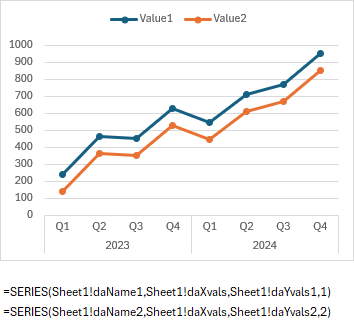
When the Dynamic Array’s spill range resizes, the Names will add rows as the spill range adds rows, and the chart will add points. If the new spill range has fewer columns, the corresponding Names will result in #REF! errors, so any corresponding series will be reduced to one point, with a zero value at the first category. If the new spill range has more columns, they will not be reflected in the chart until new names are manually defined and new series are manually added to the chart.
Related Articles on the Peltier Tech Blog
Dynamic Arrays
- ISPRIME Lambda Function
- Lambda Moving Average Formulas
- Improved Excel Lambda Moving Average
- Excel Lambda Moving Average
- LAMBDA Function to Build Three-Tier Year-Quarter-Month Category Axis Labels
- Dynamic Array Histogram
- Calculate Nice Axis Scales with LET and LAMBDA
- VBA Test for New Excel Functions
- Dynamic Arrays, XLOOKUP, LET – New Excel Features
Dynamic Charts
- Dynamic Charts
- Easy Dynamic Charts Using Lists or Tables
- Dynamic Charts in Excel 2016 for Mac
- Dynamic Chart using Pivot Table and Range Names
- Dynamic Chart using Pivot Table and VBA
- Dynamic Ranges to Find and Plot Desired Columns
- Split Data Range into Multiple Chart Series without VBA
- VBA to Split Data Range into Multiple Chart Series
- Dynamic Chart Source Data (VBA)
- Dynamic Chart with Multiple Series
- Display One Chart Dynamically and Interactively
Dynamic Array Charts
- Dynamic Charts Using Dynamic Arrays
- Dynamic Arrays, Names, and Charts
- Dynamic Array Histogram
- LAMBDA Function to Build Three-Tier Year-Quarter-Month Category Axis Labels


