In Get a Clown Suit, my colleague Jorge Camoes bemoans the overuse of the phrase “professional looking charts” to describe an ever expanding selection of gaudy and distracting visual effects. The particular graphic that set Jorge off was this chart from SmartDraw showing population of the ten most populous countries:

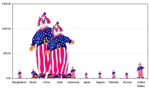
Although this chart used some kind of androids to represent the data, Jorge was envisioning the following chart in his head.
Choice of symbol to encode data
There are a number of things about this chart that should be adjusted. First, the clowns are distracting, perhaps even a little bit more so than the characters in the first chart. Whenever images like this are used, they really fill a rectangle, but the missing parts of the rectangle around the image cause us to misinterpret the true height of the bars. Let’s remedy this by replacing the clowns by rectangles of the same height and width. If you notice, even in the chart above, the value axis labels are more concise: 1500 M instead of 1,500,000,000.0 (who needs one decimal place precision on a billion and a half?).

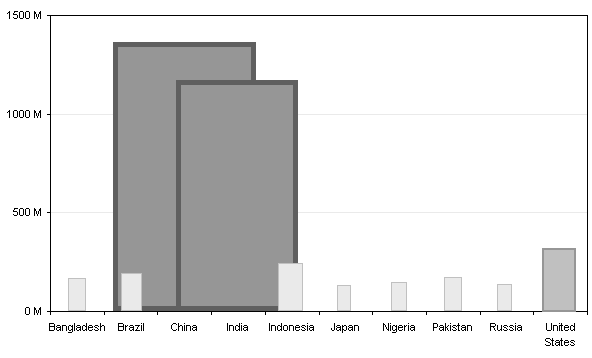
Okay, much better, at least we can better judge the extent of the numbers. There is a lot of overlapping, though. In the first clown chart above, you may have missed the Brazilian clown behind the huge shoe of the Chinese clown. In the rectangle plot above I’ve used white outlines to highlight boundaries of the rectangles which are placed in front of larger ones, but it’s better not to overlap bars.
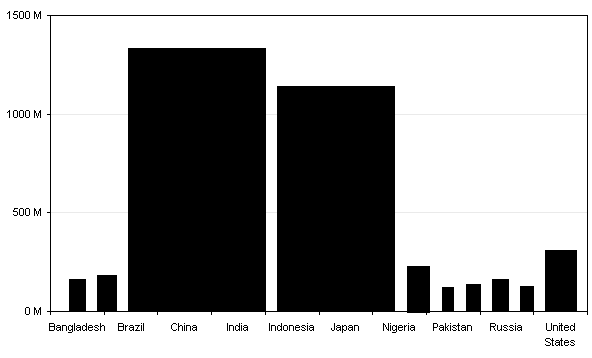
Now the neat alignment of the axis labels and the bars is lost, with the wide bars pushing the narrower ones aside.
Use of color (brightness and contrast)
Another issue with the SmartDraw chart is that the larger bars are bolder than the smaller bars. They are darker in color and less blurry. This emphasizes the larger values more than dictated by just the heights of the associated figures.

In fact, the larger androids have a thicker, darker border as well as a darker interior. If the intention was to show that China and India are enormous and nothing else matters, well, that was achieved.
Aspect ratio of data points
In addition to the color, the width of each bar distorts the perceived value it encodes. The height of each bar is proportional to the value it represents. So is its width. The area therefore is proportional to the value raised to the second power. The color difference probably makes the whole effect proportional to the value raised to the power of 2.5.
We can improve the clown chart by making each clown the same width.
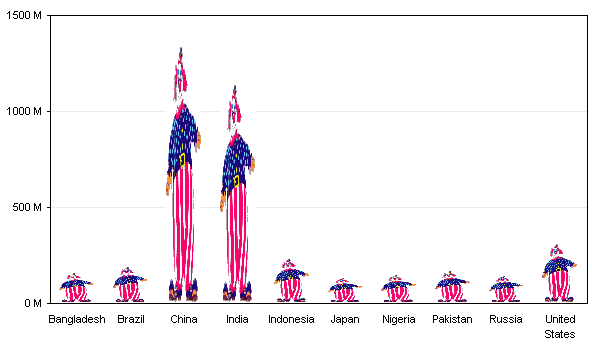
But that distorts the clowns so that they are hardly recognizable. Just as the clowns themselves distort the data so that it is hardly recognizable. We can address this by retaining the aspect ratio of the clowns, and stacking them to heights that represent the different values.

The poor Brazilian clown has been decapitated. I suppose that’s why he was hiding in the first chart. The partial clowns may be even more distracting than the stretchy clowns above.
Finally, a bar chart
We can eliminate the distraction of the clown symbols by using a plain rectangle.
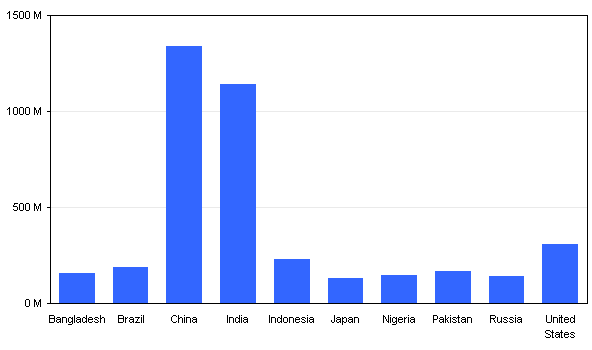
Sorting order
One thing that would help us to compare values across the chart is removing the arbitrary alphabetical sort of the country names with a more meaningful sort based on the values being charted. All of these charts use up lots of room, and without the fat clowns, we no longer need so much space.
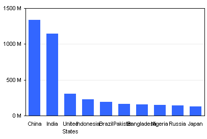
See, China and India are much bigger than the other countries, but the US still accounts for 20 to 25% of the population of each (not 1/50 of the emphasis provided by length, width, and color).
Chart Orientation
The labels overlap because of the shrinking of the chart. This can be remedied in several ways: use abbreviations for the country names, rotating the labels so the reader must turn the page or tilt his head, or rotating the chart so the labels and the values can be read without contortions. Excel will volunteer to omit some labels, but this is not useful if the data are not numeric and proportionally spaced.
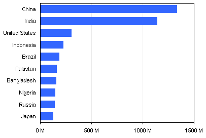
The nice thing about this chart is that it scales nicely if we decide to plot the top 25 countries.

A little embellishment won’t kill you
If you still need to resort to colorful images to draw attention to your chart, you can still add your clown, but a bit to the side so you can still make out the data. Remember that less can be more.
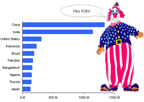
But to paraphrase Professor Tufte, if your data isn’t interesting, you need other data.
Summary of charting badness
Here are some things you should be aware of in your own charting efforts.
- Axis labels are too long, and show excessive precision. All of the text in the original was too small.
- Distracting symbols were used instead of bars.
- Symbols encode data in their length, width, and color, where only length is needed, and where only length should be used.
- Varying width bars overlap each other, partially hiding data.
- Values are sorted arbitrarily, not by value.


