Once again, I rely on Chandoo for inspiration for a charting tutorial. In Select and Show One Chart from Many he shows how to let a user choose which of several charts to show, in an interactive display. He uses data validation to enable the user to select from a finite list of charts, and uses a little-known image linking trick in Excel to show the selected chart. Basically, selecting an item changes a dynamic range so it refers to the range beneath the selected chart, and the picture is linked to this dynamic range.
This linked-picture trick is related to Excel’s Camera tool, which means two things. First, it’s pretty cool. Second, using it more than a few times will consume resources and slow down the workbook’s response. If you are linking to one picture of many, this is the way to do it, but if you merely want to show different set of data in your chart, it’s more than you need. In this post I will show you an easy and resource-friendly way to achieve the same effects in your dynamic report.
The Report Layout
I’ve set up my report as shown below. Cell F2 contains the selected quantity to be plotted, and I’ve named the cell “WhichChart”. The original data is in B17:E25, and a second data range linked to the first is in B28:E36. The borders around parts of the range B28:E36 show the chart source data range of the working chart, which I will discuss shortly.

One or both of the data ranges can be moved to a different place on this sheet, or onto another sheet, so that the focus is on the chart itself.
Data Selection
To make the selection of a chart more flexible, I changed the data validation list source of cell F2 (“WhichChart”) so it refers to the range C17:E17 rather than a hard-coded list (see the dialog below). This way, if I change one of the headers, I don’t need to update the data validation list.
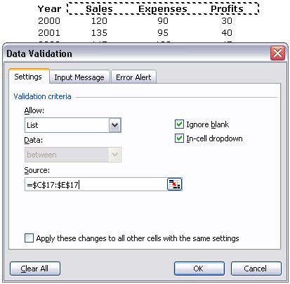
I generally prefer using a dropdown control or a listbox. A dropdown always shows the drop down arrow icon, so the user knows he can choose something even when the cell is not selected. A listbox shows all options without having to go to all the trouble of dropping down a list. But data validation is pretty easy to use, so it’s really a matter of choice.
The Dynamic Chart
I then constructed a chart that contained all of Chandoo’s data and the formatting from Chandoo’s three charts. I used B18:B25 for the category (X-axis) labels, C17:E17 for the series names, and C18:E25 for the series Y data. To make the chart title dynamic, I selected the title, typed = in the formula bar, then selected the range C17:E17, and pressed Enter. The chart title then displayed the formula =Report!$C$17:$E$17. When multiple cells are selected like this, Excel concatenates the cell values, inserting a space between non-blank items.
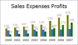
The Dynamic Data
The second data range is linked to the original data, with a twist. It compares the column header to the selection in F2 and shows or hides the column as appropriate. I selected the range C28:E36 with C28 the active cell, entered this formula, then pressed Ctrl+Enter to enter the formula into the entire selected range:
=IF(C$17=WhichChart,C17,"")
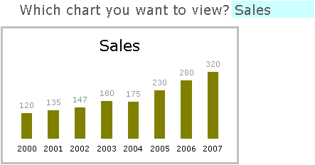
This hides the headers and Y data for the non-selected column of data. I changed the source data of the chart so that B29:B36 (purple outline) is used for the category (X axis) labels, C28:E28 (green outine) for the series names, and C29:E36 (blue outline) for the series Y data. I also changed the title link formula to =Report!$C$28:$E$28. The outline colors correspond to the colors that Excel highlights these ranges when the chart’s plot area or chart area is selected. When Sales is selected, the data range looks like this (with only the Sales column displayed):

and the chart looks like this:

Final Touches
This isn’t quite perfect yet, but it’s easy to finish. First, apply a custom number format of 0;;; to the data labels in the chart, so the zero values (corresponding to the blank cells) are not shown. Second, format any one of the series in the chart so that it has an overlap of 100, so that all columns overlap, and there is no horizontal space wasted for columns with no data. Here is the finished chart:

Download this dynamic chart (in a zipped workbook).


