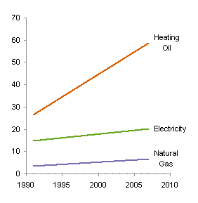
Dr. Nicolas Bissantz wrote in Do time series charts really compare time series? about time series being difficult to compare. The chart he discussed showed the cost of energy for three different heating methods. Says Nicolas, “The lines suggest that the price for heating oil has exploded, while electricity and natural gas have increased moderately.”


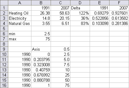
When we calculate the percentage change as in the table above, we see that the middle green curve for electicity has actually risen more slowly than the other two fuels, and the natural gas curve isn’t far behind heating oil in terms of relative increase.
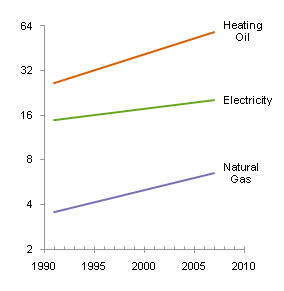
Nicolas goes on to discuss absolute and relative increases, and uses changes in the data (point-to-point changes or slopes) to make his point. HIs point is well taken, that the absolute linear scale on the vertical axis leads to incorrect conclusions. Rather than calculate a lot of slopes, and present the data in different terms than the original chart shows, there’s an easier approach: use a logarithmic value axis. I recreated Nicolas’ table, then connected the endpoints in a linear scale chart and a logarithmic scale chart.


The logarithmic scale on the right preserves the price values, while converting the slopes from absolute changes (where heating oil dwarfs the other two fuels) to relative changes (where electricity shows the slowest rise).
The use of a logarithmic scale is nothing new, of course. Financial data has long been presented on this basis, which facilitates comparisons between a $20 stock and a $30 stock, without requiring the reader to perform mental calculations.
This concludes the theoretical portion of today’s post.
How to make a nice logarithmic scale
Excel allows you to convert a linear value axis to a logarithmic value axis. Simply check the Logarithmic Scale box near the scale parameter settings. The result is okay (below left), but far from perfect. Up through Excel 2003, the axis could only begin, end, and show labels on a power of ten; Excel 2007 allows you to change the base of the log scale, a real improvement, but the labeling options are still limited to powers of the base (below right with a log base of 2).

So how did I get a nice log axis scale above? I rolled by own axis. Here is the data I used. In cells B6 and B7 I inserted “good” endpoints for my scale; I used worksheet cells to make it easy to adjust the calculations. I computed logarithmic values in E2:F4 using this formula in E2 and filling it into the range:
=(LOG(B2)-LOG($B$6))/(LOG($B$7)-LOG($B$6))
I put “good” tick labels in C10:C16, calculated the corresponding axis values in B10:B16 using this formula in B10:
=(LOG(C10)-LOG($B$6))/(LOG($B$7)-LOG($B$6))
and I put the year 1990 into A10:A16. When I construct a dummy XY series for my new axis, A10:A16 will contain X values, B10:B16 Y values, and C10:C16 data labels for the series. The value of 0.5 in cell C9 will control the length of tick marks (i.e., error bars) on this dummy series.
I selected A1:A4, then held Ctrl while selecting E1:F4, so both areas were highlighted, and created an XY chart with series in rows. These are the trends I want to show, but the axis scale does not show the actual prices.
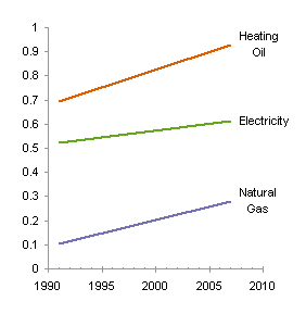
I copied A9:B16, selected the chart, and used Paste Special to add the data as a new series, by column, with categories (X values) in the first column and series name in the first row.
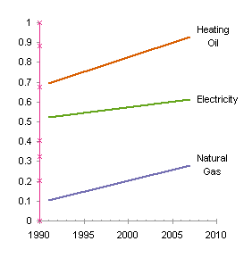
I added custom positive horizontal (X) error bars to this new series, using cell C9 for the custom error bar value.

I hid the series by formatting it to show no line and no marker.
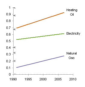
I formatted the error bars to use medium gray to match the axis line color, and to draw just the bar without the end cap.

I hid the Y axis tick marks and tick labels.
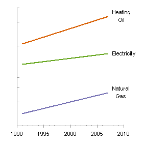
Finally I added data labels to the dummy series, using the contents of C10:C16. You can do this by adding any data labels and manually changing the text of each, but I use Rob Bovey‘s free Chart Labeler for this. John Walkenbach makes a similar utility, Chart Tools.

This nicely drawn logarithmic scale chart easily shows relative prices as well as relative changes in price.
More Axis Scale Articles
- Calculate Nice Axis Scales with LET and LAMBDA
- Calculate Nice Axis Scales in Your Excel Worksheet
- Calculate Nice Axis Scales in Excel VBA
- Chart UDF to Control Axis Scale
- How Excel Calculates Automatic Chart Axis Limits
- Reciprocal Chart Axis Scale
- Custom Axis Labels and Gridlines in an Excel Chart
- Custom Axis, Y = 1, 2, 4, 8, 16
- Logarithmic Axis Scales
- Link Excel Chart Axis Scale to Values in Cells
- Consistent Axis Scales Across Multiple Charts
- Gantt Chart with Nice Date Axis
- Select Meaningful Axis Scales
- Bar Chart Value Axis Scale Must Include Zero


