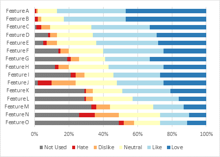
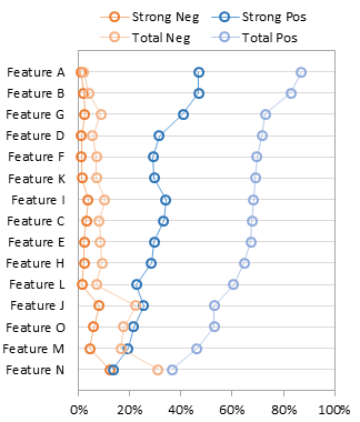
A reader commented on another post, asking how to show a bar chart of percentages with a line chart showing a goal on the secondary axis. I responded with this quick procedure, then decided it made a good standalone tutorial.
The bar chart is easy enough, but we can’t make a line chart along a vertical category axis. We’ll combine the bar chart with an XY chart instead.
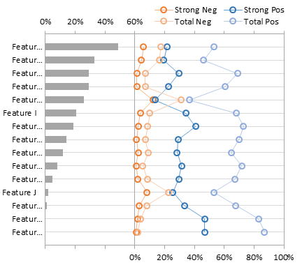
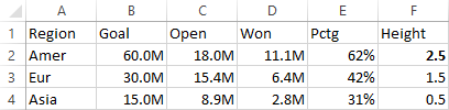
The data is shown below. Column E has the computed percentages of Won/Open, column F has Y values that make the XY chart with our Goal line up with the regions. The dollar values are in millions, displayed with the number format 0.0,,"M" where each comma removes a set of three digits from the values so millions are displayed with one decimal digit and with the “M” appended.
Select A1:A4, then hold Ctrl while selecting E1:E4 so both areas are selected, and insert a bar chart.

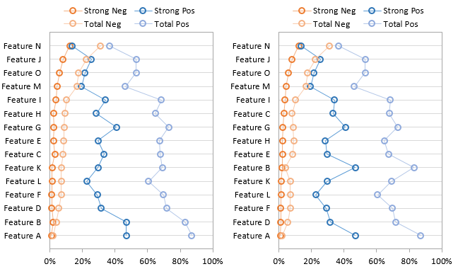
I’ve already formatted the vertical axis so that the categories are plotted in reverse order.
Select B1:B4, then hold Ctrl while selecting F1:F4 so both areas are selected, and copy.
Select the chart, choose Paste Special from the Paste dropdown on the Home tab, and choose these options: Paste as New Series, Series in Columns, Series Names in First Row, Categories in First Column.

Right click on the new series, choose Change Chart Type, and select the XY with Markers and Lines option.

Add the Secondary Horizontal Axis using the Plus icon next to the chart in Excel 2013 or using the Axes dropdown on the Chart Tools > Layout tab in Excel 2007/2010.
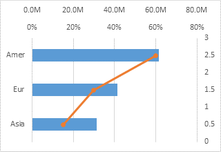
Format the Secondary Vertical Axis (right edge of the chart) so the horizontal axis crosses at the Automatic position (zero). Also format this axis so there are no labels or tick marks. Add data labels if desired.
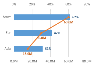
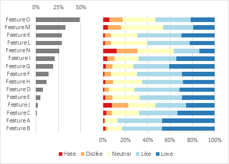
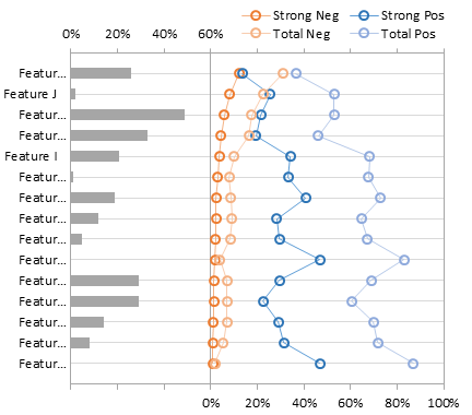
I always say that secondary axes confuse more than they elucidate, but this chart is easy enough to “panelize”; we just need to adjust the horizontal axis scales. Follow these steps to separate the plotted data into panels:
Primary Horizontal Axis (top of the chart):
Min=0, Max=1.6 (160%), custom number format [<=0.8]0%;;; which only shows labels less than or equal to 0.8 (80%) and removes the unneeded decimal.
Secondary Horizontal Axis (bottom of the chart):
Min=-80M, Max=80M, custom number format 0,,"M";;0,,"M"; which uses 0,,"M" for positive values, nothing for negative values (between the semicolons), 0,,"M" for zero, and nothing for text (after the third semicolon).
Also format so the vertical axis crosses at the Automatic position (zero) which is in the middle of the chart.
Primary and Secondary Vertical Axes:
Use a line color that’s darker than the gridlines.

Finally, add labels to the horizontal axes. I took the “M” out of the number formats for the Goal axis and data labels, since it was stated in the axis title. I should do the same with the percent signs on the other axis. I also decided to reduce the gap width to 75% to widen the bars.