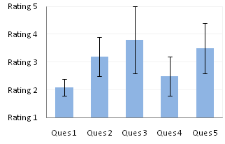
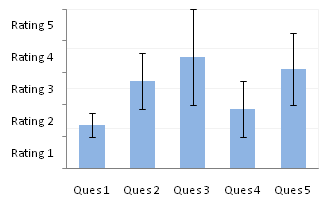
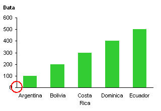
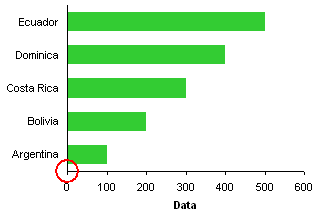
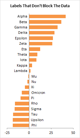
Someone on Twitter asked me how to make axis labels stay on the side of the axis away from the data. This bar chart illustrates the desired outcome. When bars indicate positive values, the labels are on the negative side of the axis, and vice versa.
The Problem
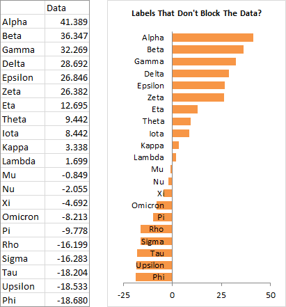
This data and chart show the behavior of axis labels in Excel. Even though some data is negative, the labels are always on the negative side of the axis, where the labels overlap with the bars. Depending on the series fill color, this could make the labels illegible.
Lame Attempts
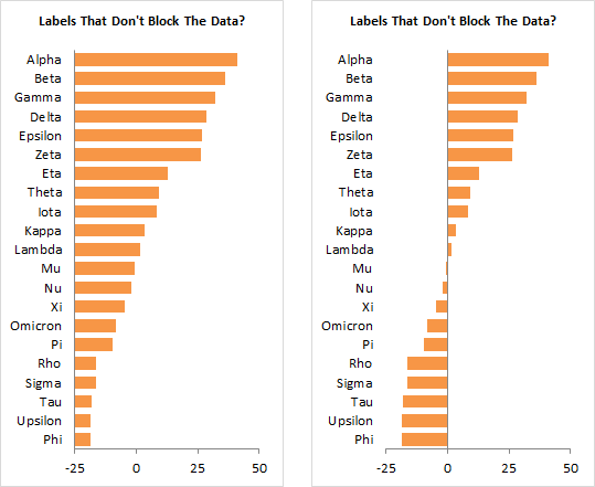
You could play with axis formats to try to make things better. You could format the horizontal axis to make the vertical axis cross at value other than zero; I used -25 below left. This is a terrible solution, though, because now the bars don’t start at the baseline of zero, and even the negative values are plotted with positive direction bars. No good.
You could format the vertical axis labels to make them appear in the Low position, that is, below the lowest values on the horizontal axis, below right. In many cases this is appropriate, but it’s not ideal.
The Solution
The trick is to realize that you can’t make the built-in axis labels do what you want, then think of another way to show the labels. In this case we’ll add a hidden bar chart series, which will use its own data labels.
I’ve added a column with small negative values next to positive plotted values, and small positive values next to negative plotted values.

When you add the new data to the chart, the built-in axis labels still overlap with the negative bars (left). The bars are offset, but we can fix this by formatting either of the bars and changing the overlap to 100% (right).
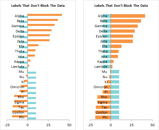
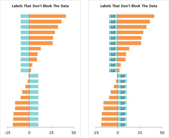
I hid the built-in axis labels (left). Then I added data labels to the added series (right). The default labels show the plotted values (10 or -10), and I selected the inside base position for the labels.
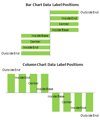
The charts below show the four positions for data labels in clustered column and bar charts. Center means in the center of the bars. Inside Base means inside the bar next to the base (bottom) of the bar (next to the axis). Inside End and Outside End mean inside and outside the far end of the bar. Stacked charts can’t have Outside End labels, because these would overlap with any bar stacked on top of the one being labeled.
I’ve formatted the labels so that they display the category names instead of the values (left) Then I hid the dummy bar chart series by setting its fill to No Fill (right).
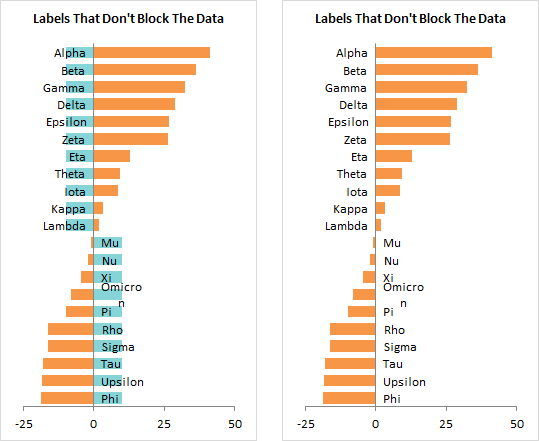
Data labels are not allowed to be as long as axis labels: note that the Omicron label is wrapped onto two lines. For general clarity it’s a good idea to keep your labels short, but here it’s doubly important.
Excel 2013 has finally enabled users to change the size of data labels (but not yet chart and axis titles). However, I’m using Excel 2010 right now, so I don’t have that luxury.
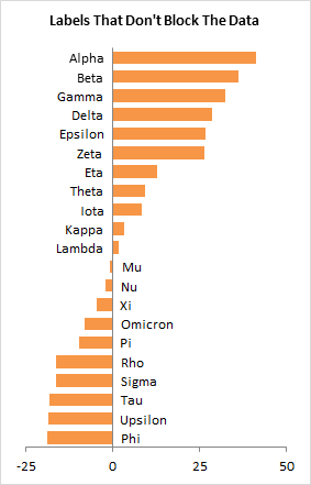
Since the data label size is related to the chart dimensions, you can make the label fit onto one line by stretching the chart.
If your chart size is constrained, you can change the font instead. Below left I’ve changed the Calibri labels from 10 to 9 points. Below right I’ve changed from Calibri 10 points to Arial 8 points.
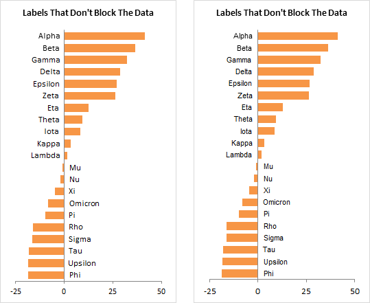
For this chart, I think I’ll keep Calibri 9 point labels.


