When analyzing survey results, for example, there may be a numerical scale that has associated text labels. This may be a scale of 1 to 5 where 1 means “Completely Dissatisfied” and 5 means “Completely Satisfied”, with other labels in between. The data can be plotted by value, but it’s not obvious how to place the text labels on the chart in place of the numerical labels on the horizontal axis.

There are several ways to accomplish this task. In this tutorial I’ll show how to use a combination bar-column chart, in which the bars show the survey results and the columns provide the text labels for the horizontal axis. The steps are essentially the same in Excel 2007 and in Excel 2003. I’ll show the charts from Excel 2007, and the different dialogs for both where applicable.
Let’s assume the following dummy survey results. I’ve sorted the list in reverse order to work around the phenomenon described in Why Are My Excel Bar Chart Categories Backwards?
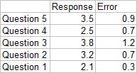
Plot the responses for each question (the first two columns of the data) in a clustered bar chart, and use the Error column as custom error bar values.
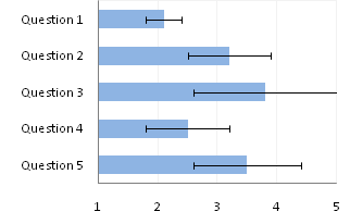
So far so good, except that the end cap of the Question 3 upper error bar is apparently hidden by the plot area border (it appears properly in 2003). Note that I’ve violated the first rule of bar chart value axis scales, which is that The Axis Scale Must Include Zero. However, the minimum possible score here is 1, and we’ll be using text labels. In our chart, fixing the scale at 1 to 5 makes sense.
Here is the data for the text labels. Rating 1 may stand for “Totally Lame” and Rating 5 for “Totally Awesome”. I chose the Dummy values of 2 just so the data would show up in the chart.
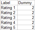
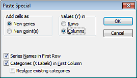
Copy this table above, select the chart, and use Paste Special to add the data to the chart using the settings below (the Excel 2007 dialog is very much like this Excel 2003 dialog).
We now have two sets of bars in the chart.
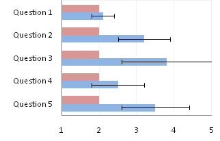
Right click on the new series, choose “Change Chart Type” (“Chart Type” in 2003), and select the clustered column style.
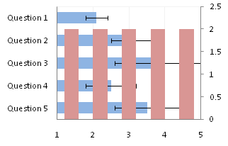
In Excel 2003 the chart has a Ratings labels at the top of the chart, because it has secondary horizontal axis. Excel 2007 has no Ratings labels or secondary horizontal axis, so we have to add the axis by hand. On the Excel 2007 Chart Tools > Layout tab, click Axes, then Secondary Horizontal Axis, then Show Left to Right Axis.
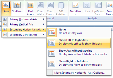
Now the chart has four axes.
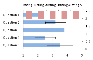
We want the Rating labels at the bottom of the chart, and we’ll place the numerical axis at the top before we hide it. In turn, select the left and right vertical axes.
In the Excel 2007 Format Axis dialog, the left axis will be set so the horizontal axis crosses at the automatic setting, and the right axis so the horizontal axis crosses at the maximum category. Switch the settings of the left and right axes.
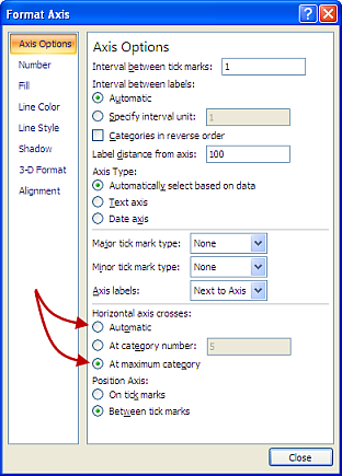
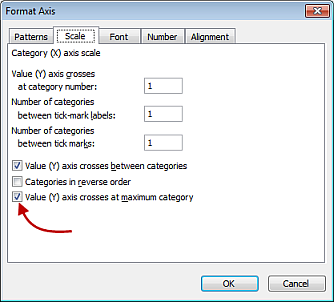
In the Excel 2003 Format Axis dialog, the maximum category checkbox checked for the right axis and unchecked for the left axis. Change the setting for each vertical axis.
Now we have the axes where we want them.
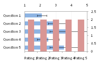
Hide the dummy series by setting its fill color to no fill.
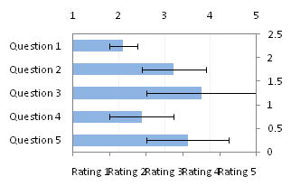
Hide the top and right axes by selecting “None” for axis tick marks and tick labels, and “No Line” for the axis line itself.
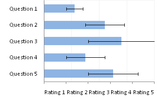
The Rating labels are not properly aligned, but this is easy to fix.
Format the horizontal axis, and in Excel 2007 change the Position Axis setting of the vertical axis from “Between Tick Marks” to “On Tick Marks”.

In the Excel 2003 Format Axis dialog, uncheck the “Value Axis Crosses Between Categories” checkbox.

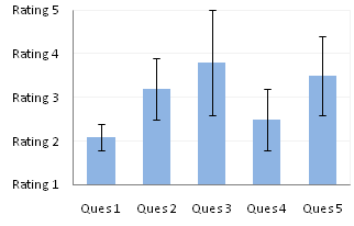
Finally we have our chart with text labels along the survey response (horizontal) axis.

I noted before that the error bar cap is not obscured in Excel 2003, and here’s proof.

See Text Labels on a Vertical Column Chart in Excel to see how to get the text labels onto the vertical axis of a column chart.


Liu says
To use a xy scatter plot to display the label may be more easily?
dermotb says
Why not just format the X Axis numbers as “Rating” # ?
Jon Peltier says
Liu –
Six of one, half dozen of the other. In general, I think it’s easier to use a column chart series and its associated axis, rather than work with custom data labels. I think people who don’t work with a lot of charts would find it much easier.
Jon Peltier says
Dermot –
If the labels are as simple as Rating X, then I can use a custom number format. But if they range from “Very Bad” to “Very Good”, I can’t use that approach.
dermotb says
If you wanted labels running from Bad to Very Good, I would simply superimpose a text box with those labels. Way simpler.
Don’t get me wrong – I admire the technical skills involved, but I’m just thinking of
whether it’s really necessary to do all this, just for some labels, and I feel for the poor bunny who comes along a year later and has to make sense of it and update it.
I would save the complexity for charts that really need it (and you have many of those on your website, for which I have been grateful several times in the past!).
bill says
i think i would have done this all as an x-y plot (5 series) using error bars to get the blue bar portion and deleted all of the axis labels in favor of a concatenated data point label with all of the relevant information something like this… “Q1 2.1 ±0.3”. if there were more than about 10 questions, I would have added a little vba program to loop through and establish each individual series (treating each question as an individual series allows the series name to be used as the data point label).
Somnath says
Jon,
How about adding a dummy XY chart with X-values (0.5,1.5,2.5,3.5,4.5) & all Y-values =0?
It will align itself with the horizontal axis, and then can be labelled using XY-chart labeler?
Jon Peltier says
Dermot –
It’s not terribly complex to make the column-bar combination chart (well, for me), and this layout keeps the labels properly aligned.
Jon Peltier says
Bill –
As comments have shown, there are many ways to skin this cat. I myself prefer using and XY series over the bars. One point per series also helps with the labeling.
Jon Peltier says
Somnath –
Yet another approach. It’s really a matter of preference. If I use the column chart axis labels, I never have to worry what happens to the XY labels if I insert or delete a point, and I never have to worry about making room for the labels, because the axis automatically provides space for the labels.
DaleW says
Jon,
If our audience is quantitative enough to appreciate error bars, shouldn’t we show them the numbers also?
Instead of hiding our underlying 1-5 scale, this seems a good opportunity to use a visible secondary scale, so numbers and text are clearly linked. Then our graph can display our averages (or whatever sleigh of hand we’re using to try to collapse ordinal data counts into a single metric with error bars). And the wise guy in the back could ask why we believe Question 3 with a 3.8 score is within margin of sampling error of a perfect score, since some in our sample and population clearly wouldn’t give it that . . .