When analyzing survey results, for example, there may be a numerical scale that has associated text labels. This may be a scale of 1 to 5 where 1 means “Completely Dissatisfied” and 5 means “Completely Satisfied”, with other labels in between. The data can be plotted by value, but it’s not obvious how to place the text labels on the chart in place of the numerical labels on the vertical axis.
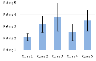
There are several ways to accomplish this task. In this tutorial I’ll show how to use a combination bar-column chart, in which the columns show the survey results and the bars provide the text labels for the horizontal axis. The steps are essentially the same in Excel 2007 and in Excel 2003. I’ll show the charts from Excel 2007, and the different dialogs for both where applicable.
Let’s assume the following dummy survey results.

Plot the responses for each question (the first two columns of the data) in a clustered column chart, and use the Error column as custom error bar values.
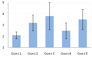
So far so good. Note that I’ve violated the first rule of column chart value axis scales, which is that The Axis Scale Must Include Zero. However, the minimum possible score here is 1, and we’ll be using text labels. In our chart, fixing the scale at 1 to 5 makes sense.
Here is the data for the text labels. Rating 1 may stand for “Totally Lame” and Rating 5 for “Totally Awesome”. I chose the Dummy values of 2 just so the data would show up in the chart.
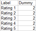
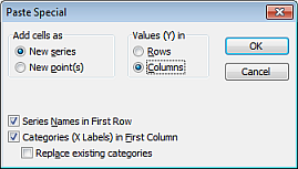
Copy this table above, select the chart, and use Paste Special to add the data to the chart using the settings below (the Excel 2007 dialog is very much like this Excel 2003 dialog).
We now have two sets of columns in the chart.

Right click on the new series, choose “Change Chart Type” (“Chart Type” in 2003), and select the clustered bar style.
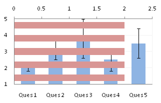
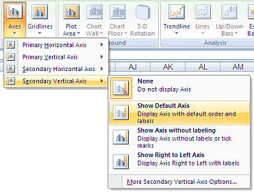
There are no Rating labels because there is no secondary vertical axis, so we have to add this axis by hand. On the Excel 2007 Chart Tools > Layout tab, click Axes, then Secondary Horizontal Axis, then Show Left to Right Axis.
In Excel 2003 go to the Chart menu, choose Chart Options, and check the Category (X) Axis checkmark.
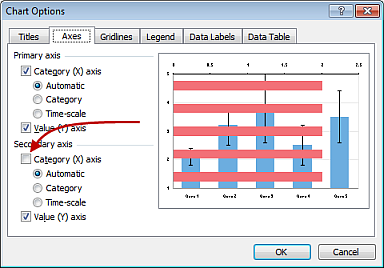
Now the chart has four axes.
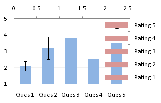
We want the Rating labels at the left side of the chart, and we’ll place the numerical axis at the right before we hide it. In turn, select the bottom and top vertical axes.
In the Excel 2007 Format Axis dialog, the bottom axis will be set so the vertical axis crosses at the automatic setting, and the top axis so the vertical axis crosses at the maximum category. Switch the settings of the top and bottom axes.
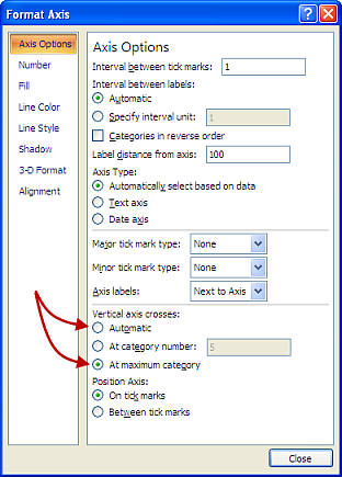
In the Excel 2003 Format Axis dialog, the maximum category checkbox checked for the top axis and unchecked for the bottom axis. Change the setting for the top and bottom axes.
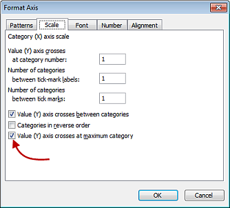
Now we have the axes where we want them.
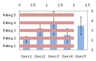
Hide the dummy series by setting its fill color to no fill.

Hide the top and right axes by selecting “None” for axis tick marks and tick labels, and “No Line” for the axis line itself.
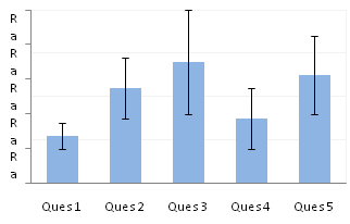
In Excel 2007 (not in Excel 2003) the Rating labels may have been squished. Select the plot area, and drag its left edge inwards to make room for the labels.
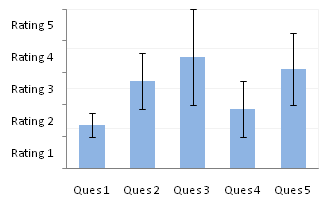
The Rating labels are still not properly aligned, but this is easy to fix.
Format the vertical axis, and change the Position Axis setting of the horizontal axis from “Between Tick Marks” to “On Tick Marks”.
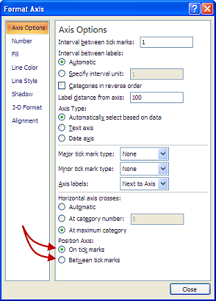
In the Excel 2003 Format Axis dialog, uncheck the “Value Axis Crosses Between Categories” checkbox.

Finally we have our chart with text labels along the survey response (vertical) axis.

See Text Labels on a Horizontal Bar Chart in Excel to see how to get the text labels onto the horizontal axis of a bar chart.


Bob says
Hi Jon,
Once again, glad to see you are posting. At this time of year, I just wanted to thank you for your contribution to the Excel community, the wit and opinion you put into your posts here and in the newsgroups.
All the Best of the Season to you & your family.
Strum, strum, strum….
Cheers,
Bob
wynand says
yet another excellent post!
SA says
Wow, great tip! Thanks!
Gadi Bizinyan says
This tutorial has been very helpful and informative. Thank you very much for sharing the technique.
Ali says
Hi
thank you very much for very useful posts
that was awesome!
Rachel says
The category labels on the x-axis of my graph are now too long to fit on the graph without overlapping and they won’t wrap into two lines. For instance, if you had typed out “Question 1” instead of “Ques 1” on the graph above, it would have overlapped “n 1” with “Que” from the label “Question 2.” Do you know of a way to wrap the text for the labels along the x-axis so it will fit when the graph shrunk down? (I tried putting lots of spaces between the words -which usually works to make it wrap- but it just made the label longer on one line.) I’m using Excel 2010.
Thank you for your help and expertise!
Rachel says
It’s also worth noting that in Excel 2010 I was unable to find the “Value (Y) crosses at maximum category” button. What I ended up doing was going to Format Axis, Axis Options, and under ‘Axis labels’ choosing “Low.” After that, I had to put an outline around the graph because there was no other way to get the left verticle axis line back in.
Jon Peltier says
Rachel –
1. About all you can do is insert a line feed into the cell. Place the cursor where you want the text to wrap, hold Alt, and press Enter.
2. Format the horizontal axis. In the Axis Options pane, near the bottom, the header says “Vertical Axis Crosses”, and you have the choices “Automatic”, “At Category Number”, and “At Maximum Category”. Choose the last option.
Anonymous says
I have an xy scatter chart. I want to place a name by the axes to identify what it is. A simple operation that should be 5 minutes, has now taken me an hour. You guys screwed this up bad.
Jon Peltier says
“Us guys?”
Did you want to add Axis Titles?
Excel 2007/2010: Chart Tools/Layout tab > Axis Titles.
Excel 2013: Plus icon > Axis Titles or Chart Tools/Design tab > Add Chart Element > Axis Titles.
Google: ‘Excel Axis Titles’ or ‘Excel Axis Labels’.
Peter says
Great instructions – was looking exactly for this – clear, simple, very effective. Thank you :) .
Oxphos says
Excellent!
I do not understand why this cannot be found on official Office site…
Antro says
thanks Jon! Excellent post that just works :-)
Melissa says
I am just trying to figure out how to add the “Ques1” “Ques 2” etc. to a graph. Why is this information not easily available anywhere?
Jon Peltier says
Melissa –
In the first table of this post (just below the first chart) you see three data columns: questions, ratings, and errors. Select the first two columns (including the top row with the blank cell and the “Response” label) and make your chart, and it will automatically use those labels for the category axis labels. If you didn’t start out with this kind of data, you can right click on the chart, select Select Data, then click the Edit button above the category labels section in the right half of the dialog, and select the range with these labels.
Terry says
Jon, thanks for your postings. I was able to use this post and another one to change the labels on both my x-axis and y-axis. I don’t know why the software has to make it so cumbersome! Thanks.
Kris says
Great articles except for the explaining what your article actually claims to be intending to explain part. How do I make my x axis label be something other than number? You claim to explain that in this article. Yet you simply show that you have already done it and then go on to talk about god only knows what.
Jon Peltier says
Well, the article was about putting text labels on the Y axis, which it does in fact explain. But besides that, what part of the article are you having trouble with?
Ed says
Thanks a lot!!!
Karen says
Hello,
How do I do this if I can’t add a secondary axis? The chart I am working with is built piece by piece using VBA. I cannot recreate the chart manually to even play with it. I’m ready to bang my head against a brick wall. I wish I could show you what I’m working on, but confidentiality prevents me. Any ideas on building a y-axis using VBA that will simply replace the existing one? The y-axis I want to use is a table on one of my worksheets. Any help, ideas, thoughts, you may have will be greatly appreciated!
Karen says
Update: I’ve played with the chart and figured out how to do it. My question is this….what if the y-axis isn’t spread out evenly? For example, what if the y-axis is % and the % varies. I would like my labels to match the %. In your example above, Rating 1 would be 0 percent, Rating 2 would be 16%, Rating 3 would be 33%, Rating 4 would be 75% and, Rating 5 would be 95%. How can that be accomplished?
Winston Snyder says
Hi Jon,
I’m using Excel 2013. When I Paste Special the “Rating” Data, Stacked Columns are only added next to the first 4 Points of Series1. I can see that I definitely selected all 5 of the Rating labels before the Copy Operation.
Any thoughts?
Thanks
w
Jon Peltier says
Winston –
Did you select the header as well (“Dummy”)? If not, then don’t check Series Names in First Row.
Lau says
Hi Jon,
I’m working with Excel 2010.. I can’t find the Paste Special option. I basically want my y-axis scale to be –,-,0,+,++. Can you give me some tips on how to do this? Thanks in advance!
Jon Peltier says
Home tab > Paste button dropdown arrow > Paste Special
Lau says
Ah I see, thanks for the quick reply!
Rob says
This is great and really helped me do what I need.
However, I have one more part that I don’t know is possible: My chart has data on it that will range from 1-3. However, the scale is 1-1.6, 1.7-2.3 and 2.4-3.
What I’m looking for is a way to display the tick marks at 1.6 and 2.3 but also have the labels of “Rating 1” at 1.6, “Rating 2” at 2.3, and “Rating 3” at the 3 mark. Is there a way to do this?
Thanks in advance!
vvanasperen says
Great stuff! Thanks a lot for sharing.
Zee says
Thank you somuch for this tutorial…it helped alot…what took me the whole night to figure out was resolved in a few minutes.
Robin Carseldine says
Are you able to provide a similar tutorial for 2016 as I can’t get the above to work.
Jon Peltier says
Robin –
The interface for Excel 213 and 2016 is different than that shown for Excel 2007 (and 2010) above. You can add an axis using the [+] “skittle” next to the chart. Formatting the axes is much the same, but you have a task pane along the right edge of the Excel window, not a big ugly dialog floating in the middle. The wording might be slightly different, and things may have been rearranged, but the things you need to select or check are still there.
Carmenpat says
Hi Jon, very useful your post and very good explanations.
I would like to do it with a stacked column graph and I have not been able, it only serves in clustered column graph?
Jon Peltier says
Carmenpat –
Nope, works just the same. Here are my data ranges:
Here are the steps I took to construct the chart. Same as above.
Margaret Farrell says
Is there a way to do this same thing with an XY scatterplot?
Jon Peltier says
Margaret –
When you have your scatterplot, start where this article says “Here is the data for the text labels.”
If you still have trouble, upload your data to a file-sharing website, and reply here with a link and description of where you’ve gotten to.
Chandu says
Very Nice article, Thanks For Sharing