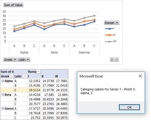
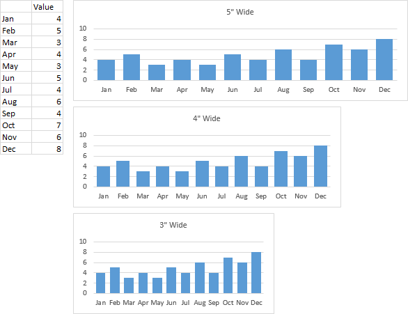
A certain data layout can produce a chart axis which divides and subdivides the categories into logical subcategories, such as years, quarters, and months in the following chart.
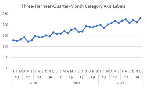
Generally, this data layout must be produced by hand, because it relies on an arrangement of filled and blank cells to help Excel parse the data into subcategories. In this post I’ll show how a LAMBDA formula can build the range for you.
Bulgaria Excel Days 2022
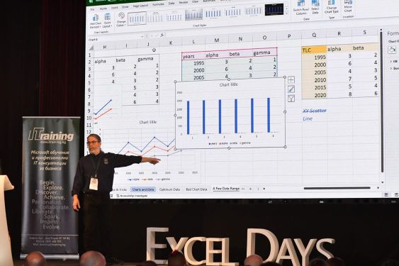
Earlier this month I had the honor and pleasure of participating in Excel Days 2022, held in Sofia, Bulgaria. On one day I held my Advanced Excel Charting Masterclass for a group of about 25; on another I presented a conference session entitled “The Best Excel Charting Tips and Tricks” to a crowd of 300 or more. That’s me standing in front of the largest LED screen I’ve ever used.

Chart Tip/Trick: Top-Left Cell
One of the tips was that using a blank top-left cell helps Excel parse the X values, Y values, and series names (highlighted purple, blue, and red respectively in the screenshot below), especially if the X values and series names consist of numbers (years, for example). The top-left cell, or TLC, is filled with light gold.
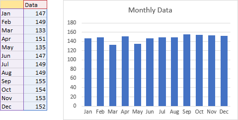
Many people know about this TLC trick.
Chart Tip/Trick: Category Axis Grouping
What I call TLC+ extends this approach to identify multiple columns to use as X values, using blank cells to identify grouping of categories and subcategories. This example groups months into quarters. Again, blank cells are filled with light gold, and the axis categories and subcategories are highlighted with the same color.
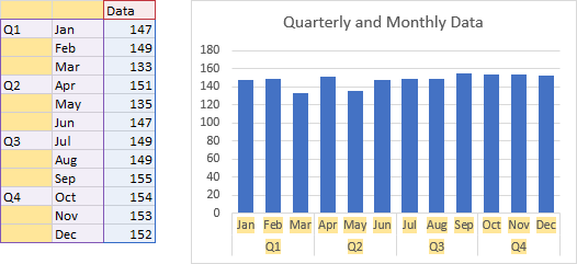
Many people don’t know about grouping axis categories in this way, although they’ve likely seen it in a pivot chart that has multiple fields in the rows area of its pivot table. So this trick was new to much of my audience.
TLC+ doesn’t stop there. The next example shows months grouped into quarters, and quarters grouped into years. I’ve applied the same highlighting as above.
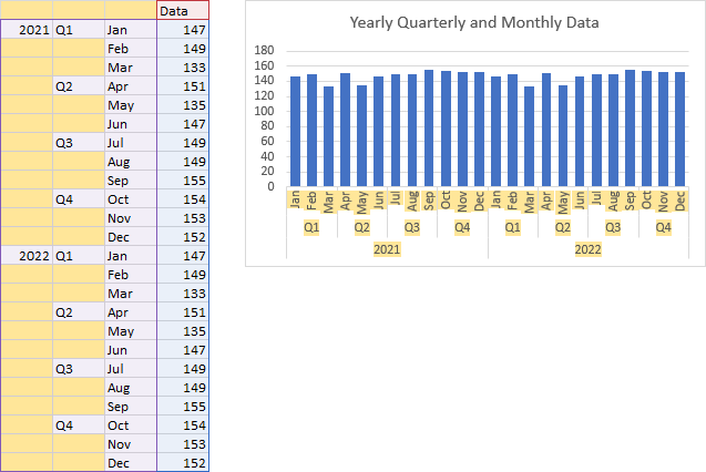
This grouping can be extended much farther; the limit is not with Excel’s technical capability but more with the legibility of the output. Once I built a chart with 9 or 10 levels of grouping in its category axis. By this point, the chart consisted of a very wide category axis and very little room for data in the plot area.
Not-Just-For-Charts Tip/Trick: Custom Number Formats for Months
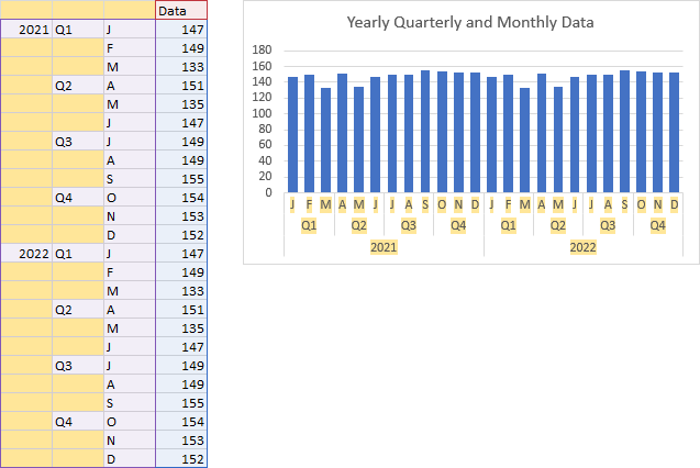
Speaking of legibility, those month abbreviations are difficult to read, since they have been rotated upward. But you can use a one-letter abbreviation for each month, by entering an actual date in the cells, and applying the custom number format below. One “m” in the custom format string results in a one- or two-digit month number; two results in a two-digit month number with a leading zero if necessary. Use three m’s for the three-letter month abbreviation, and four m’s for the full month name. Finally, five m’s will give you just the first initial of each month. This may be confusing if only one or two months are abbreviated this way, since there are multiple months for J, M, and A. But when a whole year of months is abbreviated like this, people recognize the months.
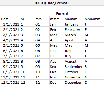
This “mmmmm” trick amazed one audience member so much that she tested whether “ddddd” would produce the one-letter abbreviations of the days of the week. She reported that, sadly, it does not.
This is the same data as above, with one-letter month abbreviations that improve legibility of the axis labels.
Most Important Chart Tip/Trick?
Those are three great tips: top-left cell, category label grouping, and the custom number format for one-letter month abbreviations. But what is the most important charting trick?
As I am energetically explaining below, the most important charting trick is to get the data right before you make your chart.

Dude, Where’s My LAMBDA?
I promised a formula to construct a grouped data range for a chart’s category axis. Here is how I built my LAMBDA.
TEXTSPLIT
My initial approach was to build a string of years, quarters, and months delimited by commas and semicolons, then use the recently introduced TEXTSPLIT function to break that into the required grid.
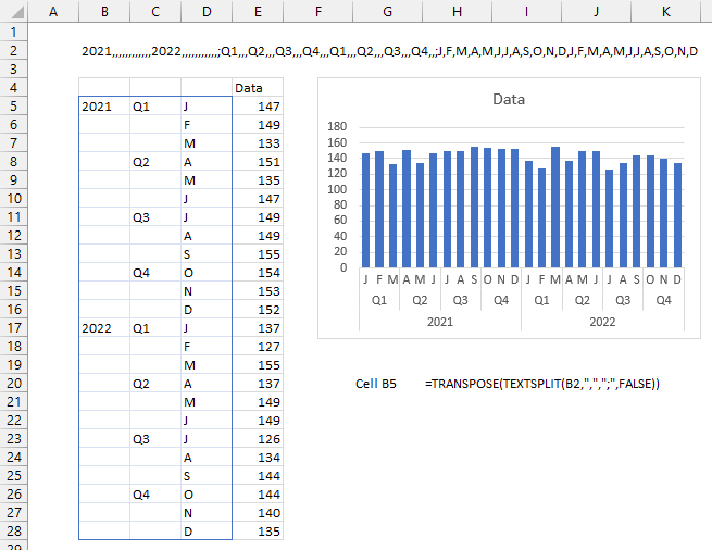
I typed this long string into cell B2 (note the semicolons before the first quarter and before the first month)
2021,,,,,,,,,,,,2022,,,,,,,,,,,;Q1,,,Q2,,,Q3,,,Q4,,,Q1,,,Q2,,,Q3,,,Q4,,;J,F,M,A,M,J,J,A,S,O,N,D,J,F,M,A,M,J,J,A,S,O,N,D
and this formula in cell B5 produced the grouped dates in B5:D28 (with a blue border intended to resemble the Dynamic Array formula highlighting).
=TRANSPOSE(TEXTSPLIT(B2,",",";",FALSE))Some people like to use spaces to make formulas easier to read; Excel ignores the spaces.
=TRANSPOSE(TEXTSPLIT(B2 , "," , ";" , FALSE))Some will even write the formula on multiple lines for clarity, with spaces to provide indentation; Excel ignores the line feeds as well as the spaces. You can press Alt+Enter to insert a line feed within a formula. I’m not sure extra spaces and line feeds are necessary for this relatively simple formula, but they will help in a little while.
=TRANSPOSE(
  TEXTSPLIT(
    B2 ,
    "," ,
    ";" ,
    FALSE
  )
)
The chart was a test that the output would work for my axis groupings.
My initial thought was to input an initial year and number of years into my LAMBDA, construct the long, delimited string, then TEXTSPLIT it. But I did a little experimenting first.
Build the Pieces
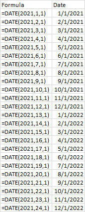
I used the DATE function to produce a list of months. DATE(year,month,day) produces a numerical date for month/day/year (or day/month/year outside the US). To get sequential months, I used the SEQUENCE function in the month argument of the DATE function.
All I needed was the initial month, as shown below. Using year 2021 and months 1 through 12, I get January through December of 2021. Then month 13 spills into the next year, giving me January of 2022. This makes it easier than having to calculate when the year turned over.
The screenshot below shows my approach. I listed the months in column B. In column D, I listed the year, but only if the month was January. In column E I listed the quarter, but only for the first month of each quarter. In column F I listed the first initial of each month using the “mmmmm” custom number format.
Column G holds some dummy data, so I could test out a chart, and it worked nicely.
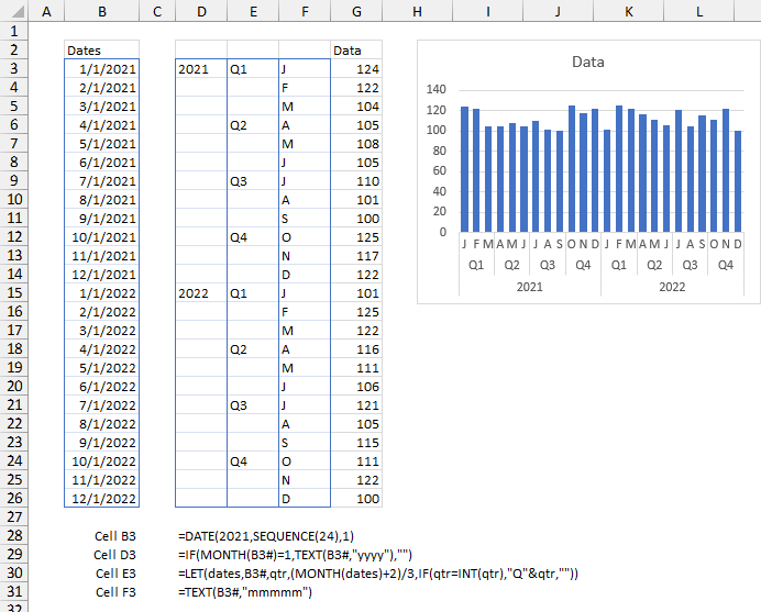
Thanks to Leonid who pointed out a typo in one of these formulas in the original figure.
Put the Pieces Together
I needed to condense all of this into one formula, so I started with the following LET function. I input the first year and number of years, then calculated my list of dates. Then I did a bit of arithmetic to calculate quarter number from the month: January is quarter number 1, February is 1-1/3, March is 1-2/3, April is 2, etc.
The CHOOSE function’s syntax the way I used it is something like this:
CHOOSE({column 1, column 2, column 3},
  formula for column 1,
  formula for column 2,
  formula for column 3)
The CHOOSE function is a great way to build up a multiple-column Dynamic Array.
=LET(
  firstyear,2021,
  numyears,2,
  dates,DATE(firstyear,SEQUENCE(12*numyears),1),
  qtr,(MONTH(dates)+2)/3,
  CHOOSE(
    {1,2,3},
    IF(MONTH(dates)=1,TEXT(dates,"yyyy"),""),
    IF(qtr=INT(qtr),"Q"&qtr,""),
    TEXT(dates,"mmmmm")
  )
)
This milti-line, indented formula is much easier to read than the no-white-spaces version.
This formula produces the desired output.
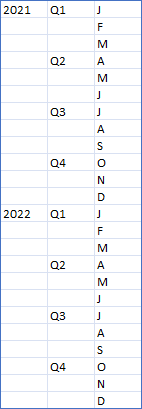
There are a few caveats for my non-US readers. First, the format strings for year (“Y”) and month (“M”) may be different in your regional version of Excel. Second, the argument separator in Excel formulas is a comma (,) for the US, but a semicolon (;) in many non-US editions, and I’ve heard of other characters being used. Third, array structures like {1,2,3} use a comma (,) and semicolon (;) respectively as column and row separators in the US, but in other regions, these may be reversed or even replaced by other characters.
Finally the LAMBDA
I rearranged my LET to produce the following LAMBDA function. When used in a cell like this, the inputs to the LAMBDA are enclosed in parentheses after the LAMBDA’s closing parenthesis. The LAMBDA produces output identical to the LET output above.
=LAMBDA(
  firstyear,numyears,
  LET(
    dates,DATE(firstyear,SEQUENCE(12*numyears),1),
    qtr,(MONTH(dates)+2)/3,
    CHOOSE(
      {1,2,3},
      IF(MONTH(dates)=1,TEXT(dates,"yyyy"),""),
      IF(qtr=INT(qtr),"Q"&qtr,""),
      TEXT(dates,"mmmmm")
    )
  )
)
(2021,2)
Here is how to convert the LAMBDA into a reusable user-defined function. Click Define Name on the Formulas tab to open the New Name dialog. Give the function a descriptive name, document it with a comment, then enter the LAMBDA formula (without the trailing inputs) into the Refers To box, and click Enter.
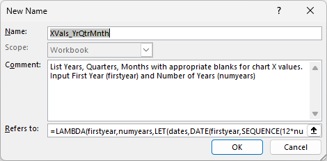
To simplify creating, editing, and deploying LAMBDA functions, Microsoft has introduced the Advanced Formula Environment. You can get it from Insert > Get Add-Ins. I have not used it here.
When you start typing the LAMBDA name into a cell, Excel’s IntelliSense suggests the full name of the function, and shows the comment, just like any built-in function.

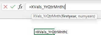
Click the tab key and Excel fills in the function name with the opening parenthesis, and shows what arguments are expected.
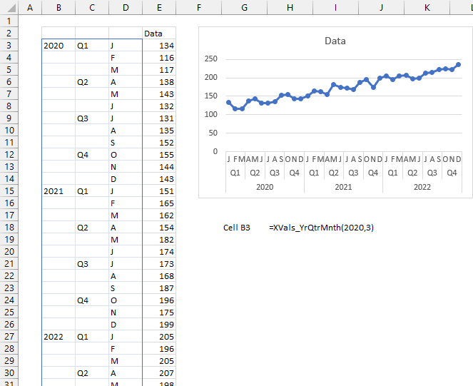
I’ve used my LAMBDA function in cell B3 below, and the output works just fine in the chart. I’ve hard-coded 2020 and 3 as the starting year and number of years, but I could have linked to cells with these values.
TLC Reprise
Here I am showing how a chart looks when the top-left cell is not blank.
Power Query Alternative
My colleague Mark Proctor likes this axis technique, and built a query in Power Query that will take monthly date and generate the Year-Quarter-Month data structure to produce the tiered axis in his charts. Read about it in his Excel Off The Grid blog in How to create chart data with Power Query.
More LAMBDA Functions
- Calculate Nice Axis Scales with LET and LAMBDA
- Dynamic Array Histogram
- VBA Test for New Excel Functions
Read More About Axis Labels
- ISPRIME Lambda Function
- Lambda Moving Average Formulas
- Improved Excel Lambda Moving Average
- Excel Lambda Moving Average
- Dynamic Array Histogram
- Calculate Nice Axis Scales with LET and LAMBDA
- VBA Test for New Excel Functions
- Dynamic Arrays, XLOOKUP, LET – New Excel Features
More Articles About Axis Scales
- Excel Chart with Square Gridlines
- Calculate Nice Axis Scales with LET and LAMBDA
- Calculate Nice Axis Scales in Your Excel Worksheet
- Calculate Nice Axis Scales in Excel VBA
- Chart UDF to Control Axis Scale
- How Excel Calculates Automatic Chart Axis Limits
- Reciprocal Chart Axis Scale
- Custom Axis Labels and Gridlines in an Excel Chart
- Custom Axis, Y = 1, 2, 4, 8, 16
- Logarithmic Axis Scales
- Link Excel Chart Axis Scale to Values in Cells
- Consistent Axis Scales Across Multiple Charts
- Gantt Chart with Nice Date Axis
- Select Meaningful Axis Scales
- Bar Chart Value Axis Scale Must Include Zero
- Text Labels on a Horizontal Bar Chart in Excel


