A question on the SuperUser forum was titled Add multiple Utilization (percentage) trend lines to a Stacked Bar Chart with a count. The user wanted to see the trends at each level of a stacked column chart. Of course, Excel disables the trendline feature for stacked series in a chart. But with a little magic we can generate stacked trendlines as requested.
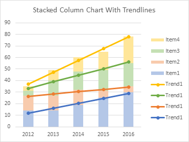
I did this two ways. First I used the actual trendline feature of the chart. Then I realized it was easier to simply calculate the trendlines in the worksheet, and plot the calculated lines.
Using Actual Chart Trendlines
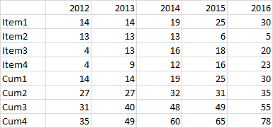
Here is the data. It plots items 1 through 4 over the years 2010 to 2016. I added four series, Cum1 through Cum4: Cum 1 is simply Item1, Cum2 is Item1 + Item2, etc. The CUM series then plot a line at each level of the stacked column chart: Cum1 plots at the top of Item1, Cum2 plots at the top of Item2, which is stacked on Item1, etc.
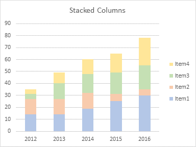
Here is the stacked column chart with series Item1 through Item4.

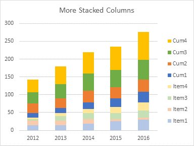
Here is the stacked column chart after adding Cum1 through Cum4 (which Excel adds as more stacked columns).
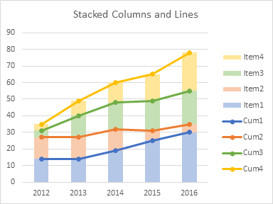
In this chart, the chart type of Cum1 through Cum4 have been changed to lines with markers.
One by one, I’ve selected Cum1 through Cum4, and added trendlines. They are partially obscured by the corresponding series.
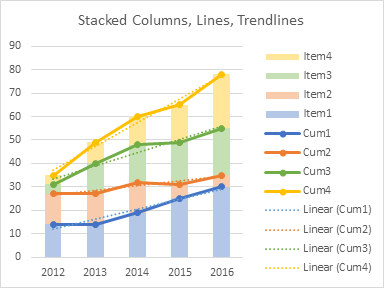
I have hidden the Cum series by formatting them with no line and no marker. (I can’t delete the Cum series without also deleting the associated trendlines.)
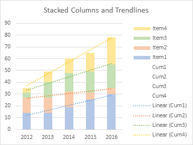
The chart still needed little cleanup. I deleted the unneeded legend entries for Cum1 through Cum4. I formatted the stacked trendlines as solid, not dotted, lines. And I changed the labels for the stacked trendlines.

Not bad, really. It’s hard to see exactly how far the trendlines are above or below the stacked columns, and I didn’t like that. Also it’s tedious to generate the trendlines, hide the line chart series, and do the rest of the formatting. And then I thought of an easier way.
Using TREND to Calculate Trendlines
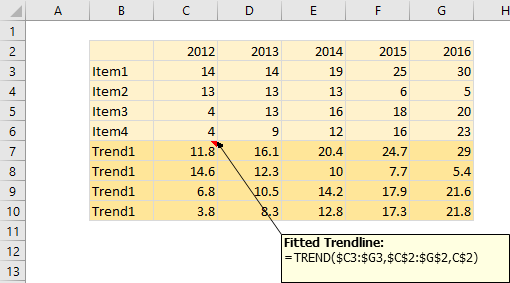
Here’s the data. The Item1 through Item4 data is identical, but the Trend1 through Trend4 data calculates the actual trendlines for the corresponding Item.
Here’s the stacked column chart showing Item1 through Item4: identical to above.
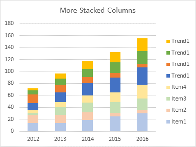
Here is the stacked column chart with Trend1 through Trend4 stacked on top.
And here is the stacked column chart, where Trend1 through Trend4 have been converted to stacked lines with markers. And we’re done. No need to plot trendlines, because they are calculated in the Trend data, and no need to delete or hide all that stuff we need but don’t want cluttering the chart.
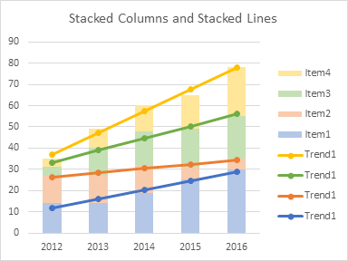
Best of all, we can tell from the markers just how close the calculated trends are to the actual data.
I almost never use stacked line charts: they are confusing and often misread. In fact, when people use stacked line charts, it’s usually because they made a mistake while clicking the chart type icons. But once in a great while, they are the right tool for the job.
Articles About Trendlines and Regression on this Blog
- Trendlines and Chart Types in Excel
- Add One Trendline for Multiple Series
- Trendline Calculator for Multiple Series
- Trendline Fitting Errors
- Choosing a Trendline Type
- Plot Two Time Series and Trendlines with Different Dates
- Polynomial Fit vs. Statistical Process Control
- Moving Averages
- Deming Regression
- Deming Regression Utility
- LOESS Smoothing in Excel
- LOESS Utility for Excel


Jeff Weir(d) says
Hi Jon. Unless I’m misunderstanding, then if you were reading the trendlines from the lowest to highest, isn’t each additional trendline really just a cumulative trend 1 through N just the trend series of A, A + B, A + B + C, and A + B+ C+ D?
If so, I’m struggling to think of the “once in a great while this would be the right tool for the job” bit.
Jon Peltier says
Hi Jeff –
I was merely noting that stacked lines worked very well with the simple formulas I used for the trend calculations; other than that, I really have no use for stacked lines. Each trendline is stacked on the previous one through the magic of stacked lines, in the second approach. In the first approach I drew the trendlines was by actually doing the A, A+B, A+B+C sums, and let the chart calculate trendlines from those points.
Meic Goodyear says
Here’s another use for stacked columns. It’s an old paper (Excel 2003) I wrote as training material for public health analysts, but the priciples still apply in more recent versions. The Office of the Scottish Government took it up and now hosts it.
I wanted to use graduated shading (another almost but not quite useless gadget) to approximate probability density in confidence intervals.
https://www2.gov.scot/Topics/Statistics/Browse/Health/scottish-health-survey/ConfidenceIntervals/ConfidenceIntervalExcel
Jon Peltier says
Thanks for sharing that, Meic. You cover a wide variety of approaches to the display of confidence/uncertainty.