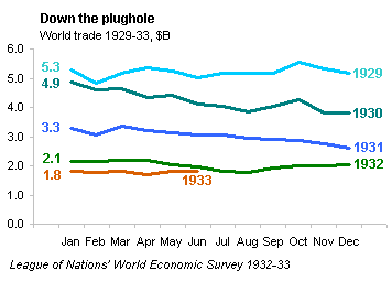
Andrew Gelman didn’t care for the ugly spiderweb chart in the Economist article The battle of Smoot-Hawley about the Smoot-Hawley Act. This was a flawed protectionist measure enacted in 1930, which led to decreased international trade and furthered the Great Depression. Andrew states that even a simple time series would be an improvement. As step one in my elaboration on his comment, I’ve recreated the Economist chart of world trade below.

The exercise above shows the best and worst of Excel: it is flexible enough to produce almost any visualization you want (albeit sometimes with substantial effort), but it does not provide guidance on which visualizations are effective, and the default options often lead to poor choices. The poor choice in this case was not due to Excel’s defaults, because this chart is not even possible with a built-in radar chart. Fortunately it requires substantial effort as mentioned above, so we aren’t likely to see many of these charts.
Well, this is an eye-catching chart. It seems to show an inward spiral, but the overall trend is really not very clear. It also looks distorted, too tall and not wide enough, but I examined axis settings several times, then even physically measured the lengths of the January-July and April-October spokes, and everything lined up. This optical illusion was caused by plotting the data in a radar chart: April and October were the two largest numbers in 1929, stretching the curve vertically. The first step to improving this chart is to cut it between December and January, and unroll it. This makes it possible to see month-to-month variation in the values (for example the dips in February 1929 and February 1931 and the spikes in October 1929 and October 1930), and use of year labels eliminates the need for the legend. The new chart takes up less space than the spiral chart. The colors are not even necessary, so this line chart could be published in black and white without any loss in fidelity.
We can see from this new chart that trade was uniform through 1929, but in 1930 (the year of the Smoot-Hawley Act) and in 1931 international trade went into a steady decline.

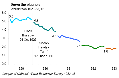
If we were interested in comparing the month-by-month values for different years, for example to assess seasonal behavior in trade, this would be an effective view. To assess longer-term trends, however, a continuous timeline approach is best. A timeline allows us to use labels to denote events in time, such as the stock market crash of 1929 and the passage of the Smoot-Hawley Act the following year.
In the chart below, we can easily see the downward trend which started around the time of the stock market crash of October 1929. The trend was well underway even before the Smoot-Hawley Act was enacted in June 1930, because many international trade partners had instituted preemptive retaliatory tariffs of their own. By the middle of 1932, the volume of international trade had effectively plateaued at one-third of its high of 1929.

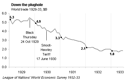
The colors aren’t needed in this chart; the monochromatic version below is equally effective. In fact, it removes the artificial separation between years which is so striking in the chart above.


Worm says
Great analysis (as always), although you appear to have renamed ‘Black Thursday’ as ‘Black Thrusday’ ;)
Bob says
Hi Jon,
Just wanted to thank you for the year’s worth of insightful, accurate and always timely information about excel and charting. You are very deserving of the MVP title.
Happy Holidays and Merry Christmas.
Bob
Elissa Fink says
Hi Jon – Love your analysis and your re-fashioning of the data. So much better!
I too had seen that chart in the Economist. Before I discovered your blog post about it, I wrote one for Tableau Software’s blog. Yours is more detailed so I’ve linked back to your post in my post.
Best,
Elissa
http://www.tableausoftware.com/blog/viz-police-economist-radial
Jon Peltier says
Elissa –
“Graphic for the Sake of a Caption”
That’s exactly what I thought when I saw the chart, but I wasn’t able to frame it anywhere near as eloquently. Too busy building 57 varieties of this chart (and only three made the cut).
Geckko says
Beauty is in the eye of the beholder.
The web plot nicely and immediately communicates the salient information, vis:
That trade in every month in every year from 1929 was lower than a year earlier – captured perfectly by the (rough) concentric circles of diminishing radius.
Those complaining just seem to be graphics snobs.
Jon Peltier says
Tom –
It shows the spiral, sure, and it does attract attention. But it’s hard to look at the spiral and say international trade dropped by 2/3 between 1929 and 1933. The radial arrangement does not give an effective baseline. The last two charts above make it easier to see the relative change.
Steve Caunce says
Extremely interesting and insightful article, I have to say I agree with you Jon, a graph should very quickly highlights the trends and changes in data. The spiral graph simply fails to achieve this.