I’ve written a bit about regression and curve fitting; see Regression Approach to a Simple Physics Problem, Choosing a Trendline Type, and Trendline Fitting Errors. A blog reader asked for help with some sample data that he couldn’t fit. Here is the data.

I plotted the data and gave it the hairy eyeball. Not a linear trend, maybe something quadratic.
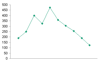
Attempted Regression
The blog reader had fitted a 6th order polynomial trendline, and was having trouble using it to predict values. My fit is shown below, and I had no such problems with predictions matching the trendline. I suspect the user had insufficient precision in his coefficients, which is covered in Trendline Fitting Errors.
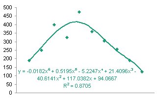
The 6th order fit isn’t really all that great. I decided it really isn’t much better than the quadratic fit I had initially suspected.
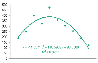
Then I thought the data almost fit two line segments over different ranges of data. I’ve plotted these below.

I replied to the user with this suggestion, and he said that wouldn’t work, because the data would have to be fitted with many line segments, because the data he gave me was only part of a much larger sequence of values.
Run Charts
I thought a moment and realized that with many weeks of repeated data, what the user needed was an approach based on Statistical Process Control. I wrote about Control charts in Introducing Control Charts (Run Charts). This is an opportunity to illustrate another set of run charts. In this example, I relied on techniques from a small, 136-page book called Understanding Variation.

Understanding Variation: The Key to Managing Chaos
Donald J. Wheeler
I added a column to my table to calculate the Moving Range, which is simply the absolute value of the difference between the current value and the previous value. This is an easier measure of variation to compute than the standard deviation, though with modern computer hardware and software that’s not an important consideration.

In any case, I plotted the weekly values data and the moving range data.


I computed the averages of the values data and of the moving ranges. I added horizontal lines to indicate the averages (see Run Chart with Mean and Standard Deviation Lines for detailed instructions).
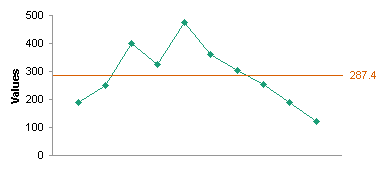
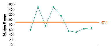
Then I used simple factors to determine upper and lower control limits for these quantities, and I added the limits to the charts. For the values, the control limits are given by:
Limit = Average Value ± 2.66 * Average Moving Range
For the moving range, the lower control limit is zero and the upper control limit is given by:
Limit = 3.27 * Average Moving Range
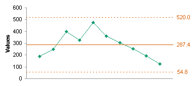
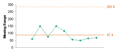
What this tells me is that the values and the moving ranges fall within limits, so the variability is given not by anything we can fit a curve to, but simply by normal variation within the process. Closer examination of some of the data would probably point to an out-of-control process (for example, the last five values show continuing decline). Let’s just worry about violations of the control limits.
I calculated 70 more values with the same mean and standard deviation as the original 10 values, to simulate an ongoing process (because the blog reader did not provide more data). I plotted these values on the same chart with the original ten values, using the limits calculated based on the original ten values.
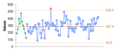

The values look pretty good, all within the limit except for a single point, which should be examined for any special causes of variation. All of the moving range points fall within the upper control limit. I recalculated the averages and limits using the entire data set and replotted the data.

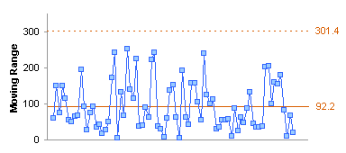
There was little difference; the limits were slightly more generous. The value that exceeded the control limit in the first chart of all the data still is out of control, and still deserves a closer look.
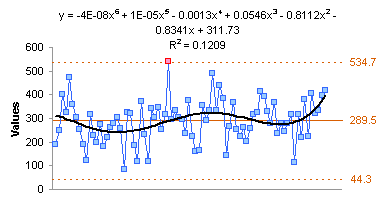
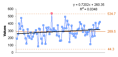
One final note: The polynomial regression breaks down completely in a process like this which is successfully modeled using SPC. A linear fit may be useful to detect a possible trend of the average over time.
Further Reading about Statistical Process Control
- ISO 9001 – Introduction to SPC
- Control Charts on Wikipedia
- Interpreting Control Charts
- Selecting the Right Control Chart
Statistical Process Control Articles in this Blog
- Watching my Weight with SPC (Statistical Process Control)
- SPC Approach to Browser Stats
- PBCharts Inflation Analysis
- Polynomial Fit vs. Statistical Process Control
- Use a Chart to See Patterns in Your Data
- Types of Control Charts
- Introducing Control Charts (Run Charts)
- Statistical Process Control
Trendline and Regression Articles in this Blog
- Trendlines and Chart Types in Excel
- Add One Trendline for Multiple Series
- Trendline Calculator for Multiple Series
- Trendline Fitting Errors
- Choosing a Trendline Type
- Plot Two Time Series and Trendlines with Different Dates
- Moving Averages
- Stacked Column Chart with Stacked Trendlines
- Deming Regression
- Deming Regression Utility
- LOESS Smoothing in Excel
- LOESS Utility for Excel


Mike Woodhouse says
I ran the data through Curvexpert which got the best fit to be a Gaussian model:
y = a*exp(-(x-b)^2/(2*c^2)) ( I think)
where
a = 407.68954
b = 4.8840398
c = 3.2081591
It fits slightly better than the quadratic (r = 0.9286) but I wouldn’t give either much credit, especially when we subsequently read that we don’t have the whole data set.
And a sixth-order polynomial is over-fitting to an appallingly dangerous degree unless you know exactly what you’re doing (in which case the question wouldn’t have been asked in the first place!)
Jon Peltier says
Mike – Thanks for that. The data does have a shape that would be somewhat Gaussian. But as you say (and I said above), fitting only a small section of a larger data set is generally not a valid approach.
I’ve also said that a 6th order poly fit is overkill. You gain in the third or fourth digit of R², but that’s fooling yourself. In the physical world there are few phenomena that follow a quadratic relationship, never mind four orders higher.
Rob says
a good example of the 6th order overkill is Runge’s phenomenon
Will Dwinnell says
It is possible to fit splines sets of connected simple curves to data (typically collections of cubic polynomials). Your pair of linear fits would be a linear spline. Almost always, spline fitting is performed as going exactly through the given data points, but this is not necessary. A trend for your 80-point series could probably be reasonably fit using 6 or 7 spline “knots” (places where the simple curves are connected.
Jon Peltier says
Yes, a spline approach could be used to fit the larger data set more closely. This is not really suited to the type of data in the plot, and will lead to overfitting. I generated a string of random numbers from a normal distribution based on the distribution of the original points. Using anything other than a control chart with horizontal mean and control lines (or trending lines) is inappropriate.
It was my assumption to simulate the reader’s many more weeks of data with a random process. From my experience, splines are good for fitting data with much less randomness and a more systematic and meaningful behavior in its variation.
DaleW says
TableCurve finds that a Lorentzian peak is a slightly better fit than a Gaussian peak, but I agree with Mike that your starting data, at first glance and with no context, looks more like a peak than a process that is in a state of statistical control.
SPC is not very powerful with only 10 points, and we might be better off using direct hypothesis testing if we can’t see the larger data set. At the end of your ten points, you’ve got 5 points in a row steadily decreasing. Assuming no ties, the odds that six random points in a row are sequentially ordered from any given point is two in (1*2*3*4*5*6) or 1 in 360. One more point would typically be considered an SPC out of control rule violation, and your data set is so small that standard SPC rules, which are certainly a great tool for larger datasets, are too forgiving here.
A look at the larger data set might show just randomness as you suggested. Or it might show intermittent peaks, or other out of control drift of the mean. From these ten points alone, not knowing if they were cherry-picked or typical of the larger distribution, shouldn’t we tentatively affirm that this limited evidence favors the existence of a local peak?
Jon Peltier says
Dale –
From these ten points alone, we can say nothing meaningful. I only suggested applying SPC to 80 points (the original 10 and 70 more derived from a population with the same mean and standard deviation as the first 10). Without 70 more valid sample data points, we can speculate on many varied scenarios: is it random, is it a section of a sinusoid relationship, are there intermittent peaks?
DaleW says
Jon,
I’d hate to see you fall into absolute skepticism whenever there are only 10 data points.
Based solely on these 10 points, a rather compelling case can be made that we do NOT here have a random sample from a process that is in a state of statistical control. That conclusion seems meaningful to me, and suggests SPC charting of a fuller dataset would very likely find it to be out of control. (Or perhaps that you were presented with a worst case example from a much larger dataset.)
As our friendly default hypothesis, let’s assume we have your hypothesized stable process where each measurement has only independent random error; this is the hypothesis against which an SPC chart is intended to detect exceptions.
The alternate hypothesis on the table is a particular nonrandom pattern in our data, some type of peak which spans more than a single data point (not just an isolated outlier). Let’s adopt this alternative only if the default hypothesis fails to explain our data, say at p<0.01 (p<0.05 is typical, but let's be more conservative here since there are several different patterns that would each cause us to reject the default hypothesis).
What test do we use to detect peak-ness? We may need to improvise one. The t-test is a good starting point, since our default hypothesis assumes we have a constant but unknown population variance.
Any distribution with unique values has a largest value. Under our default hypothesis, the points closest to it in time ("Near") should not have any higher value that the points ("Far") further from it in time. We might define our Near category as the half of the points closer in time to our maximum, and our Far category as the half of points further in time from it, excluding the maximum point from either set to keep the test fair, with an expected difference of zero. Then we can use a one-sided pooled t-test to determine if Near > Far by a significant amount. =TTEST({400,325,360,305},{190,250,255,191,123),1,2) evaluates to 0.001526 for a p-value, or 1 chance in 655 for a metric that extreme for a process that is in a state of statistical control. Unlikely!
Alternatively, we might define “near” as absolute difference and try to fit an inverse v-peak to our data. Then a linear fit of Y v. ABS(X-Xmax) for our remaining nine points not including Xmax has a t-score of 6.07 for the slope, which has a two-tailed probability of 0.0005 by regression using the Data Analysis add-in. That’s one chance in 1984 times for our default hypothesis — really half that likely, since only one tail supports a peak claim. When only a 1 in 4000 tail of our default model fits the data, it’s probably time to look at a different model, wouldn’t you say?
This isn’t at all likely to be random data — not in the sense that we define random for an SPC chart.
Bryan says
Maybe it’s because I have always worked in empirical science and not purely speculative fields, but I have always been instructed and found it to be valid to distrust each additional order of a polynomial past linear, in increasing level of distrust as the exponent increases. Years ago, there was a post-doc in our lab who insisted on using high-order polynomials to curve fit her Bradford assay standards. She got very tight fits. They were also meaningless, since there was no way the kinetics of the Bradford could really be explained by a polynomial. The usefulness of the polynomial fit is that it can account for k variables that effect the level of y. The polynomial order should never be larger than k. If you really have no clue what k might be, then do not ever use a polynomial model, no matter how tightly it might fit. Otherwise, you’re just making up effects to suit your desired outcome.