There has been a lot of discussion about pie charts and bar charts lately. I and many other know-it-alls have clearly stated that pie charts are the red-headed stepchildren in the family of chart types. In Peltier Loves Pie I provided some guidelines to follow if you still insist on using pie charts.
In this post I am giving bar charts equal time.
Bar Charts
Bar charts are widely used, and in most cases they present an improvement over pie charts. According to William Cleveland, the effectiveness of different human visualization skills are ranked as follows:
- Position along a common scale
- Position along identical unaligned scales
- Length
- Angle or slope
- Area
- Volumn
- Color
A bar chart relies on the lengths of its bars to convey information. Length is found higher than a pie chart’s angles or areas in Cleveland’s hierarchy of human perception, so bar charts are better than pie charts for presenting data. A bar chart also uses the same color for each point, so there should not be any unintended weighting of values by color.
Guidelines for Bar Charts
- Use horizontal bar charts so there is room for horizontal category labels.
- It usually helps to sort data so longer bars are at the top (or taller bars are to the left, if you use a vertical column chart).
- Use 2D bar charts only.
- Don’t use shadows, fill gradients, glows, or other distracting effects.
- Use zero as the baseline for the value axis, so the total lengths of the bars are visible.
- Avoid stacked bar charts, because bars which are not in the first layer do not have a common baseline.
- Avoid clustering more than about three or four series of bars.
- Don’t use bar charts for time series data.
Example Bar Charts
Here is the bar chart corresponding to the first pie chart in Peltier Loves Pie. Note that in a horizontal bar chart the value (Y) axis is the horizontal axis, and the category (X) axis is the vertical axis.
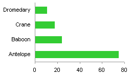
The bars are sorted smallest to largest, so format the category (X) axis scale so the categories are plotted in reverse order.
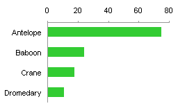
The value (Y) axis moved to the top, since it is still at the minimum (i.e., first) category. Format the category (X) axis scale again, so the value (Y) axis crosses at the maximum (i.e., last) category. (With experience you’ll remember to change both scale parameters at once.)

At first, the order of the bars may seem counterintuitive. They are listed in the sheet from largest to smallest, right? Well, the first item listed in the sheet becomes the first category, so it is closest to the origin (where the two axes cross). The second item becomes the second category, so it is plotted one slot further from the origin, which is higher on the vertical category axis.
When points are added, the new bars are lined up parallel to the existing bars, and there is no impingement of adjacent labels as in the pie chart. Even if the data were not sorted, you could tell their relative values by their lengths. This would have been more difficult, even impossible, in the pie chart.

I recommended a horizontal bar chart, because a vertical column chart will have overlapping labels.
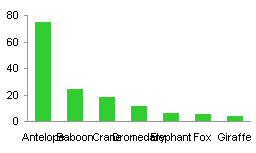
You could rotate the labels, which prevents overlapping, but requires more space for the label, and forces the reader to rotate his head to read the text.
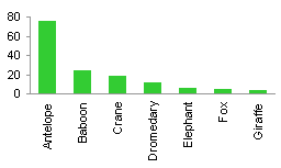
Rotating to 45° seems like a good alternative, but it is not really much better than the vertical labels.

The best option is to stick to horizontal bars. This chart has all eleven points that the last pie chart had. The chart is not as large as the pie chart, and its labels are aligned with its points (the bars) without any interference between adjacent labels.

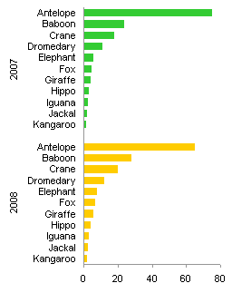
What about adding a series? Easy enough in a clustered bar (or column) chart.

Two or three clustered bars would be fine, but more than that would be too cluttered to be legible. You could rearrange the data to produce an alternate arrangement, but that may not be as useful for this particular data.
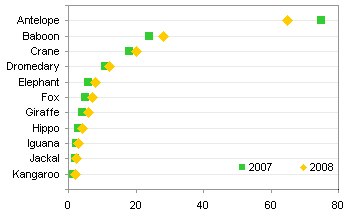
An alternative to a clustered bar chart for this display is a dot plot.


Hadley says
Cleveland and McGills’ hierarchy is a little bit more complicated than you make out. It’s important to note that they defines performance in terms of the “accuracy of quantitative extraction” – i.e. how accurately can we reproduce numerical values encoded on the plot – and this is just one facet of what makes a good graphic. You’ve also split up some of the attributes that Cleveland does not find to be different. The original hierarchy is:
1. Position along a common scale
2. Position along non-aligned scales
3. Length, direction, angle
4. Area
5. Volume, curvature
6. Shading, colour saturation
And in bar charts the primary visual attribute is position along a common scale, not length (which is no better than angle at encoding values)
Jon Peltier says
Hadley –
Thanks for the clarification. I’ve seen the attributes presented in the order I posted. and I imagine like any good methodology, there is some variation in its implementation.
It’s been a while since I’ve read the articles. I’m glad you cleared up the bar chart’s effectiveness in terms of position along an axis. That actually makes more sense.
Jon Peltier says
Sandi –
I frequently use combination charts in a similar way. Often I use an area chart for target values, or typical values, or some other kind of comparative measure, and a line chart for actual values. I don’t mix bars/columns with lines very much, unless it’s a construction like a box and whisker chart, or where I can use a floating bar to indicate a range of values and XY markers for individual measurements.
Sandi Mays says
My vote for best chart goes to the combo line and column chart. The bars are the data you are viewing … we use bars for forecasts and actuals. The line is used for the budget. This makes for an easy comparison.
You can also use this chart on 2 axis for Pareto Charts, where the bars show the Pareto data and the line shows the cumulative %.
PragmaticCynic says
Jon:
You said “Two or three clustered bars would be fine, but more than that would be too cluttered to be legible. You could rearrange the data to produce an alternate arrangement, but that may not be as useful for this particular data.”
What’s your opinion of using a variant of a panel chart ? I have done it was a small set of X access points on the horizontal comparing 4 different years using in-cell graphs. Seems to work well with my audience.
Jon Peltier says
The split bar chart I show here (the last bar chart in the post), and the three-fold bar chart I showed in Bar graphs vs. Pie charts, are both panel charts of a sort. I haven’t drawn all the boxes, but I still have recreated sets of small multiples.
Generally this approach is pretty effective. See the dashboard by Professor Hichert in Nice Dashboard Examples.
kathy Hart says
Hi,
I am trying to create a horizontal bar chart indicating regions and percent attained, but I need to show a marker in each bar indicating the goal for each region (a 2nd axis in $)… So Regions on the Yaxis with % on the x-axis. Those same regions have another x-axis with $ marked as the goal…Sample data like this
Region Goal Open Won
Amer 60M 18M 11.1M
Eur 30M 15.4M 6.4M
Asia 15M 8.9M 2.8M
Thx in advance for you help.
Kathy
Jon Peltier says
Kathy –
I assume the percentage is Won divided by Open, so here’s my data. Column E has the computed percentages, column F has Y values that make the XY chart with our Goal line up with the regions. The values that have M are values in millions, displayed with the number format
0,,"M"where each comma removes a set of three digits from the values so millions are displayed with the “M” appended.Select A1:A4, then hold Ctrl while you select E1:E4 so both areas are selected, and insert a bar chart.
I’ve already formatted the vertical axis so that the categories are plotted in reverse order.
Select B1:B4, then hold Ctrl while you select F1:F4 so both areas are selected, and copy.
Select the chart, choose Paste Special from the Paste dropdown on the Home tab, and choose these options: Paste as New Series, Series in Columns, Series Names in First Row, Categories in First Column.
Right click on the new series, choose Change Chart Type, and select the XY with Markers and Lines option.
Add the Secondary Horizontal Axis using the Plus icon next to the chart in Excel 2013 or using the Axes dropdown on the Chart Tools > Layout tab in Excel 2007/2010.
Format the Secondary Vertical Axis (right edge of the chart) so the horizontal axis crosses at the Automatic position (zero). Also format it so there are no labels or tick marks. Add data labels if desired.
I always say that secondary axes confuse more than they elucidate, but this chart is easy enough to panelize. Follow these steps:
Primary Horizontal Axis (top of the chart):
Min=0, Max=1.6 (160%), custom number format
[<=0.8]0%;;;which hides labels above 0.8 (80%).Secondary Horizontal Axis (bottom of the chart):
Min=-80M, Max=80M, custom number format
[<=0.8]0,,"M";;0,,"M";which uses0,,"M"for positive values, nothing for negative values (between the semicolons),0,,"M"for zero, and nothing for text (after the third semicolon).Also format so the vertical axis crosses at the Automatic position (zero) which is in the middle of the chart.
Both vertical axes:
Use a line color that's darker than the gridlines.